


Pro Panel: "The Colour to Watch Out for in 2016 Is..."
One question, seven expert answers
Grace Chamia
17 November 2015
Houzz Contributor. I'm an experienced lifestyle journalist with a penchant for open houses that I have no intention of buying...
Houzz Contributor. I'm an experienced lifestyle journalist with a penchant for open... More
While we eagerly await the announcement of 2016’s Colour of the Year from the Pantone Colour Institute, the Houzz community has been weighing up the options. Some have placed their bets on fruity shades of apricot or pale peach; others have jokingly suggested a smooth or crunchy (that part wasn’t settled) shade of peanut butter. You can read the discussion here. To add more speculation to the debate, we’ve asked seven Houzz professionals which colour trends they expect to be big in 2016.
Find an interior designer in your area
What do you think is the next big colour trend? Tell us in the Comments.
Find an interior designer in your area
What do you think is the next big colour trend? Tell us in the Comments.
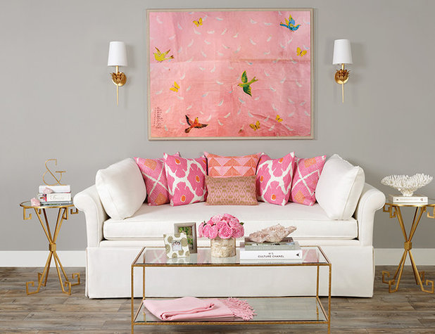
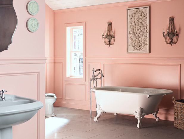
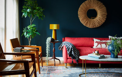
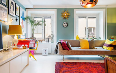
Rose
Artist Sarah Leslie of Signarture: Since the neutral ‘Sand Dollar’ in 2006, a succession of highly saturated hues have been nominated as Pantone Colour of the Year. ‘Marsala’ in 2015 was perhaps their most surprising choice yet. With many of us yearning for quieter, calming tones as an antidote to our fast-paced, technology-dominated lives, it could be time for a more approachable, less saturated colour.
Indeed, U.S. paint manufacturer Benjamin Moore have named ‘Simply White’ as their colour of 2016, but my bet is that Pantone choose one of the colours they’ve already highlighted within their Top 10 for Spring 2016 forecast.
I’d like to see ‘Lilac Gray‘ or ‘Rose Quartz‘ take the title. Greys are being forecast strongly into Autumn/Winter, as are pinks. We all know that fashion trends filter through to the home with increasing rapidity.
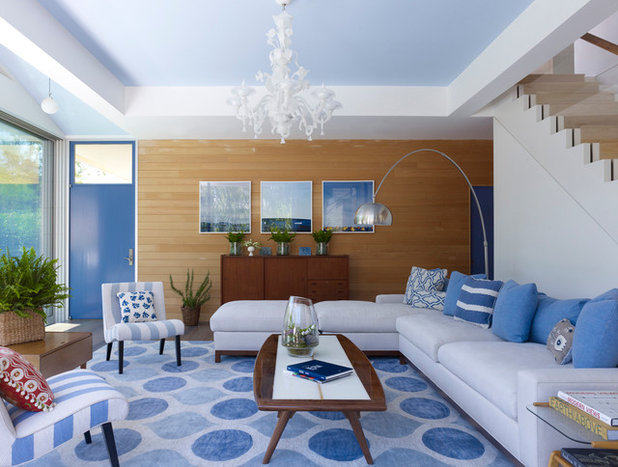
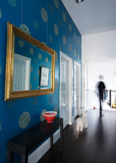
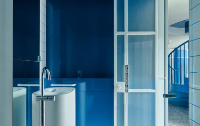
Sky blue
Architectural Colour Consultant Jacquelene Symond of The Colour Agency: As Leatrice Eiseman, Executive Director of Pantone Colour Institute, says, “Colours this season transport us to a happier, sunnier place where we feel free to express a wittier version of our real selves.” Knowing that Pantone will likely choose the Colour of the Year from the current 2016 Spring Collection, I tend to agree that the palette, as a whole, will help lift our spirits.
I feel the Colour of 2016 should help provide the sense of calm; peace and respite that we are all craving. Subsequently, I can’t go past Pantone ‘Serenity’. Perfectly described as being weightless, airy and expansive, like the blue sky above, I do agree that it has the ability to comfort and calm during the most turbulent of times.
See more blue in the living room
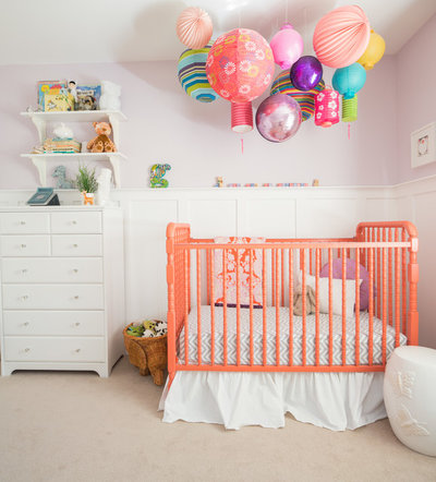
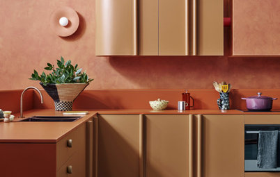
Peach
Interior Designer and Decorator Anne Ellard of Anne Ellard Design: I could see Pantone choosing a colour like ‘Peach Echo’, one of their new Fashion, Home and Interiors colours.
Looking at the trends that are emerging for the new year, I think in 2016 we’re going to see a lot of softer, feminine palettes, both in fashion and interiors. ‘Peach Echo’ is a warm, fresh and light-feeling colour and is a softer, more useable pastel-like alternative to orange. It’s a soft, whimsical colour that combines the energy and vibrance of red with the cheerfulness and uplifting qualities of yellow.
Pair it with cooler shades of mint or aqua and accents of gold for a soft and versatile colour scheme, which will work perfectly in living areas and especially in bedrooms.
Yellow
Interior Designer and Decorator Larissa Davis of Lewisham Interiors: My prediction for the Pantone winning colour for 2016 may well be as bold as the colour itself.
Excitingly, we are in for a vibrant colour palette coupled with naturals and neutrals set to “transcend cultural and gender norms”, according to the Pantone Fashion Color Report Spring 2016. The vision of the Pantone colour experts for 2016 is to inspire us to reconnect with nature, disconnect ourselves from technology, and to brighten our outlook.
The neutrals of the 2016 palette will couple brilliantly with the bright tones influenced by Picasso, Matisse and the colours of Cuba. I am also especially excited by the possibility of working with vibrant greens, burnt oranges, reds and yellows interior-wise in the coming year. With these influences in mind, Picasso in particular, the standout colour for me is yellow.
Yellow embodies optimism, happiness, sunshine and a sense of fun. It transcends culture and gender, and there is really no better colour for transporting us to a happier and sunnier place. Yellow has been Colour of the Year only once in the past 15 years; I think it is high time we embraced this colour with confidence in all areas of our lives.
What does yellow look like in the kitchen?
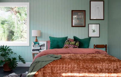
Nude/blush
Interior Designer and Decorator Jessica Viscarde of The Eclectic Creative Studio: My vote goes to a nude or blush – somewhere between a neutral and soft, earthy pink. I have seen this colour coming through homewares and being paired back with rose gold, copper, marble, timber and natural textures. It began with the pastel craze, and has toned down into a more neutral shade. I think it’s a new way to look at neutrals and a contemporary nod to the ’90s, which is also a trend I am seeing coming back through fashion and interiors.
Before everyone runs for the hills screaming, “Not the ’90s!” remember it’s a contemporary take on the style and colour. I can see it being painted on walls in 2016, adding warmer tones to the interior as we move away from crisp, sterile whites. I believe this is quite a unisex pink tone too, as it is warm, earthy and can be complemented with tan leathers, marble, monochrome and timbers, then accented with luscious green indoor plants.
Peacock blue
Interior Designer and Decorator Nelly Reffet of Twinkle and Whistle: After two years of warm colours (’Radiant Orchid’ and ‘Marsala’), I feel that the next colour has to be a cool one. My first choice would be a deep peacock blue. It is timeless and elegant and can be paired with a large variety of colours. It also blends well in both modern and traditional interiors, and can look very glamorous and feminine with a combination of white, metallic and pastels.
Try to visualise it on kitchen cabinets with marble benchtops and brushed brass tapware… It is divine! It can also look much more masculine with tan leather, exposed bricks, rustic floors or furniture, Persian rugs, etc. Versatility is key with this colour.
Cloudy neutral
Interior Designer and Decorator Jodie Cooper of Jodie Cooper Design: I think Pantone’s colour for 2016 will be ‘Cloud Dancer’. As a base, this creates the background for neutrals such as ‘Candied Ginger’ to add to the canvas when mixing in with a wider colour palette. Earthy colours such as ‘Orangeade’ and colours reminiscent of coastal scenes, such as ‘Bright Cobalt’, add tone on tone to this canvas, to create vibrant stories in interior design.
MORE FROM THE PRO PANEL
The Biggest Kitchen Design Blunder You Could Make
The Material I Love to Work With Most
The Design Rule That Is Ok to Break
Related Stories
Paint
How to Choose Your Perfect Paint Colours
By Erin Carlyle
Three USA designers share tips to pinpoint your style and mine memories to find the right paint palette for your home
Full Story
Renovating Advice
How to Choose Your Wall Colour to Complement Floors and Furniture
Which colour should I paint my room to suit the flooring and furniture? We've all asked it – and here are the answers
Full Story
Most Popular
How to Pick the Right Paint Colours for Your Federation House
By Joanna Tovia
Roof colour, wall materials and emerging trends all come into play for Federation paint schemes that work
Full Story
Colourful Homes
Suffering From White-Wall Syndrome? How to Add Colour Confidently
White walls are great... until they stop being inspiring. Five paint colour experts share how to transition to colour
Full Story
Expert Opinion
An Interior Designer Reveals How to Mix Colours and Make it Work
By tidgboutique
Don’t want to confine yourself to neutrals but lack the confidence to embrace colours? We have you covered
Full Story
Made Local
Made Local: How Dulux Colour Trends Are Born
Ever wondered how Dulux sees into the future to know the colours we'll be coveting in the year ahead? Here, we find out
Full Story
Houzz Tours
Queensland Houzz: A Cute Cottage Awash With Colour and Pattern
Bold colour, quirky prints and an abundance of art transformed this 1920s cottage into an inviting and relaxing gem
Full Story
Houzz Tours
My Houzz: A Moody, Modernised Home in Melbourne Regains its Charm
The original beauty of this Californian bungalow was lost to unsympathetic updates – see how a designer brought it back
Full Story
Interior Design
20 Honey-Hued Interiors That'll Make You Melt
Our coffee-break escape offers you five minutes' worth of images to inspire and delight. Jump right in...
Full Story
Awards
Paintbrushes Poised! 2023 Dulux Colour Awards Finalists Are In
Looking for interesting ways to add colour at home? Check out these shortlisted projects in the 2023 Dulux Colour Awards
Full Story
Yes, well done Jacqueline Symond for your prediction. They are two great colours together. I also love the colour pairings that Pantone have published to go with their two chosen colours - at least my Peach featured in there somewhere!
I'm loving the new fresh palettes for 2016.
Check out my Trend Forecast: Key Colours for 2016 article here on Houzz also:
http://www.houzz.com.au/ideabooks/54575465/list/trend-forecast-key-colours-for-2016
http://anneellarddesign.com/2015/12/03/colour-of-the-year-2016/
Ooh, lovely lovely colours!
Hehe, just remembered I had those colours plus a pale mint green in my striped wallpaper and matching paintwork in 1990 !
after that house I was all pinked out!