Houzz Logo Print
hechan

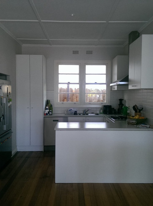
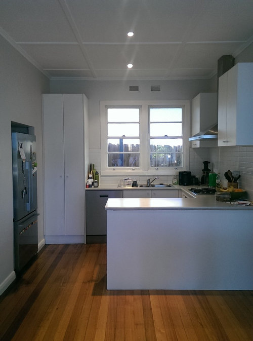
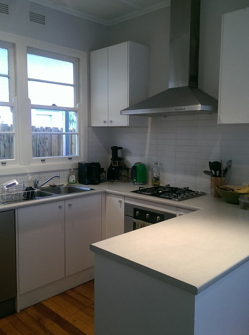
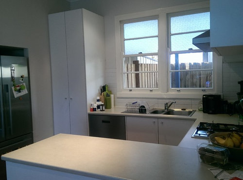
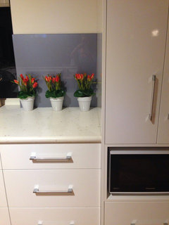
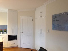
Ideas for small kitchen

hechan
9 years ago
last modified: 9 years ago
Hi we live in an old post war home built in the late 40's but we want to modernise the inside. We are starting off with renovating the kitchen and was wanting something modern and bright. It is a small kitchen so there is not a lot we can change in terms of layout, but I would appreciate any ideas especially on colours/materials. Must have's are caesar stone bench, but what should cupboards be - gloss or matt white? And splashback? See pics attached.

Comments (16)

  • User
    9 years ago
    Small spaces can be tricky.
    As an interior designer one of the services I offer 3D renderings. Contact me if you would like to be provided with a quote.
    hechan thanked User
  • lnsail
    9 years ago
    What do you like? Do you want color or stay with white? I would use color somewhere such as paint or backsplash. Are you replacing cabinets or ceiling? Give us some idea of your style...
    hechan thanked lnsail
  • Related Discussions

    Small kitchen design

    Q

    Comments (10)
    I have microwave in the corner next to the stove , same position as yours . The corner is usually hard to use and microwave fits well and door opens towards the back wall so you can take hot plates out and place it directly on the bench. You can use the top of the microwave for storage or build a shelf directly above it and you will have that corner serve you double duty . The shelving can be rectangle or triangle shape.
    ...See More

    Small kitchen design ideas

    Q

    Comments (6)
    i think the space next to the stove is much too cramped for a fridge and my suggestion would be to have the fridge next to the tall cabinets (lose the cabinet facing the living area) and add more drawers and wall cabinets in place of the broom cabinet...there should be no problem making the island at least 90cm deep as long as the sliding door opens away from the kitchne and while making these changes it would also be worthwhile to consider installing an extra power point under the laundry tub to avoid the untidy view of the washing machine cord and/or add a new wall across the laundry with space for the fridge, doors to a tall storage cabinet and doors in front of the washing machine and tub will create a much more streamlined look in the new open plan kitchen
    ...See More

    Ideas for extension of small terrace.

    Q

    Comments (10)
    Hi Cheryl, it sounds like you are getting ready to brief an architect for your project? Have you worked with an architect or designer before? I ask because it is often the case that people who haven't worked with a design professional sometimes struggle with where to begin. If that is your situation, my advice is not to sweat the details before you have found the right designer. When interviewing potential architects it is important to have a budget range and a set of desired outcomes clear in your mind, but it is not necessary, or even advisable, to present candidates with a pre-conceived "solution" because that can shut the gate on their creative input and potentially deny you the best value from your investment in their services. By all means canvas ideas here, but please try to keep an open mind and give your designer room to do their best for you.
    ...See More

    Design ideas needed for Kitchen & Living combined - small space

    Q

    Comments (4)
    my suggestion has an L shaped kitchen area with a small free standing kitchen island and/or small extending dining table and chairs with a shallow sideboard, U shaped seating for five and two locations for wall mounted TV
    ...See More
  • mldesign0401
    9 years ago
    last modified: 9 years ago
    Can I ask which of the following are more of an issue for you; storage or bench space?
    Meaning which of those things would you like improved, and would you sacrifice a little of one for the other?
    hechan thanked mldesign0401
  • trestino2002
    9 years ago
    I used white gloss and a glass splash back. See photo. My key thing was storage. So I have mostly draws in my kitchen under the benches.
    hechan thanked trestino2002
  • hechan
    Original Author
    9 years ago
    I would like more storage and would like to stick with white. I like more simple styles. We will be replacing everything in the kitchen so ripping out all cabinets including appliances. I prefer tile splashback. And was even thinking of tiling the front of the bench. Do u think that would be too much tiling? Any ideas for splashback? Also should we put bulkheads or not? We were told it can make the kitchen feel smaller and that it will ruin the style of the ceiling cos there are trimmings on the ceiling.
    Btw love your white gloss cabinets trestino2002. What style house do u have?
  • mldesign0401
    9 years ago
    hi hechen. I can think of a way to increase your tall storage three fold, but it would mean shortening your return bench by about 200-300mm so a ruler. If you have lots of glassware, plastics or even small electrical appliances, this would be very valuable.
    It involves shortening your return breakfast bench as I mentioned making the opening wider, this is so you could build on the fridge wall.
    Tom do this, imaging the tall pantry removed, the fridge bout forward by 250mm from that alcove, then actually relining that wall only with floor to ceiling flat door panel cabinets, without handles, all push catch or shadow lines.
    These cabinets would be the 250-300mm depth that the fridge now protrudes making it again inline. Having the 300mm cabinets across the entire wall, although shallow would mean the 600dounle door pantry which you have to store items front ho back, now would be kept in shallower cabinets. So you would have multiple space for pantry storage, things like toasters, sandwich makers, blenders etc and create a paneled wall in your door finish. It is an opportunity to introduce a texture here, like a whitewashed oak door for this wall only, making the white part of the kitchen a contrast, creating colour and introducing a textural element without colour.
    Then as you bench top is reduced, although the single most impactful element, I would have a 70mm square edge detail, making it appear thicker and bulkier. I would go with a concrete grey with some aggregate or glass inclusions to diffuse and destracting from crumbs etc. No bulkheads.the ceiling provides the architectural character and sets the scene for a contemporary comparison.
    One thing that would help create structure and added dimension is to install a tall cabinet at the wall end of the island back, only shallow so floor to ceiling it encloses the bench on the cooking side only by it's width, like a column would do, say about 600mm, the distance it protrudes provides an overhang for a couple of stools. Having some small enclosed space means you can place things like utensils or a kettle and not have bench clutter visible from the adjoining room, but still allow for practical items to be kept out. Being a wall of doors, some up high rectangular etc could actually tie into your strapped ceiling, the geometry is a contemporary element that is interesting an not just current, but works with your exisiting homes character regardless.
    As your home has some simple characteristics following the deco era, I would also use a geometric tile on the backsplash. Actually I'd use a white still, with a grey grout but so it highlights the geometric pattern. Ive seen an impressive triangular pattern that would provide some much needed interest in a small space and particularly against white cabinets. Further enhance this by installing down lights in the base of the upper wall cabinets so at night they have a visual feature, reflected off your stone benches.
    As for that, as stone benches are typically gloss, I re Coe Nd a Matt, satin door finish, they are more tactile, easier to clean and retain their new state far longer then gloss.
    Gloss will reflect light, but also everything else, and against your bench top really provide no added element to create any interest.
  • trestino2002
    9 years ago
    Hey hechan,
    My house is only 3 years old
    Having worked as a property manager for some years does give mean I have been into a lot of homes.
    For resale and appeal I would suggest retaining your ceiling features.
    I wouldn't tile the edges of benches as the grout will discolour and the tiles tend to chip at corners really easily in there.
    My house is on a small block and has an open living kitchen dining area. To give the illusion of extra space we kept everything simple in colour and lines and used integrated appliances such as freezer and dishwasher.
    Power points are also a big priority for me so have an in bench spare the pulls out fir use.
    hechan thanked trestino2002
  • mldesign0401
    9 years ago
    heres some tile inspiration, this in a white would look very sophisticated. I love this colour, but perhaps you prefer it simple. if I chose these tiles, id go with the most similar bench top colour as possible.
  • hechan
    Original Author
    9 years ago
    Hi mldesign0401, I absolutely love your idea thank you so much! It's the most inspirational design I have received so far as all other kitchen designers we have seen have not provided any layout changes at all. I love that u have integrated some timber into the kitchen as I was concerned all white might look a bit stark. And funny you suggested those tiles cos I actually already had that pic saved into my ideabook! Great taste! Would the cupboards go all the way to the ceiling as we have rather high ceilings, or would u suggest adding bulkheads or nothing?
    Trestino2002-can u expand on why u would retain the ceiling feature & how that would provide resale value?
  • mldesign0401
    9 years ago
    last modified: 9 years ago
    Thank you hechan. No your cabinets would not go to the ceiling, but the wall of shallow cabinets would. This is because having high up storage is better than not having any at all, and they are still useful for the odd vase or Xmas serving ware etc, Also it is necessary for this walled look to look right.
    The other column cupboard would do the same, as I like that it looks like a column or structural element and not joinery. However, laminate sheets are typically 2400mm x 1200 so they can only go to this height before. Join is necessary, this is another reason I have placed an open shelf ut on top, ring in a timber toned material, means the Join is intentional, as hiding them often fails. As for the wall, the cabinetmaker would literally stack your carcasses on top of each other, therefore the join once again is only visible at the end, where I have also placed an open unit. No bulkhead is necessary, a 20mm shadow line is left under the ceiling level, in your case the shadow line would be the minimum distance that tour plaster strapping is. The cabinetmaker would worry about this detail, you would simply ask for floor to ceiling.
    Retaining any architectural features is always a plus for resale, as the homes facade will generally show definite characteristics of the homes era, and this is what potential buyers are drawn to. As a result, people interested in post war, deco or ore styled homes are always grateful for retained period details, however minimal, and infact, the ceilings are the single most appreciated element of a homes design. Ts is because is generally is what gives you the wow factor, demanding your attention instantly upon entering, and they also do not dictate or influence the interior as far as your furnishings goes.
    You could decorate sympathetically, or contradictory to them, and either will work.
    The ceiling, floors and windows are the single most desirable elements of period homes, you have the ceiling and the window, most likely beautiful hardwood floors also. These elements provide all the details you need, and a lovely back drop for a simple and sophisticated fit out. Contemporary by comparison is ever popular as mod cons and innovative materials are as equally requested as period charm.
    Thank you for your compliments. I pride myself on being a pragmatic designer, often good design comes from the need to work within limited parameters, such as yours.
    But that's easily resolved wi details at address things like maximum ceiling heights with an understanding of material restrictions, ie the panel sizes in your joinery, or understanding what the joiner needs to consider before designing for them.
    I have an architectural fit out background, and designed many types of firings from showrooms, magazine sets and many more private houses.
    I'm glad you like it.
    hechan thanked mldesign0401
  • hechan
    Original Author
    9 years ago
    Thanks mldesign0401. We will definitely be taking onboard your advice and suggestions! If we have the wall of shallow cupboards on the left side where u suggested, would you have an integrated rangehood with cupboards all along the right side or would that be too much considering the left wall will be full of cupboards also? Or would you stick with a canopy rangehood as per your drawing?
  • mldesign0401
    9 years ago
    last modified: 9 years ago
    I like the look of an enclosed range hood better in a small space actually, I think I had drawn what you currently have, but if you are buying all new, then a pullout ranged will look better, my only concern is generally these pullout models don't have great exhausting capacity, however the fixeuni DDR pints are better. Definitely ask questions about their noise output and their extraction capability. As the current regulation stipulates they ust duct to external air, it will also mean you will need a bulkhead to conceal the ducting in your case. Having to do this, I would suggest doing it on the tall cabinet wall for consistency. The minimal height is recommend, however the ducting will work better if the bulkhead is around 300mm high. The cabinetmaker can install one of mdf, setback from the doors by 20, my suggestion is to paint it in your wall colour rather than use a laminated board, as technically they are part of the wall, ANC not the joinery, and if you do ever decide to paint your room a colour, the bulkheads will enclose the joinery making them look built into the wall. There is no need to cornice around it, your strapped ceiling has coving on the perimeter, and the bulkhead can be scribes around it, and will look better leaving the ceiling intact.
    Good luck.
    hechan thanked mldesign0401
  • gregory1232
    9 years ago
    megan have yuo thought about your own blog, your amazing....... proud follower
  • PRO
    Curtains4Australia
    9 years ago
    More lightings, wallpaper and window valance. Change the color, white is too dull.
  • mldesign0401
    9 years ago
    You need at-least one idea book. Coastal collection!
    Coastal gardens you need, cute kids spaces, guest room orgsnisation. So many things to start collecting!