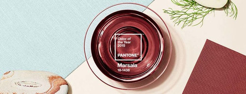
What did you think when you first saw Marsala - Colour Of The Year?
Luke Buckle
9 years ago
last modified: 9 years ago
Oh, gosh, really?
I had that in the 80s!
I guess it's ok
It's warm. I quite like that.
Wow! Great colour - where do I get it?
Something else - tell us below...
Featured Answer
Sort by:Oldest
Comments (34)
 PRO
PROHampstead Design Hub
9 years agoRelated Discussions
What did you spot first in this photo?
Comments (37)Marble benchtop. Classic. Then the window because I have one in the same spot, it's not overly common...See MoreWhat did you notice first about this great Swedish apartment?
Comments (16)The first thing we noticed was the beautiful light created by the back window and the blue curtains either side of it. What a fantastic room!...See MoreHow old were you when you bought your first home?
Comments (46)I was 23 years old and our first home (1982) was $42,000 but interest rates were 21%!!! It was in Otorohanga NZ and mortgages were tough to get. Best decision ever though. We had second hand everything, even using an old beer crate as coffee tables and book shelves lol. Over the years we have owned only 3 homes though, and if we were to start again we have learned to not over capitalise on homes we have bought instead upgrade sooner. Finally we are ebarking on our first new home build ... bettter late than never though definately!...See More11 home decoration tips for 2018 - What do you think about these?
Comments (3)White kitchens are neutral, they go with everything, so I don't think they'll ever be out of fashion. The "dark recycled black plastic sinks" sound horrible, and this is the first I've heard of that trend....See More PRO
PROGreen Room Interiors
9 years ago
Linus Reimann-Kaißer
9 years ago
mldesign0401
9 years agolast modified: 9 years ago
Barbara Dunstan
9 years ago PRO
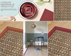
PROAlternative Flooring
9 years agomldesign0401
9 years agolast modified: 9 years ago PRO
PROElements at Home
9 years ago
islanine
8 years agolast modified: 8 years ago
LouieT
8 years agoUser
8 years agomykky48
8 years ago
olldroo
8 years ago
junipergirl
8 years ago- PRO
Sharpdesign
8 years ago mldesign0401
8 years agoolldroo
8 years agoBarbara Dunstan
8 years ago
jmm1837
8 years ago
Vy
8 years agojmm1837
8 years ago PRO
PRODesigns by Chloe
8 years agoBarbara Dunstan
8 years agoVy
8 years agoBrett Cottle
7 years agoSerena
7 years ago


Hampstead Design Hub