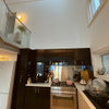
Boring taupe kitchen - how to spice it up? (Photo in Comments)
slavkabromley
8 years ago
last modified: 8 years ago
Featured Answer
Sort by:Oldest
Comments (6)

slavkabromley
8 years agomykky48
8 years agoRelated Discussions
kitchen design dilemma - i want everything in a small kitchen!
Comments (25)Hi Mike and Emma Hope you are slowly but surely getting there... may I make some comments/suggestions that you may or not take on board, but hopefully it may at least give you some ideas/options... Going through a new build ourselves at the moment, and for what it's worth, here's what I personally think: A. Work with what you've got: - additional plumbing work, gas work etc may not be necessary and (particularly gas) can be costly when you're trying to work around existing walls, floors, etc, and as much as possible utilise the existing connections... after whatever you can save here and there, you can spend on nicer cabinetery, gadgets, finishes, etc :) B. Avoid unnecessry structural work: - removing the kitchen/living wall is a must (more space, light, etc) but removing the laundry wall is an unncessary added cost (may even require costly additional strutural support) - putting up a plastered wall on the other hand is inexpensive, allows you to redefine different zones and relocate doors/openings where required (*note: avoid hinged doors in small spaces as you have to allow for wasted space to open door - suggest cavity sliding doors, easy to incorporate in a new wall) C. Don't sacrifice functionality and natural light for design - love full height floor to ceiling cabinets, very much on trend... but they also tend to bring the walls in, which you want to avoid in an already small space... they will also block out more natural ligtht from the only window to the living and breakfast bench (meals area)... not to mention seated guests would be staring at a cabinet tower and fridge - on the other hand a walk in pantry (not that much of a walk in a small space) is also very much on trend, provides more storage and... as entertaining guests in open plan livings tends to happen more in the kitchen... it provides a good hiding place for unsightly items, including frigges... (an underbench bar fridge in the kitchen can easily keep those beers cold... though do consider that means sacrificing some cabinet space) - constantly wiping off the floors from dripping wet dishes across the kictchen from the sink to the dishwaser on the other side bench would personally drive me mad after a while... the dishwasher can easily be connected to the existing sink water and waste points through the cabinerty... any half decent plumber should be able to do that... ON THAT NOTE... or should I say those notes... I know I got a bit carried away :) ... if it were me, here's an idea of what I would try to achieve ......See MoreHello 2016 Kitchen! Is a white kitchen dead?
Comments (45)No, I'm sorry, but it doesn't work for me at all. That unrelieved expanse of shiny white is quite disorienting. You don't quite know where the light is coming from. But the colour isn't the main problem here. Although it isn't pretty, the "before" kitchen actually has a lot going for it. The new kitchen has the benches all at the same height, which is a problem because different kitchen tasks are most comfortable at different heights. The surface that houses your sink needs to be relatively high so that when you're using the sink you don't have to bend your back. That's uncomfortable! Conversely, a cutting surface is better if it's relatively low, because that way you can control the knife better. It's a safety thing. The new kitchen has the cooktop and the sink under wall-mounted cupboards. You're absolutely sure the extractor fan whisks all the steam and particulates out of there? Most don't, you know. And with the cupboards at that height, if you're standing close enough to cook or wash up can you see to the back of the bench? No, it's not you, it's the design. Look at the old kitchen. It has surfaces at a variety of heights, and although the sink is under a cupboard you can stir the sauce on the stove without bumping your head, I think. I could be totally wrong about this. The featured kitchen might be a joy to work in. I do think, though, that this does not look like a kitchen designed by a cook....See MoreLIVE CHAT TODAY: How to add value to your home - Thu, 29 June, midday!
Comments (51)Q7) Louise - I live in a small federation single fronted cottage in an inner west suburb of Sydney and would like to freshen the façade to modernise it and improve on the street appeal. Within the next month I am planning on replacing the bullnose awning to one that is flat but angled, paint the exterior of the house and lay tiles in the porch and step areas (carport and planting to soften the façade will come later). The tiles that will be laid in the porch are artisan style ones shown in the pics below, steps will be marble. The house is north facing and I am going for the Hamptons look. I would like to know (a) if you think this colour scheme will work and if there is a better colour scheme that you can please recommend - Dulux tranquil retreat for the exterior, trims will be crisp white, surfmist for the awning and momentum for gutters, (b) should the awning have a corrugated or trimdek profile and (c) the tradie will be removing the timber post and replacing this will aluminium ones white in colour - is aluminium a terrible idea? The houses on the street are a mix of federation, bungalows and modern ones. Some are as-is in pretty much original condition and others freshened up with render and paint in pretty neutral colours....See MoreLooking for advice for kitchen colour scheme
Comments (38)Hello again, thank you for the input. I've taken it all on board. Regarding the island, we will be sticking with Knights Grey but if we choose a very dark floorboard, we will then switch to Timeless Grey (which happened to be one of the swatches I'd picked up anyway!) to avoid that sinking effect. Thanks for the tip. I won't be able to get back out this week to check the Dulux Raku colour, did I mention that I'm getting around with a 1 month old and 2 year old? They are totally dictating my schedule! Ann I'm not sure exactly how they get half strength. I just have the understanding that paint looks darker on a wall than it does on the sample card so to always opt for a lighter shade to counter that effect. So to avoid the Snowy Mountains colour looking too dark, I will go for a half strength. Worst case, I figure, is that it will just be a touch lighter than what I'd expected. There wasn't consistency between the three separate Snowy Mountains cards that I ended up with so I guess it's to be expected anyway. Thanks for sharing your experience Antonia, it's good to know it works. Today I went out to Beaumont Tiles to try and find a tile like the one I attached to my original post. This was surprisingly difficult to match and I've borrowed a sample of the closest match from the store to mull it over. The colour seems to work quite well against all my samples but I'm worried about the wavy edge and how it will appear on the wall when grouted. On the one hand I'm worried it will look too busy or untidy, on the other hand I think it could be a winner because it could add some depth or interest to an otherwise boring subway tile splash back. I've attached the tile against my samples and also Tranquil Retreat (half strength) wall with Vivid White trim. Please tell me what you think :)...See More
jmm1837
8 years ago
Karin Peagam
8 years agolast modified: 8 years ago PRO
PROMy Beautiful Abode
8 years ago


nedoz