Houzz Logo Print
veritymario

Which white should we choose?

8 years ago
last modified: 4 years ago

Hello!

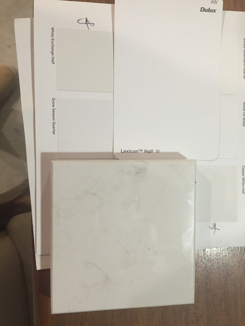
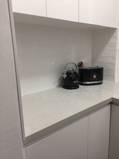
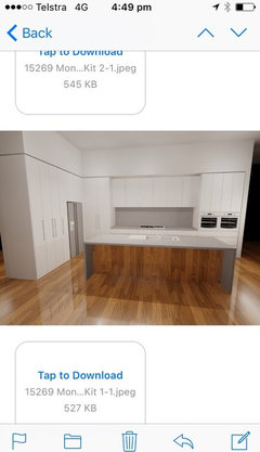
I have chosen Ceaserstone Frosty Carrina for our benchtops and Dulux Lexicon Half for our cabinets.

I am terrified the Lexicon is too cool a colour for the Frosty Carrina and would appreciate any suggestions!

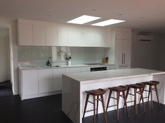
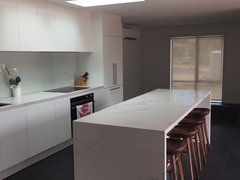
Our kitchen is a large open space with a reasonable amount of sunlight.


Comments (83)

  • PRO
    7 years ago

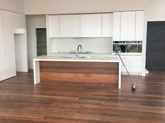
    Hi veritymario, it does look good! The 'rustic' nature of the European Oak flooring will really add the warmth and depth to the scheme. It may also 'darken' the wall colour, depending on the timber stain. It's all coming together nicely! Good work!

  • 7 years ago
    Thanks Gem'Apelle!
  • Related Discussions

    Which carpet should I choose?

    Q

    Comments (23)
    Hi me me EC Group are a small Australian mill that were previously known as Edwardstown Carpets. They have traditionally made a good product. The carpet you are looking at is a BCF solution dyed nylon. This means that the fibre is a Bulk Continuous Fibre (ie a continuous length) nylon that has had the colour mixed into it while the nylon was still a liquid (and not applied afterwards). It gives it a much greater resistance to staining and soiling (be aware that it has no separate stain treatment) and means that it also resists fading in direct sunlight very well. As far as the durability of it is concerned, the ratings have evolved to a two tier level of Extra Heavy Duty now, being a 5 and a 6 star. Avenue is a 5 star which is reflected in its' light commercial rating. Being a 25oz I would say it would be a good performer for bedrooms and living areas but will tend to flatten down in doorways, stairs or passages. Without knowing the areas intended we would probably suggest also looking at the Stoney River which is similar but a slightly heavier pile weight and a 6 star rating. Being a solution dyed nylon means it also responds well to being steam cleaned which tends to make it 'bloom' again. Cheers
    ...See More

    Help! Which kitchen design should I choose?

    Q

    Comments (164)
    In my early twenties I designed kitchens for my mother and two aunts (Uncle built them and they worked), but when it came to designing my own - had to fit a constrained space and no possibility of extension - I chewed my lips for ages - like Nicole, I drew and measured ad infinitum, and used graph book walls, views etc. I did one extra thing - which I think worked - I listed all that I wanted to store, and tried to analyse how I liked working in the kitchen. Some things I had to settle for because of space (such as a smaller dishwasher) but most of it has worked. We have a corner pantry, which I (and the cat, husband a bit larger) can walk into, but have not put small appliances in there - they sit in a large drawer beneath the main working bench, which also works well. It all looks good to me Nicole and thinking carefully about needs and how things work in advance usually results in something you'll be happy with. Good luck!
    ...See More

    Which stone should I choose for my kitchen?

    Q

    Comments (8)
    Hi Paul - making the choice of "which stone" is not just colour - have a look at https://themarbleman.com.au/tips-for-choosing-your-stone/ Our core business is the restoration, polishing, repairs and sealing stone. With over 27yr experience The Marble Man has seen stone used and abused in many ways. Take the time to research stone and how it responds to humans, life and the way we live. We're happy to talk stone - 1300 627 626
    ...See More

    Which colour rug should we choose?

    Q

    Comments (32)
    Luckily, you have a great monochrome base to start with, so you can almost go wherever your imagination takes you! You could definitely try lightening up the space to contrast the darker lounges with a lighter or brighter statement colour, but be sure to avoid any colours that are too closely matched to the existing carpet. https://www.designerrugs.com.au/rug-collections/designer-collaborations/akira-isogawa-hirameki/batik-ubud/ https://www.designerrugs.com.au/rug-collections/designer-collaborations/hare-and-klein/etched/ https://www.designerrugs.com.au/rug-collections/designer-collaborations/bernabeifreeman/folk/  https://www.designerrugs.com.au/rug-collections/designer-collaborations/greg-natale-carpet/milano/ https://www.designerrugs.com.au/rug-collections/designer-collaborations/dinosaur-designs-series-1/skipping-stones/ https://www.designerrugs.com.au/rug-collections/designer-collaborations/catherine-martin/westchester/ https://www.designerrugs.com.au/rug-collections/handknot-collections/contemporary-hand-knot/blair-ivory/ https://www.designerrugs.com.au/rug-collections/handknot-collections/contemporary-hand-knot/genesis/ https://www.designerrugs.com.au/rug-collections/handknot-collections/contemporary-hand-knot/glory-days/ https://www.designerrugs.com.au/rug-collections/handknot-collections/contemporary-hand-knot/orion-silver-grey/
    ...See More
  • 7 years ago

    Hi all I've just been reading all the comments on this thread, they've been great as I'm also in a dilemma with choosing the 'right' white. We're building a new house by the beach, contemporary design with burnished concrete floors throughout and high raked ceilings, very open plan. I tend to lean towards unpolished surfaces, like natural materials. So I need to choose very soon a white which will be painted throughout all the house, walls, ceilings, doors etc. Part of the kitchen cabinetry will be in the same 'white', as against a back wall, this will have SS bench top. The kitchen island is in oakey timber veneer with Super White Dolomite top on one end and timber top at the table end. I tend to lean towards warmer whites and have used 'natural white' in our previous home and loved it but it had timber floors, our new build has concrete floors with dark charcoal 'Monument' window frames so thinking the 'natural white' may not work. I've had so many samples and thought I was leaning towards the Snowy Mountain Half (it didn't seem cold) but someone suggested Lexicon Quarter, one I'd put aside because it looked too bright and stark. I do prefer warmer than cold. Please I'd be grateful for any suggestions and feedback.

  • 7 years ago

    I have Snowy Mountains Half throughout my entire house (walls and ceiling) and also my kitchen cabinets. I absolutely love it after spending many hours deliberating over which white to use. It is not too cold, and goes really well with my bench top in Ceasarstone Statuario Maximus which is a warm white marbled benchtop. I was going to use Natural White but the designer showed me the two samples together and the Natural White sample looked pink next to SM half sample when at my house.

  • 7 years ago

    Thankyou so much for your feedback, this has been really helpful and for the photos your kitchen looks lovely. Just spoke to a guy at Bunnings who also said with the Monument being a warm charcoal I should go with the Snowy Mountains as is warmer than the Lexicon. Now I have to decide on SM Half or SM Quarter? Thank you

  • PRO
    7 years ago

    Hi rma49454, I agree that the Snowy Mountains is probably the better choice. with everything else and your like of the warmer whites. Good Luck and your new home sounds really interesting.

  • 7 years ago
    Looks great! It's so exciting when the kitchen is nearly done and everything is coming together! Gem appelle I ended up going with Caeserstone, alpine mist on the bench and so happy I did, frosty carrina would have been way too cool for me as I went Matt vivid white on the cupboards and gloss white tile
  • 7 years ago
    Sorry I meant frosty carrina was too warm for me, so I went with alpine is has a cooler undertone with a white vein
  • 7 years ago

    Hi Nicole, your kitchen looks great, you must be please how it'ss all come together and from the photo it all works.

    Gem'Appelle thankyou for your feedback, appreciate your pro advice as yes will omit Lexicon Qtr as a choice. In the thread somewhere I read that Dulux Wairakei is a good option though have been told by paint guys it uses the same tints as Snowy Mtns just different measure depending on what strength SM you're using?? Do you think I should also leave out 'Natural White' as an option, so many of the Architecture magazines (Houses) with homes in similar schemes to mine seem to have Natural White? Snowy Mountains or Natural White?? I know I'm being so indecisive!


  • 7 years ago
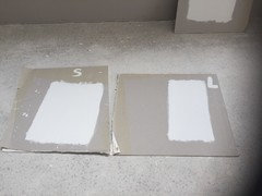
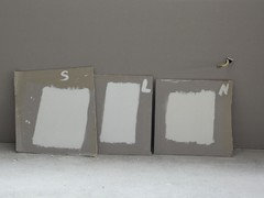
    If it helps you to compare the whites mentioned, here is a pic of both Snowy Mountains Qtr and Natural White and one comparing SWQ, NW and Lexicon Qtr. After much indecision and toing and froing, we are choosing SMQ! The Dulux colour consultant also recommended SMQ in our home
  • 7 years ago
    Forgot to mention in my previous post that I'm also going for Frosty Carrina bench top. Here is a pic of SMQ and SM HALF.... Half has more grey undertones
  • PRO
    7 years ago

    Hi rma49454, it's my pleasure to offer advice. I think an important point to remember is that there is over 3000 shades of white. Each one of these is slightly different and wanting to find the differences between them is like splitting hairs. These differences and which one works best etc also changes when adding cool or warm white, daylight, direct/indirect sunlight, floor colouring, space, furniture etc etc. Either Snowy Mountains or Natural White will work and it is your personal preference that is important. Don't overlook the joy of designing and decorating your own home. I personally think Snowy Mountains over Natural White, simply because I prefer the cooler, crisper schemes as it helps bring the art, deco, furniture more into play. Enjoy.

  • 7 years ago

    Thankyou Gem'Appelle and yes 'no truer words'..... really appreciate your advice and shall keep you posted on final choice, at this stage is Snowy Mountains Quarter!

  • 7 years ago

    And thank you Zaffa for your photos, much appreciated for your effort. Me too, am 99% sure I'll go the SMQ!!

  • 7 years ago

    Important thing is once you've made your choice, don't second guess yourself!! Move on to your next decision!

  • 7 years ago

    Yep great advice!

  • 7 years ago

    hi what colour splash back is that for the maximus bench top?

  • 7 years ago

    Hi blewy09 - I just found the specs! The splashback colour behind the optically clear glass is Antique White DG3040. I am not sure if this is the Dulux Colour by the same name though? I think it is. Toscan Glass in Canberra were the supplier to my kitchen company, you could always call them if you wanted to know for sure. I was going to use Snowy Mts Half behind the glass but it looked blueish in some light whereas the Antique White matched the stone benchtop much better. I would have loved to have used the stone as a splashback but it would have required a join as the length was 3.6 metres. I am too OCD to have a join in the splashback! I then wanted to do smokey mirror splashback but it too didn't come in a length that long and would have had a join, so I had to revert to coloured glass! I think it looks pretty good though and allows the bench top to stand out as the hero piece of the kitchen.

    <?xml:namespace prefix = o ns = "urn:schemas-microsoft-com:office:office" />

  • 7 years ago
    I would actually use Whisper white.
    Grab a few samples and paint them on large pieces of cardboard, then you can move them around a bit to see on different wall, lights etc.
  • 6 years ago

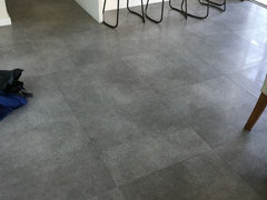
    I have used Frosty Carrina on my bench top and white cabinets. We have a grey concrete floor tile throughout. My colour consultant suggested Dulux Grey Pebble 1/4 for the walls. Has anyone every used this? It is warm which is nice against the floor, I don't want it to look to clinical. However I'm wondering if Snowy Mountains might be a better choice? Would appreciate any advice.


  • PRO
    6 years ago

    Without seeing pictures etc, I feel that your consultant has made a good selection. The Snowy Mountains would possibly make it more 'clinical', as it is a white rather than a grey. You can further 'warm' the space with timber or other textural elements.

  • 6 years ago

    Thought you might like to see my floor tiles Gem'Appelle Designs. Still think Grey Pebble 1/4? I've just heard about a paint by dulux called Mt Aspiring? Seems to be a grey white with less pinky tone compared to the grey pebble.


  • PRO
    6 years ago

    Thanks for the pics of the floor tiles. A very good choice indeed. A 'less-pinky' grey will work well, rather than a white.

  • 6 years ago

    Benchtop decided = Calacutta Nouvo .....but cabinets?....choosing the most suitable "white" from all the " whites" is beyond difficult. I quite like Snowy Mountains half and Natural white but was advised that they weren't perhaps the best choice. Lexicon mentioned but I'm not sure about it. Ps existing darkish wooden floorboards.

  • PRO
    6 years ago

    Hi Jennifer, when you say 'darkish wooden floorboards' are they are red, brown or chocolate? Also the colour of your walls? Have you considered half strength Taubmans Thin Ice instead of 'white'?

  • 6 years ago

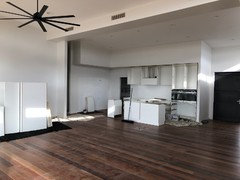
    This is my kitchen, it is half finished as I don't like the white I have chosen for the cabinets vivid white. My walls and the bulk head are white exchange quarter. I am having the kitchen taken out and repainted but I can not decide on colours we are thinking of doing 2 different colours possibly a darker grey and a lighter grey/ white. The bench top and splash back are frosty carina and just look dirty next to the vivid white. We have tons of natural light with floor to ceiling windows. Any suggestions would be so appreciated

  • PRO
    6 years ago

    HI Erin, Thanks for the pic. It does look a little stark, against all that warm timber. Firstly, is it laminae cabinetry or 2Pac? If laminate, maybe on the oven stacks you could even go Cinder Matt, and then a Riga Zinc Finegrain running horizontal for the overheads and keep the lowers, inside the island the white? These are all from Polytec.

  • 6 years ago
    They are 2pac painted doors so I can't add a timber look. I am thinking of going quite a dark grey on the island and above and below the stone to really make it a feature then maybe colour match the rest of the cabinets in a shade lighter of the wall colour?
  • PRO
    6 years ago

    Hi Erin, With 2Pac, I would probably still do the uprights the dark and then spread the lighter grey through the horizontal. Maybe Taubmans Knight Grey for he upright, Grey Moggy for underbench and then Stormy Shadow for the overheads. I feel that the dark grey overhead will take away from the feature timber to the front of the island. The walls could stay White Exchange Quarter, so that ties back to the rest of the house. Finish off with a black Falcon LED Pendant light, by Tec-LED, in black.

  • 6 years ago
    Thank you, do these colours have a dulux equivalent? I those three colours look great together thank you for the advice
  • 6 years ago
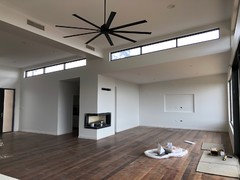
    This is what the kitchen will look like with all of the doors installed.
  • 6 years ago
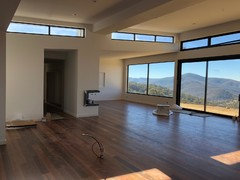
    These are some other photos of our house to give others an idea of the style of the house
  • PRO
    6 years ago

    HI Erin, I'm sure Dulux do have a colour match and if you take those names into a Dulux store they should be able to match it for you. The pictures you have attached look great and seeing more of the space, I would stick with the darker colours for the uprights, the mid for the overheads and the lighter for inside. The Falcon pendant should be slightly less in length than the island, to continue those long, straight lines. Can't wait to see the finished product!

  • PRO
    6 years ago
    last modified: 6 years ago

    Here is the Falcon Pendant I have in my showroom. This one is 2700mm long and 4000k for a crisp light on the workbench below They are custom made to your requirements and can be shipped Australia wide..

  • 6 years ago
    Hi I'm having a very similar dilemma. We have an older home and have just installed a new kitchen. The cabinets are all Dulux Lexicon quarter with Calacatta Nuvo benchtops. We are planning on doing our splashback with a subway tile and have chosen a soft dove grey (for more warmth) with white grout laid in traditional brick pattern. Our walls are Hogsbristle half and our floors are a golden hardwood. I've noticed with the cabinets now installed is that the kitchen looks just so stark now and I'm just not 100% happy with it. The bulkhead is as yet unpainted and no appliances are in yet. We have 3 pendant lights over the island with a warm led globe, and another larger downlight in the centre, between the island and rear cabinets with a cooler globe. If I change the cooler globe to a warmer globe will this make the cabinets appear less stark? We don't get a lot of natural light in the space hence the Lexicon selected in consultation with our kitchen designer.
  • PRO
    6 years ago

    Hi Brenda, Yes Lexicon is a very stark white indeed. I am assuming that you will paint the bulkhead in Hogsbristle half to match in with the walls? I am also assuming that the lights in your rangehood will also be cool? Is your free standing range white or stainless? I would swap out the cool central light for a more warmer tone, to help take out he starkness of the Lexicon. Once that is done and the splashback and appliances are in it should look a little warmer. Then try to add some 'artificial' warmth with your other accessories, eg rustic timber fuit bowl, old fashioned stove top kettle etc. Let me know how it all goes.


  • 6 years ago
    last modified: 6 years ago

    I have been following the advices re: white kitchens and am impressed with your knowledge, I hope you can also help me; I am after a crisp white contemporary kitchen. I have an organic white caesarstone bench top. What colour can I choose for the cabinets in matt finish? Also, would the Solver Floral White paint be suitable colour for the internal wall? If not, please advise. My floor tiles are white in lapato finish as I could not get anything in plain white. Thanks, Cynthia.

  • 6 years ago
    Thank you Gem'Apelle Design, yes intending to paint bulkhead with Hogbristle half in line with the rest of the walls and a white cornice still needs to be installed above the bulkhead (standard ceiling white). Should I paint the bulkhead a different color or use Hogbristle? The freestanding oven has a stainless cooktop and black oven (see photo). We are having led lighting under the rear cupboards and have requested warm led lights for there. Not sure about the range hood lighting, but would assume also that they would be a cool light, which I'm not all that concerned about. Interestingly the kitchen installers had a blue protective sheet on the floor which I discovered made the kitchen color look starker than what it actually is, so the color is softer once I removed it. We will change the centre led light to a warmer light as well. Do you think the dove grey subway tile will work as a splasback? Thanks so much for your advice xx
  • PRO
    6 years ago

    Hi Brenda, Thanks for those details. I would keep the strip lighting as cool, as it is more task lighting rather than ambiance lighting. Although, you will probably use it for both. I think for a little more drama, look at the dove grey subway and a darker grey grout. This will tie a little depth into the splashback along with the veining on the benchtops. I think the rest will come together nicely.

  • PRO
    6 years ago

    H Cynthia, Thanks for those words. I try to assist where possible. A couple of concerns with all white kitchens are making the white's match and more importantly, giving it some life. The second is more important when in a home. Are you able to mix another colour into the cabinetry? This could be as little as the run of overhead cabinetry, a different colour end panel or bar panel on the island etc. To keep a contemporary feel, two or three tones to your cabinetry works well. Maybe even a little timber as this instantly adds a little 'warmth' without taking the crispness out. I find one of the best crisp whites is Lexicon. This will further be enhanced by a cooler light rather than warmer light. The organic white, in an all white kitchen, probably doesn't have enough light and shade to it. Is your kitchen just a re-spray keeping the original benchtops? I hope the above helps and I'm interested to hear your thoughts on the above.

  • 6 years ago

    Thanks for your help. No, the house is being built. As suggested, I shall add a bit of timber as well find the lexicon paint for the interior.

  • PRO
    6 years ago

    HI Cynthia, Thanks for that. Are you 100% wedded to the Organic White? I am thinking once you get the white tile with Dulux Lexicon walls and cabinetry, it will feel very clinical rather than homely. Maybe break it up a little with gun metal or mat black tapware. Also timber where possible. The Lexicon will look good throughout the rest of your house as I am assuming you are using warm lighting throughout. Again I would suggest a cooler light for your kitchen work stations. Bring other textures in throughout the house, such as leathers, faux fur, timber, stone etc to help take away the 'clinical' feel. Interested to hear how it all goes.

  • 5 years ago
    Any advise would be appreciated for kitchen schemes.
    A new build with surfmist aluminium windows and brushbox wooden floors.
    For the kitchen am favouring frosty carina benchtops.
    Don’t want anything too grey or creamy .or clinical
    So far have been told that variations of Resene Thorndon Cream would work for walls but not sure what to use for cabinetry and skirtings.
    Also told that Dulux Whisper White works with the surfmist windows.
    Any help with cabinetry and walls appreciated
  • 5 years ago

    Could you please help me with my new build. We are building a Hampton style house. French oak flooring,White natural finish stack kitchen cupboards, subway gloss tiles white for splash back. all matt black handles on cupboards and three black rope,glass pendant lights over bench top. i think i have that all good? My concerns are my caesar stone bench top. WHAT COLOUR?? We are having a charcoal grey tile in wet areas away from the kitchen.Ceilings are white and walls are in Haymes paint Greyology 2.

  • PRO
    5 years ago
    last modified: 5 years ago

    Hi kathryn0305

    Apologies for he delay in getting back to you. With your kitchen, do you have any floorplans, other details with your kitchen? Is it all part of a large open plan area? Do you have any pics of the build so far? With regards to the windows, are they are particular style? What window treatments are you thinking of? Surfmist is a warmer white so the Whisper White works well with the windows. My concern would be a cream paint colour would bring too much cream. Especially if you go for a warmer light. If the cabinetry is detailed, ie shaker style, then Whisper White for the cabinetry would work, paired back with mat black taps and handles. This also depends on the overall style of the build. I hope this helps.

  • PRO
    5 years ago

    Hi HU-648755060


    A couple of questions for you. Do you have any floorplans or other details as well? A lot of people say Hampton's Style but that in itself can vary greatly between people. What you have picked out so far all sounds pretty good. I would look at a darker stain, like an espresso for the flooring. The darker automatically adds a feeling of understated luxe. I assume you are doing larger architraves, crown mouldings and skirts and these are painted white? Are you doing a grey grout on the splashback? For a more modern/industrial twist, look for a concrete finish to your kitchen benches. Remember that the concrete looks can be rather patterned so look at full slab pictures before choosing. If you go down this path I would keep all of them the same, vanities, laundry benchtops and kitchen benchtops. Otherwise you could look at a dramatic marble look such as Smartsone Blanco Molassa for the island and then a pared back white, for the other benchtops throughout the house. I hope this helps.

  • 4 years ago

    Hi, would love advice on choosing white colour for cabinetry and walls to go with CS Frosty Carrina. The cabinetry will be shaker style and the floors are a dark chocolate colour (Prestige Oak engineered flooring in Ebony). Have brushed nickle tapware and lower cabinet handles. I am after a fresh look but want to avoid a clinical looking kitchen. With thanks

  • 4 years ago

    Hi, I was wondering if you could help me and give me some advice. We are renovating our home and we have chosen a French provincial style kitchen and have purchased a gloss black free standing stove, , gloss black dishwasher, black granite undermount sink , black glass undermount rangehood , black provincial style door handles etc. After going back and forth I decided I think on Dulux natural white for kitchen cabinets, walls, ceiling , skirts. We have Jarrah timber floor boards. Could you give me some advice on what stone benchtop would suit and match Dulux Natural white? I was thinking of CS frosty carina bench tops and splasback but would love to hear some suggestions and advice from an expert please

  • 4 years ago

    Pamela. Please start your own post.

  • 4 years ago

    Hi Pamela. Frosty and Natural white are perfect together. I have them both in my kitchen. Sorry Kate, I can’t find where to message Pamela this comment.