Houzz Logo Print
sue_hamlet79

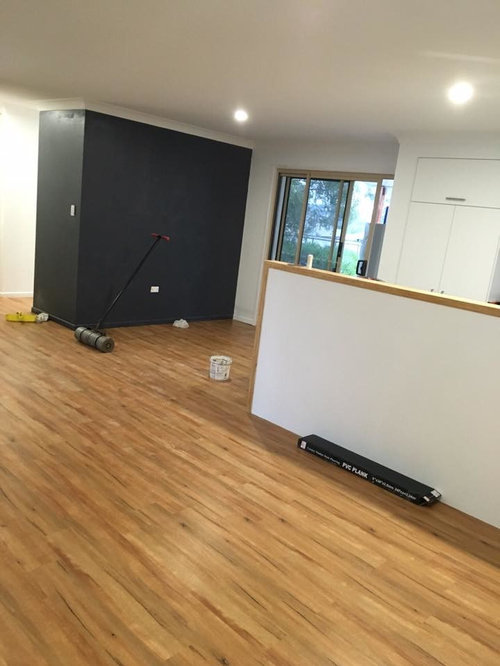
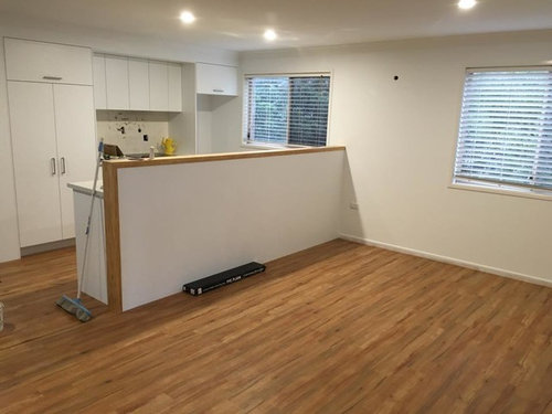
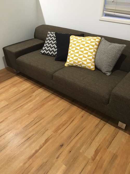
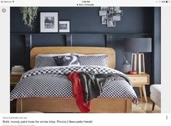
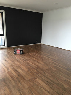
Feature wall colour - did I get it wrong?

9 years ago

I've only applied the first coat of this paint but it's not looking good - I think it's way too dark for my Scandi-eclectic reno. The colour is Taubmans Viking Grey but I'm seeing a very strong charcoal with blue/purple,and i would expect it to darken with a second coat. I have had several ideas about what to do with this wall, which will have a banquette seat and dining table added in due course. First thoughts were to add a lot of white and/or copper or ochre. Quite prepared to soften the paint before I go further.


Ideas welcome.

Taubmans Viking grey

The opposite wall (waiting on tiles and blinds)

Existing couch and new cushions.

Walls are Dulux White on White. Cupboards are Polar white; laminex benchtop is peacestone. Door/window frames are beige.


Comments (37)

  • 9 years ago

    I know what you mean. I tend to think it might look ok if it was just the wall facing the kitchen and not the end bit of wall as well and also if the skirtings were left white like the rest of the skirtings. At my first glance it looked like a big heavy-looking metal cabinet had been put there because everything is that colour! Try keeping that end wall white and I think it could look ok, especially once there are other things in the room and a picture or something on the wall.

    Sue Hamlet thanked robandlyn
  • 9 years ago
    Do you plan to put anything on the wall? A mirror, art or sideboard might give you a very different perspective. I think robandlyn's suggestions would work well. The photo attached combining light timber & dark grey wall looks lovely.
    Sue Hamlet thanked dkin0577
  • Related Discussions

    Tv feature wall

    Q

    Comments (29)
    I can see you like minimal furniture and clean lines so I will remember this when I comment. You are getting a new bigger tv, which I think would help balance the wall/tv ratio which is great, would you consider a long, low entertainment unit? Regardless that your tv is mounted. Have a look at this website; www.sydneyside.net.au Also, I do like the dark rug (recently bought a dark charcoal one myself) but it looks too small for the space. The next size would have worked better. Sizing is everything with rugs.
    ...See More

    Black feature wall & Carpet colors

    Q

    Comments (7)
    Very glam- but I hope you don't own a cat or dog that sheds, as you will see every hair on the dark carpet.
    ...See More

    Feature wall - Dark grey colour? PLEASE HELP ?

    Q

    Comments (22)
    Hi Italian Girl looks great, when dressed would you be able to post a couple of photos, I am trying to recess TV and accessories as well, I can't get it right in my head to give to cabinet maker..thanks if you can.
    ...See More

    Should I paint my exterior feature wall?

    Q

    Comments (38)
    Looks good. Before I read through discussion, I had these thoughts. You could look at painting on the front of the wall only, not in the porch/entranceway area underneath, double strength of main colour. So you could as an option get a test pot of Dulux double Self Destruct or even triple. I would not use Monument, or similar to the roof color as it will disappear into the roof. I also think the front fence would look better painted a stronger colour from your existing but as it seems it has just been painted perhaps you could do that, when and if you liked, to cut down expense. On the Dulux website they also give you colours that look good with Self Destruct. (Picture below). Another option is look towards going bold like a strong blue or blue green. Something like in the picture. That's my feature wall, Resene Billabong. ...or a dirty purple or a blood red. It's starting to get really personal of what your tastes are. Perhaps you could Half or Quarter the main house colour in the entranceway so it still flows but gives you more light. Exciting stuff!
    ...See More
  • 9 years ago
    It does look dark but it is going to look striking in an empty room. It will be softened by the decor you add to the space. Artwork or a mirror will change how it looks as it will break it up so it won't look so hard.

    If that coat is wet it will dry lighter as well so just wait and see and think about what it's going to compliment in the room.
    Sue Hamlet thanked Jacinta O'Brien
  • 9 years ago

    Great, thanks everyone. I am certainly planning to put things on the wall and had looked at lots of photos similar to what @dkin0577 kindly showed. However our floor is not as light as planned, and that really shifted the colour. Plus the grey in that pic is softer. It's already dried, Jacinta, and in fact it's still patchy due to the white undercoat, so I think it will darken further :(

    Good points about following through the idea to the end, and adding in white trims etc.

  • 9 years ago

    dkin0577 I should have added... this is the wall our dining table sits in front of. Presently it is an old yellowy pine table and chairs, but I think it needs lightening up or at least freshening up with some paint if it is to work next to the wall as is.

  • 9 years ago

    OMG thanks for sharing this colour, I've been looking for a dark grey! :) x

  • PRO
    9 years ago
    last modified: 9 years ago

    Hi Sue,

    Don't give up on the colour yet.. It may be dark but it gives a striking appearance in the room.

    If you can display the photos in various sizes with a generous mount around them and a slim pine look frame to tie in with your Scandi-eclectic theme and floor colour, you've got yourself one beautiful gallery wall as a feature!

    Good Luck! :)

    http://abeautifulmess.typepad.com/.a/6a00d8358081ff69e2017c38999a64970b-800wi

    Sue Hamlet thanked Miriam Innes ] [ Charcoal Artist
  • 9 years ago

    I love a bold wall like that. Is it bothering in contrast to the colour of the couch and cushions? Perhaps that palette is working against this wall? Perhaps a slightly different tone of grey that would work with an olive - mustard tone rather than a blue-purple might give harmony. But it's hard to tell from photos. I like the idea very much though!

    Sue Hamlet thanked Tyrian
  • 9 years ago

    I love the colour! Looks Bold, picks up on the darker colours on the floor and enables you to add other brighter colours with your cushions etc But yes I hate that yellow/mustard colour in the cushion...goodluck


    Sue Hamlet thanked Trish Vella
  • 9 years ago

    The cushion palettes plus mid grey are more to my taste than the bold wall so I think I'll need to tone it down a bit.


  • 9 years ago

    Stay with it, a bold colour always looks imposing in an empty space. Once it's furnished and decorated it will soften.

    Sue Hamlet thanked Susan Hosack
  • 9 years ago
    Looks great but under no circumstance should you paint the skirtings or the return a lighter colour. Leave it as you have it.
    Sue Hamlet thanked John Henson
  • PRO
    9 years ago

    Your sofa is the big money item here so you may not be e changing that soon.

    I suggest you take a cushion off your sofa - and head to the paint store for COLOUR MATCHING!!

    This is the colour for your "feature" walls.

    Definitely suggest painting the woodwork on the kitchen divider as well ... to give it a more sharp, more now "contemporary" look.

    The whole area has now been linked ... colour-relationship!!!

    If your cushions are reflecting your current favourite accent colours... then look for compliment accent colour/s when you go hunting and gathering for artwork, floor and table lamps, throws, artwork, oranments,p ots and plants etc. etc.

    Have fun!!


    Sue Hamlet thanked V Richards
  • 9 years ago

    Love it and love taking it around the corner. What is behind it. i would take all the way around


  • 9 years ago
    I am sure it will look really good when all the furniture is in , stick with it, I had the same feeling with my bedroom but now I am happy and I am thinking even going darker, it is not something we are used to so we get scared. Keep it.
    Sue Hamlet thanked KK1000
  • 9 years ago
    I'd even take it into the kitchen by changing the overhead cupboard doors to a satin black. Take a look at the future proof your kitchen. This will show what the wood(do not paint), the white and the black will look like. That is a contemporary look.
    Sue Hamlet thanked John Henson
  • 9 years ago
    Hi, do you have a picture of the tiles and blinds that are going on the opposite wall. Btw I love the couch and cushions and I think they compliment the feature wall.
    Sue Hamlet thanked kel16
  • 9 years ago
    If you are using that area for dining then pendants like this would add impact
    Sue Hamlet thanked KK1000
  • 9 years ago

    I like it. I also think you should keep going with it. Some kind of a sheer blind over the window would help hide the window frame (which is in a different style altogether) and maybe a bold splash back in kitchen behind stove to help pull it all through. I think the skirting should stay as you have it and the timber table and pendant will look good. Good luck and please post an after photo when it's all done!

    Sue Hamlet thanked Gill OB
  • 9 years ago
    last modified: 9 years ago

    Some more great comments, thanks all! The splashback is going to be white, but it is really beautiful - many facets of hexagons. I'm not one to go too trendy with my core items. My kitchen is just 2 weeks old, so I won't be changing anything in there.

  • 9 years ago

    This is my tile, for which I am waiting... waiting... :). It is pure white same as cupboards and walls.

  • 9 years ago

    Gill OB and others, I am planning to put a blind and a sheer white curtain on the sliding door window.

  • 9 years ago

    I have heard these blinds are good quality and good value.... looking at the roller blind range: https://www.halfpriceblinds.com.au/roller-blinds

  • 9 years ago

    Most are urging you to persevere, to reduce the bold impact by adding pics, pendants etc. I disagree on the grounds that you'll be happiest living with a colour/shade that lifts your heart each time you see it. You write about your splashback as "really beautiful". Look for a wall colour you find really beautiful too, rather than forcing yourself to go with a dark grey.

    Sue Hamlet thanked rwalton5
  • 9 years ago
    As RWalton5 writes, find something that you love. Go all out. Life is too short to go with a trend you're not crazy about. It's only paint ! Easily changed. Is it my monitor or does your couch look brown-toned not grey ? What an exciting project you have, love to see the finished rooms on here please.
    Sue Hamlet thanked brennz
  • 9 years ago
    I do like the tiles you are adding to the kitchen. If you are still not convinced about the dark feature wall there was an article on houzz called The new Nordic about scandi style embracing colour. The colours discussed in this article are blues, greens, pinks and greys all subtle, good pictures to support the article. Might be worth a look. All the best with your reno so far it's tasteful and looks great.
    Sue Hamlet thanked kel16
  • 9 years ago
    An aside....... All the Coloras you mention, copper, ochre, pine, floor colour, kitchen divider trim etc are 'brown' based and your grey wall colour is 'blue' based. Warm vs cool tones. This might be where you're feeling the disconnect. The colours are from different families !! A brown based grey would probably feel more in synch. Just my 2c worth :)
    Sue Hamlet thanked brennz
  • 9 years ago

    Yes, brennz we are stuck with the taupe/black sofa for now but I'm keen to connect where I can. I have changed the feature wall colour for a warmer grey but I'm definitely going greyish as the sofa will change in due course. Mixing warm with cool can work, it just takes some skill. Eg, scandi style is warm wood with cool greys and whites.

  • 9 years ago

    rwalton5, you have totally nailed it! If I have to adjust my room because the wall feels wrong, then it is wrong. Hubby and I went back to our colour inspiration, and we like the greys found in rocks like pumicestone. So I mixed the existing grey with white from the wall and some warmer paint I had in the garage and I now have a warmer grey we both like that it much more Scandi, softer, picks up the kitchen benchtop and works better with plywood and the floor.

  • 9 years ago
    last modified: 9 years ago

    Here's the new wall, my own colour mix dubbed 'Pumicestone'. I will be using white and copper with it (cooler weather), or perhaps a punch of yellow (summer/spring). I am seeking a grey/copper cushion to add to the sofa. We may be having banquette seating along this wall at some stage, in either white or ply.

  • 9 years ago

    Sue, congratulations. You've not only identified a colour you feel happier about, you've actually created it. I suspect you'll now be able to create a pleasing mix of warm greys, plywood browns, stone tones, coppers or bronzes, warm whites, etc; maybe with a bit of yellow added come spring; and you'll be able to live with the brownish sofa until you're ready to update or reupholster.

    I have some KAS cushion covers from a couple of years ago which show how this kind of colour mix can be done. One has stylised flowers (a la Mexican) in grey, brown and caramel with a touch of burnt orange. (You mention liking ochre.). Another is lighter grey, brown, taupe and bone-white on a natural linen. A third (less subtle) is warm greens with brown, taupe, yellow, white and a little aqua. I'm not saying go for styles that are a few years out of fashion. But do be confident enough to resist a harsh, hard-edged option if a gentler one is right for your temperament and household and the room's aspect. Robyn

    Sue Hamlet thanked rwalton5
  • 9 years ago

    Thanks Robyn, beautifully summed up and yes I like brown when used in natural textures such as leather, stone etc. Those colour mixes you suggest are good. I'm happy enough to go with Scanclectic :) instead of Scandustrial as it's more my style. In the past, I've sometimes been a step ahead of the trends (accidentally!) so I wonder what this will turn into. Warm yellows and rusts are lovely with the right context. I'm figuring the warm grey wall will provide a lot of fun options for table settings as this wall sits behind a dining table. Should be versatile!


  • 9 years ago
    I think the colour you have chosen is quite dark - maybe soften a little to about 2 shades?
  • 9 years ago
    I think it would look better if it was just the wall not the end panel as well, it's too strong. I do love black & I have black feature walls, maybe just paint over the end panel with white plus print the Skirtings White too. Then find something bright to put on the black wall, black is a great back drop & makes everything pop ! See pic of mine
    Sue Hamlet thanked Rachael
  • 8 years ago

    Great post, Check out for roller blinds online at Dynamic Blinds Online. These blinds are very good to leave your room with smart and fresh looking design.

  • 7 years ago
    last modified: 7 years ago

    Hi Sue, I would love to see a follow-up on this post, with the room put together. I am thinking of painting a wall in my living room in a colour similar to your pumicestone and I'm curious to see how you accessorized it. Thanks in advance.