Houzz Logo Print
zaffa

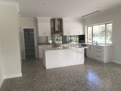
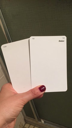
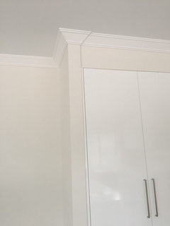
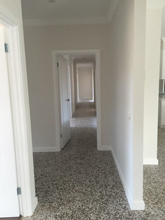
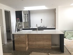
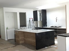
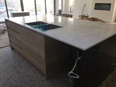
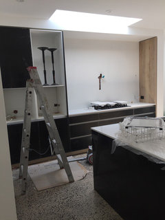
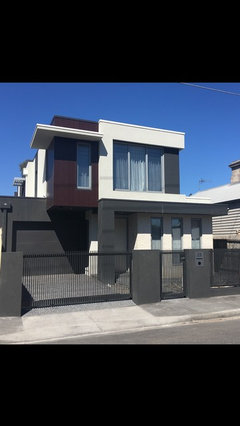
Wall colour and kitchen colour

zaffa
7 years ago
Hi there,

We are owner building a contemporary home in inner Melbourne. We don't receive a great deal of northern light as we have had to build along our northern boundary to make the most of every square inch of space living in the inner suburbs!!We love the minimal look and want white walls, warm but NOT cream. Lots of the whiter whites have cool tones to them and give off a tinge of blue/grey which look cold, and will particularly do so against our downstairs polished concrete floors (full exposure aggregate, in raw concrete colours - grey base, bluestone, smaller white stones and some riverstones). Our kitchen will be white 2pac on the perimeter and overheads and a feature walnut timber veneer island bench (photo of veneer attached, lighter veneer in the photo) with a 70mm Caesarstone bench that's waterfall at one end and cantilevered at the other end. Our stone will be Frosty Carrina (image attached).

We want to add 'warmth' to the house through colours chosen. We have added walnut timber veneer throughout (floating credenza/servery in the meals area and lowline entertainment unit next to gas log fire place), to give warmth to the space. We want our chosen wall colour, at this stage Dulux Natural White (in photos), to do the same.

My design dilemmas are:-

1. Is Dulux Natural White a good choice for areas that don't receive an abundance of natural light? We have two 1.8m skylights in our kitchen and meals areas that are adjacent/ open plan. We also have 6m of sliding stacking doors and 2 X 600 awning windows facing east (one window in either side of stacker doors, shaded somewhat by an alfresco that is a bedroom cantilevered above the alfresco area) and 2 X 600mm awning windows facing south) on either side of our gas log fire place).

2. I don't want a cream wall colour! Will Natural White look cream?

3. What kitchen cabinet colour should I go for? I would like the same wall colour but I don't want the cupboards to look cream either!! Similarly, I don't want whiter cupboards to make the Natural White look cream in terms of contrasts between the warm and cool colours.

4. The kitchen white needs to match the benchtop in Frosty Carrina, which is a Calcutta look but more subtle, and a warmer white. The 1.8m skylight will provide direct light onto the perimeter and island benches directly beneath it and therefore the stone may look whiter.

Thanks everybody! I look forward to some ideas.

Comments (57)

  • hagan_38
    7 years ago
    My internet search found these comments on Dulux Natural White if that helps with your decision.
  • bigreader
    7 years ago
    I love Dulux natural white. I have it in my lounge which doesn't receive a lot of natural light. The room was so much brighter when I painted it the natural white. I did the ceiling in the same colour and paint. Love it!
  • Related Discussions

    Need feedback with bathroom & kitchen wall colour?!

    Q

    Comments (32)
    Thankyou @sonomamama, so you agree no greenish khaki in the bathroom? Yes i dont mind that colour @rebeccamitchellinteriors&boutique but i worry that having grey will make it look dreery? its a very small space too, its only about 2.5x3m?
    ...See More

    Help with kitchen wall colour

    Q

    Comments (15)
    Colour is a whole-of-house thing ie it begins at your letterbox and ends at the back fence! When I work with clients I assess their personal colour type and make recommendations from there. Often people will add just one colour eg red, as an accent and use it throughout the home...red pots at the front door, splashback, cushions, throw rug on the bed etc. Personally I prefer to use two colours to spice up a neutral scheme. They may be complementary eg red/green or analogous eg green and blue. The trick is alternating which is the more used colour in different rooms. Taubmans have a formula of 60/30/10 - the bright, intense accent colours should not make up more than 10% of your scheme. Never go 50/50 it always looks out of whack. Pick two colours that you both like, and find pictures on houzz as well as Pinterest for ideas.
    ...See More

    Advise needed in choosing color for kitchen walls,cabinet & splashback

    Q

    Comments (35)
    i have not looked into the splashback pricing yet, as i am still stuck onto the colour fr the cabinets. we have to decide it tonight. I have been looking at warm whites, as suggested earlier in the thread. Antique white USA in 1/4 strength i think will go with the grey colored stone. I have read tht in full strength it throws cream tones. NOt sure if this colour scheme will work. i still have to decide the wall colours for the kitchen. We have finalised hog bristle1/4 for the living area with natural white for ceiling n trim.
    ...See More

    Kitchen Colour - wall paint

    Q

    Comments (3)
    Yeah I know what you mean... I have to paint it anyway as it needs repainting and the colour that is there has a pink undertone which really bothers me. not a pink person at all... So you would suggest just staying with an antique white or something and just adding all my colour with accessories?
    ...See More
  • Sue Hamlet
    7 years ago

    We chose Polar White kitchen cupboards, and found the perfect match in Dulux White on White for walls (low sheen) and ceiling (in ceiling paint) and trims (acrylic gloss). Very very happy with the whiteness of it all, and as we have a timber-look floor, some colour is thrown onto the walls so they don't seem too sterile. I had seen White on White used in several houses and really liked it - so versatile.

  • antonia_d
    7 years ago
    I think the natural white is a better choice for your bench top. I was initially painting some of our areas in vivid white, however comparing this white against natural white, it was too stark. I have my kitchen cabinetry in a wenge colour and it ties in really nicely with the veins in the benchtop. Your walnut is a lovely colour. Would you do all the cabinetry in that colour? If not perhaps have it in natural white.
  • PRO
    The Den Interiors
    7 years ago
    Natural White is my favourite white. I have it in my own home! I also don't have a northerly aspect and find that it looks like a true white. Go with your gut. Good luck!
  • Emma
    7 years ago
    It sounds like Dulux Natural White is s great choice. I can't comment on that, but we have used a very similar Dulux Limed White in our house which is white with the barest undertones of stone - ie. A pinky brown. Looks refreshing yet warm, and great in darker rooms as well as brightly lit ones.
  • zaffa
    Original Author
    7 years ago
    Thanks to everyone for your comments. Im almost sold on Natural White for my walls. My remaining concern is whether this colour would look too ivory/cream for my kitchen cabinets as I want same colour for both to minimise the effect of colour contrast in the shades of white. So just spoke with my wonderful cabinetmaker who is going to cut up some board samples and have them 2pac sprayed in sample colours of my choice. What a legend! Going to get samples of natural white, vivid white, and white polar quarter. Fingers crossed!!
  • bigreader
    7 years ago
    What a wonderful cabinet maker. Could you post your findings back here? It would help lots of people in future as the right white is always a dilemma. I posted above that I loved natural white. I didn't add that I've also had vivid white trims and Windows in the past, and also in several rooms. I found the vivid just too stark but maybe my tastes have mellowed as I've aged. The rest of me certainly has.
  • hagan_38
    7 years ago
    Look forward to seeing the results of your samples too. I have been busy with my sample pots. The white in the middle is Vivid White, on the left is Natural White and on the right is Casper White Quarter.
  • hagan_38
    7 years ago
    Incredible how the natural white doesn't look white at all against the vivid white!
  • zaffa
    Original Author
    7 years ago
    I know. That's what's throwing me. Pretty much had decided to go natural white on the walls but not sure about the kitchen. Worried about the contrast. So I've decided to get a Dulux colour consultant in and then organise 2pac samples based on the suggestions from the colour consult. I want a warm white kitchen, matching the Frosty Carrina Caesarstone bench top but don't want cream!! I also don't want a whiter white that throws off blue and looks cold!! Aahhh, the dilemmas of white!! Il keep you all posted. Thanks for all your input. Much appreciated!!
  • hagan_38
    7 years ago
    It isn't easy at all. White is not just white. I would be inclined to go Natural White for the look you are after. Vivid White is very neutral though. I have looked at it in all lights and it isn't cold at all. My laundry and bathroom cupboards are Vivid White. I haven't seen my kitchen as that is only going in this week. I will be using that colour for my skirtings, doors, cornice and ceiling and maybe the Natural White for my walls.
  • hagan_38
    7 years ago
    My bathroom showing Vivid White vanity
  • hagan_38
    7 years ago
    Laundry with Vivid White cupboards.
  • hagan_38
    7 years ago
    Vanity
  • zaffa
    Original Author
    7 years ago
    Looks great. Vivid white is definitely on my list of choices. Thanks!
  • zaffa
    Original Author
    7 years ago
    Can I please ask what your benchtop is on your bathroom vanity? It's a great match!
  • hagan_38
    7 years ago
    The benchtop is polytec laminate in classic white Matt. It was the best white to go with my cupboard choice. I used that bench top in bathrooms and pantry.
  • darewing
    7 years ago
    last modified: 7 years ago

    @zaffa, I was thinking of doing my walls Dulux Natural White and have run into the same problem as you. Did you have an update?

    If I do Dulux Vivid White for the kitchen, will that be too much of a constrast? What did you end up doing?

    Thanks in advance.

  • hagan_38
    7 years ago
    fiveDock this is my kitchen with Dulux Vivid white cabinetry. Walls are Dulux natural white and trim, ceiling and doors are vivid white
  • PRO
    The Interior Difference
    7 years ago

    The Natural White is quite Ivory; if there isn't much natural light I would factor your artificial lighting into your choice also. If you are going with warm white lights they will accentuate the warmth in the paint and make it appear a lot yellower / warmer than it actually is. If you are looking for a modern white kitchen I wouldn't use Dulux Natural White on the joinery.

    I find that Resene have a better range of neutrals than Dulux, so I would suggest checking out their colours. Even if you have decided to use Dulux brand paint you can still have it tinted to a Resene colour.

  • darewing
    7 years ago
    Hagan, thanks for sharing. Your kitchen looks fantastic.

    Did you have more images? Is that area receiving a lot of sunlight?

    The Interior Difference, there is sufficient lighting at the rear of the house as its open plan, but the first half I would say the lighting is just ok.

    Maybe for the first have, the Downlights will need to have a cool white bulb?
  • hagan_38
    7 years ago
    @fivedock do you want to see photos of the house or just kitchen? I have natural white throughout and vivid white trims and cabinetry also throughout. Kitchen does receive lots of light.
  • hagan_38
    7 years ago
    I have a large window in the kitchen so I can see the view when I am in there plus double sliding doors further along and another big window at other end of the room.
  • darewing
    7 years ago
    Thanks Hagan.

    If I could get a pic of the house too, like hallway and maybe a room to see the Natural white.

    Of course I know it'll be different in mine due to lighting etc but just to see. I'm north facing by the way.
  • darewing
    7 years ago
    Also just wondering why the Natural White looks Ivory? Is it the lighting, or the contrast from vivid white which makes it less white?

    Still looks good though!
  • hagan_38
    7 years ago
    @fivedock the contrast is what you are noticing. Vivid white is a true white. We like the contrast. Wanted some warmth in the walls. I will take some more photos later in the week. Too many tradies there at the moment.
  • zaffa
    Original Author
    7 years ago
    Hi five dock. Sorry for the delay in response. We ended up getting a Dulux colour consultant in and she suggested another colour, Snowy Mountains Quarter, that would work in our space and not throw off tones of yellow. She described it as 'the next Natural
    White' in terms of popularity and versatility. I must admit it looked great in our space. The Natural White looked pinkish (!) in our kitchen. We have not yet plastered but I will purchase some sample pots of this colour when ready to test it out and move around the house at different times of day and in different light. I will also get our cabinet maker to make up some 2 pac samples of this colour to matching against the Carsarstone, Frosty Carrina. The following picture shows the difference between Natural White and Snowy Mountains Quarter. See what I mean? The NW is the pinker/creamer swatch in the photos. Let me know what you think...
  • darewing
    7 years ago

    I'm thinking of doing the same @zaffa, regarding Consultant. I can select all the whites in the world, but if I have no idea how light affects a room etc, then I'd be wasting my time and efforts.

    AND, because I rendered the place as well, I thought the cost of a consultant is worth it if I'm to get it right.


    Any pics of your new space?

  • zaffa
    Original Author
    7 years ago
    No pictures. Not plastered or painted yet!!!
  • hagan_38
    7 years ago
    @fivedock photos as promised. I have included a close up, one of the hallway, laundry and main bathroom. Can take other shots if you want.
  • bigreader
    7 years ago
    Lovely photos @Hagan.
  • candice567
    7 years ago

    Hi Zaffa, I've just stumbled upon this thread and am also considering snowy mountains quarter but still am not sure! Do you mind posting a few photos of how it turned out for you? Thank you!

  • Sue Hamlet
    6 years ago

    White on White is also an awesome colour - it blends well with all whites, does not throw either grey or cream, and works well with polar white laminate

  • micasirena
    6 years ago

    Any updates, or pix of the finished product Zaffa?

  • zaffa
    Original Author
    6 years ago
    Hi there @candice567 and @micasirena.

    We ended up painting with Snowy Mountains Quarter and love how it suits our modern decor. A crisp white that is neither blue/too cold nor cream/too warm. Also not greyish as the half strength was in our place.

    Regarding our kitchen, we completely changed our minds and ended up choosing Nikpol Matt black and Halifax Oak with Caesarstone Intense White benchtops. We love it so far!! I have attached some pics. Still in progress
  • micasirena
    6 years ago

    Looks great Zaffa! Thanks for posting. We are choosing colours for our walls, cabinets, etc. Theme for the house is driftwood beach - crisp white, grey and aqua. Thinking of Polar White for the shaker cabinets as we are concerned Natural White may apppear too beige... was recommended to get Ceiling White for the walls as we want the walls and ceiling to match, and there is an issue of some whites not providing adequate coverage...floors will be concrete grey, countertop at this moment is Silestone Eternal Pearl Jasmine. Will also have grey reclaimed wood barn doors. How many coats of Snowy Mountains did you apply? It looks very nice, and bright.

  • zaffa
    Original Author
    6 years ago
    Sounds great! We applied 3 coats and had to apply an extra in the hallway. It did seem that coverage wasn’t the best but we worked around that as we specifically wanted that colour which was recommended to us by our Dulux consultant. We used the same colour and strength for walls, ceilings and trims. Good luck with your choices!!
  • Lindel
    6 years ago
    Thanks for the visuals Zaffa! Your kitchen looks beautiful. I had chosen Natural White for walls, with the same 'white' cabinetry issues, but having seen your pics...Snowy Mountain Quarter it is!
  • zaffa
    Original Author
    6 years ago
    Thanks @Lindel! Good luck with your choice. Grab a sample pot and paint a piece of plaster board and move it around your home at different times of the day. In our space, the SMQ remained the 'truest' in all lighting situations.
  • Jennifer Bradley
    6 years ago

    Because the pantry in our new kitchen was antique white, I cheerfully said the splashbacks should be antique white as well, only to be told there were 9 different antique white colours. All whites are the same - a multiplicity of minutely different hues. I'd get a batch of sample pots and try them - the light coming in, your overhead lights, the effect of the walnut - all these change the white you choose. So put some where you want it and live with it for a day or so, watch the changing light and then choose.

  • Cheryl
    5 years ago
    Wish i found this Q &A before. So many beautiful people advising and sharing here! I am Repainting Tropical Queenslander with dark red and orangy timber floors and this thread is so helpful.

    I painted Whisper white and it is throwing so much Green it makes me so sad I am going to repaint.

    I get loads of tropical sun in the north facing - with eastern morning sunlight.

    Was just about to go and buy Natural White just to cover it.
    Do you think it will be too dull/warm a colour. I do like a fresh feel and contrasting with vivid white decorative trims.

    The whisper white looks nice For a while in the morning while the morning sunlight throws read up onto it but then it returns to a green
  • Jyoti H
    5 years ago

    @Zaffa have burnished concrete flooring with black window trims. Still deciding on black or white cabinetry for kitchen...black is so much more forgiving. Its a contemporary feel new build. Have black valance/ screen on the exterior... Would love to know what exterior colors did you go for.

  • Jyoti H
    5 years ago

    @zaffa n also why did you have to apply extra coat in hallway.. thanks again


  • zaffa
    Original Author
    5 years ago
    Hi jyotih. We chose surfmist and monument for our exterior paint colours with chestnut coloured feature timber panelling. We also have an iron/rust front door. We had to apply an extra coat down our hallway as with the light coming into the hallway you could see the edges of the tape that is used to join plaster sheets. Hope that makes sense.
  • Jyoti H
    5 years ago

    Oh wow, sounds great. I really wanted to get rust door as well, but was advised against it saying it would cause leaching, no mater how we seal it. which sealant did you use and where did you get the door from pls. Could you share some pics of your exterior as well pls. Much appreciated.

  • zaffa
    Original Author
    5 years ago
    Hi Jyoti H. We painted our door with the Porters Paints range of universal primer, liquid iron, instant rust, and instant rust sealer. We have had no problems whatsoever with the rust running off the door. We love the originality of our door and get so many comments on it. The photos really don’t do it justice. The pics of our exterior are minus the front door (almost at the end of build) but you can see the colours. Hope this helps....
  • Jyoti H
    5 years ago

    Oh, this info definitely helps. will check out porters today. I am thinking of 1400 wide pivot door. Really hoping I can achieve it. Thanks for sharing all the info n pics. Really appreciate!

  • Delwyn Emm
    4 years ago

    Would love to know what benchtop hagan_38 went with.