Need Help Choosing Grey & White Render Colours!
Chelsea Wood
7 years ago
Featured Answer
Sort by:Oldest
Comments (11)
 PRO
PROKatrina Okoronkwo
7 years agoRelated Discussions
Need help deciding on render colour
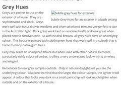
Comments (28)I think this is the perfect tone next to the brick. If you see it near a light colour, in contrast it may appear that way to some, but seeing it complete has a different impression. I think it looks modern and sophisticated. I would continue to complete the porch and reserve an opinion until then. Paint as much of the rendered base also to get the full effect. Regardless it will be painted so it's worth doing, you will be repainting soon anyway. I don't agree lightening th ecolour, it will look wushu washy next to the boldness of the brick. Your rendered brick has so much feature, this grey will accent that. Paint the rest and live with it for your husband to see. Don't stop at that square. Once you've done that, only then reconsider it. Too many people stop when they start, because they're having a reaction to change, an adjustment has to be made visually, and different is not bad. Light is comfortable, but I can't count the many of period homes that professional specifiers apply this too. How many architecturally renovated homes do you see cream? One more colour I will suggest along these lines, but not better, just slightly lighter is murky water. And last case, dune. Get all three, I would bet on your husband liking dune, which proves my theory, but dont settle on the dullest colour. It won't do the facade favors. Rather it will look ho hum. Render flattens the facade, removes character, so I think it more important than before tonuse these tones to effect to compensate the loss of character. First look at it, I smiled, that's it, keep going. Hard to trust me not knowing me, but many have to success. I have been a dulux colour finalist and are recognized for my colour specifying. Please just see it out, then you can make an informed decision, one where you've had time to adjust to a change....See MoreNeed help with choosing colour grey for sitting room
Comments (20)Thanks Helen. Actually I've read that Bristol paints have a record of the formulas used for Benjamin Moore's paints. Not sure if that's accurate though. Also thanks Tilly for all your suggestions. Ironically I used China White throughout an entire house many years ago and I loved it. I also used Whisper White for a lot of the painted shelving and some furniture. It was an open plan house and the colour scheme was seamless. Received lots of compliments. The woodwork in the rest of our current house is in Antique White USA (as are the walls), but I'm wanting to go for a more 'intimate' look in the sitting room, and I'm still drawn to the idea of a warm charcoal grey for the walls, and Antique white USA for the architraves, skirtings etc. I'm attaching a picture of the Benjamin Moore Rockport Gray, but I know it's impossible to choose a colour from a photo, but it will give you an idea of the colour scheme I'm wanting for that room. By the way I know what you mean by the picture rails limiting the use of walls. I'm attaching another photo I've found that shows a similar room (although a lot grander) without picture rails. But my partner is rather fond of the picture rails, and I can just imagine his response if I suggested they be removed! It's hard enough trying to decide on paint :)...See MoreDulux grey feature wall - HELP me choose 1 of these colours please...
Comments (30)Silk would be interesting, not to mention elegant. As for paints, the Silver Illusion appeals, but it might throw green (not sure). I also agree the Tranquil Retreat is a good one. I'm wondering how big the feature wall is, and what is going on this wall, eg TV, fireplace, large artwork, etc.?...See MoreNeed help with render colour
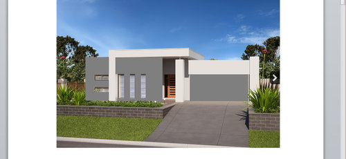
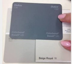
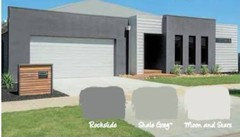
Comments (19)Thank you everyone for your input. It has been keeping me up nights. Yes Lesley, the house is built. The picture I posted above is the actual house , with the white being the render to be painted. Due to all the greys and browns I did think something in a brown tone might be best. I love the suggestion of Dune. I had looked at it but I think I overlooked it as I read that render should be four shades darker as it washes out in sunlight. (is that even true?). I do like the look of that linseed too. I now think the purple would be a bridge too far. I chose the Woodland Grey believing it would look like the swatches above..a lovely green/grey.the trouble is..it looks just like dark grey on the house unfortunately. The brick and roof are fine too but they are much like Ayer's Rock..the brick looks sometimes red, sometimes brown and the roof sometimes grey/green, sometimes light grey....See More
Chelsea Wood
7 years ago- PRO
Katrina Okoronkwo
7 years ago 
LesleyH
7 years agoChelsea Wood
7 years agoLesleyH
7 years agoLesleyH
7 years agoLesleyH
7 years agoBec
7 years ago PRO
PROMonsta
7 years ago


MB Design & Drafting