A warm and inviting home makeover
User
5 years ago
last modified: 5 years ago


Featured Answer
Comments (10)
Related Discussions
Bedroom makeover help needed
Comments (98)What a great big room. The ideas are endless. Not sure if you live in Melb but I would get professional help. Honestly it doesn't cost a lot and you have peace of mind. For the painting go to any paint store, even Bunnings. They have the ph nos for a paint colour consultant. (I went with Dulux) but most Paint companies now have colour consultants to come out for a fee. The consultant comes out for a fee approx.($150) but that was for a few rooms. Then if you buy their paint, the price of the consultation is deducted off the paint you purchase. So really the consultation is free, if you choose their paint. Freedom decorator consultant works the same way. Can't remember how much (no more than $200) and she gave me great ideas. If you buy anything from them, again it's deducted off your purchase. There is no commitment with either paint company of Freedom to purchase from them. The advantage is, you can have the amount spent deducted from purchase. Honestly it cost saving and you get professional advise. Win Win situation. We've built 3 times and painted the house myself, and I have been so glad I did the above, with both paint and furnishings.. Plus I do up my own furniture, (most bought at garage sales) so I only purchased what I really wanted from Freedom, the rest 99%, I got from op shops and did up myself. But the ideas are helpful. Honestly, you need to know what decore you want in your room? So they will work around that. If your unsure, they will look at the rest of the house and work with your ideas. I like French provin. So I worked around that, Just to give you ideas you don't have to spend a fortune. My bedroom is also huge. Haven't took photos all-round. I redid all the furniture in both rooms. The above cabinet was brown stain which I painted white. GOODLUCK...See MoreHouse makeover
Comments (2)I love the sound of teak, timber garage doors and bluestone roof. I suggest teaming it with a warm neutral, such as Dulux Camel Hide, which is a rich beige with a hint of terracotta. Alternatively, if you want to go even more terracotta and earthy, Dulux Cuddlepot is a great rich colour! Just make sure you do a test patch first before committing, as colour can change depending on it's surroundings. Good luck...See MoreHidden & dull vs open & inviting exterior
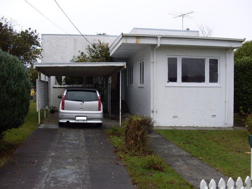
Comments (13)You have spent a ton of someone else's money and wound up with a house with no style reference. It was already looking bitsy with the half hearted car port and you have emphasized the gables and made that worse. The car port has no gable. There is no point saying "oh, but the orange is only for the big bits of the house, because, you have used the same timber on something so insubstantial as bannisters. If horizontal bands of wood ever looked good in gables, it would have been done by now. It has never been done before, and is not part of any tradition. That will be for a reason. But you have done that to a house that used to be brick and is now rendered. In other words, the house used to be traditional mid century but was not that any more. And then you added another layer. See the problem? Too many ingredients in the cake. White and cream can go together. But not a muted bluish cream with big slabs of orange wood. It makes the walls look insipid and dirty. Talking of insipid, with the old window treatment, there was some character with the sloping bricks. Now, there are shallow ripples in the wood, and shallow ripples in the windows, and shallow, too-small lights on the outside. If it was a woman, she would be wearing two brooches, each 2 mm by 1 mm. And what are those mismatched pimples at shin height. Moral of the story: if you want the viewer to enjoy the subtle textures, don't mess them up. If you want to wear a white suite, that's fine - but please make it clean and with no defects at all. If you want to go for subtle variations in texture, be my guest. But don't have the top of the middle two windows on the right 100 mm lower. The eye says, "what is that for?" Is that supposed to be like that, or were they saving money? When is the top of the middle windows 100 lower? Never. That will be for a reason. You have probably just discovered it. You know how you're really design sensitive? Well, the pitch of the roof on the gables and the pitch of the rails for the front steps is close enough to ask the eye if they match and different enough for the eye to say: nope. You might have had a rail the same colour as the gutter and the angles the same. That might have worked. Actually, the biggest problem is knowing which is the positive and which is the negative space. The gables and rails say "I'm the hero! I'm a loud colour!" And the walls say, "Nope, you are not the important bit of the house, and those who see you know that I am the physically solid one. And there is more of me". And the gables say back "Nope, dope, you are the most insipid colour on the whole house, remember?" If you were alive in the early 80's you might remember Colour Me Beautiful by ? Jackson. Pop cultural phenomenon. Before the "makeover", the house's roof and walls belonged to the same pallet (Summer, as it happens). The fence was there, but able to be ignored. Now, the bright orange fights with the dark brown. (The orange is an Autumn colour.) (The white windows are winter.) The orange and the muted brown are similar darknesses, esp if the top of the gable is in shade. They clash, in other words. Also: how often do you think the owners will go out onto the master bedroom / attic / office patio that overlooks the street? Let me answer that: n e v e r. A bit like Volvo making ugly cars all those years ago: they still cost just as much to make. Disclaimer: I am not a competitor or a design professional. You might take comfort from that. P.S. Just back from looking at the interior. It looks really good. It is uniformly modern. I would have gone with less orange floors. But, blame the clients for that. Now the outside just looks like you were trying to save money. You might ask, why does the angle of the roof have to match the angle of the bannister? The answer is: because you made them the same loud colour and the same material. The edge of the loud orange gable is at a particular angle (actually three angles, but I digress). Also, the ONLY place where the loud orange wood is angled is on the steps: the place where it is least important. You are begging the view to ask if the banister to settle into the rest of the house by being the same angle. About the three angles: if the roof only had one angle, and if the angle was the same as the angle of the bannister, that would look MUCH better. There would be horizontal and vertical (all houses have these), and one diagonal angle. Emphasising one diagonal would have been coherent....See MoreComplete makeover - new floor?
Comments (39)Update above - this is what we have done so far. We decided to not paint Hog Bristle but paint ceilings Vivid White and walls in Haymes Organic 3. We felt it would be too stark in just Vivid White. Organic 3 is a nice light linen colour. After living in the house for a few weeks we have decided to keep the floors as they are. Wished we could have afforded to put in longer skylights - the room is facing south so no direct sun. The skylights have made a huge difference though - thanks to Gary at VSKY skylights (Gary is installing the skylights on 2017 The Block) he did an excellent job. We also installed bifold doors to the patio area as the previous owners dog had chewed and scratched the cedar ones to death and they had to go! Now to the kitchen and bathroom!...See More PRO
PROUser
5 years agoUser
5 years ago- PRO
User
5 years ago
Sponsored


me me