Houzz Logo Print
darlene_morrish

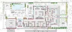
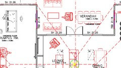
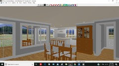
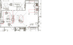
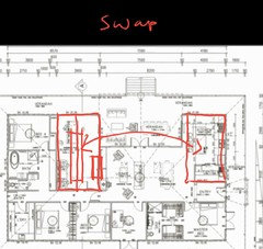
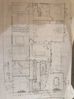
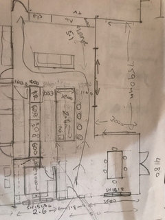
Kitchen layout advice needed

D Morrie
5 years ago
last modified: 5 years ago

I am having doubts about our floor plan layout - such a big investment & I want to LOVE it.

Attached are current plans, feeling nervous about kitchen position. Views to NW as is slope, entry/driveway will be to the NE side of house. We have 4 kids so traffic flow & storage & ability to hide mess important (hence butlers pantry). Style of home we are trying to achieve is Victorian era farmhouse style.
Attached possible alternative kitchen placement but think traffic doesn’t flow so good in this design even though it feels more spacious.


Comments (48)

  • Paul Tannous
    5 years ago
    I like the plans I think there great !! Scrap the alternative
  • dreamer
    5 years ago
    Hi Darlene, I think your plans are great. All in zones, with no wasted space. The only thing I would look at is, the privacy of the master bedroom to the main living/dining area. Could you incorporate a small alcove when entering into bedroom. Or locate door to bedroom in foyer. The line of sight from dining area goes straight into your bedroom. I'm just thinking of bed to bathroom run, if door is open and kids friends sitting around the table. But, what a fantastic house it will be.
  • Related Discussions

    Need opinions and advice on fireplace/TV/living room layout

    Q

    Comments (8)
    i'd like some feedback on the two windows, as I am currently looking at the same thing without windows. Why r they there given the expanse of glass on other wall. My mum had two narrow vertical windows either side and as they were un curtained they look like black rectangles at night which I found spooky. They didn't let in much light because of trees outside, but I guess if u had a skyline view say they may be useful. They also compromised positioning of artwork.
    ...See More

    Kitchen Layout Advice

    Q

    Comments (7)
    I would prefer to have the pantry and fridge close to each other so that you’re not trekking from one to the other when taking food out to prepare. Then have all of them near the prep area and sink. Bins/compost bin close to sink for disposing if food scraps when making food and scraping plates after eating. Keep ovens and cooktop close to each other. And you need adequate space beside the sink for stacking dirty dishes and draining dry ones (even with a dishwasher) and space beside the cooktop. Minimum of 30cm bit more is preferable. Good luck. Exciting time.
    ...See More

    Advice/inspiration on layout - particularly around kitchen area

    Q

    Comments (23)
    based on the dimensions shown on the plan the existing ensuite doesn't look big enough to add a bathtub unless you could take space off the master bedroom, wiw and/or add a "bay window" under the eaves and sometimes demolishing a good quality existing space is much more expensive than adding an extension (what about adding a new master suite overlooking the pool and using the old master as guest room and pantry? and, if you need an art studio do you have enough land to add another carsport and use the garage for the studio....can you post a plan showing the house on the block and the size of the block
    ...See More

    Advice on Kitchen Layout

    Q

    Comments (23)
    Oh dear. Looks like i caused a misunderstanding with my drawing on the dimensions. I'm just going to steal your picture to clarify the dimensions available Its 3900 from wall to start of hallway (door), then an extra 1200 for the hallway. The front and back door directly face each other (straight hallway from front to back door) sorry I don't know how to move the door in your picture I hope that clarifies the dimensions of the room? My picture of the empty room was excluding the hallway, as I wasn't planning on building into the hallway so didn't include it (I don't know how to draw plan, sorry!!) Looks like it caused alot of confusion. sorry about that. Let me change the picture in my original post to reflect the change.
    ...See More
  • siriuskey
    5 years ago
    last modified: 5 years ago

    Can you move the doorway into the master into the entrance for privacy and swing the bed to the other side of the room. What is the large room next to the living dining family, I'am finding it hard to read your plan.

  • Susan
    5 years ago

    Beautiful plan, I like the kitchen like it is and yes moving the bedroom doorway is a good idea. Good luck!

  • oklouise
    5 years ago

    can you add the dimensions to the proposed plan or post a close up view of the east half of the house so that we can read the dimensions but my first suggestion would be to steal some space off the family bathroom and living room to make the hallway at least 1200 wide and more in keeping with a traditional country home (space for a whole library of bookshelves or coat rack etc and which entry will be the front door for guests and which entry would be the door for carrying groceries into the house in wet weather and describe your climate and the block of land

  • PRO
    Paul Di Stefano Design
    5 years ago

    Hi Darlene,

    We recently developed a design for a new build residence project that accurately referenced the Victorian homestead, to the point where it's regularly mistaken for a restored original. It's all in the scaling, proportion and symmetry

    I know what you're trying to achieve, but there is a degree of imbalance/lop sided quality to your current plan/design in regards to the scaling and the layout/resolution of the spaces. The Entry should be centralised/clearly defined and a sense of formality in this area that then transitions into a more casual/informal rear. You have to work hard with the design to achieve the "look" simultaneously with the often incongruous functionality of the spaces when you push for symmetry.... but it can be achieved..........It's like overall the house proportion is too "fat" and the issue with this is that from a function/cross ventilation aspect it won't perform as well as it could and you get a massive jacked up roof bulk. You arguably shouldn't have a kitchen shoved into a corner like that in a house like this with living space of that scale. It should breathe better and be well integrated and flow without any awkwardness that I know you know will happen. I've attached the drawings of what we did and you can see there's actually a very similar scope/building program (ie 4 bed+ study +2 living areas) and sure it's a completely different context, but you cannot compare the level of balance and resolution - it achieves distinct zones and a true reference of the bygone era blended with contemporary living amenity........I appreciate you have the full wrap around verandah which required a different kind of management, but it's like the whole thing needs to be pulled into symmetry to achieve the mark you are aiming for. It can be done, but there is more work to do.........you're 100% correct, you need to "love it" as it is a significant investment that deserves to live up to what your vision is for your home........trust your instinct, if it' not sitting right for you then there is always something wrong that requires addressing/further resolution

    We seriously had 5 or 6 revisions of this plan to get it right, pushing and pulling with all the various components the clients wanted and jiggling it/fine tuning until we achieved a reasonable balance between the style and the function within context (a suburban block which had it's proportional & level challenges). What I would suggest is considering playing around with some major flips, say positioning the study to where the kitchen is and creating a "formal frontage wing" with a centralised passage with flanking study/master bedroom set-up that funnels/transitions then into a centralised living zone, with the kitchen more centralised and flowing. Get the laundry out of the back corner and associated with the utility areas and position the rumpus over to the where the Bedroom 4 is and you could potentially delete the passage run that goes around the corner. Don't mean to be critical, but hopefully constructive to demonstrate that you can achieve this but in a better configuration that is more refined, functional and balanced. Hope this helps somewhat. Cheers PD :)

    21st Century Victorian · More Info


  • D Morrie
    Original Author
    5 years ago
    Thanks everyone for the comments. To put in context here is some extra info. Building in country South Australia on a 2.5ha block which slopes down to NW. Driveway will run up NE side, hence entry on Easter side is main entry. Door on western end is for laundry and ceasing that end of the hose which will be more utility based, clothes line and bio-cycle and tanks out that side.
    My positioning of kitchen is there because this is the best aspect NE corner and where I will spend most of my time as I have 4 kids! Imagine beautiful morning sun coming in as kids sit at island bench. Initial drafts we had deck smaller but symmetrical but this almost created a third living/family area that we didn’t want. We also had a formal entry beside study, opposite deck but this was a waste as entry from drive is on the east and southern side where we originally had formal entry looked out to back of the hill (the high side). We are also thinking down the track we may extend deck and put in a pool. The north/NW side is essentially our backyard. Hope this adds context.
  • D Morrie
    Original Author
    5 years ago
    Thanks Paul for the detailed comments and plans. I was very adamant about symmetry but got overruled by husband and others that function was more important. Hence making deck bigger and putting kitchen in NE corner, a study here would be a waste of that best aspect of sun & light.. I’d still love to achieve some symmetry with eastern side entry as this is where most people will approach from, including us, everyday! We are also Woking to a relatively tight budget (in the range of $340-$400k). I also don’t want a massive house to clean so we’ve tried to keep it to around 250m sq.
  • D Morrie
    Original Author
    5 years ago
    Ok louise, some close ups, not if this helps.
  • dreamer
    5 years ago
    I think your home design is ideal for a rural setting. I would always have my large laundry on the side of the home with other utilities, not the kitchen. The kitchen in the corner of home is contained and benefits your views. With four children you do not want a thorough fare. The rumpus room is a perfect placed room for children and there friends to congregate, away from other family members, when required. You have a wonderful placed/sized study, which is always required if running a rural property or business. All the bedrooms are of similar size, which stops arguments. The main toilet is accessible from outside, without going too far into the home. You have easy external access into the laundry from outside. The main entry is where it needs to be, on a practical sense. Good luck with your build. Don't worry about symmetry.
  • D Morrie
    Original Author
    5 years ago
    Dreamer, thank you for the reassurance
  • siriuskey
    5 years ago

    Hi Darlene, Just a thought, the 1000cm between the island and the wall isn't wide enough for a family of 6 to use stools, this will push the family into the working side of the kitchen when they want to leave sitting on their stool. Without being able to read most measurements it appears that the Rumpus Room is wider than the kitchen. What part of SA are you building in as climate can vary, coming from a former SA original.

  • dreamer
    5 years ago
    I also forgot to mention that unlike Paul Di stefano design, the laundry is near the bedrooms, and bathroom. With four children, then four young adults, you do not want to spend your time walking a distance with dirty laundry. I remember times, with sick children, changing bed linen at midnight, soaking sheets in laundry trough. All these wet rooms are easily accessible, and without having to walk through living area. With all designs, you know how you live, and that is why your home is designed your way. Thanks.
  • siriuskey
    5 years ago

    I should have re mentioned that the access to the master is in a terrible position, so along with the kitchen and this access I can understand, and rightfully that you have concerns. With the lovely country house that you are trying to achieve you have the scope to make it better, and fix these things, it's a lot of money, now is the time to make the changes. Are you able to make the plan more readable

  • PRO
    Paul Di Stefano Design
    5 years ago

    It’s personal preference stuff.......I actually battled with the clients on the example to have the laundry not near the kitchen and on the south side....it’s not right or wrong......rather a pro’s & cons weigh up

  • dreamer
    5 years ago
    Exactly Paul
  • PRO
    Paul Di Stefano Design
    5 years ago

    100% siriuskey........

    sort the kitchen, get the master access out of the main living, improve the symmetry/ entry fomality/definition & you’ll be nearly there

  • oklouise
    5 years ago
    last modified: 5 years ago

    i think the current kitchen location is excellent but a little cramped so my suggestions include adjusting the size of the island and walking spaces, stealing space off the entry to lengthen the kitchen and adding a cabinet on the outside of the pantry to help open up the kitchen to the dining area and, a country home can be much less formal with the door from living into the master bedroom but i would steal a few cms off the small bedrooms to enlarge the ensuite for more comfortable use for two and the wiw has an extra 1.2m of staorage wall and with four children/young adults and guests sharing the family bathroom it would function much better compartmented to allow several users at once with a generous vanity, wall cabinets and linen cupboard in the bathroom


    and, based on approximate measurements of 24m x 15m the house is bigger than 360 sqm including about 150sqm verandahs so strongly suggest you consult your designer to clarify what's included in your budget and the gable roof over the alfresco could be reduced in height and be in better proportion to the rest of the house by changing the angle of the roof to be lower than the main roof

  • D Morrie
    Original Author
    5 years ago
    Thanks oklouise for your suggestions, we had been discussing making the island smaller as one option so great to be able to see this visually. I too am not fussed about the bedroom door location. 95% of the time it will be just our family home & the door can be closed for privacy, that’s the whole point of one right. The only dilemma is still the way the house looks from the eastern end exterior. I’d love the windows to be all the same along there but with the pantry this is difficult. I could definitely swap the bedroom French doors for a 1215 to match kitchen but pantry is a 1290.
    I must admit I had not considered the deck height, other than we wanted it open (no ceiling) so I’ll re-look at that too. Great suggestion.
  • oklouise
    5 years ago
    last modified: 5 years ago

    with matching kitchen and master windows a smaller pantry window would match the scale of the front door and the external doors on the south from the master would have more opening space in the bedroom and be more private on the south side and see how the lower roof over the alfresco is much less lobsided than the original eastern elevation (although adding another small gable on the south side outside the study and laundry could also be worth considering

    and, this inside view shows how tall windows (instead of full height) can make the external doors to the verandahs more obvious and these windows would be cheaper) and the set back of teh pantry wall makes the kitchen more open (this colour scheme is necessary to make the features more visible)


  • Jessica Davies
    5 years ago
    last modified: 5 years ago

    Ok


    My 2 cents worth, when you come in the house it should invite people to come sit down. I would be inclined to swap the kitchen and lounge around. You could keep the butlers pantry where it is on the original plans but turn it to a coat closet. Also with this way round the person in the kitchen doesn't get stuck in the kitchen by themselves.

  • D Morrie
    Original Author
    5 years ago
    Oklouise, I love this 3D view, it really does highlight that the kitchen is disconnected from the lounge/dining. What program do you use?
  • PRO
    Paul Di Stefano Design
    5 years ago

    Darlene, your instincts are correct in that with this type of design it will look odd if you don't get the symmetry, particularly on the main entry frontage. If you are going to offset an entry it needs to be definitively/deliberately off- centre, not slightly off. Possibly you could crank up the projecting gable and make it larger and centralised and then the door becomes off set to that, but at least the building form would look more formal. The Living/Kitchen/ Dining set-up could be much better. The pantry ideally shouldn't be next to the formal entry and the kitchen is forced rather than integrated in terms of flow. It should feel spacious, not squeezed into the corner.

    Do you have a designer onboard? You needs someone who understands the building style you are trying to achieve with the capacity to resolve the function/layout within the architectural language.

    Fenestration (windows) & scaling & proportioning are key to doing these types of things, and when they are not right, the whole thing looks & feels out of whack. It's not easy to achieve, but you can do it but what needs to happen is the look of the place needs to be given the higher priority - otherwise it will be a case of looking like you tried but didn't quite get there.

    Thought I'd also let you know, we can offer ad-hoc remote consultation if it's something you are interested in, just to help sort the key layout issues out and get it all on the right track in this regard, as this is most important (and hardest!) part of the whole project..

    Cheers PD

  • siriuskey
    5 years ago
    last modified: 5 years ago

    I think Jessica makes sense, kitchen in a much better position, with easy access to the rumpus room as kids want food and great access to outdoor living, it also gives some separation between Rumpus and parents living


  • siriuskey
    5 years ago

    Oklouise great 3D view really shows how the kitchen is being forced into a corner, it could/should be so much more

  • oklouise
    5 years ago

    my program is a vintage 3D home architect version 4 that's no longer available and i'll assume that you've already had a professional draw your plans and he/she should be able to offer 3D views (not just elevations that are useful for builders but don't give a true image of how the house will look from a human point of view)..ie this view is from the same direction as my elevation but you'll notice that it looks very different...you can't see the gables over the study and alfresco, the roof looks much lower and you will find it hard to see that i've extended the eastern gable to make the entry verandah about 2.5m deep...this view provides a better understanding of what you would see as you approach the front door on foot and looks very different to elevations which should not be used to make decisions on external appearance although alternative suggestions need to have elevations so that the new ideas can be compared to what you already have.....

    if you wish to explore other options i'd be happy to try other ideas but strongly suggest that you first clarify the maximum size available as your floor plan is already over 360 sq m

  • D Morrie
    Original Author
    5 years ago
    Ugh I’ve been up til 2am, sketching & re-sketching and still not happy. All I’ve come up with is is maybe put deck back to 6m and an even 7m either side so bed4 & rumpus 3.5m each and kitchen area 7m along NW side. Maybe bring bedroom 1 out a bit so earthen end looks like pic attached kinda.
  • PRO
    Paul Di Stefano Design
    5 years ago
    last modified: 5 years ago

    This is not what you should be doing - ie trying to resolve the plan yourself- that’s the designer’s job.....

    the Victorian style homestead with wraparound verandah will be a better suited option to a rural context (as opposed to the Edwardian frontage pictured that is more suitable for smaller urban allotments) In your case the residence/design needs to look good from all angles as there is a relationship to the space all around it

  • siriuskey
    5 years ago

    Darlene have a look at this site for Australian homestead floor plans

    http://www.archivosweb.com/country-homestead-house-plans-australia/


    And these, 1) charming with verandah 2) Verandah with possibility to add pergolas


  • PRO
    Paul Di Stefano Design
    5 years ago

    Good advice siri

  • oklouise
    5 years ago
    last modified: 5 years ago

    best results are never simple but, worried about the total size and cost of your plans, these suggestions reduce the total floor area including verandahs to 250 sq m ...(fine details have not been included pending your response)


  • D Morrie
    Original Author
    5 years ago
    Paul, you have hit the nail on the head. We are not designers. We are using a draftsperson to draw our plans but he really is just that, he draws what we ask he is not very helpful when it comes to design.
  • D Morrie
    Original Author
    5 years ago
    Oklouise, I see what you are trying to do and totally get your concerns re:budget. I have them too. But I have to be honest and say I don’t like either of the last layouts. As I said happy with everything except, look of eastern elevation and most importantly the kitchen area, which I fell is not the heart of the home as I wish it to be. I love where we have lounge and don’t want to change that. Just feel the kitchen and dining need to swap.
  • oklouise
    5 years ago
    last modified: 5 years ago

    i have to agree with Paul and strongly recommend that if you want to keep the original design, with or without a rearranged kitchen, you should urgently seek some quotes to help identify what has to be changed to achieve the ideal within budget

  • siriuskey
    5 years ago

    The following floor plan is different from what you asked for but it gives better access to the kitchen and keeps the living room where you like it.

    I have swapped the Master suite with the rumpus, this gives easy access to food and enables you to open up that space to the family.


  • PRO
    3DA Design Drafting and 3D Visuals
    5 years ago
    Try this idea.
    Swap Rumpus and Kitchen. I think its for the better.
  • PRO
    3DA Design Drafting and 3D Visuals
    5 years ago
    This will make the kitchen becomes more of the heart of the house. Put a long wall and you end up with a double galley back to back.
    Might even have a good sized serving window to alfresco.

    Your rumpus is to be near entry where it should be. For more entertaining space
  • D Morrie
    Original Author
    5 years ago
    Our driveway is on eastern side (current kitchen side), I’d be dragging groceries through the entire house if swap with rumpus. Also rumpus in kids end of house.
  • D Morrie
    Original Author
    5 years ago
    Oklouise, any chance you could test this out? Sorry about the messy drawing! Pantry 2.2x2.6, fridge & oven both 1m & 600mm either side of oven. Island 2.6 x 1.2
  • PRO
    Paul Di Stefano Design
    5 years ago

    Sorry Darlene but that's just no good...........a big part of the problem here is your trying to keep the cut out alfresco/outdoor living that is at odds with the style you are trying to work with, and it's causing the squeeze/compromise to the main central internal living spaces. There's nothing wrong with this type of thing in concept but they require experienced hands to resolve elegantly as opposed to a clunky way....

    Refer to the plan I posted earlier - there is not one dogleg to be seen. paths of movement are streamlined and neat and proportions and alignments are balanced.

    What you've proposed above here walking straight into the dining area is not a good option and it makes your house feel smaller - this may be justified in situations say when you have no space in an apartment or unit scenario.........your on 2 acres or something? - your home should feel appropriately scaled and with space to breathe.......

    There are different plan configurations that will meet your particular brief requirements but the problem you have is that you are locked into this particular perimeter that has developed and then in the process of trying to sort it out you keep forcing/rejigging everything within the same shape/format that is actually not a fixed thing

    Here are your options:

    (a) seek some pro design guidance with a professional who understands the style/language you are working with - but don't be surprised if the nominated budget is exceeded in a custom format

    (b) explore some alternative options what siri & I suggested in considering off the shelf solutions of similar style that may be more aligned with your budget

    (c) keep going the way you are doing your head in fumbling around trying to DIY design your home but clearly falling short of your vision

    Best of luck!

  • oklouise
    5 years ago

    firstly your dimensions do not allow for the thickness of walls and with an easier to read copy of the original plans i could be more precise and, although there's enough space for the stove, fridge and pantry there's not enough circulation space and instead of being the heart of the home there'll be a horrible traffic jam as everyone has to walk through the kitchen or squeeze around the stools and those sitting at the island miss out on the lovely views and block access between living and dining areas...there's not enough space for seating in the living area or for a proper family sized dining table and, omitting the entry foyer means that there's no where for a mudroom except outside the front door which is not centralised along the eastern frontage...

    this arrangement would be challenging in a renovation but is not suitable for a new build and strongly advise that you reconsider the kitchen next to the rumpus but my dimensions are not precise because we can't clearly see the measurements on the original plans

  • siriuskey
    5 years ago

    Have to say that I agree with the above, the centralized deep verandah has compromised the internal floor space, which oiginally caused the family of 6 kitchen to be squeezed into a corner and now further compromising the living area. There's a whopping rumpus room which is an unnecessary waste of living space and could be of much better use if this was allowed to be opened up with sliding doors to be used for a young family 356 days all year round, instead of trying to squeeze so much into a smaller space. It would be well worth visiting display homes with a tape measure to get a better idea of floor plan designs. You are about to spend a lot of money

  • siriuskey
    5 years ago

    A re jig of an earlier floor plan I posted, reducing the size of the alfresco and moving the master to the rumpus, Home office/mudroom next to entrance and then Rumpus with large pocket doors so that this space can be combined with the family room when needed for daily use or larger gatherings


  • siriuskey
    5 years ago

    The pocket doors for the Rumpus are full height and square formed like moving walls/partitions


  • siriuskey
    5 years ago

    to save time on redrawing your floor plan that you love, I suggest the following change,push the kitchen wall out into the alfresco which will make that space 1.5m shorter but will make the indoor space work for you which is far more important. As previously mentioned you will most likely need to reduce the whole floor plan due to cost anyway. cheers


  • siriuskey
    5 years ago

    And another, which would give you a large alfresco which could have white timber folding shutter doors across the verandah side to have open in good weather and close off when not so good and give you all year round use of the alfresco with heating. Both wings facing the front would be symmetrical .

  • PRO
    Eurofit Group Pty Ltd
    5 years ago

    My advice is, get rid os the pantry and make it part of the kitchen on the westen side extend the bench and windows to benchtop, maybe a servery? Move island bench down centred into the u-shape space. This would give you a much more victorian style look and layout. You would get much more useable storage space as well. Sink and cooking spaces to be determined after floor plan is agreed on. Think about this, do you want to work with your back to visitors or family or not? Removing the pantry will give you a much larger opening loopking into the kitchen as well.

    George