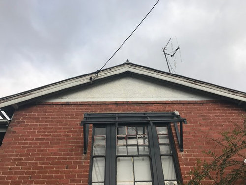
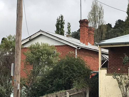
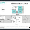
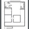
Which exterior paint colours for a 1927 brick bungalow?
Souzette Lovell
4 years ago
last modified: 4 years ago

Featured Answer
Sort by:Oldest
Comments (11)

dreamer
4 years ago94236633
4 years agoRelated Discussions
Californian Bungalow Exterior Colour Scheme - thoughts?
Comments (7)You have a fantastic period home and the colours you have selected are following contemporary fashion trends. However your terracotta tiled roof and chimneys are very orange, and the greys you have selected will make them see even more orange. I would be looking to the grey/greens to counterbalance the strength of the terracotta. Just remember that the fashionable greys of today are the daggy mission browns of tomorrow, especially when used on a period home like yours. This is why the current colour scheme looks so bad - as it is not original and was probably done in the 1980's. Have a look at this Haymes paint resource if you want some refreshing inspiration that is beyond today's generic greys: https://www.haymespaint.com.au/explore-colours/heritage-authentic-colours/identifying-period-styles/ Best of luck with your considerations, Dr Retro of Dr Retro House Calls...See MoreAdvice of Exterior Colours of Brick Californian Bungalow
Comments (6)I would take the shutters off and see how it looks. And yes to painting them if they are to go back up, paint the windows, the existing painted parts of the porch, gate and the gable all the same warm white colour. The fascia and gutter a warm grey like woodland grey. Some flowering plants will complete the brightening up. You can mKe the whole gable darker, say a 1/4 strength of gutter....See MoreWhich exterior cladding and colours should I choose?
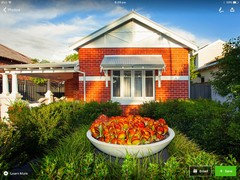
Comments (14)Hi, firstly congratulations on your decision to renovate. How exciting. We are nearing the end of a major renovation and choosing the exterior colours was a real sticking point. Most of the houses around us were built in the 1990's and my renovation had the potential to not quite fit in. I had to use a timber cladding to match the existing cedar but the original had been poorly stained and I was never going to get a cohesive match between old and new. I was left pondering my choices. The solution was to paint both but what colour? In the end, I looked at what of the existing was going to be left unchanged. It turned out to be the Karaka Green window frames - not my favourite colour - but in order to work with it I had to pray I didn't offend the neighbourhood. I didn't want the old dirty brown shade and a thousand testpots later, left me with only one really obvious answer. As you can see from the photo, I chose [quite radically] to paint the entire extention in Half Karaka green. It's still a work in progress and in the coming weeks, the rest of the house will be painted to match. I waited for the neighbours - particularly, the old people from the Rest Home at the end of the street - to tell me off for my choice but have been blown away by their reactions. Every last comment has been a major thumbs up. Even the painter - who was highly skeptical - apologised for his doubt, Don't automatically assume your neighbours are going to hate seeing the changes you are about to bring to the area. Which brings me to your planned renovations. I am assuming that your window frames are also going to remain the white colour in the photo. Rather than get all confused about greys etc. Start with them as the basis for the rest of the house and work out from there. If you do that, then I don't think it will be as difficult as it currently seems for you to pick what the rest of the house will be. Don't be afraid to spend money on purchasing test pots. They are around $4 or $5 each and I believe that I probably spent $200. It was worth every penny to me to get a few small off cuts of cedar painted and sit and look at them alongside the existing windows in order to make an informed decision. Good luck. I look forward to seeing some finished photos. I hope to post my finished renovation photos here soon....See Moreexterior colours - red brick California bungalow
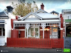
Comments (9)You asked about painting the 'stripe' , and I was going to mention it in my post above . Visually , that existing hip-line 'stripe' looks a bit funny , it is pretty non-existent on the left , then sort of alternates between red and white . So that seems a problem to me , because I was going to suggest either 'just' painting that 100mm or so stripe in black , or preferably getting a slightly raised render 'hip line' , either in a black render , or painted afterwoods . BUT as you don't want to do red around the top , I think that would look like a dogs breakfast -- red and white with a black stripe is pure 1960's style and class -- red , white , mauve or grey , and black would look disjointed IMO ....See More
Souzette Lovell
4 years agoJE C
4 years agoAnne Monsour
4 years ago- PRO
MB Design & Drafting
4 years ago  PRO
PROHelenscolour
4 years agoSouzette Lovell
4 years agolast modified: 4 years agoSara Graham
4 years agoSouzette Lovell
4 years ago


User