Houzz Logo Print
kitchenshack

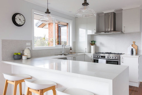
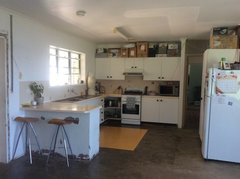
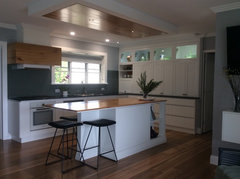
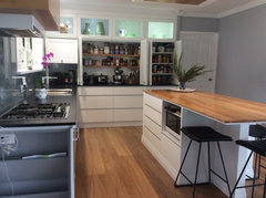
Before & after: From dated kitchen to modern stunner

Kitchen Shack
4 years ago
last modified: 4 years ago

This Before and After demonstrates the perfect way to save dollars on your DIY Kitchen Renovation.

The original older style kitchen was so dated with dark timber pantry doors that it was ripe for renovation.


The Designer and Team worked diligently to design the perfect u-shaped kitchen easily displayed with our 3D Kitchen Software program. This visually helps clients to see the exact layout and flow so any modifications can be made to the design stage.

The fresh white kitchen is a clear winner from the old run down space. By saving money on their kitchen they could use funds to add the wow factor of penny royal tiles and gorgeous lighting not to mention the new flooring.


The addition of the pantry and effective use of the corner area are also other highlights worth mentioning.


What do you think of this transformation?

See full Before and After Transformation

Comments (26)

  • Kate
    4 years ago

    How much brighter with white window frames. Great job. Styler why 2 kettles and no toaster?

  • PRO
    Kitchen Shack
    Original Author
    4 years ago

    Thanks Kate and yes definitely brighter!

  • Karen Quinn
    4 years ago

    I have a kitchen the same style, with a walk way through the area. I was planning on using the other side of the walk way as a part of the kitchen. You haven't shown what happened to the other side of the walkway.

    Kitchen Shack thanked Karen Quinn
  • julie herbert
    4 years ago

    Looks fabulous

    Kitchen Shack thanked julie herbert
  • Debbie Fisher
    4 years ago

    Well done. I had a similar space to work with after purchasing our 1980’s home in 2010 I spent quite a long time planning and thinking of what I wanted. My Kitchen is now 2yrs old, I couldn’t be more happier. I just love it there is nothing I would change it just works.


    before

    Kitchen/ Living · More Info


    After.


    Completed Kitchen · More Info


    Completed Kitchen · More Info


  • User
    4 years ago

    Which hospital laboratory is this in ?


    Just me -- I would have had some colour . The wall tiles in say red , orange , yellow , even Kermit Green or a 'metallic' blue Subway tiles would lift it , with glass shades in the same colour . A colourful abstract art piece on the wall . The clock is 'sort of' right -- but go with a 50's style in a similar colour to the wall tiles -- pale yellow if the tiles are bright yellow ; mint green clock if you use Kermit Green tiles , etc .


    Almost there -- change the bar stools ( or the tops ) to the above colour too .


    Leave the hospital look for those who are truly sick . . . . . . . . . . . .

  • dreamer
    4 years ago

    Debbie fisher, what a wonderful kitchen. You have used the space very efficiently. The pantry is excellent. I like the use of the wood. Really adds interest, well done.

    Kitchen Shack thanked dreamer
  • PRO
    Kitchen Shack
    Original Author
    4 years ago
    last modified: 4 years ago

    Hi @Karen Quinn, we did design the other side of the walk way and added two pantries built into the wall like the older style but updated to the new cabinetry!

  • PRO
    Kitchen Shack
    Original Author
    4 years ago

    Thanks for your comments @User this customer chose these colours and the softness of the grey and white penny royal tiles creates the space she loves.

  • PRO
    Kitchen Shack
    Original Author
    4 years ago

    Wow @Debbie Fisher your kitchen looks amazing - well done!

  • Debbie Fisher
    4 years ago

    Thank you dreamer & kitchen Shack.

    i am only short so high storage for me would be a pest so I used these spaces as a feature. We live right on the coast and even the best of handles show signs of corrosion in no time, so I went for simple knobs only where I had to.

    i also like keeping everything uniform it all had to be square, tap, knobs and above bench cabinets. I also like the flat 2pac shows less marks. I wanted my island to be a bit different with a feature in one corner for storage and a kick that gives the island a more grounded feel. Most of all I wanted my kitchen to have points of difference and it had to work.

  • Daphnemaria Sch
    4 years ago

    Love what u have done, liking the kitchen window going white. I will do the same. You can always change around your accessories in the glass top cupboards. Take your time, you could add a bit of warmth with the right piece when u see it. More importantly the space works well for your family.

    Kitchen Shack thanked Daphnemaria Sch
  • Anne Monsour
    4 years ago

    Kitchen stack , I love white clean kitchens ,lovely . I think what really makes it stand out , (but not hospital Pottsy - Ha ,Ha ) is the old style clock and clear glass lighting .

  • User
    4 years ago

    I know it's not about me haha , but my current kitchen is 'eclectic' -- one wall has natural red brick walls , BUT I put old wooden panels from the floor up to about 1.2 metres , and it has a 42" TV above that -- it flicks to the front door camera if someone pushes the door bell .

    The main 'long' wall has a full length stainless bench , cupboards below are white framed and 'burnt red' doors with modern stainless handles -- that unit is over 40 years old ! There is a stainless dishwasher there too , that was new 6 years ago not 40 haha . From the stainless bench up I did these cool tiles I found that are about 100-250mm long ( 'erratic' lengths ) and 25mm tall , in black , white , dark and light grey and I got 5mm thick aluminium strips cut the same -- all with white grouting . The tiles go about 200mm up to the white window ( with a wooden venetian blind ) , while either side of the window ( above the narrow tiles ) I did bright red subway tiles , also with the white grouting . Above that are the red bricks , and a couple of 400 x 400 works of abstract art , and a stainless microwave on a stainless bracket .

    Wall 3 is done in the same 'burnt red' as the cupboard doors , and has a pantry with white doors ( you'll be pleased to know ! ) , a freestanding deep grey gas stove ( 6 years old but made to look 100 ! ) , a range hood that I had sprayed the same as the stove , and a double door fridge also sprayed the same deep grey .

    The 4th side basically is a built-in breakfast bar , the base in a mushroomy colour ( same as the dining room walls ) , the top in a grainy marble of whites and greys , and industrial metal bar stools in a distressed faded red ( again , 6 years old but look 60 years old !

    Oh , and even though the floor is concrete , it's done in wooden slats that look like a 60 year old barn -- mostly timber hues , but a little bit of distressed paint in off-white , light green , and cream .


  • PRO
    Kitchen Shack
    Original Author
    4 years ago

    @Anne Monsour so true you can add any pop of colour to a white space!

  • PRO
    Kitchen Shack
    Original Author
    4 years ago

    @User wow sounds like a lot going on in your kitchen but love that you have put your own personality into it - thanks for sharing.

  • julie herbert
    4 years ago

    Love to see photos of your kitchen Pottsy.

  • Debbie Fisher
    4 years ago
    last modified: 4 years ago

    White is such a classic, and it so doesn’t have to be clinical. It’s amazing what a bunch of fresh flowers can do or a bowl of fruit. It’s more important I think in a kitchen to get the structure right. Kitchens are foremost a work and gathering space, such a costly investment its important to get the foundation right. Everything else can be personalised to individual taste. It’s just lucky we are all different and this is such a great site together ideas.

    pottsy99 your kitchen sounds amazing and pictures tell a thousand words please share. :)

  • User
    4 years ago

    My kitchen is primarily 'burnt red' and the red bricks , which are slightly less brown than the burnt red . the ceiling is white , with stainless downlights , the rest is red , charcoal , white , the odd fleck of grey and black . The floor and blind are brown wood . I don't consider it overly decorated .


    It opens to the dining room , which is also a natural wooden floor , a black glass top table with black legs , black steel framed chairs with red leather seats and backs , an almost black wooden sideboard , a couple of big colourful abstract paintings , and 3 walls are wallpapered in a wheat weave pattern , the 4th is that red brick . There are 2 large wooden venetians too .


    The lounge is , yep , red leather lounge suite and extra chairs , there's even a red leather footstool that is heart-shaped ! The TV cabinet is custom made and is nearly 4 metres long , all wood with a dark stain . The floor is wheat coloured carpet with a large shaggy red rug , a black glass coffee table , a 65 inch TV and 7 speaker home theatre , a couple of those polished search light spot lights on wooden tripods , and several original paintings ( only 1 is an abstract , the rest are people , although a couple are Picasso-esque ! ) .


    Not much white , not a great fan .


    I'll put up some pics in a couple of years when I've tidied hahaha .

  • Debbie Fisher
    4 years ago

    It sounds like a wonderful space I am imagining a space that leans between industrial/modern and inviting . obviously a large space. I envy you.

  • User
    4 years ago

    It was originally a 1920's red brick Police Station ( until the 1980's ) then used by an advertising agency for 20 odd years until I bought it . You'd think an advertising agency would have some creativity and design flair -- well , every single room was painted beige . Every single wall . The red brick walls ( which , to be fair , is only two ) were battened then gibbed over , and painted beige . When I bought it , there were patches where certificates and the like had been hung , and the rest of the beige wall had faded around them !


    The old sash windows have these huge brass stops , the solid wooden doors ( double front , a single back door , and every internal room ) also have huge solid brass hinges and handles , almost like they valued security haha . With good bones like that , which were obviously installed by the cops , I couldn't understand why the ad people didn't add some flair , but it certainly gave me a blank canvas haha .


  • Anne Monsour
    4 years ago

    I really enjoy reading your suggestions Pottsy , they are never “ beige” , lots of colour and life . I am a bit conservative in my tastes , though not beige !

  • Rochelle
    4 years ago

    It’s great that we are all so different. I LOVE white kitchens - they are just so elegant and classy.
    As an owner builder I’ve looked through hundreds (if not thousands..) of photos of kitchens on Houzz and Pinterest in all the different styles and colours, and while many were beautiful, for me I just could not go past white. I’ve added colour with flowers and some coloured plates and glasses that are on display in a clear glass cabinet.

    Kitchen Shack thanked Rochelle
  • User
    4 years ago

    Dear Pottsy99, I'm sure your home is everything you want and you love it and are comfortable there, half your luck. However, your description sounds like a version of hell. To each their own I guess.

  • User
    4 years ago

    Yep , if it actually existed , hell would be a colourful and interesting place , filled with character .


    Luckily , I've managed to sell each place to fellow sinners who seem to like them . . . . . . . . . .