Plant combinations
Plant combinations ‘enhance your design by making the most of contrast and harmony’
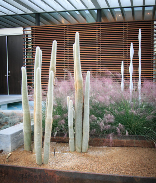
This is a subject of a lot us get stuck on and question our ability to get a good result. That I understand but let me try and break down that plant voodoo to give you that ‘have a go’ attitude.
There are some rudimentary elements you would be well to think about and let me cover off on a few to give you the just of the approach:

- What is the region you are growing in like – seasonal weather, soil conditions, exposure
- Are you prone to native animals having a good old munch – Deer’s and Kangaroos
- Are you looking to create a combination based on the season
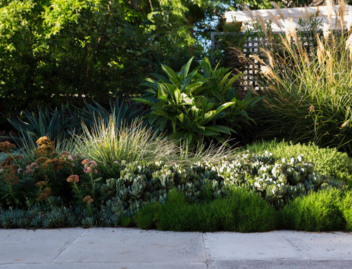
For a plant combination to work, the arrangement of the colours, shapes, sizes, and textures must add up to a complete and satisfying unit. As with all good design, it’s a matter of blending similarities and differences in pleasing proportion to one another.
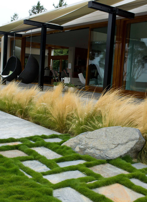
In human affairs as well as in art, harmony is the product of likeness—of shared qualities and mutual accord. Contrast, on the other hand, depends for its effect on differences, which produce drama and, if those differences are extreme, conflict. The secret of combining disparate ingredients is to preserve the peace but not at the cost of excitement.
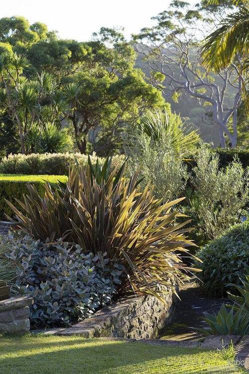
In terms of colours, an inexpensive colour wheel can guide you in choosing combinations that sing by virtue of their differences or that soothe with calming likeness. Pairing opposites always works, hence the success of combinations like blue and orange, yellow and violet, or red and green.
Another safe bet is to group colours that share a common pigment and a strong kinship, like violet, red-violet, and blue-violet. These principles also relate to plant shapes, sizes, and textures. Here are some of the many ways to make harmony and contrast work within a planting.
So now let’s break it down a little further and chat about:
Contrasting colours and complementary colours:
Planting to yellow and violet (colouropposites or complements) gives a degree of harmony to an otherwise highly contrasting combination. While all the coloursare either tints or tones of colour you can also create a bit of a storm and have opposing forms and textures creatingtension through stiff, erect leaves of say the variegated yucca thrusting out of a mass of smaller, softer, more rounded leaves provided by say the liquoriceplant or Helichrysum periolare.
o Yucca filamentosa Adam’s needle ‘Bright Edge’
o Tradescantia pallida ‘Purple Heart’
o Helichrysum petiolare Licorice plant ‘Limelight’
o Lantana camara ‘Samantha’
Similar colours with different shapes:
Matching the coloursof two or more flowers, while varying their shapes, is another way to guarantee a winning combination. The cool pink hues of saythe Echinacea ‘coneflower’and Phlox are closely related if not identical. But the structure of the flower heads give that striking contrast. The coneflower’s humble prairie origins are apparent in single blossoms that resemble coarse daisies, while the lush, pyramidal clusters of phlox florets indicatethe civilized world of the garden.
o Phlox paniculata Garden phlox ‘Eva Cullum’
o Echinacea purpurea ‘Purple coneflower’
Contrasting leaf patterns:
Nothing is more restful than a skilfullyassembled group of foliage plantsand their combination of subtle but differences shades and tints of green. The sooty Euphorbia ‘spurge’ foliage provides a foil for the ice green of the Athyrium niponicum ‘painted fern’and also contrasts with the lighter, brighter green of the hydrangea leaves above it. There are also pronounced differences in the leaves’ sizes, shapes, and patterns, from the radial arrangement of euphorbia foliage and the elegant fish-bone design of fern fronds to the large, simple, alternating leaves of the hydrangea.
o Hydrangea arborescens ‘Annabelle’
o Euphorbia amygdaloides var. robbiae ‘Mrs. Robb’s bonnet’
o Athyrium niponicum var. pictum ‘Japanese painted fern’
Soft tones and strong shapes:
Juxtaposing industrial-strength blue and caution-sign yellow creates a sharp, rather harsh contrast because the two hues have no common bond and are at considerable distance from each other on the colour wheel. They are just too different. But soften the one to a frosty steel blue and the other to primrose yellow and you have a marriage made in heaven. Set them both against a deep, low-intensity tone of red and you have a plant combination that boasts tonal harmonies enlivened with contrasting shapes.
o Acer palmatum Japanese maple ‘Crimson Queen’
o Echinops bannaticus Globe thistle ‘Taplow Blue’
o Verbascum chaixii Nettle-leaved ‘Mullein’
Variations in height and texture
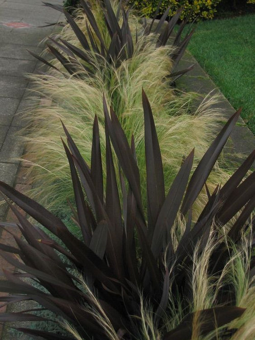
The heart and soul of this design is difference. A clump of yucca with its rigid, swordlike leaves furnishes an authoritative vertical shape to contrast with the prevailing softness and low profiles of the false cypress, juniper, and lambs’ ears.
o Chamaecyparis pisifera ‘Filifera Aurea Nana’
o Yucca filamentosa ‘Golden Sword’
o Juniperus squamata ‘Blue Star’
o Stachys byzantine ‘Lambs’ ears’
Three harmonious hues
This trio of colours, which includes violet, blue-violet, and red-violet, would please even Gertrude Jekyll, the discriminating British garden designer who preferred the fine distinctions found in harmony to the invigorating clash of contrast. As a rule, the closer the colours are to each other, the sweeter their song together. For devotees of closely related hues, the frilly leaves of this ornamental cabbage unite blue-violet and red-violet with the deep, true violet flowers of heliotrope, which is about as close to a perfect harmony as you can get.
o Heliotropium arborescens ‘Blue Wonder’
o Brassica oleracea cvs. ‘Ornamental cabbage’
So, I hope I have given you a sense of having a go. There is no right and wrong just different but before you start bolting down plant types go back to the top and consider the region you are working in and its eccentricities.






oklouise
julie herbert
Related Discussions
The best way to cover our arched windows with plantation shutters
Q
Seeking design collaboration
Q
Update very tired front of house and streetscape
Q
Help selecting plants for front yard and back yard
Q
Scenic Blue Design Pty LtdOriginal Author
Scenic Blue Design Pty LtdOriginal Author