
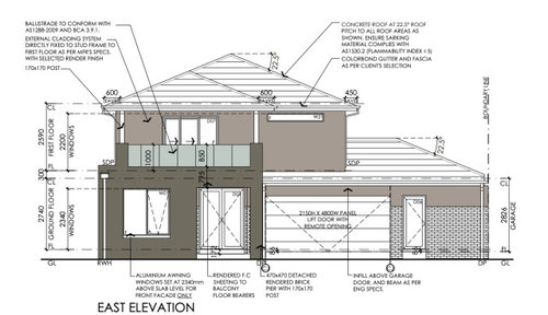
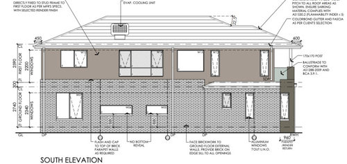
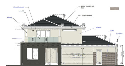
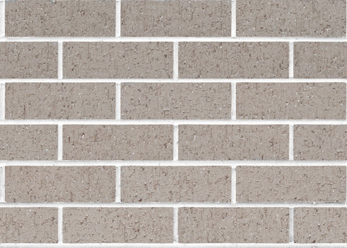
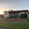
Looking for expert opinion on external colour scheme
Kira
3 years ago
last modified: 3 years ago

Featured Answer
Sort by:Oldest
Comments (34)

dreamer
3 years agoKira
3 years agoRelated Discussions
External Facade Colour Help
Comments (8)Hi Chris. I like the colour scheme and materials for your house, although a few things come to mind. Why have two different timber finishes, Merbau and Western Red Cedar? Is Merbau not available as a garage panel? Or is Western Red Cedar not available as post cladding? If they are both available for both applications, I would choose one for both applications. You mention black Sikaflex as joint filler for the cladding, and off-White mortar for bricks. Would you consider black mortar for brickwork for consistency, or do you not like the look of it? I bring these questions up because there are a lot of materials, which is great, but maybe minimising the number of colours and using them more consistently would produce a more cohesive visual outcome. I googled images for brickwork and black Sikaflex and this is the only decent one I could find quickly - just to give you an idea of how it might look....See MoreExternal colour scheme to work with primrose frames
Comments (5)a more classic lighter grey roof would work and lots of white including the current verandah railing, you can paint the windows. Your driveway posts are classic and worth working with that for a Hamptons look, great house would be good to see some daylight photos...See MoreLooking for advice for kitchen colour scheme
Comments (38)Hello again, thank you for the input. I've taken it all on board. Regarding the island, we will be sticking with Knights Grey but if we choose a very dark floorboard, we will then switch to Timeless Grey (which happened to be one of the swatches I'd picked up anyway!) to avoid that sinking effect. Thanks for the tip. I won't be able to get back out this week to check the Dulux Raku colour, did I mention that I'm getting around with a 1 month old and 2 year old? They are totally dictating my schedule! Ann I'm not sure exactly how they get half strength. I just have the understanding that paint looks darker on a wall than it does on the sample card so to always opt for a lighter shade to counter that effect. So to avoid the Snowy Mountains colour looking too dark, I will go for a half strength. Worst case, I figure, is that it will just be a touch lighter than what I'd expected. There wasn't consistency between the three separate Snowy Mountains cards that I ended up with so I guess it's to be expected anyway. Thanks for sharing your experience Antonia, it's good to know it works. Today I went out to Beaumont Tiles to try and find a tile like the one I attached to my original post. This was surprisingly difficult to match and I've borrowed a sample of the closest match from the store to mull it over. The colour seems to work quite well against all my samples but I'm worried about the wavy edge and how it will appear on the wall when grouted. On the one hand I'm worried it will look too busy or untidy, on the other hand I think it could be a winner because it could add some depth or interest to an otherwise boring subway tile splash back. I've attached the tile against my samples and also Tranquil Retreat (half strength) wall with Vivid White trim. Please tell me what you think :)...See MoreKitchen colour scheme opinions - carrara marble splashback & benchtops
Comments (0)We're renovating our kitchen and are at decision time to decide on benchtops etc. I'd love any opinions or advice on the colour scheme we're considering as we're not sure if it will all go together and it's a big chunk of money, so we want to get it right! :-/ The kitchen is a smallish U shape with a breakfast bar which opens to the lounge room. There's limited natural light so we want it to be as light as poss. The cupboards will be all white poly, floorboards are white sand engineered bamboo, walls are quarter strength tranquil retreat. For the splashback we're looking at carrara marble hexagonal tiles, benchtop - caserstone intense white and cupboard colour lexicon half or quarter or possibly vivid white (satin finish). We like the pure white of the intense white benchtops but not sure if it will compete with the splashback tiles (although the texture is very fine). Any opinions/other ideas?? Also not sure on which white to go with for the cupboard doors - leaning towards Lexicon half. Photos below of the floorboards, carrara splashback tiles, caesarstone intense white benchtop and paint samples. If anyone can offer any opinion or advise on this selection or other alternatives we could consider it would be really appreciated!...See MoreKira
3 years agolast modified: 3 years agobigreader
3 years agoUser
3 years agolast modified: 3 years ago
siriuskey
3 years agolast modified: 3 years agosiriuskey
3 years agodreamer
3 years ago PRO
PRODr Retro House Calls
3 years agosiriuskey
3 years agoKira
3 years agodreamer
3 years agoKira
3 years agodreamer
3 years agoKira
3 years agoKira
3 years agodreamer
3 years agoLyn Wood
3 years agoKira
3 years agoLyn Wood
3 years agoKira
3 years agodreamer
3 years agolast modified: 3 years agoKira
3 years agodreamer
3 years agoLyn Wood
3 years agoKira
3 years agodreamer
3 years agoLyn Wood
3 years agoKira
3 years agosiriuskey
3 years agolast modified: 3 years agoLyn Wood
3 years ago
Susan Clark
3 years agofianou luca
3 years ago


bigreader