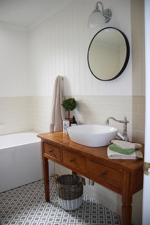
French provincial/country-style bathroom redo
I For Style
last year
last modified: last year


Featured Answer
Comments (7)
Related Discussions
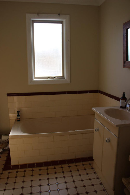
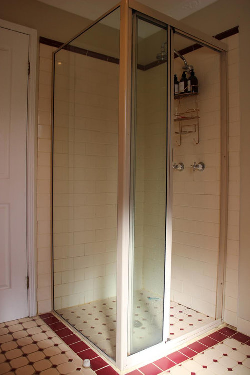
Help me fix my bathroom please
Comments (68)I remember years ago being in a similar predicament and someone gave me some mirror tiles - I glued them on the the wall and thought I was very clever. They actually did look much better in my eyes. Try not to spend too much - I think everyone's idea of a shower curtain will all the bathroom colours in it would probably be the best option. You'll laugh about it in years to come and you will love the improvements you make over time. Enjoy the moment, unless you're selling soon your ideas will change after living there, so change when you can afford it - who cares it's YOURS. Good luck, it's so rewarding and so much fun. P.S. now we have a small bathroom, wall to wall tiles, dark grey on the floor and white on all the walls with a large grey tile up each opposing wall, tall mirror over the handbasin which reflects the opposite wall then a full length bath with shower over it. It works perfectly and looks great....See MoreLove or loathe? French provincial style
Comments (3)I like that floor but find most French style decor & furnishings too fussy these days. The odd piece here and there is ok, without it dictating the style of the room. As previous poster suggested painting a single piece in a bold colour can provide a nice accent, in a bedroom for example....See MoreHelp with a very pink bathroom!
Comments (53)Yes I agree not to paint or add an faux type treatments as over time they will deteriorate and the bathroom will look tacky. My suggestion would be to hang two large rectangular framed photos. Use a light gold colour for the frame and almost silver looking one but you can just see the gold. Keep the framed photos light and classical, not to busy. On the vanity add a tray the same colour as the photo framed or with a mirrored look. Use white fluffy towels and a Scandinavian style light colour timber towel rack. Possibly a gold colour pot containing a leafy green plant. My...See MoreBefore & After : Refined French Country House
Comments (3)Hi Oklouisse Thanks for your comment. The bathroom is used for guests and there is a large storage cupboard just outside the entry....See More PRO
PROI For Style
last year PRO
PROAus Joinery Kitchens Pty Ltd
last year- PRO
I For Style
last year


Tango Tiles