Houzz Logo Print
anna_kosolapova

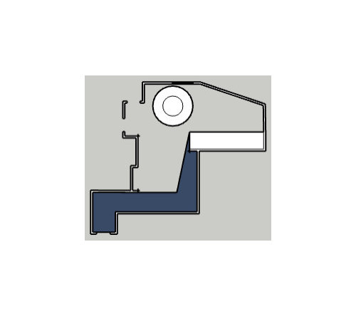
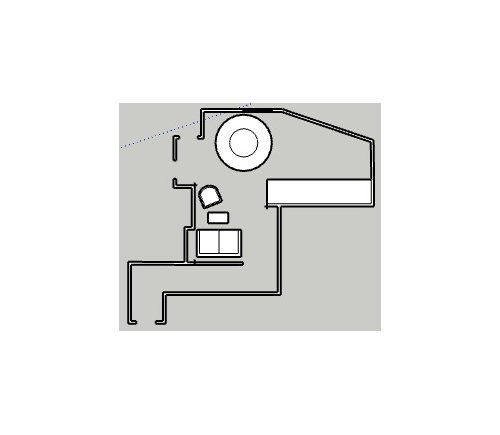
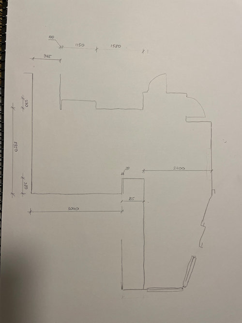
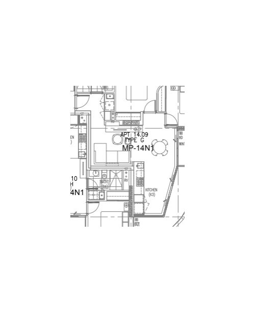
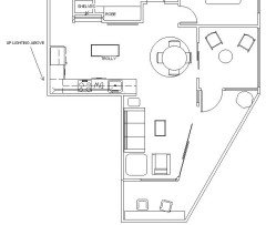
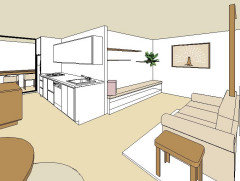
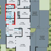
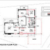
Please help with awkward space layout

Anna Kosolapova
last year
last modified: last year

Here’s the builder’s floor plan, and I’m trying to work out what to do with the living room, that weird L - shaped space which shares Living/Meals.


One of the challenges with it in my mind is, that despite the apartment being North facing, it’s facing another building that blocks morning light, and does not get much light through it during the day, as light gets caught in all the awkward crevices, such as the kitchen that sticks out from the dedicated area, as well as the Study (which is really just a closed balcony) with extra layer of glass windows.


So the back of the LIVING area, adjacent with the corridor is pretty dark in general.

We tried fixing it by covering the back wall with mirrors to catch the front light. This created a feeling of space and brightened it up a bit, but still feels quite gloomy, especially on the dark days.

When we first saw the apartment, interior stylists has chosen to lay it out the way shown on one pic, where couch sits on the A/C wall.


I quite liked the position of the round table, outlined with an area rug, close to the kitchen. So we decided to keep it this way. Was quite easy to navigate around the round table in the space.

What I didn’t like, is:

  • the whole living space ended up in the dark area of the room
  • Armchair has been, effectively, placed in the corridor, so it’s psychologically not comfortable sitting there
  • We do not have/watch TV, so just facing the wall seem to be weird
  • I also had a weird feeling about the couch being visually obstructed by the kitchen

Another challenge with this apartment is that there are doors everywhere, here’s a small diagram of the flows around the area.


So placing any conversation area in between left and right walls also feels awkward as it’s breaking apart, as well as becomes quite hard to navigate around, if, for example, coffee table obstructs the pathway. This does not create a cozy feel, and you seem to have a feeling of almost sitting on a high-way. Facing a dark wall, or even worth, the kitchen corner is also not ideal.


Then I started experimenting a little bit, possibly placing couch just closer to the sunlight.

That looks very weird, again (no “conversation” area either). And no idea what to do with that kitchen corner, grrr or the TV-niche on the left. Surely, can just fill it with bookshelves, but would it look good? Dont' know..

Then I thought maybe we could extend the corridor with some translucent/see through divider or something like that, and position everything in front of it like so. Also this is maybe better, but it makes the room quite heavy, and there is a longer path outside (but that's ok given the space is tiny anyway).


Maybe I am too set on fitting the couch in? Maybe we just need a couple of chairs symmetrically positioned against the wall? I am not completely set on any furniture that we have, just trying to make the space work, but it seems to be too hard of a task. I really like when sofa or armchair can easily accomodate you with the legs on it, so it’s snuggly, which, sort of, implies that it has quite a big footprint, rather than some regular casual one.

It certainly makes it less of a challenge that we do not entertain or have friends around often, so it’s just a cozy area for 2 of us to enjoy the evening with a book or laptop. It's probably even ok if it's a nook for just 1, as my partner prefers sitting at his desk. Although would be nice if the area is "inviting".

With either of the layouts, the room feels very heavy on the left wall, and visually not balanced on the right. Pathways split it a lot, etc.

What would you do in this case? I’m open to any outside of the box ideas, like bespoke furniture, shelving, etc.

I’m seriously lost in trying to make it work.

Even if we sacrifice everything and go minimal, I just don’t see what might even look good here.


The layout that works so far, probably, the best is perhaps as shown below, when the couch is tucked behind the kitchen peninsula, but it still feels very unbalanced in my mind, where the wall with the couch much out-weights the opposite wall.


Please, help!

Thank you!


Some photos


Sketchup scaled 2D plan could be found here https://drive.google.com/file/d/1PieSohlbNhUKL18rRwEDQJHBn3rZCn3O/view?usp=sharing


Original builder's floor plan.

In my mind it's not ideal, as

a) if you sit in the corner of the sofa, you're facing an entryway, I think it's not particularly psychologically pleasant

b) navigation might be a bit hard with a heap of coffee tables and not super slim console

c) couch might be a bit oversized for the space and heavy

d) console just covers wall cavity, it does not make a lot of sense, I think


Comments (48)

  • Kate
    last year

    What furniture layout was in the planning permit drawings?
    With a small apartment flow paths will go through zones.
    Could you do some built in seating for the table in the corner? This could be couchlike.

  • Kate
    last year

    We need lots more dimensions given the awkward plan

  • Related Discussions

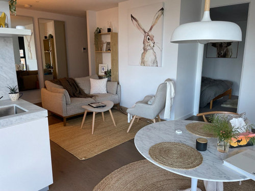
    Furniture layout awkward lounge

    Q

    Comments (17)
    Two of these, stressless chairs, one either side of the bay window they are totally comfortable, not cheap, friends have them for reading and tv watching, in that position, they usually only watch tv at night, and love to read in natural light. They would certainly go with you to the next house and will fit in anywhere. Put the tv opposite, with the ottoman off centre. Small retro table in between chairs. Move the big pictures currently on the tv wall to either side of the fireplace. Heaps of carpet lying space. Rug once you have finalised the furniture locations and colours nip out and get a thin silk/wool oriental kilim Easy to take with you.
    ...See More

    Help please! Kitchen layout, 1927 house, small constrained, 3m ceiling

    Q

    Comments (20)
    my suggestion would be to keep the new kitchen in proportion to the size and scale of the whole house so i prefer option 2 with cabinets only as high as the top of the window, tall narrow fridge (less than 80cm wide) next to the back door with wall mounted mw and wall cabinets all round, no tall cabinets, more counter on the fridge wall then stove, sink and dw along the window wall to make sure that there is counter on either side of the stove and sink and locations for a toaster, kettle and other appliances..but exact location of appliances depends on budget and sizes of all the cabinets you want to use.. but, if you plan to remove gas in future, why not start with electric appliances and best insulation ready to add solar power at a future date? ...eg check out the electric air sourced hot water heaters and consider an electric flame heater for the kitchen fireplace and save the gas heater for the hew rear living area although it may be possible to have one heater with hot air connected to the other rooms with an in roof ducting system and, if you have long term plans to alter the rear lean-to research options for renovating the whole house and then plan all the work in stages...eg i would have the new laundry/bathroom next to the refurbished bedroom (master suite?) and have the future new rear living area with the north aspect
    ...See More

    Furniture placement for awkward living room layout
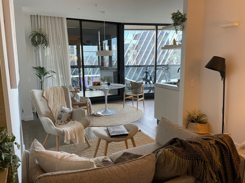
    Q

    Comments (3)
    where does the short hallway lead and is it possible to remove that wall? with small children i would be keep as much clear floor area as possible with easy access to storage for games and toys and there appears to be enough space for two x three seater lounges and two small armchairs (that can be easily moved into different locations and but having furniture with open legs instead of covered to the floor and small coffee tables and/or foot stools will help the space feel less crowded
    ...See More

    How should we style this awkward living room layout?

    Q

    Comments (7)
    The window looking out to the brick wall, in my opinion should be utilised for your tv unit. There is no view, and this wall length offers plenty of space. Position your two, three seaters opposite each other. Place single chairs in corners, they can be brought into room when required.
    ...See More
  • Kate
    last year

    Which city is this in? I am not clear where windows are either.

  • Kate
    last year

    Do you have photos

  • Anna Kosolapova
    Original Author
    last year

    Yep, indeed. We are in Melbourne. Windows are running through the "internal" wall on the plan from Study to kitchen, it's effectively one big balcony window.

    Here are some photos. Furniture is currently placed on the left, black lamp is the A/C wall.

    Builder plans had same layout as we've seen during the inspection, it didn't seem to be working particularly well.


    I'm happy to share the scaled sketchapp plan if that helps.

    https://drive.google.com/file/d/1PieSohlbNhUKL18rRwEDQJHBn3rZCn3O/view?usp=sharing


  • Anna Kosolapova
    Original Author
    last year
    last modified: last year

    Not sure built in seating for the table in the corner would work, as there's a balcony window. Left frame (behind the linen curtain and the potted plant) is fixed, right one is the sliding door. In front of the kitchen, the middle frame is the sliding door. But more than happy to explore.

  • Kate
    last year

    Thanks for the photos. I love how it is arranged in them. The table is under a low pendant which would need to move if you want to change table location. Maybe what you need is more comfortable kitchen chairs to sit in during the day. Or a chair in front of window.
    In relation the the couch area. I see you have a small standing lamp. I would look at something bigger in the corner to Light up that area more. And a bright pic where the lamp is now to add cheer in the gloom.

  • Anna Kosolapova
    Original Author
    last year

    Yeah, it’s not a concern with moving thing around really.

  • Kate
    last year

    And what is the study used for. It could be a lovely sitting room

  • Anna Kosolapova
    Original Author
    last year

    Unfortunately “study” is uninhabitable. It does not have proper windows, so it gets pretty cold outside of summer months. We just use it for a tiny winter garden. Although I think that’d be nice to even put the dining area there, we struggled finding someone who’d install double glazed windows in there.

  • bigreader
    last year

    I’d switch out the sofa and replace it with two lounge chairs. I’d add another lounge chair in the kitchen/balcony corner, this would give you a light spot to sit in and can be dragged into the lounge area if you do have guests. I’d also consider adding wall sconces. Sometime you just need to accept that you’ll need lights on to add light. Do you eat at/use the the table? If not,

    Anna Kosolapova thanked bigreader
  • Anna Kosolapova
    Original Author
    last year

    Yeah, we eat at home and use the table every day. The size is quite comfortable at the moment, smaller might be a bit squishy.


    I also tried adding a chair in the far kitchen/balcony corner, but there's not enough space then to open the pantry/fridge door on the kitchen, it only opens diagonally. So I just landed with a plant pot there :(

  • Lyn Wood
    last year

    I like the furniture you have. My thoughts are to leave the couch on the wall as you walk in the front door (opposite the balcony and your dining setting.) I think your sitting area looks cluttered as is so consider shifting the angled  single chair to the opposite side of your lounge setting next to the kitchen  bench. This gives you a defined walk way without walking through your lounge setting. Rearrange all your occasional pieces to suit or change if necessary.

  • Anna Kosolapova
    Original Author
    last year

    Do you mean this way? The only concern that I have with it is that armchair is very close to the kitchen sink. So I’d need to put a screen there or something. Otherwise it might get wet/dirty

  • Anna Kosolapova
    Original Author
    last year

    Ps ignore the work desk. It’s there just temporarily

  • Anna Kosolapova
    Original Author
    last year

    Or maybe you’ve meant that way? So there’s the pathway between the kitchen and the armchair? Agree it looks cluttered. That way, I think, might need some see-through chair maybe so it’s not blocking a lot of light

  • Lyn Wood
    last year

    Yes, looking at your photo of the chair a little away from the kitchen bench (not abutting the sink  as it wouldn't  be practical as well as looking odd) is what I envisaged. By moving the desk and shifting your couch further over where desk is, you will have a clear walkway past your lounge setting. It would be a shame to have to find another chair but if you think it would let in more light, so be it. You may like to explore other suggestions  for letting in more light but judging by your photos, it doesn't  look that bad. I hope you will let us know  what you decide. PS for some reason my posts are coming up under hubby's  name to his amusement as he is hopeless at arranging furniture.

  • Lyn Wood
    last year

    Further to my last post, I still may be not clear with the walkway. By moving your desk and shifting the couch over,  the walkway would be along the bedroom wall. However if there is nowhere else to put your desk, your arrangement as is depicted now with the walkway behind the couch and down the wall near the kitchen would have to stay.

  • Anna Kosolapova
    Original Author
    last year

    Yeah, I plan to move the desk to the bedroom, so it won’t be there at all. So that’s fine. Yeah, interesting. Chair is quite bulky, so I think it needs change over. I use it primarily as placeholders for now to get an idea on arrangement. Maybe could be something chair like but not chair? E.g. pouf stool/bench?

    the rug needs to be different as well, does not fit the size at the moment 😂

  • Lyn Wood
    last year

    You are probably right in thinking something lower and smaller in size such as a pouffe would work and not block the light.  There are some really nice pouffes around.

  • PRO
    CHRISTINE HALL ARCHITECTS LTD
    last year

    Hi Anna,

    The key to the small apartments with a lot of doors it to try and minimise the circulation routes and create the sitting areas that are not walk through spaces. (Experience with tiny Hong Kong apartments) I'd put the couch in the 'L' corner facing the dining table with the chair oposite it in the little corner created by the 'nib' wall from the kitchen. It could be angled a little towards the middle of the couch. That way, 3 people could easily sit there without it being a walk through space. You might even fit in another 2 seater instead of the single chair so they face each other or a bigger chair than you currently have so it is really cosy. People often think they need small things in small spaces but that often looks more cluttered than if you fully occupy the space you have. If you don't have space for a coffee table between these, look for ones that sit at the end of the seats with a small surface above the arm of the chair. You have the dining table in the right spot and the light really dictates that. Being round it is perfect for the small area and you can add or subtract chairs or stools as the number of people changes. Stools could be fold up ones so they don't take up space when not in use or live in the 'study' space normally so it's not cluttered around the table. I'd also get a really big pot plant for the far end of the kitchen window area. Creating a focal point will draw your eye out further to your view. The plant could be inside or outside. I'd forget about the mirrors on the wall you have them on. Perhaps put one in the alcove behind the shelf unit you have there at present. I'd stick to your favorite artwork on the walls. Lighting - get some good quality LED bulbs to keep it brighter but also, it is quite nice to have an 'evening' space with lower lux level to balance all the light you have in the kitchen area. If you have wall lights in that space, I can't quite see what you have, change these to fittings that shine up and down. The reflected light off a white ceiling will brighten the space without glare.

    Christine.

  • siriuskey
    last year

    I have done a floorplan without curved walls to show possible layout. I have added a wall of cabinets with top half open shelves these will be as deep as the niche and would also have a TV. More of the same in the other smaller niche, both would have low energy up lighting on top of cupboards, If there's an Aircon on this wall you would need to work with this. The single arm chair can be swung around for extra seating to watch TV or just chat. I haven't laid out the kitchen but you could had a small moveable island. The section of the Balcony that looks toward the city view (tree) could have a fitted bench with a couple of stools

    A possible door from master into bathroom? The enclosed outdoor room would be amazing if this could be turned into a dining space by adding appropriate windows. Years ago I looked at buying a unit in a 70's building where several owners had done this to enlarge the living space but also because they didn't like being up so high with a balcony they were afraid to use


  • Anna Kosolapova
    Original Author
    last year

    Yeah, that’s a very interesting idea to make shelves in those alcoves to align with the walls. You are right, there is the aircon on the kitchen side alcove, I was thinking maybe it’s somewhat an idea to hide it, behind some sliding doors or something like that.

    We don’t watch TV, don’t even have one, but I like the idea of a bench. Not sure though as it won’t be opposite to the couch?

    We’ve tried to find someone who’d do the windows, but couldn’t. So the area remains a bit of a “maybe” use, can’t permanently move dining there unfortunately. I’d definitely love to! It’d be very nice. The movable island needs to be then real slim, there’s not much of a space there, unfortunately, but it’s definitely an interesting idea, that allows to free up the area too.

  • Anna Kosolapova
    Original Author
    last year

    C P, without the rug dining table looks a bit “bare”? But I 100% agree those 2 rugs shouldn’t be next to each other.

  • Anna Kosolapova
    Original Author
    last year

    Christine, could you please do a small drawing on what you’ve meant with the couch? This seems to be an interesting thought, but I’m not sure I’ve got it right. Agree that small pieces might make it look cluttered! And totally agree with you the plant needs to be much much much bigger!

  • PRO
    CHRISTINE HALL ARCHITECTS LTD
    last year

    Hi Anna,

    Please see sketch attached.

    Be careful about building more joinery in that will make the space even smaller. I like the kitchen Island idea. I had thought this would be good. It can be moved around depending on whether it needs to be more kitchen work space, for the BBQ on the deck or perhaps a cocktail cabinet/bar storage and server or just out of the way when there are more people in the space.

    C:)


  • Anna Kosolapova
    Original Author
    last year

    Yeah, right! This makes sense. My concern with placing the couch in front of the corridor was this psychological exposure to to entrance. But maybe I could consider some timber battens, so it’s see through? But still separating the area…

  • PRO
    CHRISTINE HALL ARCHITECTS LTD
    last year

    I don't see the entry or the need to screen from it to be an issue. In an apartment the door is generally shut and nobody other than your partner will be coming in unannounced and when the door is open, its only for a few moments. I'd focus more on the space you are trying to create to spend time in, without it being a walk through zone. Obviously you don't want to block the entry and ensure you leave enough space to bring in groceries etc.

    C.

  • Kate
    last year

    I keep coming back to your original brief. Living space lacking natural light. I really think the layout in your photo works the best. You are happy with the dining table location. It is centred by the light pendant and the circular jute rug grounds that space.
    I think your current lounge layout best fits your needs. You could move couch to under the cute hare but not sure if that meets your needs any better. What I would change is the lounge rug. I would put something luxurious there. Not too big, but again grounding that space as more the cosy retreat. Make better use of your sun room for daytime retreat.

  • siriuskey
    last year

    If only it was different, I think the layout from the get go was wrong, I wouldn't like to sit in a lounge chair which is part of the entrance passageway in a dark corner.

    If you built the cabinets to fit the niches in the same wall colour they would recede and add interest avoiding small pieces of furniture which will make the space small and difficult to move around

    The following layout would flow better


  • siriuskey
    last year

    The now closed RSL Art Union Sydney Apartment is a good example for furnishing a small space.

    https://www.rslartunion.com.au/prizes/draw396/sydney

  • Anna Kosolapova
    Original Author
    last year

    Kate, yep, I’m just trying to consider all of the ideas. But yes, 100% the light is one of the main things. Which sort of rug comes to your mind?

  • Anna Kosolapova
    Original Author
    last year

    @siriuskey, yep, I totally agree initial layout that building has and how designers and architects put in the kitchen and petitioned the rooms feels really a bit wrong. I’d definitely go for some rearrangement there. Dreaming real big, I’d just continue the balcony wall to be a dividing wall between the bedrooms too, losing th wardrobe. But it would allow to do things like inner windows etc and let more light into the master bedroom. But yeah, for now it’s what I have and probably moving walls or kitchen is prohibitively expensive :(

  • Anna Kosolapova
    Original Author
    last year

    Partitioning*

  • siriuskey
    last year

    Hi Anna, I agree they didn't take into account function and natural light, the apartment looks lovely with beautiful flooring does that continue into both bedrooms and the kitchen has a lovely fit out.

    That closed in terrace room would most likely contribute to the lack of internal light

    Would it be possible to fit a highlight window between both bedrooms so that the Master would get more light, and what cost, What are the walls built with.

    Could you look at replacing your dining chairs, although lovely with something like the RSL chairs which the Coco Republic supplied, they would make great additional seating for your lounge area there fore reducing need for additional single chairs?

  • PRO
    CHRISTINE HALL ARCHITECTS LTD
    last year

    Hi Anna,

    If your budget does not allow for any major changes, and remember that plumbing in apartment buildings generally has a fixed drain location, then it would be easy to change the dining light fitting and put your sitting space in that corner. The pendant fitting could be made shorter or changed completely or the old idea of hooking it up to a different position from the existing ceiling location. The dining table could go under your bunny art and being round, would be easy to pass without causing issues. You could keep an office space in the darker corner with additional lighting.

    If you were going to spend any money on the apartment, it would be a net gain to you if you could incorporate the study properly into the living space, even if you needed to get building approval from the body corp and keep your costs down by re using the glazing between the study and dining on the exterior wall line. This might be a step too far though.


    C:)

  • Anna Kosolapova
    Original Author
    last year

    Yep, even if we were to move the kitchen, likely we’d have issues with the sink drainage, you’re right. Definitely would love to know if there’s a company that could make window installations happen and how much would that cost 😢 can you suggest anyone by any chance?

    Although it wouldn’t solve the living area layout issues, I think. But then dining could be there / or office

  • PRO
    CHRISTINE HALL ARCHITECTS LTD
    last year

    If the building is fairly new, check with your body corp, they may know who the architects were as they may need to be approached to ascertain the design details that you need to accommodate in terms of waterproofing etc and also may be able to put you in touch with who manufactured the window joinery. If the exterior of the building is to be altered, you will need to get approval to do that, probably from the body corp and local council.

  • siriuskey
    last year

    I have some drawings for you but having trouble getting them to copy, will keep trying. Re changing Plumbing in your kitchen which I don't think you should go with that, I placed the sink in the new space next to the old sink for ease of transferring,, but there is a company that produces plumbing to suit changes in multi story buildings old and new, just can't think of the name at the moment!!

    You should speak to other owners re windows so you can approach the Body corporate etc, strength in numbers.

  • siriuskey
    last year

    Sorry Christine our Posts crossed over

  • Anna Kosolapova
    Original Author
    last year

    We tried talking to other residents in the building, no one seem to do that so far. But talking to building manager sounds like a reasonable idea.

  • siriuskey
    last year
    last modified: last year

    What if you work with your lounge or a longer 3 seat on the wall backing to the bedroom, the niche would have a door on the lower section with shelves above, the lounge could then cover part of the base for a better space.

    Opposite you would have a long Bench Seat topped with a long cushion plus smaller cushions, this would have storage underneath for cushions, mags etc.

    Timber random shelves above and if a TV was ever introduced it could also go on this wall, the aircon would be worked around.

    This arrangement would give you extra seating for visitors being able to sit on the Bench plus the more comfortable fabric dining chairs. You could have a small rug under the lounge just big enough for the length of the lounge and the coffee table and for your feet so that walking through the space you would avoid walking/tripping on any floor rug

  • siriuskey
    last year


  • Anna Kosolapova
    Original Author
    last year

    This is also a very interesting option. I like the idea of the bench, however, I think this won’t be used most of the time. For this idea I’d maybe opt into floating storage units, but without a TV feels a bit not “conversational”. There’s definitely something to it too. Your sketches are very nice and give a good idea how the space might look like. This is very helpful, thank you!

  • Cedric Nowicki
    last year
    last modified: last year

    To me, the architect by making a functional kitchen extended the wall turning it into a focal point. A pity they did not finish with an open-lined space above the sink-back splash to perhaps 2100mm height with a spotlight under the top even though narrow would become the new focal point, would create an ambiance, draw the surrounding lines together. One could even position a favorite piece of art in the void.

  • Maya Saric
    last year
    last modified: last year


    Hi Anna,

    By now you have likely conquered your space and are happily on to other aspects of your fantastic home.

    I only came across your post last night and started thinking what would I do if this were my apartment? I would lean into the what is. If it's a dark corner, use the darkness. You know 'use the force Luke'. The contrast with the light-coloured neutral sofa a medium to dark colour for the wall from the entrance will make the space sharper. The sofa will make it look 'light' even though it's not.

    I wouldn't go with matching pillows to the wall, but I love the cactus at the beginning of the runner which when you are seated on the couch would be a visual break from the entry and bathroom door but no width to touch you as you walk past.

    I would remove one of the mirrors along that wall and hang the other horizontally about 20 cm above the back of the couch starting from the corner. This way, when seated in the armchair, you are not looking at yourself. I would hang the second mirror on the back of the front door so you can check yourself one last time before leaving, or when coming out of the bathroom.

    In this example, they have not used a rug to define the living space, but a runner to define the 'corridor' past it, which in your room would be past the bedroom. I would have the armchair just off the runner deeper than the kitchen bench. I would also not put anything in the 'corner nearest the sink as that would be the doorway to the living area and also when you are seated give you a clear sight line to the balcony.

    For the wall with the aircon, I would put a dramatic piece of art that has the same total volume as the mirror but is square or a fatter rectangle hung vertically so that it sits in the middle of the space between your knees when seated on the couch and your knees if seated on the armchair. That is in the 'coffee table' area whether you have any tables.


    I started the search with my favourite colour for the wall and then searched graphics for the artwork. But really you should have the art to best match the colour on the wall to one of the lesser dark shades in the art.

    You can get art made from any print relatively cheaply at Officeworks and use an IKEA frame. Or choose from art printing sites that print to stretched canvas, like this one with postage would be around $300.

    Hang the art so that the middle of the picture is 150cm above the floor.

    If you did want a rug to define the space, instead of the corridor past it like in my example, I would choose a single colour that was noticeably darker than the sofa in a shade from the floor and possibly even slightly darker than the floor. Darker than the floors would make the floor look lighter (if that is preferable). You can have any rug cut and edged to any size, including having a rug made from a new length of carpet at all carpet shops.


    And if this was my place and that was my desk, I would set up in the kitchen facing the balcony to the right of the sliding door. After years of working from home that sense of being on top of the world appeals to me.

    Thank you for the opportunity to fantasise about living in your space. I hope you are super happy there.


  • Anna Kosolapova
    Original Author
    last year

    Awww, thank you so much, Maya. Believe it or not, I’m still playing around with layouts and positions of everything. I’m back to the couch being on the opposite from the aircon wall. It gives the best circulation and combination with coziness. I’m thinking of doing some colouring on the aircon wall like you said, potentially. Or maybe just some panelling with laminex. Possibly just swapping armchair with a tiny bench running along the wall, finishing with the full height wardrobe to define the entryway area. So far perhaps the best option.

    Also, I’ve accidentally figured out that round rug works quite well in the area! It defines it, but it does not feel like it’s an awkward shape or protruding to dining area, just grounding the couch really well.

    Thank you again! You’ve made quite a few suggestions I’ll definitely try to consider in the space. Cacti /green wall of something should be a good screen for sure