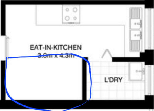
Space in the kitchen
Annie Me
last year
Featured Answer
Sort by:Oldest
Comments (9)

C P
last yearRelated Discussions
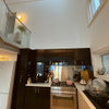
Shaping Spaces: The Kitchen
Comments (1)Small kitchen spaces reinvented to seem larger... This is a design tool that will never go out of style! Check out the image, In this space our eye is drawn outside. How? The walls are a dark colour, so naturally our eyes are drawn to the light outdoors. The high ceilings mixed with the use of windows direct our gaze to the shrubs beyond. Using an island (housing your sink and storage) looking out to an outdoor dining area gives the illusion of additional space.... Because we aren't stuck in a corner looking at the wall. This simple aspect change reinvents this entire home :)...See MoreKitchen design dilemma - is a scullery worth it?
Comments (11)Hmm... as much as I agree that a scullery in the original plans is wasted space the location of the laundry illogical (where is the clothesline, not down the side of the house with its 1m distance to the boundary that's for sure). I'm not sure the second version is really much better. Here's why.... 1. The scullery looks like it's there just to make use of what would otherwise be a useless space in the plans. Typical builders solution, make it into some fashionable do-dad so it looks logical. 2. The laundry behind kitchen makes sense from the plumbing point of view but otherwise it terribly placed. I wouldn't want to walk through my kitchen to do a load of washing. And where is the clothesline? Miles away down the back of the house with the only route between it and the laundry either through the living room or by circumnavigating the entire house via a tiny walkway down the side. Neither are really good solutions. 3. But removing the scullery doesn't actually make your kitchen any larger. All the builder has done is pushed the original floorplan to the back wall, creating a slightly wider walkway in front of the island. wasted space again. 4. Shoehorning the laundry between the bedrooms is also a terrible placement for it. Ideally the laundry should be at the rear entrance to the house close to the clothesline. When you have a large heavy basket of wet washing you don't want to be walking the whole 30m length of your block to hang it out. I'll be honest the floor plan isnt fantastic. That dog leg hallway between the bedrooms created solely because of the pokey family bathroom with no toilet in it. A master ensuite that dwarfs the family bathroom by miles....just why? Shouldn't the most heavily used bathroom in the home actually be as large as an ensuite at least. A laundry accessible only through the kitchen and miles from the clothesline. But of the two plans the original is the least awful just because it places the laundry as far back as possible and it doesn't cost you any extra. These are the problems of using stock plans but you can always accept the layout as is and change it later if it becomes unlivable. If I didn't specifically need a scullery I would forgoe the planned sink in it and instead have it fitted out with cupboards for extra storage space. That way it can be used for any purpose. Who needs a scullery when we have dishwashers?...See MoreWhat to put on the space between entrance and kitchen?
Comments (20)Thanks all for your advice ☺️ Much appreciated! We are still debating whether to keep or remove the shelf unit. The idea of having a small shelf unit with a small pot plant on top (hiding the router as the back of it!🤭) sounds nice as well. If we were to keep a small shelf unit there, as recommended I'd find the one with table height and narrow in depth. As for the colour/material of the side table if we decided to have one, what would you recommend? We have white walls and dark grey carpet. Most pieces of furniture are light beige/white/black, and the dining table (near the wall which is the topic of discussion) has a glass top. I am wondering if something like a tray stand or a narrow (in depth) hall table will suit there. Also as for the colour, while white will brend in with the background wall, black/dark grey aligns with the colour of the carpet - but it may be overpowering.. Would love to hear your thoughts ☺️ And it does seem to be difficult to find a piece of shelf unit for this particular wall and @Jennier, it's amazing that you can build your own piece of furniture! Thanks all for sharing your inspirations....See MoreIdeas for space under Kitchen Bench top
Comments (11)Hi , honestly I think your kitchen looks beautiful, you could always break up the area by putting the stools like the photo I have included, but a lot of high end kitchens don’t have anything, yours is really lovely, you could always find a gorgeous planter for near the corner near stools or a gorgeous vase for the counter, it’s a lovely kitchen....See More
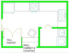
oklouise
last year
Kate
last year
Annie Me
last yearoklouise
last yearAnnie Me
last yearoklouise
last yearKate
last year


Davincicalbourne