

Houzz Tour: It's Easy Being Green in This Californian Bungalow
An alteration and addition to this Melbourne home was inspired by the lush green garden and tones of a Kandinsky print
Rebecca Gross
1 November 2018
Design writer and historian. I write about contemporary architecture and design, and I study cultural history through the lens of architecture, design and visual culture. I have a Masters in the History of Decorative Arts and Design from Parsons The New School for Design, New York. My latest book is called "Ornament is not a crime: Contemporary Interiors with a postmodern twist."
Design writer and historian. I write about contemporary architecture and design,... More
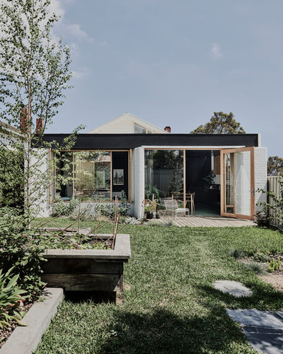
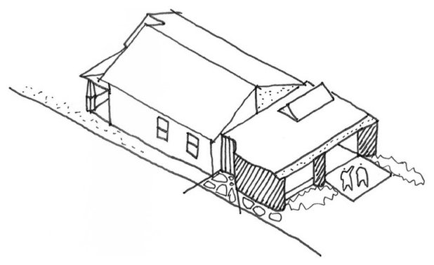
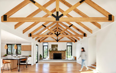
Australians welcomed the Californian bungalow in the early- to mid-1900s. It was seen as an ideal home for Australians to embrace the suburban outdoors and adopt a more informal and modern lifestyle. But look back on those original homes and they still had compartmentalised rooms with little physical or visual connection to the outdoors. That’s why many Californian bungalows are being opened up or extended with modern, open-plan living spaces that achieve the bungalow’s original intention. Taylor Knights designed the alteration and addition for this bungalow in Brunswick West, Melbourne, creating a new living pavilion that connects the original house with the backyard and showcases the client’s art collection.
Houzz at a Glance
Who lives here: A family of three (and their dog), who are creative souls, avid readers and collectors of art and eclectic objects
Location: Brunswick West, Victoria
Size: 130 square metres including the new 50-square-metre extension
Architect: Taylor Knights
Builder: GC+F Construction
Photography: Tom Blachford
Styling: Ruth Welsby
The clients lived in this house for 10 years before they approached Taylor Knights in 2015 to redesign their home. During that time the family had learnt what they loved and what they loathed. “Our client came to us with a clear view to rethink the back section of the original house that, true to its heritage, was a rabbit warren of compartmentalised rooms, and that ultimately had very poor visual and physical connection to the garden beyond,” says architect Peter Knights.
The clients also provided Taylor Knights with a scrapbook of cut-outs and clippings of homes and spaces they loved and felt inspired by. “We generally work with our clients now using platforms such as Houzz as it is so quick and accessible,” says architect James Taylor.
The house has a deep, north-facing backyard and an ivy-lined wall on the eastern side. Taylor Knights created an extension that accommodated one flexible living space. “The clients wanted a calm and comfortable place to retreat, and we created a space with implied zones that offers moments of privacy and seclusion within the open plan,” says Knights.
The house has a deep, north-facing backyard and an ivy-lined wall on the eastern side. Taylor Knights created an extension that accommodated one flexible living space. “The clients wanted a calm and comfortable place to retreat, and we created a space with implied zones that offers moments of privacy and seclusion within the open plan,” says Knights.
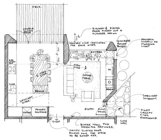
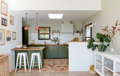
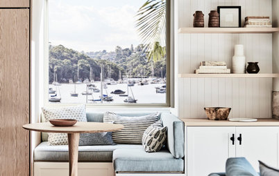
The extension is configured with the kitchen and dining area to one side where it opens to the deck, and the living area to the other side with a daybed along the window.
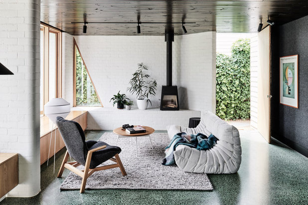
Access to the house is directly into the new pavilion rather than through the original front of the bungalow. The living, dining and kitchen are arranged in and around sculptural masonry walls. “These create nooks and reveals within the open plan, and are spaces that offer a place to sit and share with family, or to retreat within at other times,” says Knights. For example, timber joinery extending between sculptural walls provides storage and a daybed adjacent to the living area.
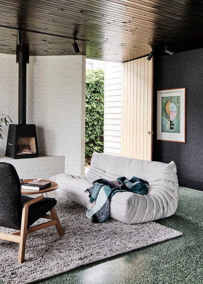
The clients have a diverse collection of art, objects and literature. A much-loved print of artist Vasily Kandinsky’s Upward (Empor), seen on the wall to the right, is a family favourite and its geometric and tonal elements inspired the interior palette.
Taylor Knights was also taken with the vegetation on the property planted by the client, and explored how they could pull this into the project. “Especially the lush, ivy-lined fence in the sideway and the formidable vegetable garden,” says Taylor.
Togo Settee by Ligne Roset: DOMO; Sweeney armchair: Jardan; Mayu floor lamp: Coco Flip; Skantherm Shaker slow-combustion wood heater: Oblica
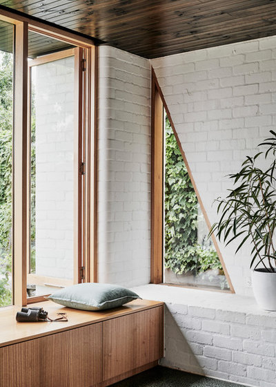
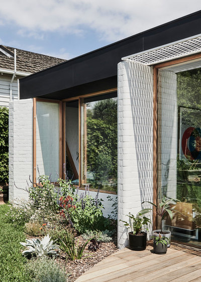
The edges of the masonry walls are curved to visually soften the robustness of the material, and a triangular window along the eastern facade frames views of the ivy.
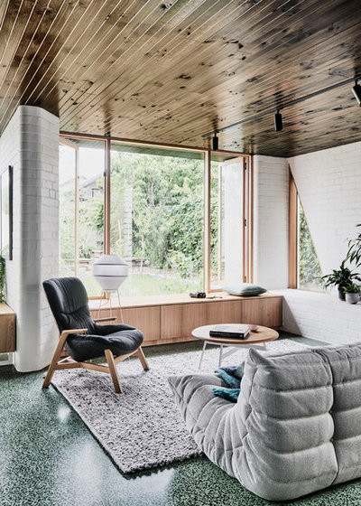
Taylor Knights selected durable materials that would not only physically and visually stand the test of time, but also bring an extra dimension to the space. “Both the clients and ourselves were keen to explore how simple materials such as concrete and brick could become playful, sculptural and colourful,” says Taylor.
The sage-green concrete floor surface draws reference from the Kandinsky artwork and foliage outside. It is a decorative, levelling treatment – “essentially a topping screed” – but it enabled a two-pour concrete slab method. This allowed for insulation between the two slabs, making the space highly thermally efficient.
Imagecrete flooring: Hanson
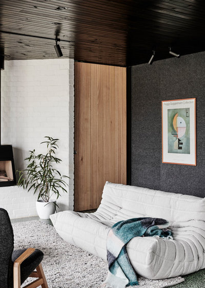
The low-slung ceiling helps create an intimate and cosy atmosphere, and the stained-pine boards reflect light through the windows. Grey acoustic panels cover the living area and entrance wall, adding texture and helping it recede into the background.
Zintra acoustic panels in ash: Baresque
Zintra acoustic panels in ash: Baresque
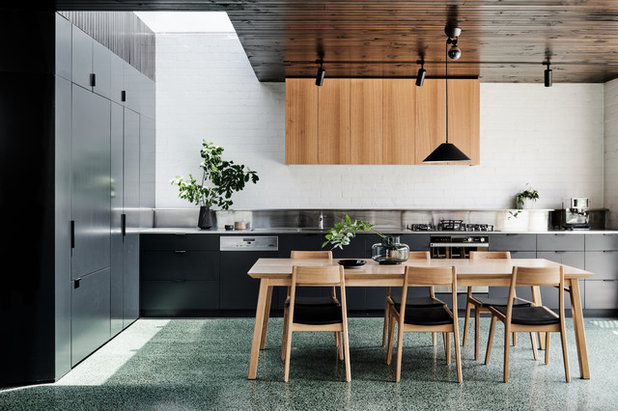
Likewise, dark joinery in the kitchen recedes, while a skylight draws natural light deep into the floor plan. A single galley-style kitchen extends along one wall of the pavilion with the pantry, fridge and storage on the perpendicular wall.
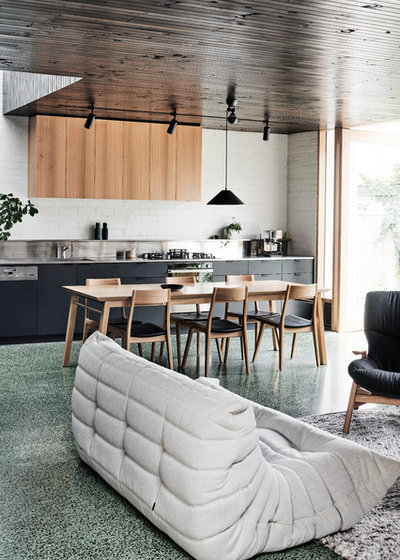
Timber joinery cupboards are above the kitchen bench and conceal the rangehood. Black appliances and drawer handles enhance the seamless effect.
Kitchen joinery: Marant Industries; custom-designed dining table by Taylor Knights, made by Tescher Forge; dining chairs: Temperature Design
Kitchen joinery: Marant Industries; custom-designed dining table by Taylor Knights, made by Tescher Forge; dining chairs: Temperature Design
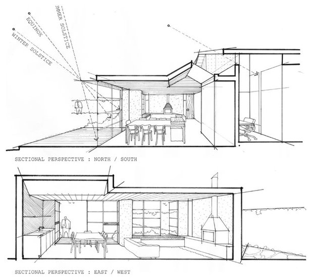
The north-facing aspect of the pavilion means natural light and warmth filters into the interior space throughout the day. “The key sustainability driver in this project was to produce a highly efficient, low-volume addition that ‘did a lot with very little’,” says Knights.
Eaves help control light and solar heat gain, protecting against the high summer sun while allowing low winter sun inside. Floor-to-ceiling glazing forges the strong visual and physical connection between indoors and out, and aids cross ventilation with high openings to the south of the extension.
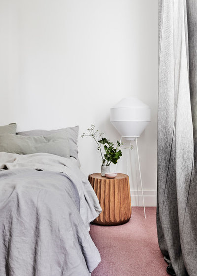
In the front of the house, the clients wanted to inject more colour into the bedrooms, reflecting their eclectic and playful sensibility, so Taylor Knights introduced pink carpet in the master bedroom.
Emi Pod bedside table: anaca studio
Emi Pod bedside table: anaca studio
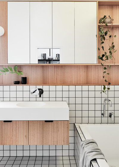
The house has only one bathroom to serve family and guests, so Taylor Knights designed a generous space (in lieu of an additional powder room or ensuite) that would cater to everyone, including washing the dog.
Tell us
What do you love most about this home? Tell us in the Comments. And don’t forget to save the images, like this story, and join the conversation.
More
Love mid-century Australian architecture? Catch up on last week’s Houzz Tour: From Mid-Century Modern to Modern Mid-Century
Tell us
What do you love most about this home? Tell us in the Comments. And don’t forget to save the images, like this story, and join the conversation.
More
Love mid-century Australian architecture? Catch up on last week’s Houzz Tour: From Mid-Century Modern to Modern Mid-Century


Related Stories
Houzz Around The World
France Houzz: A New Island Home With an Old Soul
Check out this young family's welcoming and characterful French island home on Île d’Yeu, which embraces local style
Full Story
Houzz Around The World
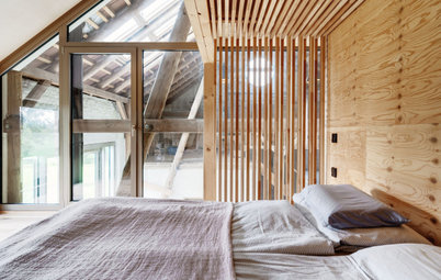
Germany Houzz: A Small Cabin Transformed Into a Forest Retreat
In this secluded area in the Taunus mountains of Germany, a family enjoys their weekends in 29 square metres of space
Full Story
Architecture
Sydney Houzz: Bob Hawke's Iconic Northbridge Home Made Modern
The old home of Australia's longest-serving Labor prime minister and his wife Blanche d'Alpuget has had a new makeover
Full Story
Houzz TV
London Houzz: Tour a Contemporary Loft in an Old Victorian School
Watch and read how a design firm updated this light and airy apartment in an old block with sleek style and warm touches
Full Story
Interior Design
Before & After: A Dream Family Home on Sydney's Waterfront
The owners of this grand six-level home wanted to give it a casual, coastal feel to suit its spectacular setting
Full Story
Architecture
Rural Houzz: A Modern Mountain Retreat Set Among the Gums
Explore a cleverly designed country home that sits quietly within the landscape, while providing views from every room
Full Story
Houzz Around The World
Berlin Houzz: A Touch of Japanese Forest Bathing in a German Home
Beloved memories of Japan come to life with the renovation of this 120-square-metre apartment in Berlin, Germany
Full Story
Houzz Around The World
London Houzz: Daring Colour & Texture Transform a Victorian Home
By Kate Burt
The busy owners of this terrace sought help to design outside their decor comfort zone – the result is a cool classic
Full Story
Colourful Homes
Queensland Houzz: A Cute Cottage Awash With Colour and Pattern
Bold colour, quirky prints and an abundance of art transformed this 1920s cottage into an inviting and relaxing gem
Full Story
Houzz Around The World
Germany Houzz: Creating Summer & Winter Homes in a Converted Barn
One barn, two homes – see how architects designed separate zones for summer and winter living in an old country barn
Full Story
I love this - very well done. The owners have certainly achieved the 'calm and comfortable' they were looking for. I particularly loved the entry with the curved masonry walls for interest and that gorgeously lustrous dark wood ceiling.