


Trend Alert: Softer Colour Palettes on Kitchen Cabinets
Show your softer side with kitchen cabinets in light and airy candy-coloured pastels
Anne Ellard
2 November 2018
Houzz Australia Contributor. Kitchen designer at Kitchens by Kathie in Brisbane, Australia. I strongly believe that above all else, the most important thing when designing a kitchen is creating something that the client loves!
Houzz Australia Contributor. Kitchen designer at Kitchens by Kathie in Brisbane,... More
When a client came to me recently and expressed her desire to use a pastel green-blue colour on her kitchen cabinets, I almost jumped for joy. She presented me with a beautiful wooden ornament of a bird that was partially painted in a soft and calming pale-green – this was the colour she wanted her cabinets matched to. Having spent several years at the start of my career designing beautiful kitchens in character-filled homes in Ireland, I was no stranger to the request for a colour palette that was ‘anything but white’.
It seems that everything from soft furnishings to paint colours have jumped on the soft-pastel bandwagon, and not wanting to be left out, kitchens are following suit. Decor enthusiasts have been adorning their homes with paler shades – the most famous of which is undoubtedly millennial pink – and these colours show little sign of fading away.
Until recently, softer pastel shades have been reserved for bedrooms and the more personal areas of the home, but now, as was all the rage back in the ’50s, these shades are creeping into what many of us consider the most important area of the home – our kitchens – in varying intensity.
Until recently, softer pastel shades have been reserved for bedrooms and the more personal areas of the home, but now, as was all the rage back in the ’50s, these shades are creeping into what many of us consider the most important area of the home – our kitchens – in varying intensity.
When one thinks of soft colours and pastels, feminine candy colours are generally the first visions to spring to mind. However, twenty-first century pastels are being used in a much more grown-up and sophisticated way that is appealing to all ages and genders. Here we answer all the questions you have about what colours to consider and how to incorporate them into your next kitchen renovation.
Why choose pastel colours?
There is no denying that a white-on-white kitchen is timeless and classic and can be incorporated into almost any style of home. However, for those looking to break away from white and add a bit more colour to their lives, pale and subtle colours are a beautiful way to add interest to a space while still maintaining a bright and neutral colour palette.
The beauty of light, pale colours is that they are expansive and airy. They appear to recede as opposed to advance into a space, making it easy to add colour to kitchen cabinetry without making an overpowering statement.
Which shades should I choose?
When choosing a pastel colour for your new kitchen, think sophisticated cotton candy. Pastels have come a very long way since our grandmother’s kitchens. Don’t be afraid to choose a colour that appears quite feminine or even baby-like when viewed on its own. Pastel aqua and mint greens are great colours to consider. Green helps create a calming and tranquil feeling in a space and is also a very natural shade.
When choosing a pastel colour for your new kitchen, think sophisticated cotton candy. Pastels have come a very long way since our grandmother’s kitchens. Don’t be afraid to choose a colour that appears quite feminine or even baby-like when viewed on its own. Pastel aqua and mint greens are great colours to consider. Green helps create a calming and tranquil feeling in a space and is also a very natural shade.
Muted baby pinks and blues are other colours to consider, as are lilacs. All of these colours are subtle and will exude a very peaceful and relaxed feeling in any space, making both homeowners and visitors feel warm and welcome.
Create a similar look to this soothing kitchen palette by using soft greys with slight undertones of any of the before-mentioned colours. It’s a bit more subtle for those who are not big fans of colour, but are keen to try something other than white or grey. Although technically a pastel colour, this is a very understated look and can feel quite sophisticated.
This Colour, There: Where to Use Colour to Enhance Mood
This Colour, There: Where to Use Colour to Enhance Mood
What style of kitchen suits these colours?
Typically, pastel colours are associated with more retro-style kitchens from the ’60s and ’70s or the mid-century style homes of the 1950s, but they are no longer confined to these eras or styles.
Here are some of my favourite kitchen styles in which to use pastel colours, along with tips on how to pull the look together.
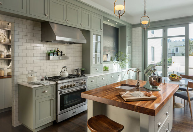
Mid-century style: Mid-century style is having a huge resurgence at the moment, so it is no coincidence that pastels are also having some time in the limelight. In this mid-century style kitchen the soft pink cabinets have a retro feel but the colour is subtle enough not to feel kitch.
Browse marvellous mid-century style kitchens
Browse marvellous mid-century style kitchens
Tip: Wood veneer and glass-fronted cabinets were two strong features in mid-century interiors. Consider accentuating pastel-coloured kitchen cabinets with some statement open shelves in a wood veneer to give it a grown-up feel. Alternatively, opt for a warm, solid-wood benchtop to work on. The warmth of wood will counteract the cool feeling that can often emanate from pastel colours and will ensure the space doesn’t feel insipid.
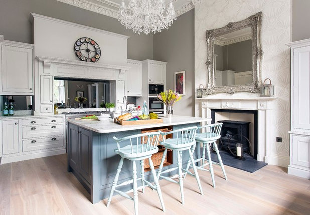
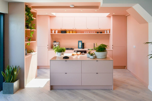
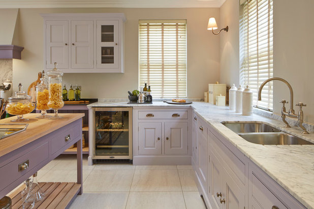
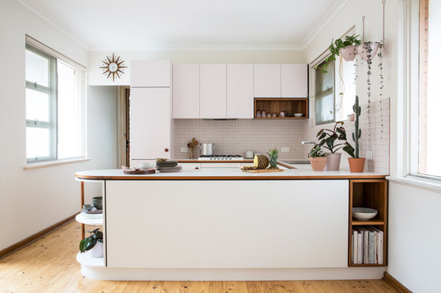
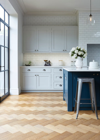
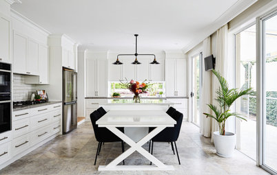
Traditional style: The warm and inviting nature of traditional-style kitchens lends them perfectly to the softer aesthetic of a pastel colour scheme. The combination of the muted-pastel island cabinets and crisp white in this kitchen creates a fresh and inviting look.
When opting to use any shade of colour on kitchen cabinets, one must consider the available natural light in the space and the size of the room to ensure the colour doesn’t become overbearing in the space, even when working with pastels. One way to avoid this is to counter pastel-toned cabinetry with a crisp white or cream-coloured stone benchtop. This will help keep the space light and will also contrast beautifully with any pastel colours.
When opting to use any shade of colour on kitchen cabinets, one must consider the available natural light in the space and the size of the room to ensure the colour doesn’t become overbearing in the space, even when working with pastels. One way to avoid this is to counter pastel-toned cabinetry with a crisp white or cream-coloured stone benchtop. This will help keep the space light and will also contrast beautifully with any pastel colours.
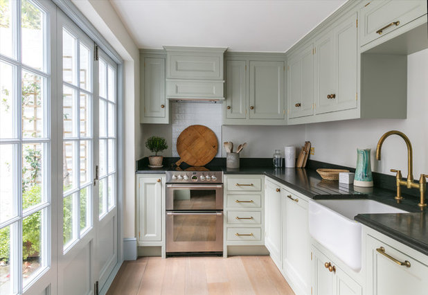
Tip: Black, gold, brass and timber handles are a beautiful addition to any pastel-coloured kitchen, particularly in more traditional or classically styled homes. Here the aged-brass handles and tap stand out against the pale-green cabinetry, making them the real showpieces in the kitchen.
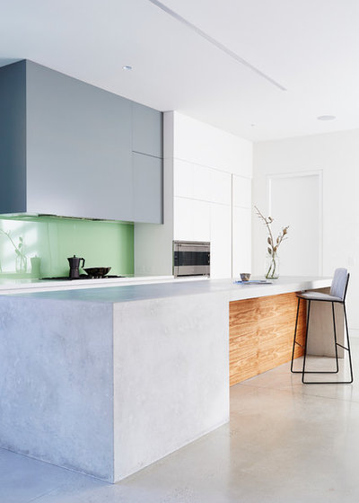
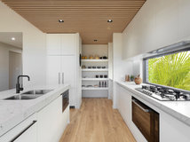
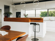
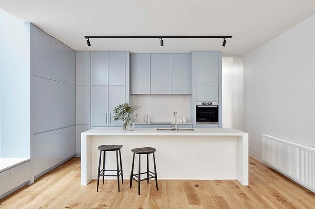
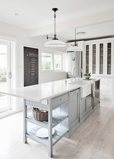
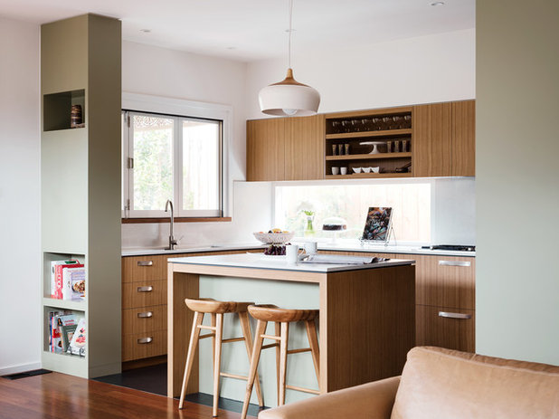
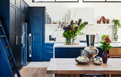
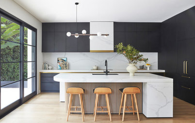
Ultra-modern style: For those who crave an ultra-modern, streamlined, handless kitchen, choosing more muted pastel shades adds a softer aesthetic to the harsher contrast of white, black and grey that is often associated with ultra-modern kitchens.
Tip: Keep the pastel colours to a minimum here by using them as a feature, such as on your splashback, overhead cabinets, or on the back of an island bench. This kitchen has retained a predominantly white and grey-based colour scheme that helps maintain its contemporary edge.
Tip: Keep the pastel colours to a minimum here by using them as a feature, such as on your splashback, overhead cabinets, or on the back of an island bench. This kitchen has retained a predominantly white and grey-based colour scheme that helps maintain its contemporary edge.
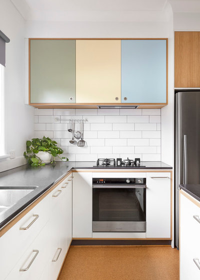
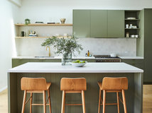
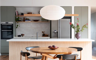
Scandinavian style: Scandinavian style is predominantly defined by a neutral colour palette of crisp white finishes and light timber tones with slight pops of colour.
Here the pastel-coloured overhead cabinets add a perfect pop of colour to this Scandinavian-style kitchen in a fun yet refined way.
Tip: With a bold choice of multiple colours such as those seen here, keep your choice of colour to a minimum, to ensure the space doesn’t start to look kitsch or over-worked.
Adding pastels in other areas
Cabinet fronts are not the only areas of a kitchen where softer shades can be incorporated. For those who still prefer white or off-white cabinets and even benchtops, pastel tones can be introduced in many other ways through design elements and accessories.
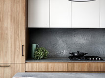
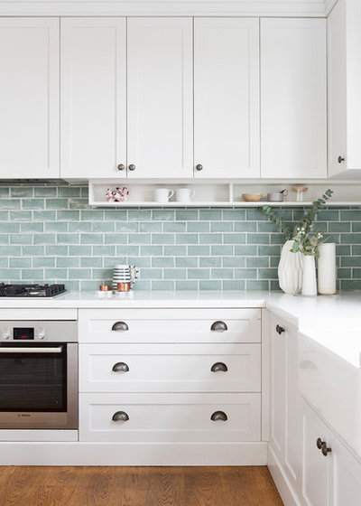
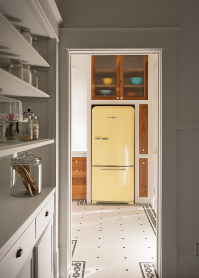
Tiles: Here, the pastel-green splashback tiles add just the right amount of subtle colour to this otherwise all-white kitchen. Splashbacks generally cover a much smaller area than your kitchen cabinetry, so they can feel like a safer place where you can dare to be different.
Cabinet fronts are not the only areas of a kitchen where softer shades can be incorporated. For those who still prefer white or off-white cabinets and even benchtops, pastel tones can be introduced in many other ways through design elements and accessories.
Tiles: Here, the pastel-green splashback tiles add just the right amount of subtle colour to this otherwise all-white kitchen. Splashbacks generally cover a much smaller area than your kitchen cabinetry, so they can feel like a safer place where you can dare to be different.
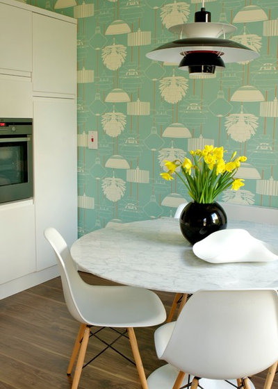
Wallpaper: I just love wallpaper and pastels – the two go hand-in-hand. This retro wallpaper in a soft green adds a fun and interesting element to this combined kitchen and dining space. The dining area instantly feels more intimate despite being situated within the kitchen.
9 Wow-Worthy Mid-Century Wallpaper Designs
9 Wow-Worthy Mid-Century Wallpaper Designs
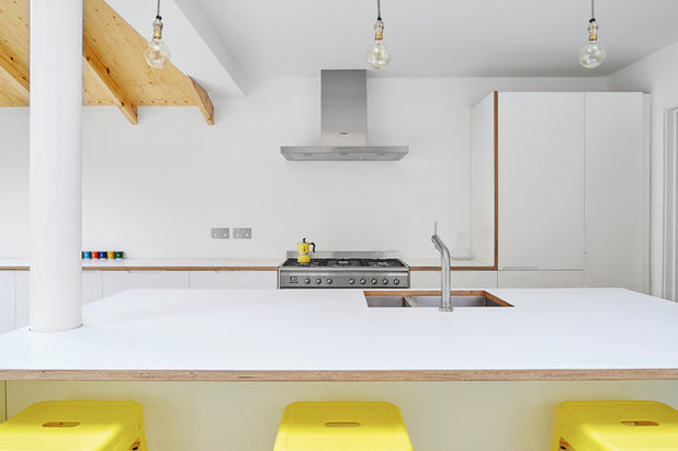
Appliances: Many appliance manufacturers are now producing entire ranges in different colours, from black and red through to baby pink and canary yellow.
If a big-ticket item such as a fridge is committing a little too much to colour, then smaller appliances including kettles and toasters do the trick just as well.
If a big-ticket item such as a fridge is committing a little too much to colour, then smaller appliances including kettles and toasters do the trick just as well.
Have some fun
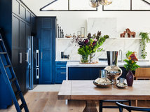
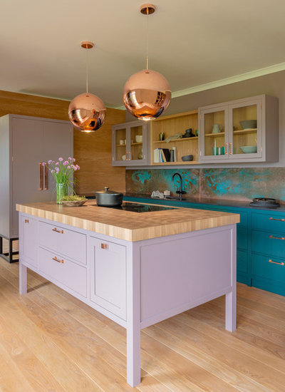
One of the best things about pastel shades is that they work so well against darker and bolder colours. The soft pink and dark- aqua blue pictured here may seem like an unlikely colour combination, but they work well together to create a vivacious yet surprisingly understated scheme.
One of the best things about pastel shades is that they work so well against darker and bolder colours. The soft pink and dark- aqua blue pictured here may seem like an unlikely colour combination, but they work well together to create a vivacious yet surprisingly understated scheme.
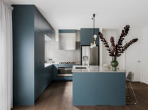
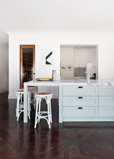
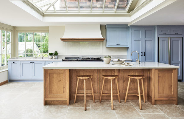
A less bold but just as striking option is to pair a soft pastel shade with a much darker version of the same colour. Pale-blue cabinetry, as seen here, in such a bright open space runs the risk of feeling washed out and almost disappearing into the background. However, the deeper shade of the island ties in with the pastel shade beautifully, pulling it back into the space.
When in doubt, add timber!
Nothing warms a kitchen colour scheme more than the addition of timber, be it solid wood, timber veneer or wood-coloured laminate. Consider timber accent cabinets, open shelves, wooden trims or a solid wood benchtop.
Tell us
Have you, or would you, introduce a light pastel shade in your kitchen? Tell us in the Comments section below, save your favourite images, like this story, and join the conversation.
More
Find a kitchen designer or renovator near you
What are you working on?
Related Stories
Most Popular
Renovation Insight: How to Choose a Kitchen Designer
The right designer can bring your dream kitchen to life – three kitchen designers reveal where to look and what to ask
Full Story
Kitchen Expert Advice
7 Common Kitchen Design Challenges & How Experts Get Around Them
From bad layouts to poor storage, here are seven issues pros come up against (and overcome) in clients' kitchen renos
Full Story
Kitchens
A Good Fit: 10 Questions to Ask a Potential Kitchen Designer
By lwkkitchens
A good designer knows which questions to ask about your kitchen project. But what should you ask them before you sign?
Full Story
Most Popular
8 Dos and Don'ts for a Well-Functioning Butler's Pantry
Having a little help behind the scenes is key to a pristine kitchen – here's how to create a functional butler's pantry
Full Story
Most Popular
Key Measurements to Consider When Designing the Perfect Kitchen Island
By Anne Ellard
Discover the correctly proportioned kitchen island bench dimensions so your space works as well as it can
Full Story
Kitchen Renovations
10 Times You Should Hire a Kitchen Designer
These specialists can solve layout issues, save costs, update an older space and create custom design details
Full Story
Popular Houzz Series
How Practical Is... Handleless Joinery?
Handleless joinery is popular in modern homes. But how suitable are cupboards that can only be opened with a touch?
Full Story
Renovation Guides
Room by Room: Experts on Ways to Avoid Common Renovation Blunders
From the kitchen to the garden, and all areas in between, experts identify common mistakes and share priceless insights
Full Story
Most Popular
From Planning to Pendants: Kitchen Lighting Essentials
By Joanna Tovia
This valuable guide will give you all you need to know about choosing kitchen lighting for fabulous form and function
Full Story
Kitchen Renovations
A Kitchen That Uses Special Elements to Punch Above Its Weight
This couple wanted a well-designed kitchen that incorporated their pre-bought furniture; this designer delivered
Full Story
Yay, lets see some individuality in our homes for a change, after all we live our lives in them and it is time we went back to reflecting just who we are.
Five years ago I renovated my kitchen and sick of all the white I went for a soft pastel yellow, for all cabinetry and walls. The kitchen was only small so having everything the same colour really enlarged the look of the room. The new all black ovens and hotplates these days really sharpen the pastel otherwise I had everything white which kept a fresh, clean look in the room.
So five years on I've just repeated this colour scheme again in a small kitchen making it look so much more spacious and it is really getting a lot of attention. I find yellow a very cheerful colour, the room gets a lot of sun and when the kitchen is such a work room, it makes the kitchen a great room to be in.
Don't be frightened to let your head go, it is your home, if it is a colour you really like you will love living with it.
I was so pleased to find this article as I like to be different rather than do what everyone else is doing ie No, I don't want a white kitchen Yes - I'm an embarrassment when it comes to fashion. Yes - green was the kitchen colour in the 1980's - Whatever - so I'll tone down the green this time but I still want a pastel soft colour like a mint green. I've had a flannel colour kitchen for the last 11 year and nobody else picked that colour but my flannel kitchen started appearing in more homes over the coming years although it wasn't as popular as white. Who cares! I still love it, just want a change in my new home. Pick whatever colour makes you happy as you have to spend a lot of time living with it. I've been getting up every morning for 11 years thinking - what a beautiful house I live in - so glad I spent a year getting it planned and perfected in every way I could. Good luck!