


Room of the Week: A Kitchen Makover in a Pettit+Sevitt Home
Mid-century touches and a nature-inspired palette are the makings of this kitchen in an iconic project home
Georgia Madden
18 February 2019
In a Q&A format, we talk to the designers – and examine the creative thinking – behind some of Houzz’s most loveable rooms.
Images by Thomas Dalhoff
Answers by Karen Aston, principal designer at Karen Aston Design
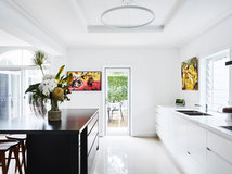
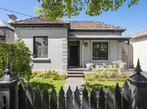
Who lives here: A family with two teenagers, a cat and chickens
Location: Lindfield, NSW
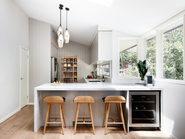
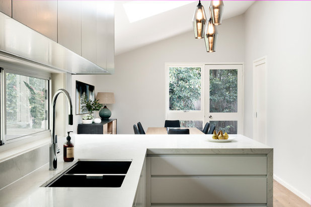
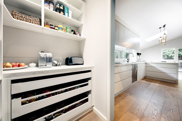
Room purpose and size: A 34-square-metre kitchen-diner with a walk-in pantry (the kitchen alone is 17.4 square metres)
Answers by Karen Aston, principal designer at Karen Aston Design
Who lives here: A family with two teenagers, a cat and chickens
Location: Lindfield, NSW
Room purpose and size: A 34-square-metre kitchen-diner with a walk-in pantry (the kitchen alone is 17.4 square metres)
Brief
The clients wanted to update the look and layout of their kitchen. The existing kitchen was functional and reasonably sized, but it looked tired and lacked pantry storage.
Initially, the clients were not sure about the style, colours and finishes they wanted, so I assisted them in their research. They wanted their kitchen to have a sophisticated look and favoured cleaned lines, whites and neutrals. It also needed to feel welcoming as the family likes to entertain.
Starting point
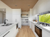
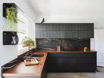
The house has unique architectural bones, being a classic mid-century Pettit+Sevitt project-home design – an influence we were keen to incorporate into the new kitchen.
The clients were open to including some mid-century features into the new kitchen design in a contemporary way, hence the introduction of the classic V-board panelling that was painted in a contemporary grey rather than a traditional stained-timber finish.
The pendant light trio was selected for its mid-century style and shape.
Challenges you worked around
None.
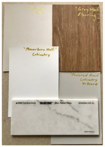
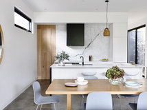
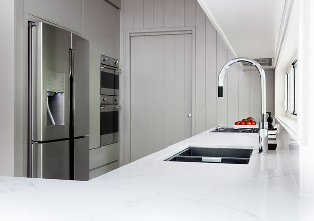
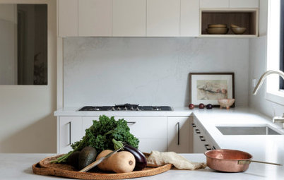
Colour and materials palette
Key design aspects
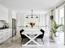
Colour palette: White, green-grey and mid-tone timber.
The colour palette was informed by the clients’ preference for whites and pale neutrals, and the soft green-greys of the bush garden outside the window.
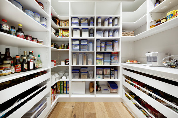
Materials palette: Benchtop in marble-look Talostone quartz Carrara Gioia; base cabinets finished in Dulux Manorburn polyurethane satin finish; tall cabinetry wall and overhead cabinets finished in Dulux Powered Rock polyurethane satin finish; V-board panelling on bulkhead, wall and door leading to the pantry all painted in Dulux Powdered Rock; other walls painted in Dulux Ghosting; white melamine cabinetry inside pantry; engineered oak flooring from Solomons Flooring Willoughby.
Key design aspects
Colour palette: White, green-grey and mid-tone timber.
The colour palette was informed by the clients’ preference for whites and pale neutrals, and the soft green-greys of the bush garden outside the window.
Materials palette: Benchtop in marble-look Talostone quartz Carrara Gioia; base cabinets finished in Dulux Manorburn polyurethane satin finish; tall cabinetry wall and overhead cabinets finished in Dulux Powered Rock polyurethane satin finish; V-board panelling on bulkhead, wall and door leading to the pantry all painted in Dulux Powdered Rock; other walls painted in Dulux Ghosting; white melamine cabinetry inside pantry; engineered oak flooring from Solomons Flooring Willoughby.
Key pieces of furniture/fittings:
Abey Luz Goose Neck pull-out mixer tap. Abey Schock black sink.
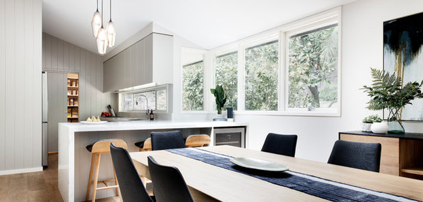
In the dining room, contemporary furniture pieces with a Scandinavian feel were selected from designers such as Ethnicraft.
Abey Luz Goose Neck pull-out mixer tap. Abey Schock black sink.
In the dining room, contemporary furniture pieces with a Scandinavian feel were selected from designers such as Ethnicraft.
Thinking behind the arrangement of furniture/fixtures:
The galley-style layout of the kitchen was retained as other designs could not be achieved without major structural changes and expense. However, this layout was improved both aesthetically and functionally with some minor structural changes to the walls and windows.
These included:
The galley-style layout of the kitchen was retained as other designs could not be achieved without major structural changes and expense. However, this layout was improved both aesthetically and functionally with some minor structural changes to the walls and windows.
These included:
- Adding a walk-in pantry to the rear of the kitchen by stealing space from the adjoining home office.
- Lowering the height of the window above the sink and adding a second window beside it to create one long, contemporary splashback-style window, with space for wall cabinets above it.
Why do you think this room works?
The palette is contemporary and calming, and reflects the surrounding bush. The selected finishes and subtle nods to the mid-century design of the house integrate smoothly with other areas of the house, creating the contemporary update the clients were hoping to achieve. The kitchen/dining/pantry space is now incredibly functional with more than enough storage – and all without the huge structural changes or expense of extending.
Tell us
What do you love best about this kitchen? Tell us in the Comments below. And don’t forget to save your favourite images, like this story, and join the conversation.
More
Want more kitchen inspo? Check out last week’s Room of the Week: An Affordable Art Deco-Inspired Kitchen
Related Stories
Kitchens
A Kitchen That Uses Special Elements to Punch Above Its Weight
This couple wanted a well-designed kitchen that incorporated their pre-bought furniture; this designer delivered
Full Story
Kitchens
An Interplay of Light, Dark & Colour Creates a Striking Kitchen
All-white joinery, floors and walls is foiled by a handsome island bench and contemporary artworks in this handy kitchen
Full Story
Kitchens
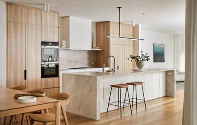
Before & After: A Beachy Sydney Kitchen Sans the Coastal Cliché
A fresh materials palette gives a sense of place, while avoiding style stereotypes, to uplift this timeless new kitchen
Full Story
Kitchens
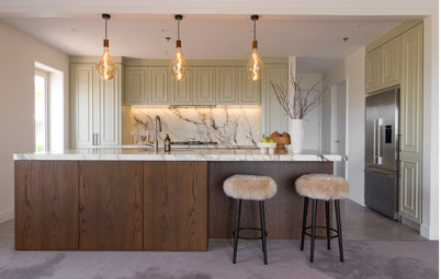
Before & After: A Penthouse Kitchen High on Glamour & Substance
This NZ penthouse kitchen needed to open up to the views and adjacent dining area. The designer served up that and more
Full Story
Projects Born on Houzz
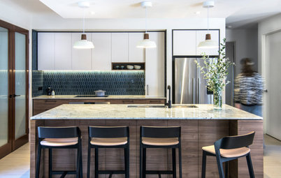
Before & After: An Open-Plan Kitchen Goes from Boring to Boss
After scouting Houzz for designers, this couple found the right match in a local designer who transformed their space
Full Story
Kitchens
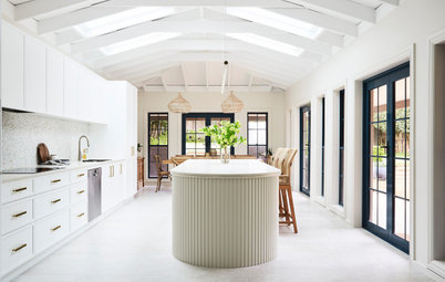
Before & After: A Cathedral-Like Kitchen With Soft Texture & Tone
High ceilings, curves, fluted features and beautiful tactile details elevate this white kitchen into the stratosphere
Full Story

Kitchens
Before & After: A Scandi-Style Kitchen in NZ That's Light & Airy
See this sweet, bright kitchen and dining space in Wellington, which had environmental concerns at the heart of its plan
Full Story
Kitchens
Before & After: A Quietly Quality Kitchen That Kept Its Layout
The layout couldn't be changed, but a clever approach to storage and colour transformed this Melbourne kitchen
Full Story
Projects Born on Houzz
Room of the Week: A Reader's Bathroom Inspired by Houzz
When you're planning a new bathroom, where do you look for ideas? Houzz, of course! See how this reader did it
Full Story
Kitchens
Room of the Week: A Scandi Kitchen That Doubles as a Workspace
Pared-back lines, a clay-coloured ceiling and a cooking/storage 'pod' star in this designer's family kitchen/work zone
Full Story
Liz - they have used that dead corner for a drinks fridge on the other side of the island by the look of the pix.