Project Of The Week
Architecture
Renovating
Popular Houzz Series
Popular Houzz Series
Appears in
See also
Fun HouzzFrom The ProsHouzz Around The WorldProject Of The WeekStickybeak Of The WeekQuizzesCreatives At HomeAt Home With...Best Of The WeekRoom Of The WeekDesigner Profiles3 Things I Wish My Clients KnewHow Do I...Buyer's GuidesExpert EyeInnovation AlertSo Your Style Is...Spotted!Picture PerfectBefore & AfterBudget BreakdownHome TimeMade Local
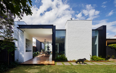
Coming of Age: From Student Digs to a Modern, Light-Filled Home
Step inside this startling transformation of a Victorian house from student accomodation to luxe, contemporary abode

In this Q&A series, we turn the spotlight on one thought-provoking renovation or extension each week. Here, Andrew Child at Andrew Child Architecture reveals how he took a Victorian house with a rabbit warren of six bedrooms and 2.5 bathrooms and turned it into a stunning three-bedroom, 2.5-bathroom home with generous living spaces and enviable indoor-outdoor flow.
Gained
- A new and improved layout that reduced the number of bedrooms to create large new living spaces.
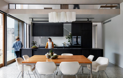
- A new open-plan living/kitchen/dining area with a double-height ceiling.
- A new six-square-metre laundry extension to the kitchen.
- A new casual living/television room in the original Victorian part of the house.
- A new ensuite to the master bedroom.
- A new study and main bathroom in the 1970s extension.
- A new roof and ceiling to the 1970s extension.
- New built-in storage.
- Landscaping to the front and rear of the house, including a new rear pergola.
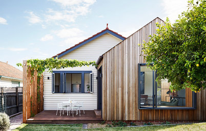
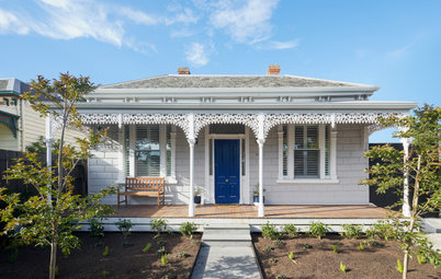
The original facade
What was the house like originally?
It was comprised of two distinct parts:
What was the house like originally?
It was comprised of two distinct parts:
- An elegant single-storey, double-fronted Victorian brick house.
- A tired but serviceable two-storey 1970s brick addition.
The original ground floor
The original hallway
What was your brief?
To transform a serviceable, but tired and awkward, six-bedroom student rental property into a delightful, high-quality home for a professional couple.
The owners are a couple en route to becoming empty nesters, who were looking for a place that could equally be their primary home or a city pad.
One of the original bathrooms
What problem or constraint did this project address?
Lack of delight in the home, poor connection with outdoor spaces and inadequate storage.
What problem or constraint did this project address?
Lack of delight in the home, poor connection with outdoor spaces and inadequate storage.
Original ground-floor layout
What were the clients’ must-haves?
What were the clients’ must-haves?
- A home specifically tailored to the needs of the owners and their family.
- Better indoor-outdoor connection.
- More storage.
- New or renovated bathrooms.
- A small study space to enable periods of working from home.
- Dedicated wine storage.
Original first-floor layout
New ground-floor layout
What exactly did you do?
What exactly did you do?
- Renovated three of the four bedrooms in the original Victorian part of the house. Special care was taken to preserve the original character and features of these rooms with the fireplaces, cornices and architraves largely retained.
- Turned one of the four renovated bedrooms into a new ensuite and turned another into a new living/television room.
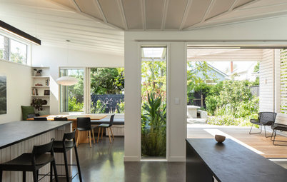
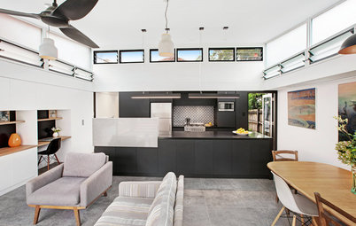
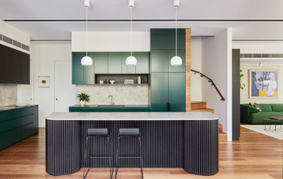
- Thoroughly renovated the downstairs part of the 1970s extension and added a new open-plan kitchen/living/dining room.
- Added a new six-square-metre laundry side addition adjacent to the kitchen.
- Renovated the original powder room in the 1970s extension.
New first-floor layout
- Altered and refurbished the upstairs part of the existing 1970s extension.
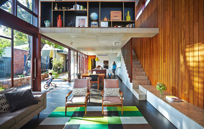
- Removed one of the two upstairs bedrooms to create a double-height void in the new kitchen/living/dining space below.
- Removed the original upstairs bathroom. Added in a new bathroom and study.
- Replaced the roof and ceiling of the 1970s extension.
- Added built-in storage to the new kitchen and living spaces.
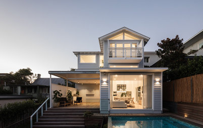
- Added new landscaping to the front and back of the house, including a new steel pergola to the rear of the house and a new front porch.
What was the budget?
Approximately $400,000.
Approximately $400,000.
Where did most of the budget go?
We aimed to limit structural and new building work so that most of the budget could be directed to new materials, finishes and accessories.
We aimed to limit structural and new building work so that most of the budget could be directed to new materials, finishes and accessories.
How does the new work address the constraints of the original home?
- Lack of delight: The new double-height dining space has created spatial drama and a new focal point for the home.
- Poor connection with outdoors: A double-height dining space with associated double-height windows opens the main living spaces of the home to the garden.
- Lack of storage: Added new built-in storage throughout the existing parts of the house. The new side-addition laundry reduces pressure on the kitchen, allowing extra space for built-in storage.
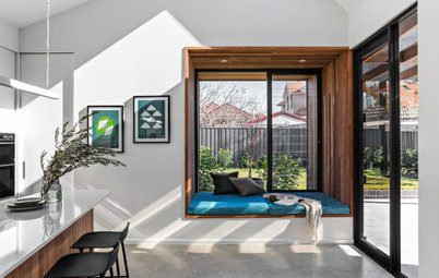
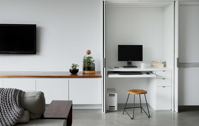
The new study is located upstairs directly above the kitchen bench and overlooks the dining area below. When seated at the desk, you have a view to your right across the rear yard.
What are the key features of this project?
- A new double-height dining area was created by removing an upper-level bedroom. This new focal point for the home has created drama among the relatively modest ceiling heights of the existing 1970s addition, and has opened the living areas to the sky and trees.
- The introduction of contemporary materials has reinvigorated the 1970s extension, such as powder-coated aluminium windows and other black metal elements.
- A new small side-addition laundry relieves pressure on the kitchen, and creates more space to add custom built-in storage within the home.
- The new ensuite within one of the existing Victorian rooms is a particular area of delight for the owners. It uses custom-designed, low-height vanity walls to create separate spaces in the room without detracting from its spacious feel and proportions.
- A new roof and ceiling to the existing 1970s rear extension sharpens the look of the extension when viewed from the rear yard.
One of the original bedrooms in the Victorian part of the house was transformed into a new ensuite
What challenges did you face with this project?
To create an outcome of high quality within a largely existing home on a reasonably restrained budget.
What challenges did you face with this project?
To create an outcome of high quality within a largely existing home on a reasonably restrained budget.
A custom-designed low-height vanity wall creates separate, luxurious spaces in the ensuite without detracting from the generously proportioned feel of the space
Another view of the ensuite
Key fittings
Key fittings
- Astra Walker Icon brass tapware and accessories in ensuite.
- Astra Walker Traccia sinks in ensuite.
- Caroma Liano Nexus tapware and sink in ensuite.
A new, more efficient bathroom was installed in approximately the same location as one of the original bathrooms in the upstairs rear 1970s addition.
One of the original bedrooms at the front of the Victorian part of house was redesigned as a casual living/television room. It also serves as a music room for the guitar-playing father.
This is a view towards the other end of the new living/television room.
This timber-veneer unit was custom-designed to hold six electric guitars and cases, various associated effects/cables, plus media equipment for the television. It was important to keep this unit as low and compact as possible so it did not overwhelm the proportions and features of the original Victorian room.
Interior materials palette
Paint colours
- Tongue n Groove European Oak engineered floorboards.
- Honed Carrara marble kitchen benchtop from Amalgamated Stone.
- National Tiles black ceramic penny-round tiles in ensuite and bathroom.
- National Tiles white ceramic penny-round tiles in bathroom.
- Ghiaccio Plus white blend glass-mosaic tiles on kitchen splashback from Bisazza.
- Custom-designed study screen with white powder-coated aluminium angles.
Paint colours
- Dulux Berkshire White and Dulux Black for the internal and external Victorian parts of the house.
- Dulux Fair Bianca half-strength and Dulux Black for the internal and external parts of the 1970s addition.
Exterior materials palette
Tell us
What’s your favourite feature in this stunning home? Tell us in the Comments and don’t forget to save your favourite images, like this story and join the conversation.
More
Want more reno inspiration? Don’t miss this Houzz Tour: A Hamptons-Inspired Bungalow That Blends Old and New
- Bluestone external paving to the rear of the house.
- Black powder-coated aluminium windows.
- Black powder-coated aluminium and steel for other exterior elements, such as the new pergola.
Tell us
What’s your favourite feature in this stunning home? Tell us in the Comments and don’t forget to save your favourite images, like this story and join the conversation.
More
Want more reno inspiration? Don’t miss this Houzz Tour: A Hamptons-Inspired Bungalow That Blends Old and New

Sponsored
Sponsored
Answers by Andrew Child, principal at Andrew Child Architecture
Who lives here: A couple, their grown-up child, and occasionally their second adult child or visitors
Location: Toorak, Victoria
Original size: 209 square metres
Size after extension: 203 square metres
Number of bedrooms and bathrooms originally: Six bedrooms and 2.5 bathrooms
Number of bedrooms and bathrooms after works: Three bedrooms and 2.5 bathrooms
Architect: Andrew Child Architecture
Builder: Stage Constructions
Structural engineer: Stantin Consulting