Popular Houzz Series
Popular Houzz Series
Appears in
See also
Fun HouzzFrom The ProsHouzz Around The WorldProject Of The WeekStickybeak Of The WeekQuizzesCreatives At HomeAt Home With...Best Of The WeekRoom Of The WeekDesigner Profiles3 Things I Wish My Clients KnewHow Do I...Buyer's GuidesExpert EyeInnovation AlertSo Your Style Is...Spotted!Picture PerfectBefore & AfterBudget BreakdownHome TimeMade Local
17 Awkwardly Shaped Rooms That Are Beautifully Designed
Struggling with a tricky floor plan? Feast your hungry eyes on homes that use non-conforming angles to their advantage

When your floor plan throws you a defiant angle or a room is the embodiment of architectural mutiny, don’t despair. With some smart planning and beautiful decorating, even the most delinquent spaces can be straightened out or embraced in stunning, non-rectilinear ways. Here are 17 homes from around the world that have done just that.
And remember, you can get more details of a project and see more of a professional’s work, including their contact details, by clicking on an image.
And remember, you can get more details of a project and see more of a professional’s work, including their contact details, by clicking on an image.
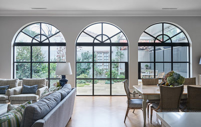
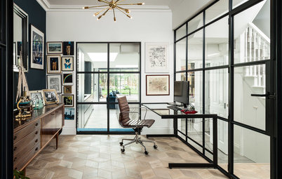
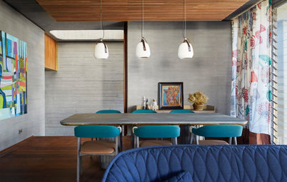
…In fact, the designer has even created a hidden office area off the seating zone, bathed in sunshine and views.
Find an interior designer near you on Houzz for clever customised solutions for your home
Find an interior designer near you on Houzz for clever customised solutions for your home
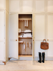
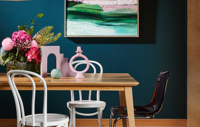
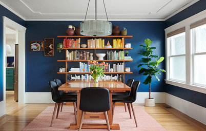
2. Location: USA
Why we love it: Bet you didn’t even notice the angles of this room at first glance, thanks to the symmetrical decoration that smoothes them out.
Why we love it: Bet you didn’t even notice the angles of this room at first glance, thanks to the symmetrical decoration that smoothes them out.
3. Location: Stockholm, Sweden
Why we love it: Rather than try to disguise the radiating lines of this room, the designer has chosen to embrace them. The arrangement of furniture and cabinetry along the periphery has the effect of opening out the fan-shaped room, giving the illusion of space.
Why we love it: Rather than try to disguise the radiating lines of this room, the designer has chosen to embrace them. The arrangement of furniture and cabinetry along the periphery has the effect of opening out the fan-shaped room, giving the illusion of space.
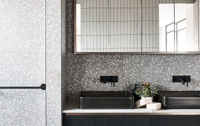
4. Location: Stockholm, Sweden
Why we love it: Can you spot the offending angle in this room? The bath surround blurs it cleverly by tapering in the foreground and widening towards the window. This has the added bonus of creating a spot to rest toiletries in the far-left corner of the bath. Hidden genius.
Why we love it: Can you spot the offending angle in this room? The bath surround blurs it cleverly by tapering in the foreground and widening towards the window. This has the added bonus of creating a spot to rest toiletries in the far-left corner of the bath. Hidden genius.
5. Location: Sydney, NSW
Why we love it: It would be tricky to place the bed in any other position in this room, with the angle of the fireplace wall and the French doors opening inwards (yes, that’s really a thing in Victorian homes). However, running the rug perpendicular to the balcony wall anchors the bed and draws a visual line from the door of this bedroom to the balcony, uniting both sides.
Why we love it: It would be tricky to place the bed in any other position in this room, with the angle of the fireplace wall and the French doors opening inwards (yes, that’s really a thing in Victorian homes). However, running the rug perpendicular to the balcony wall anchors the bed and draws a visual line from the door of this bedroom to the balcony, uniting both sides.
6. Location: Moscow, Russia
Why we love it: Sometimes the tight end of acute angles leaves you with limited options to create a room with purpose. In these cases, consider embracing the spatial restrictions rather than resisting them. Can’t make something functional out of a teeny, challenging corner? Dress it up as a nook instead and site it with a chair, small side table, statement pendant and some jazzy wallpaper.
Why we love it: Sometimes the tight end of acute angles leaves you with limited options to create a room with purpose. In these cases, consider embracing the spatial restrictions rather than resisting them. Can’t make something functional out of a teeny, challenging corner? Dress it up as a nook instead and site it with a chair, small side table, statement pendant and some jazzy wallpaper.
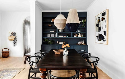
7. Location: Paris, France
Why we love it: It’s how the lines of this room have been sneakily disguised that draws our attention. By specifying black for the kitchen units, the designer has faded the odd angles into the background and used them to frame the rest of the colourful space, where they now behave quite nicely, thank you very much. It’s technicolour artistry at its finest.
Why we love it: It’s how the lines of this room have been sneakily disguised that draws our attention. By specifying black for the kitchen units, the designer has faded the odd angles into the background and used them to frame the rest of the colourful space, where they now behave quite nicely, thank you very much. It’s technicolour artistry at its finest.
8. Location: London, UK
Why we love it: Many a homeowner has cursed ‘out, damned stairs!’ when trying to account for level changes in a small or stubborn floor plan. This sharp line proves that you can have your stairs and bench space too with some smart planning, and don’t always need to disguise challenging angles.
Why we love it: Many a homeowner has cursed ‘out, damned stairs!’ when trying to account for level changes in a small or stubborn floor plan. This sharp line proves that you can have your stairs and bench space too with some smart planning, and don’t always need to disguise challenging angles.
9. Location: Sydney, NSW
Why we love it: How do you fit in a kitchen below a run of stairs without blocking out the light? With open treads, it turns out, which this home has made a nifty feature of.
Why we love it: How do you fit in a kitchen below a run of stairs without blocking out the light? With open treads, it turns out, which this home has made a nifty feature of.
10. Location: Sydney, NSW
Why we love it: There’s something seductive about architectural curves… until you try to decorate the room with square or rectangular furniture. If you’re blessed with undulating walls or features like these, it may be time for a circular rug and a custom curved sofa to enter your life… or living room.
Why we love it: There’s something seductive about architectural curves… until you try to decorate the room with square or rectangular furniture. If you’re blessed with undulating walls or features like these, it may be time for a circular rug and a custom curved sofa to enter your life… or living room.
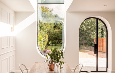
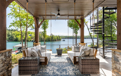
11. Location: London, UK
Why we love it: Part-room, part-threshold, part-transition zone, the statement design of this area has given rise to a restful indoor-outdoor spot from what could have been a tricky part in the floor plan.
Browse more stunning living rooms by Australian designers
Why we love it: Part-room, part-threshold, part-transition zone, the statement design of this area has given rise to a restful indoor-outdoor spot from what could have been a tricky part in the floor plan.
Browse more stunning living rooms by Australian designers
12. Location: Brisbane, Queensland
Why we love it: When your home presents you with a challenging angle, try to consider it in section-view, rather than in plan. Here, bespoke joinery on the ceiling mirrors the form of the banquette below it. This creates a beautiful feature that’s also functional for display and storage.
Why we love it: When your home presents you with a challenging angle, try to consider it in section-view, rather than in plan. Here, bespoke joinery on the ceiling mirrors the form of the banquette below it. This creates a beautiful feature that’s also functional for display and storage.
13. Location: Gold Coast, Queensland
Why we love it: Hands up who spotted the angles coursing across the floor and ceiling here. They fade into subtle submission compared with the bold form and bright colours of the rectilinear kitchen…
Why we love it: Hands up who spotted the angles coursing across the floor and ceiling here. They fade into subtle submission compared with the bold form and bright colours of the rectilinear kitchen…
…Take a peek at the space to the right of the kitchen – a concealed work station that can be closed off with that handsome charcoal door. Now that’s a nifty use for an unused corner if we ever did see one.
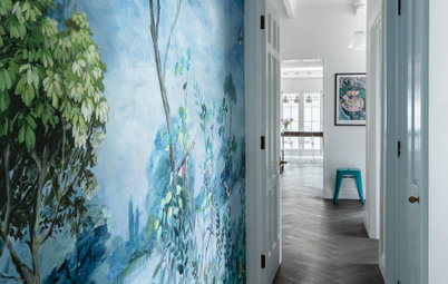
14. Location: Stockholm, Sweden
Why we love it: There’s something forgiving about natural light – welcome it into an awkwardly laid-out space via a dormer window and a skylight and it transforms the meddlesome angles into a heaven-sent space.
Why we love it: There’s something forgiving about natural light – welcome it into an awkwardly laid-out space via a dormer window and a skylight and it transforms the meddlesome angles into a heaven-sent space.
15. Location: Malmo, Sweden
Why we love it: This kitchen wall could be mistaken for living room joinery at first glance, thanks to the generous proportions of those drawers and the low splashback that runs the length of the room. By treating kitchen cabinetry more like custom joinery and siting the table by the bay window, the room’s two functions – cooking and dining – merge together harmoniously in one oblique space.
Why we love it: This kitchen wall could be mistaken for living room joinery at first glance, thanks to the generous proportions of those drawers and the low splashback that runs the length of the room. By treating kitchen cabinetry more like custom joinery and siting the table by the bay window, the room’s two functions – cooking and dining – merge together harmoniously in one oblique space.
16. Location: Gothenburg, Sweden
Why we love it: The charm of this cheeky space lies in its odd angles and offbeat design that have been deliberately emphasised. Its cubby-like character is tempered with a uniform palette… and of course, the splash of verdant greenery is the perfect decorative touch.
Why we love it: The charm of this cheeky space lies in its odd angles and offbeat design that have been deliberately emphasised. Its cubby-like character is tempered with a uniform palette… and of course, the splash of verdant greenery is the perfect decorative touch.
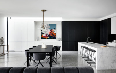
17. Location: Sydney, NSW
Why we love it: And to finish, this kitchen proves how non-rectilinear designs that may first appear difficult can, on second thoughts, add a yielding beauty to a space that wouldn’t exist if every angle was a right angle. Perhaps it’s time we thought outside the square.
Your turn
Which of these spaces do you love the most? Tell us in the Comments below. And while you’re at it, like this story, save the images and join the conversation.
More
Need more visual inspiration? Don’t miss last week’s Picture Perfect: 30 Times Classic Blue Made a Space

Sponsored
Sponsored
Why we love it: This odd-shaped space contends with a lot: French doors that open onto a balcony, a hidden study, a separate entrance, a living area and a dining zone. But despite the odd angles and multiple flow points, the layout works beautifully – in part due to the sofa that acts as a room divider…