Room Of The Week
Popular Houzz Series
Popular Houzz Series
Appears in
See also
Fun HouzzFrom The ProsHouzz Around The WorldProject Of The WeekStickybeak Of The WeekQuizzesCreatives At HomeAt Home With...Best Of The WeekRoom Of The WeekDesigner Profiles3 Things I Wish My Clients KnewHow Do I...Buyer's GuidesExpert EyeInnovation AlertSo Your Style Is...Spotted!Picture PerfectBefore & AfterBudget BreakdownHome TimeMade Local
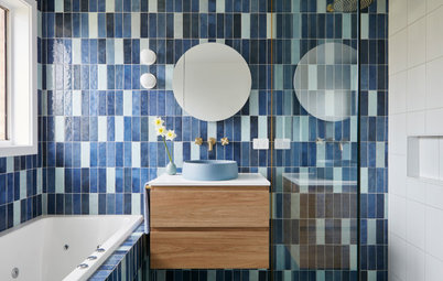
Room of the Week: From 1970s Horror to Modern Bathroom Beauty
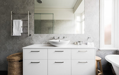
Statement tiles laid in an unusual way are the star of the show in this chic bathroom redesign

In a Q&A format, we talk to the designers – and examine the creative thinking – behind some of Houzz’s most loveable rooms.
Brief
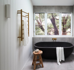
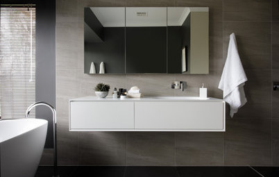
The brief was for some wow factor – this is the main bathroom serving the master bedroom, but it’s also used by guests in the nearby living area. The bathroom needed to be spacious, functional and impressive. There is a second bathroom serving the other three bedrooms downstairs.
What were the client’s must-haves?
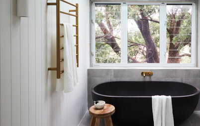
- A bath tub (freestanding if possible).
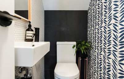
- A toilet out of view.
- Wow factor.
How would you describe this project?
The bathroom was part of a full internal renovation of this two-storey 1970s brick home. It involved the reconfiguration of the layout on both levels, a new kitchen and new decor throughout.
What wasn’t working about the original bathroom?
Everything! Think pink tiles and a toilet in full view from the doorway.
Starting point
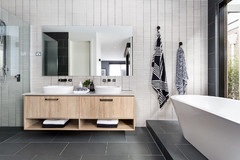
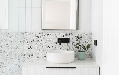
An idea of a subtle transition or division between the wet and dry parts of the room – which we achieved with the tile layout.
Where did most of the budget go?
On labour and decorative tiles.
An idea of a subtle transition or division between the wet and dry parts of the room – which we achieved with the tile layout.
Where did most of the budget go?
On labour and decorative tiles.
Key design aspects
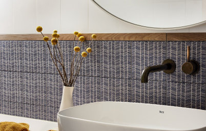
Colour palette: Pale grey, white and warm timber.
Paint colours: Dulux Natural White was used on the bathroom ceiling, architraves and door.
Materials palette:
Fittings and fixtures:
Colour palette: Pale grey, white and warm timber.
Paint colours: Dulux Natural White was used on the bathroom ceiling, architraves and door.
Materials palette:
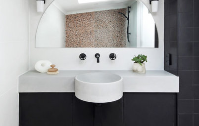
- Futura porcelain tiles from Di Lorenzo.
- Vanity finished in Polytec Prime Oak Woodmatt laminate.
- Vanity benchtop in WK Quantum Quartz in Alpine White matt.
Fittings and fixtures:
- Phoenix Vivid Slimline tapware in matt black from Reece.
- Formosa Stone Gloss basin from Reece.
- Milli Pure heated towel bar and hooks from Reece.
- Custom-made mirror.
- Lighting from a local supplier.
What exactly did you do?
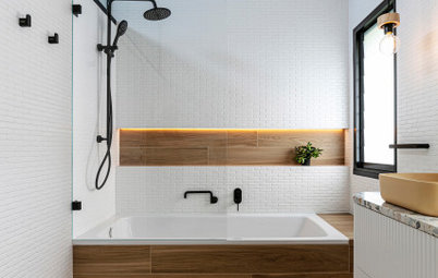
Redesigned the layout, changed the direction of the door opening, made the shower space bigger, and designed a custom vanity that matches the joinery in the rest of the house.
Did you retain anything?
The original window.
How did you handle the issue of storage?
Basic storage was needed in this bathroom, which is provided by the wall-hung vanity.
We didn’t want to compromise the spacious feeling of the design. So, to provide extra space to store make-up and a hair dryer, and another spot to get ready, we added a small dressing-table area with drawers and a mirrored wall in the walk-in-wardrobe in the master bedroom.
Challenges you worked around
Laying the tiles in the desired pattern. There is only one decorative tile and one plain one, but you can create many different patterns by turning the two-tone tile 90 or 180 degrees. It was a very time-consuming job for the tiler but totally worth the effort.
Why do you think this space works so well?
It has a generous, open shower and the ‘wet’ and ‘dry’ parts of the room are cleverly delineated by the tile layout (the patterned-tile area contains the ‘wet’ elements such as the bathtub and shower, while the plain, white-tiled area houses the vanity and toilet in the ‘dry’ zone).
Your turn
Do you love this bathroom as much as we do? Tell us in the Comments below. And don’t forget to save your favourite images, like this story and join the conversation.
More
Craving more great renovation ideas? Take a look at last week’s Room of the Week: A Pale and Interesting New-Build Kitchen


Sponsored

Sponsored
Answers by Maria Roussos, owner of design firm Schemes & Spaces
Who lives here: A couple with two children
Location: Oatley, NSW
Room purpose and size: A 7.5-square-metre bathroom serving the master bedroom and guests in a four-bedroom, two-bathroom 1970s red-brick house
Bathroom budget: $25,000 plus
Interior designer and stylist: Maria Roussos at Schemes & Spaces
Builder: Zero Two Constructions
How did you use Houzz?
The client and I used Houzz in the early stages to create and share ideabooks so we could communicate our ideas for the space.