

Before & After: A Once-Cramped Kitchen Now a Small Scandi Dream
From dated and dirty to Scandi simplicity, this small kitchen makeover is a miracle of materials
Vanessa Walker
8 June 2020
Houzz Australia & New Zealand Editor-in-Chief
In a Q&A format, we talk to the designers – and examine the creative thinking – behind some of Houzz’s most loveable rooms.
Images by Art Department Creative
Styling by Art Department Styling
Answers by Alison Burfield, co-director and project manager, Transform-A-Space
Who lives here: A busy woman with her young adult son (who enjoys cooking so he wanted a say in the kitchen design and appliance selection!).
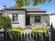
Location: Norwood, SA
Budget: $25,000 (excluding new flooring, splashbacks, painting and appliances).
Room purpose and size: A kitchen with casual seating along the peninsula bench. The room is approximately 3.5 x 3.3 metres including the passage/doorway.
Styling by Art Department Styling
Answers by Alison Burfield, co-director and project manager, Transform-A-Space
Who lives here: A busy woman with her young adult son (who enjoys cooking so he wanted a say in the kitchen design and appliance selection!).
Location: Norwood, SA
Budget: $25,000 (excluding new flooring, splashbacks, painting and appliances).
Room purpose and size: A kitchen with casual seating along the peninsula bench. The room is approximately 3.5 x 3.3 metres including the passage/doorway.
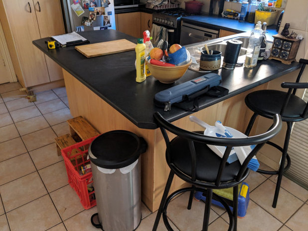
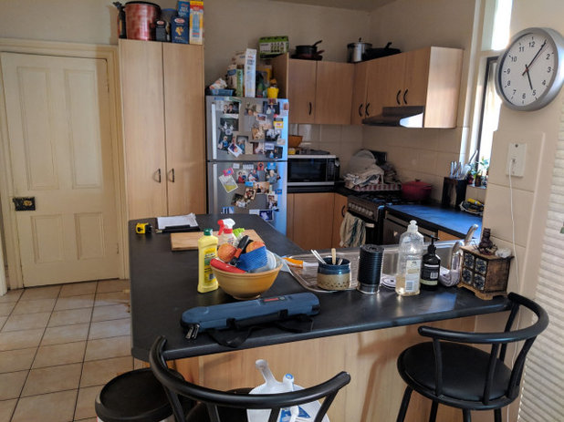
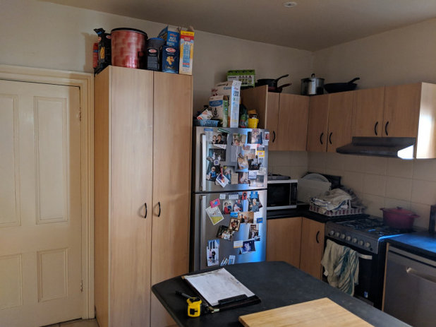
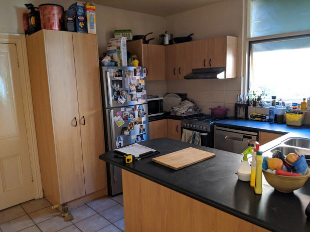
The kitchen before works
This is an old original terrace home that is long and skinny. The original home is the first half of the home, and an extension had been built on to double the size of the house. The kitchen used to be a lean-to on the back of the old home. The kitchen adjoins a large open-plan dining and lounge area.
This is an old original terrace home that is long and skinny. The original home is the first half of the home, and an extension had been built on to double the size of the house. The kitchen used to be a lean-to on the back of the old home. The kitchen adjoins a large open-plan dining and lounge area.
Brief
Our client was catching up with her friend in Blackwood, SA, who also happened to be a past client of ours. She loved her friend’s new kitchen, especially how every cabinet had a specific purpose (including pull-out mechanisms for easy access to blind corner cabinets), and given it was a small space – like her own kitchen – she wanted to know who completed the project for her. After that we received the call.
Upon meeting with her at her terrace home – where old meets new with the extension on the back of the original terrace house – her brief was simple: more storage to help her declutter, a modern finish with clean lines, some wood elements to bring warmth, with an overall light and bright feeling given the space was so small. She also wanted to incorporate a space for friends to sit while her young adult son (a passionate cook) prepared a feast for their guests.
Thinking of renovating your kitchen? Find a kitchen designer in your area on Houzz
The kitchen before works
Starting point
Nothing specific, apart from her friend’s kitchen that she loved and which inspired her to take action.
She had lived with a tired, dark, frustrating old kitchen that was in need of upgrading for quite some time, so visiting a fresh new kitchen was the motivation she needed to take action. She was happy to let us design what we felt suited the space, based on the discussions we had with her at the site visit.
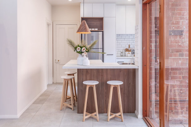
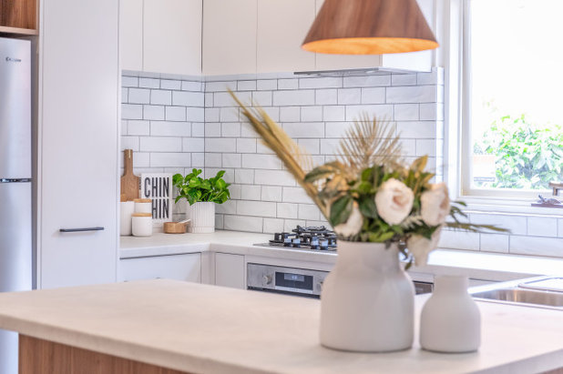
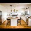
Key design aspects
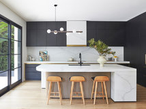
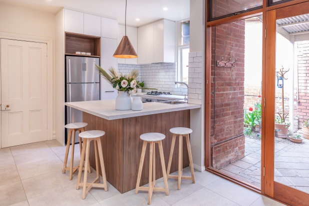
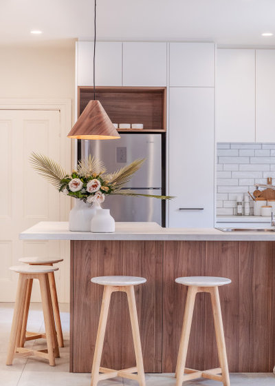
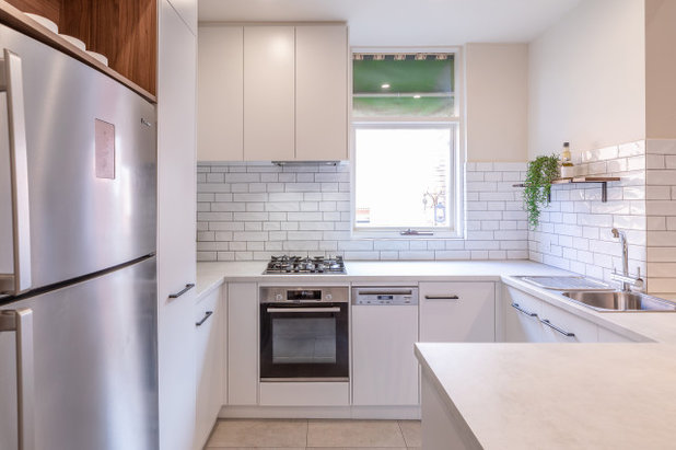
Colour palette: White, timber (walnut) and grey (not dissimilar to a Scandi scheme).
Colour palette: White, timber (walnut) and grey (not dissimilar to a Scandi scheme).
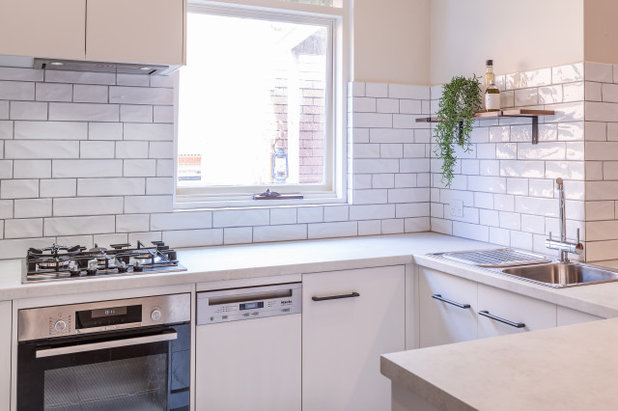
Materials palette:
- Polytec ‘White Cement’ laminate benchtops from the Matera range.
- Polytec ‘Notaio Walnut’ Woodmatt finish timber feature accents.
- Polytec ‘Blossom White’ matt finish melamine cabinetry.
- Undulating gloss-white subway tiles from Beaumont Tiles (laid in a mix of shorter and longer lengths) with a mid-grey grout.
- Kethy HT017 handles in charcoal matt finish.
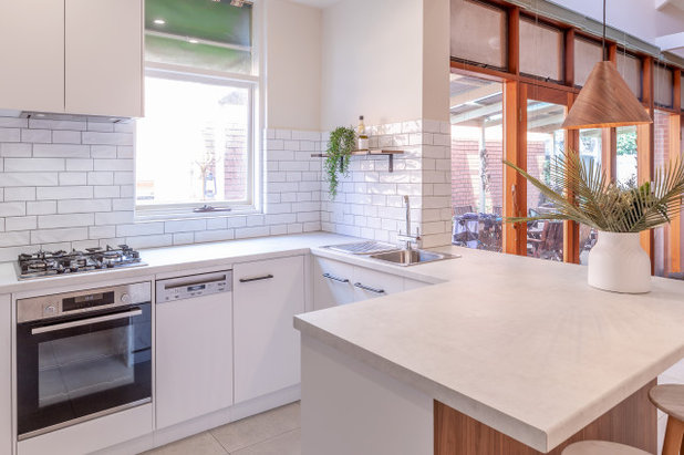
Key pieces of furniture/fittings:
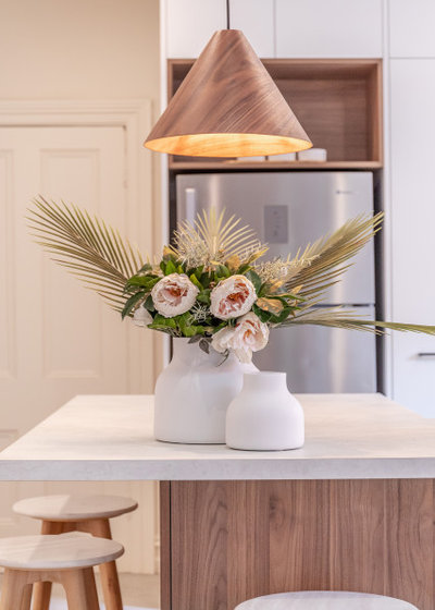
- Aiden pendant in Walnut/Black from Beacon Lighting.
- Wilson & Bradley Compact Pull out pantry System.
- The Shelving Shop Lip Shelf Brackets in Matt Black.
- Blum Soft-Closing Hardware throughout.
The kitchen before works
Thinking behind the arrangement of furniture/fixtures
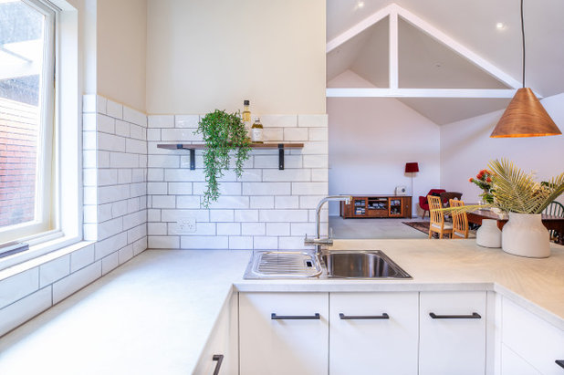
Wanting to keep the space as light, bright and spacious as possible. This is why instead of overhead cupboards above the sink area we put an open shelf, which is still handy for occasional items, while keeping the area near the window bright and spacious. The pendant light on the corner of the peninsular bench hangs lower as a feature, similar to bar lighting.
Wanting to keep the space as light, bright and spacious as possible. This is why instead of overhead cupboards above the sink area we put an open shelf, which is still handy for occasional items, while keeping the area near the window bright and spacious. The pendant light on the corner of the peninsular bench hangs lower as a feature, similar to bar lighting.
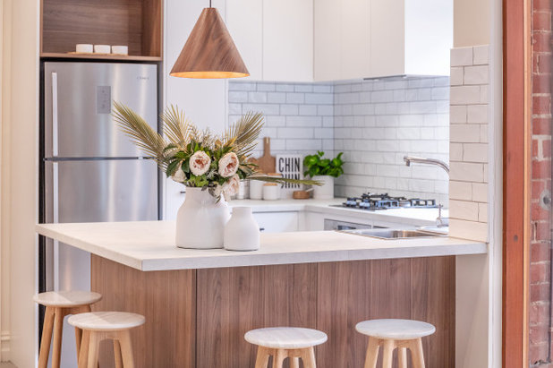
Challenges you worked around
The very small space. Small kitchens are harder to design than larger kitchens, given that you need to fit in the essential items – fridge, cooktop, oven, range hood and sink – while ensuring the client won’t be knocking their hip against the benchtop while frying up their eggs for breakfast.
The very small space. Small kitchens are harder to design than larger kitchens, given that you need to fit in the essential items – fridge, cooktop, oven, range hood and sink – while ensuring the client won’t be knocking their hip against the benchtop while frying up their eggs for breakfast.
We needed to ensure there were sufficient clearances for the barstool seating, while not compromising on the internal clearance when working in the kitchen. The levels of the walls and floor were a long way out, due to the fact that the space used to be a lean-to on the back of the old terrace house, which resulted in a more time-consuming installation process.
The kitchen before works
Why do you think this room works?
It’s an inviting, light and bright, highly functional area of the home. It now feels like a place you want to spend time in. The styling of the kitchen suits the contemporary feeling of the back half of the home (the extension was completed 20-plus years ago).
It’s an inviting, light and bright, highly functional area of the home. It now feels like a place you want to spend time in. The styling of the kitchen suits the contemporary feeling of the back half of the home (the extension was completed 20-plus years ago).
Your turn
Tell us what you like most about this kitchen makeover. And don’t forget to save your favourite images, like this story and join the conversation.
More
Can’t get enough of kitchen makeovers? Read this Before and After: A Kitchen That was Spun Around and Extended
Tell us what you like most about this kitchen makeover. And don’t forget to save your favourite images, like this story and join the conversation.
More
Can’t get enough of kitchen makeovers? Read this Before and After: A Kitchen That was Spun Around and Extended
What are you working on?
Related Stories
Kitchens
A Kitchen That Uses Special Elements to Punch Above Its Weight
This couple wanted a well-designed kitchen that incorporated their pre-bought furniture; this designer delivered
Full Story
Kitchens
An Interplay of Light, Dark & Colour Creates a Striking Kitchen
All-white joinery, floors and walls is foiled by a handsome island bench and contemporary artworks in this handy kitchen
Full Story
Kitchens
Before & After: A Beachy Sydney Kitchen Sans the Coastal Cliché
A fresh materials palette gives a sense of place, while avoiding style stereotypes, to uplift this timeless new kitchen
Full Story
Kitchens
Before & After: A Penthouse Kitchen High on Glamour & Substance
This NZ penthouse kitchen needed to open up to the views and adjacent dining area. The designer served up that and more
Full Story
Projects Born on Houzz
Before & After: An Open-Plan Kitchen Goes from Boring to Boss
After scouting Houzz for designers, this couple found the right match in a local designer who transformed their space
Full Story
Kitchens
Before & After: A Cathedral-Like Kitchen With Soft Texture & Tone
High ceilings, curves, fluted features and beautiful tactile details elevate this white kitchen into the stratosphere
Full Story

Kitchens
Before & After: A Scandi-Style Kitchen in NZ That's Light & Airy
See this sweet, bright kitchen and dining space in Wellington, which had environmental concerns at the heart of its plan
Full Story
Kitchens
Before & After: A Quietly Quality Kitchen That Kept Its Layout
The layout couldn't be changed, but a clever approach to storage and colour transformed this Melbourne kitchen
Full Story
Projects Born on Houzz
Room of the Week: A Reader's Bathroom Inspired by Houzz
When you're planning a new bathroom, where do you look for ideas? Houzz, of course! See how this reader did it
Full Story
Kitchens
Room of the Week: A Scandi Kitchen That Doubles as a Workspace
Pared-back lines, a clay-coloured ceiling and a cooking/storage 'pod' star in this designer's family kitchen/work zone
Full Story
not impressed. Its just the same kitchen layout with clutter removed, colour change, smaller sink and a a tiny bit more upper cabinet that reach the ceiling instead.
@nmlondon
Perhaps. Don't have a TV so don't know about property programmes, but have always had pretty much a 'take me as you find me' for friends close enough to be invited to stay. I dream about being super tidy but realise by now that this is simply a lost cause. I do, however, have a 'thing' about keeping wooden furniture (and shoes) well polished!
That is nice but why is there a light on top of the plant?