Room Of The Week
Popular Houzz Series
Popular Houzz Series
Appears in
See also
Fun HouzzFrom The ProsHouzz Around The WorldProject Of The WeekStickybeak Of The WeekQuizzesCreatives At HomeAt Home With...Best Of The WeekRoom Of The WeekDesigner Profiles3 Things I Wish My Clients KnewHow Do I...Buyer's GuidesExpert EyeInnovation AlertSo Your Style Is...Spotted!Picture PerfectBefore & AfterBudget BreakdownHome TimeMade Local
Before & After: A Tiny Apartment Kitchen Packed With Charm
See how a dash of bright colour, new finishes and improved storage transformed this small apartment kitchen

In a Q&A format, we talk to the designers – and examine the creative thinking – behind some of Houzz’s most loveable rooms.
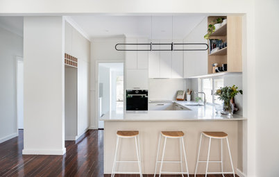
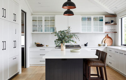
The kitchen before and after works
Brief
It was dark, dated and didn’t function well. There wasn’t enough storage or bench space and the bench was at two different levels.
What were their must-haves?
Brief
- A modern, two-tone kitchen that would complement the existing living spaces, which features timber and white.
- Improved functionality.
- More storage and bench space.
It was dark, dated and didn’t function well. There wasn’t enough storage or bench space and the bench was at two different levels.
What were their must-haves?
- Open shelving to showcase books and decor items.
- Integrated recycling bins.
- A dedicated space for their video-intercom automated cat feeder (installed on an open shelf unit, not shown in photos).
The kitchen before and after works
Starting point
The client wanted a modern version of a Shaker-style kitchen, and they had put together a lot of inspirational images for us. We interpreted and adapted these ideas to suit the space and their needs.
Thinking behind the new design
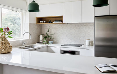
The new design followed a very similar footprint to the original kitchen, but made better use of all the space available by including wall cabinets wherever possible.
We added tall, shallow cabinetry and clever storage solutions, such as a LeMans corner unit and a custom splashback cabinet to store spices and boost storage.
Ready to take the plunge and renovate? Find a kitchen designer near you on Houzz
Starting point
The client wanted a modern version of a Shaker-style kitchen, and they had put together a lot of inspirational images for us. We interpreted and adapted these ideas to suit the space and their needs.
Thinking behind the new design
The new design followed a very similar footprint to the original kitchen, but made better use of all the space available by including wall cabinets wherever possible.
We added tall, shallow cabinetry and clever storage solutions, such as a LeMans corner unit and a custom splashback cabinet to store spices and boost storage.
Ready to take the plunge and renovate? Find a kitchen designer near you on Houzz
The kitchen floor plan after works
What exactly did you do?
As the space was small, the remodelling options were limited. We ripped out and replaced the old kitchen, which slightly changed the footprint.
We kept the oven and island in the same positions due to plumbing position constraints. We also had to ensure that we covered the footprint of the old kitchen as the flooring wasn’t changing.
We went handle-free for the tall overheads and back island cabinets to provide a cleaner look and help trick the eye into thinking the space is larger than it actually is. We used handles for the lower cabinets inside the kitchen.
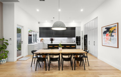
The designer took the open shelves down the stairs to create an eye-catching feature in this open-plan space.
Why do you think this room works?
The new kitchen feels so much bigger and brighter than the old one, and the aesthetics now tie in with the style of the apartment. The kitchen is also more functional.
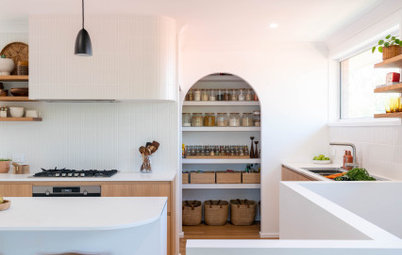
Tell us about the sliding panel
This is my favourite detail in the project [pictured below]. The benchtop on that run was quite deep, so we thought a splashback cabinet behind sliding doors would be a great idea to store our client’s many spice jars since it is right next to the cooking area. The shelves are only 100 millimetres deep, but that’s enough depth to store spice jars.
Sliders work well as they are easy to use and non-intrusive in a small kitchen.
Why do you think this room works?
The new kitchen feels so much bigger and brighter than the old one, and the aesthetics now tie in with the style of the apartment. The kitchen is also more functional.
Tell us about the sliding panel
This is my favourite detail in the project [pictured below]. The benchtop on that run was quite deep, so we thought a splashback cabinet behind sliding doors would be a great idea to store our client’s many spice jars since it is right next to the cooking area. The shelves are only 100 millimetres deep, but that’s enough depth to store spice jars.
Sliders work well as they are easy to use and non-intrusive in a small kitchen.
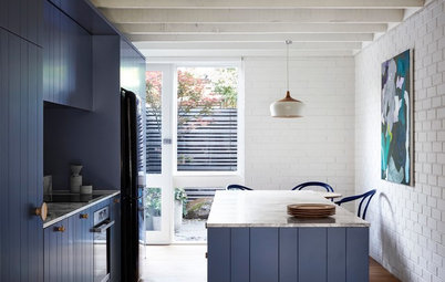
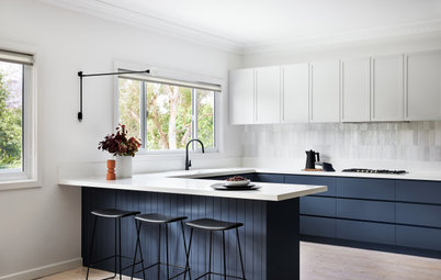
Bold blue on the kitchen island and base units adds contrast and balance in this predominantly light-toned open-plan space.
Materials and fixtures
Your turn
What do you love about this kitchen? Tell us in the Comments below. And don’t forget to save your favourite images for inspiration, like this story and join the conversation.
More
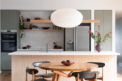
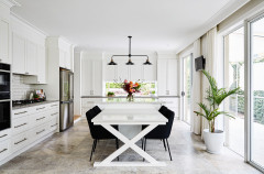
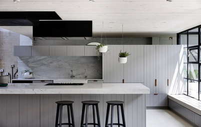
Craving more great kitchen makeovers? Take a look at this Room of the Week: An All-Black Streamlined Kitchen
Materials and fixtures
- Laminex AbsoluteMatte Natural White for the white joinery.
- Laminex Natural Finish Honey Elm for the open shelving.
- Polyurethane base units finished in Porter’s Paints Squid Ink satin finish.
- Silestone Calacatta Gold benchtop.
- Cosentino Dekton in Zenith splashbacks.
- Blanco Subline700U-Level sink.
- Water People stainless-steel mixer tap.
- Nordlux Strap 27 pendants.
Your turn
What do you love about this kitchen? Tell us in the Comments below. And don’t forget to save your favourite images for inspiration, like this story and join the conversation.
More
Craving more great kitchen makeovers? Take a look at this Room of the Week: An All-Black Streamlined Kitchen
Answers by Alicia Gonzalez, designer and client support at Blakes of Sydney
Who lives here: A couple
Location: Balmain, NSW
Room purpose and size: A five-square-metre open-plan kitchen in a modern warehouse-style apartment
Kitchen designer: Blakes of Sydney
Budget: Around $40,000 (excluding appliances)
Where did most of the budget go: On the joinery and benchtops. The clients won a Cosentino Dekton surface in a competition, which they used on the splashbacks.