
UK Room Tour: A Garden-Focused Extension Boosts Light
Striking glazing and a green roof contribute to the sensitive modernisation of this early 20th-century home in London

This Arts and Crafts end-of-terrace hadn’t been touched for about 20 years when architect Lizzie Fraher of Fraher and Findlay first saw it. “The layout was very 1920s, not designed for 21st-century living,” she says, explaining there were lots of rooms, a tiny kitchen and a newer conservatory that was too hot in summer and too cold in winter.
The owners wanted a modern, family space, but not a huge extension, and nor did they want to encroach on the garden. Plentiful green vistas were also on the wish list. The architect translated this brief into something very special, with a sensitively modest addition, an ingenious courtyard and verdant views at every turn.
The owners wanted a modern, family space, but not a huge extension, and nor did they want to encroach on the garden. Plentiful green vistas were also on the wish list. The architect translated this brief into something very special, with a sensitively modest addition, an ingenious courtyard and verdant views at every turn.
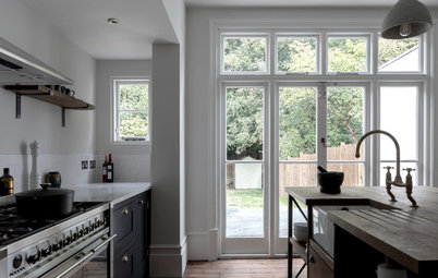
On the right, Fraher brought the extension across into the side return, but didn’t fill the whole of it (retaining garden access from the street). “This gave us space for a reasonable-sized kitchen,” she says.
This side is shallower than the left, partly because of its raised level – Lizzie didn’t want to extend too far into the garden at that height.
The right-hand window extends up and over the top, giving views of the sky as well as the garden. Below it is a large planter; in time the greenery will be tall enough to be seen from inside.
“We like to push the garden right up against the back of a house to improve the relationship between the two spaces,” she says. “I didn’t want a big, wide terrace that acted almost as a barrier to the garden.”
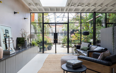
From the inside, this full-height glazing gives the sense of the glass disappearing into the roof. “It’s as if there’s no barrier [to the garden]. We also wanted this space to feel as tall as possible,” says Fraher. The diagonal view was the longest in the space, she adds, hence the corner window was placed to maximise this.
Thinking of renovating or building? Find an architect near you on Houzz to bring your vision to life
Thinking of renovating or building? Find an architect near you on Houzz to bring your vision to life
A focus on greenery and the garden was integral to the design. Fraher says that the area was famous for its market gardens in the early 1800s and she wanted to bring a sense of this local history to the home.
“We didn’t want to lose much garden space,” she says. “And we replaced what we did lose by adding it onto the roof.” What you’re looking at is a sedum and wildflower mix; the sedum is green year-round, while the flowers appear in spring. This element had to be designed in at the outset, so a structural surveyor could advise on a roof strong enough to support the weight of the planting.
Lizzie chose brick for the extension’s exterior “to create some relief from the render at the back of the house”, and to reflect the Arts and Crafts tradition of honesty about materials.
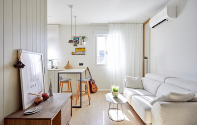
The wraparound window in the kitchen as seen from the inside shows just how special the effect is. “It really extends your view. When you’re cooking, it feels as if you’re in the garden,” she says.
The island contains storage on both sides and a small space to sit, rather than an area for dining. “The clients have a wonderful big Danish dining table so close, so this is more a spot to sit and have a coffee.” Fraher says, adding that one half of the couple is from Denmark and a lot of their furniture is sourced from there.
The kitchen fronts are a mix of white spray-painted MDF and ash timber, while the worktops are Cararra marble.
Flush floor-to-ceiling units hug the left-hand side of the kitchen. Behind the doors are a fridge, a freezer, a pantry and wine storage. Behind this bank, accessed from the dining area, is a utility room housing the laundry appliances.
There’s discreet downlighting in the ceiling as well as task lighting concealed in the shelves over the sink.
The kitchen floor is polished concrete, and a Sonos sound system is installed in the ceiling.
In the foreground is the ash-topped side of the small staircase leading down to the nook.
There’s discreet downlighting in the ceiling as well as task lighting concealed in the shelves over the sink.
The kitchen floor is polished concrete, and a Sonos sound system is installed in the ceiling.
In the foreground is the ash-topped side of the small staircase leading down to the nook.
The pantry and the wine fridge sit neatly within the bank of floor-to-ceiling joinery.
The oak parquet flooring delineates the dining room from the kitchen. The dining area sits in the location of the original rear reception room. “Because of the conservatory, it was kind of neglected,” says Fraher.
In place of the too hot or too cold conservatory is this delightful small courtyard. “It gives breathing space to the back of the house and between the old and the new,” she says.
“When extending, you risk losing the space in the middle, as it gets sandwiched and has no connection to the garden,” she says. “As we needed to step down to the garden, creating this space was possible – and it brings more green to the interior.”
Here you can see how the courtyard provides another view of greenery from the kitchen.
The courtyard doors open it up to the dining room and kitchen, bringing additional light into both spaces. The clerestory window seen straight on here captures a view of part of the green roof.
Tucked into the left-hand dining room wall there’s a tiny bar with a floating drawer and storage below.
Tucked into the left-hand dining room wall there’s a tiny bar with a floating drawer and storage below.
On the other side of the dining room there’s an original fireplace, complete with a decorative arch and a wood-burning fire. The slate hearth is new.
The nook is tucked behind the courtyard and dining space. There’s underfloor heating throughout to keep the spaces cosy.
The door on the right side of the dining room leads to the laundry and cloakroom.
The door on the right side of the dining room leads to the laundry and cloakroom.
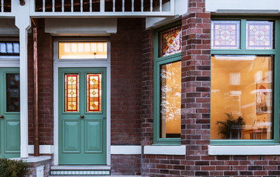
The house as it looks from the street.
Your turn
What do you love most about rear extension? Tell us in the Comments below. And remember to like this story, save the images for inspiration and join the conversation.
More
For more great global design, check out My Spanish Houzz: Plants, Sea Views and a Touch of Morocco
Your turn
What do you love most about rear extension? Tell us in the Comments below. And remember to like this story, save the images for inspiration and join the conversation.
More
For more great global design, check out My Spanish Houzz: Plants, Sea Views and a Touch of Morocco

Sponsored

Sponsored
Who lives here: A family of four with primary school-aged children
Location: Southwest London
Property: An Arts and Crafts end-of-terrace with five bedrooms and three bathrooms
Architect and interior designer: Lizzie Fraher of Fraher & Findlay
Joinery: Shape London
Photos by Adam Scott Images
The project was an extension of two halves. On the left-hand side, as seen from the garden, Fraher designed the building to come out by around four metres while on the right it projects by around two metres.
Within the left-hand side of the construction there’s a two-level space containing a reading nook by the window and a dining area at the back. Fraher also created a small courtyard to replace the conservatory.
Rather than designing these rooms to all sit at the same level as the original house, steps down to the nook mirror those outside from the side return. “It minimises the impact of the architecture on the neighbours,” says Fraher.