Room Of The Week
Popular Houzz Series
Popular Houzz Series
Appears in
See also
Fun HouzzFrom The ProsHouzz Around The WorldProject Of The WeekStickybeak Of The WeekQuizzesCreatives At HomeAt Home With...Best Of The WeekRoom Of The WeekDesigner Profiles3 Things I Wish My Clients KnewHow Do I...Buyer's GuidesExpert EyeInnovation AlertSo Your Style Is...Spotted!Picture PerfectBefore & AfterBudget BreakdownHome TimeMade Local
Before & After
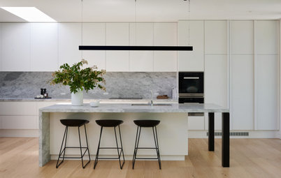
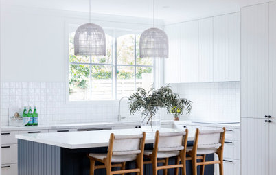
Before & After: From Goer to Whoa, a Kitchen Reborn
Classically calm coastal colours, beautiful joinery and the inclusion of an island bench transformed this kitchen

In a Q&A format, we talk to the designers – and examine the creative thinking – behind some of Houzz’s most loveable rooms.
Brief
The client wanted to reimagine the interior by fusing the old with the new, keeping the design cohesive and balanced. It was important, with the redesign of the client’s kitchen, to incorporate integrated appliances into the joinery design and to create more useable storage.
The client also wished to create better flow and connection to the surrounding living spaces as well as maximise privacy from the neighbours.
The kitchen before works.
The original kitchen layout was a U-shape with a high servery bar that was not functional. The previous design had one oversize window with stained-timber lourve shutters located directly above the current kitchen mixer and sink. We kept the original plumbing points to keep the cost of the kitchen down for the clients.
A built-in wall oven and warming drawer was incorporated to meet the client’s brief as they did not like their original oven, which was under the bench. They also didn’t like microwaves, which we made note of.
The client wanted an island bench in the kitchen to create a useable breakfast-bar area for casual eating and to encourage conversation with family while cooking.
Starting point
It was important to the client that the colour and materials palette of the new design made a connection to the previously renovated bathroom, which we completed five years earlier.
It was important to the client that the colour and materials palette of the new design made a connection to the previously renovated bathroom, which we completed five years earlier.
For this reason, we continued to reuse the same stone benchtop and introduced mosaic tiles to the kitchen splashback, which match the colour of the floor and wall tiles in the bathroom.
The design also had to consider and accommodate the existing painted structural ceiling beam in the kitchen and dining area. This needed to be a kitchen that promoted informal dining, which the client previously did not have the opportunity to enjoy, and we achieved this by introducing a kitchen island with bar stools.
The floor plan after works.
The kitchen before works.
The fridge is integrated into the wall opposite the window and is built into the full-height joinery. It has three stained solid ash-timber handles to match the full-height joinery.
Key design aspects
Colour palette:
Materials palette:
Key design aspects
Colour palette:
- We drew inspiration from the nearby coast, and adopted a sympathetic palette of warm and muted tones.
- The paint colour is Resene Karen Walker quarter-strength Sandspit Brown.
Materials palette:
- Benchtop in Caesarstone Topus Concrete.
- Caesarstone Topus Concrete and honed Skyline Silver travertine from Earp Bros is used on the L-shaped units and splashback upturn.
- Caesarstone Shittake is used on the kitchen island benchtop.
- Joinery is a combination of timber laminate and two-pack polyurethane, the timber finishes are Polytec Florentine Walnut.
The plinth design, positioned below a venetian plastered wall, was an opportunity for the client to display decor or indoor plants.
Key pieces of furniture/fittings:
Key pieces of furniture/fittings:
- Dita Bar Stools with an upholstered back frame in Mannex Suede Brass.
- The footrail detail upholstery is Aero in Talc by Leather Italia from Grazia & Co.
- The City Stik kitchen mixer in a chrome finish is by Brodware.
- Original mixed hardwood floors were restained in Bona finishes.
- Toscot Newton Parete/Soffitto wall light from ECC Lighting & Furniture.
- Rectangular Lineal Handles with curved internal grip in an Ash Finish.
- Decorative vessels from Curatorial+Co.
- Lally woven basket, clay pot and vase from Papaya.
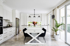
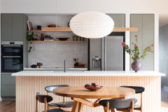
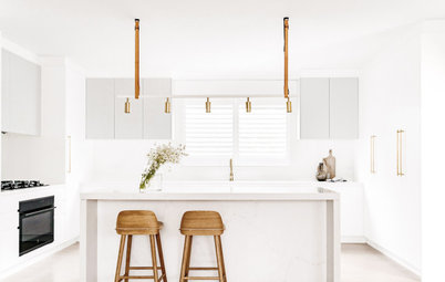
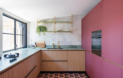
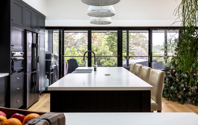
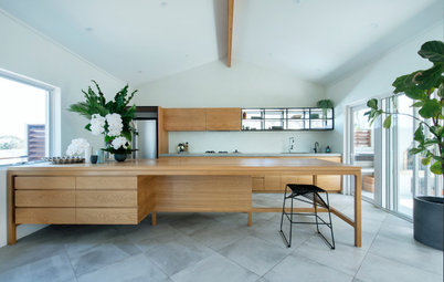
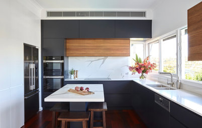
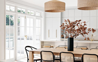
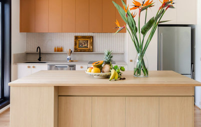
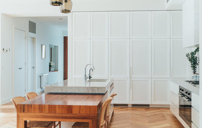
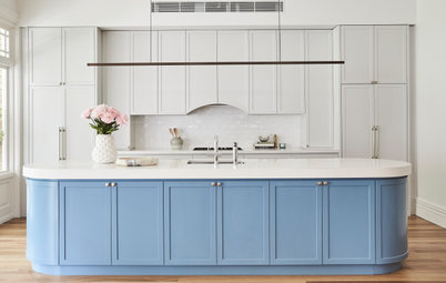
Browse more brilliant Australian kitchens for inspiration
The kitchen before works, showing the adjacent laundry.
What was your thinking behind the arrangement of furniture/fixtures?
The layout of the kitchen with the island bench returning off from the shared wall with the living room also maximises views of the ocean.
Consideration of the functioning bones of the home and its decorative elements was important due to the open-plan living area.
We also gave thought to ensuring the home reflected the personality of its occupants by responding to a blend of sentimental furniture pieces and adding a layer of modern context. The design combines a clean and linear approach that revives the surrounding living spaces in a well thought-out manner.
The kitchen and dining room before works, featuring the same dining table suite.
Furniture was reused and refurbished with new elements added to connect each space harmoniously.
Furniture was reused and refurbished with new elements added to connect each space harmoniously.
The kitchen before works. This was the wall that faced the windows.
What challenges did you have to work around?
One of the challenges we worked around included reusing the original mixed hardwood floorboards, which were 46 years old and involved sanding and lacquering.
During the demolition phase of the previous U-shaped kitchen, we discovered a gap in the floorboards. Because of this, we decided to run a horizontal board across the vertical floor boards that was wider than the original floorboards. Thankfully it was in a location that did not compromise the design.
Another challenge we faced in this project was the protruding plumbing from the bathroom one level above. This plumbing had previously been disguised by a bulkhead in the kitchen joinery. To overcome this problem, we dropped the ceiling slightly.
The kitchen before works.
Why do you think this kitchen works?
The previous layout of the kitchen/dining was not optimised for the site’s outlook and, with no link to the surrounding view, the kitchen felt tucked away and disconnected.
Through careful planning, the new design gives the space purpose and opens outwardly. With this carefully considered layout the design is more functional, has been organised to meet the client’s desired needs in the kitchen, and welcomes open-plan living and entertaining.
Your turn
Which ideas would you steal from this space? Tell us in the Comments below. And don’t forget to save your favourite images for inspiration, like this story and join the conversation.
More
Catch up on more great transformations here with this Before & After: A Teen Bathroom Gets a Cool Coastal Makeover
Answers and styling by Alexandra Ferguson, creative director of Alexandra Marie Interiors.
Who lives here: A retired couple in their 60s
Location: Macauleys Headland, NSW
Room purpose and size: A 26-square-metre kitchen and dining area (the living area and laundry had some cosmetic changes too)
Designer: Alexandra Ferguson, creative director of Alexandra Marie Interiors
Approximate budget: $100,000
Find a local, client-reviewed kitchen designer on Houzz to work magic on your home