


Inspo Alert! See the Winners of the Dulux Colour Awards 2022
The most colour-forward homes in Australia and New Zealand have just been announced – get ready to be inspired
Georgia Madden
10 June 2022
These exceptional Australian and New Zealand homes have just been recognised for their creative and original use of colour in the Dulux Colour Awards 2022, now in its 36th year. “Not only did we witness some remarkably creative, original projects, but this year we also saw colour strategies that challenged stereotypes, with ambitious programs and unparalleled impact, across a range of building typologies,” says Andrea Lucena-Orr, Dulux colour and communications manager, about the winning and commended designs.
Here, we invite you to step inside the award-winning and commended homes in the Residential Interior and Residential Exterior categories.
Here, we invite you to step inside the award-winning and commended homes in the Residential Interior and Residential Exterior categories.
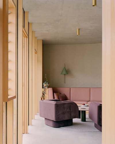
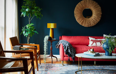
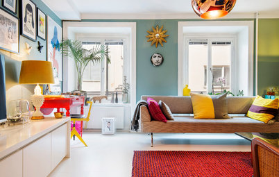
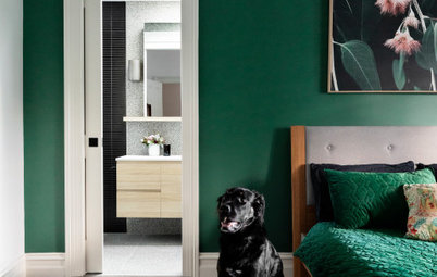
Winner – Residential Interior Award
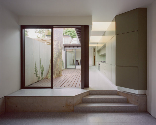
Designer: Lachlan Seegers Architect
Project: Erskineville House
Location: Erskineville, NSW
Photographer: Rory Gardiner
Project description: At the centre of this narrow site stands a single spotted gum that has towered over the existing terrace since the early 1970s.
Considered a tremendous gift, a suite of precise interventions respond directly to this magnificent tree, binding the atmosphere of the home with the ever-changing presence of nature. The tree provided the foundation and was omnipresent throughout the design process.
The most significant of these interventions is associated with the introduction of colour to harness the spirit of the tree and moderate the atmosphere of the interiors to respond to the ever-changing colours of nature.
Joinery elements were coloured in hues of green to respond to the leaves; the inner surfaces of the kitchen apertures were painted light yellow to ensure the view into the canopy always felt sunny; the steel threshold onto the courtyard was painted natural grey to complement the hues of the trunk; and bathrooms were tiled and painted blue to create the atmosphere of being underwater.
Joinery elements were coloured in hues of green to respond to the leaves; the inner surfaces of the kitchen apertures were painted light yellow to ensure the view into the canopy always felt sunny; the steel threshold onto the courtyard was painted natural grey to complement the hues of the trunk; and bathrooms were tiled and painted blue to create the atmosphere of being underwater.
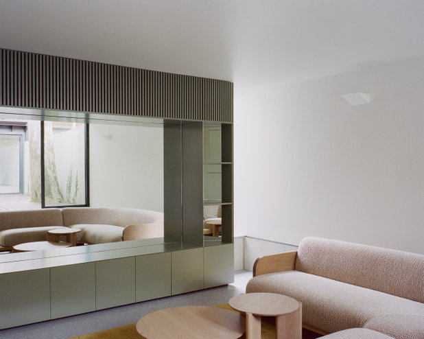
Colours used:
- Dulux Battle Dress.
- Dulux Pale Daffodil.
- Dulux Night Wizard.
- Dulux Natural White.
- Dulux Silver Tea Set.
- Dulux Madigan.
- Dulux Ferrodor 810 Natural Grey.
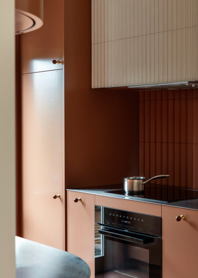
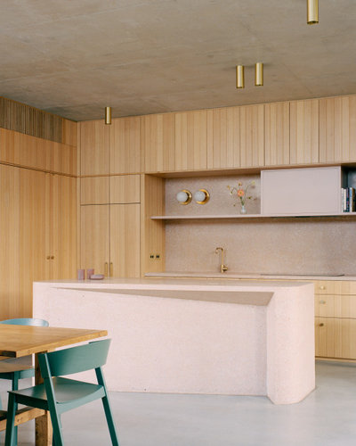
Commended – Residential Interior Award category and Winner – Grand Prix NZ Award
Designer: Pac Studio
Project: Eden View
Location: Sandringham, NZ
Photographer: David Straight
Project description: In compact spaces, colour and texture take on greater significance. For Pac Studio, this reworking of a tired and dated townhouse kitchen and bathroom was also an opportunity to continue our research into colour: how it defines identity, delineates space, and affects mood and atmosphere.
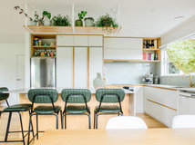
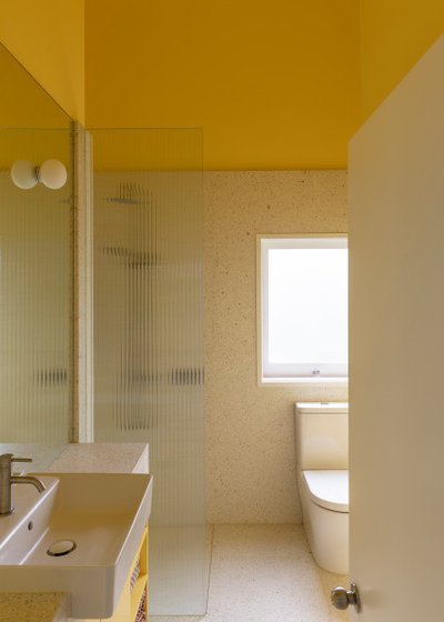
Here, the bathroom could signal the start of a fresh and sunny day; the kitchen could provide a calming and quiet place to cook in the evening and close the day with a cup of coffee.
The starting point was the rearrangement of space for efficiency. The relocated laundry freed up room for an additional guest bathroom. Lifting the ceiling height in the bathroom transformed the sense of space. New doors from the kitchen connect with a lovely herb garden and bring in natural light.
The overarching aim was to create two distinct spatial experiences, using colour and texture as a counterpoint to the home’s more neutral rooms.
A ‘pleated’ kitchen tile was selected for warmth and the way it captures the light when it falls across its surface. This was matched with rich Dulux Coyote paint-finished cabinetry.
The fresh yellow of the bathroom was carefully matched to a terrazzo tile with a yellow-gold fleck of crushed shell. Both feel light and bright even on the most cloudy day.
Colours used:
The fresh yellow of the bathroom was carefully matched to a terrazzo tile with a yellow-gold fleck of crushed shell. Both feel light and bright even on the most cloudy day.
Colours used:
- Dulux Coyote on kitchen cabinetry.
- Dulux Cape Kidnappers in the bathroom.
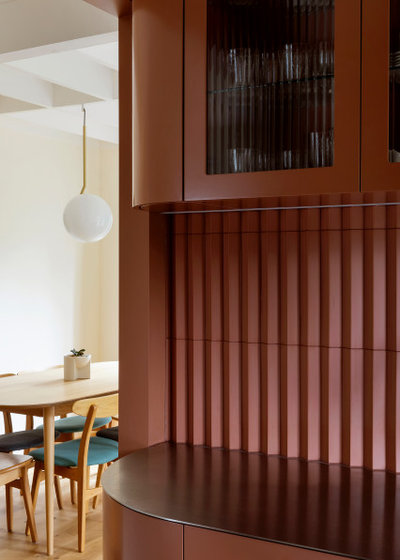
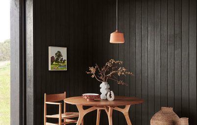
Commended – Residential Interior Award
Designer: Studio Bright
Project: Autumn House
Location: Kew, Victoria
Photographer: Rory Gardiner
Project description: Autumn House attempts to negotiate the need for refuge, retreat, and privacy with generosity and engagement with the urban context. An extension to a Victorian terrace with a 1980s renovation by architect Mick Jörgensen and a mature elm tree in the backyard, it adds a new layer stitched into and around these constraints.
The project balances the architecture of the Victorian, and the Jörgenson addition, with a new contribution by our studio.
The original period rooms [including the living room] offer traditional spaces and detailing, which lend themselves to a neutral palette. The ’80s Jörgensen elements adopt a playful palette to complement the rich, exposed timber, red-brick floor and lush garden glimpsed through the windows.
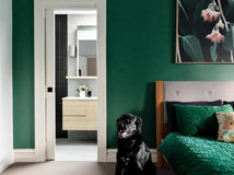
An immersive experience is found through the bathroom door where a visitor can dive into the calming aquamarine sanctuary. A large custom bath and matching mint basins for twin girls are complemented by playful elements in Dulux Stromboli to complete a cohesive palette.
An immersive experience is found through the bathroom door where a visitor can dive into the calming aquamarine sanctuary. A large custom bath and matching mint basins for twin girls are complemented by playful elements in Dulux Stromboli to complete a cohesive palette.
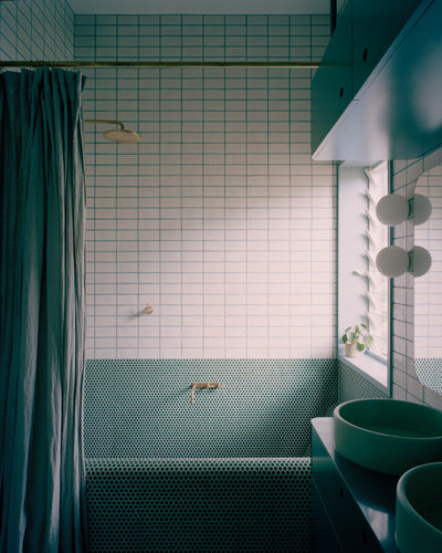
Colours used:
- Dulux Stromboli for the window frame, heated towel rail and joinery in the bathroom.
- Dulux Natural White in the living room trims.
- Dulux Light Rice Half on the living room walls.
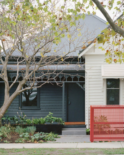
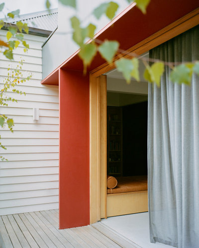
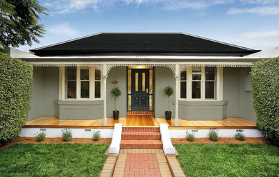
Winner – Single Residential Exterior Award
Designer: Kart Projects | Architecture
Project: House K
Location: Fairfield, Victoria
Photographer: Rory Gardiner
Project description: Our client wanted a single-storey house while retaining as much of the garden as possible on a relatively small block. The design strategy was to remove the old lean-to and add a small extension of connected living spaces, only increasing the total footprint of the house by 30 square metres, making the most of each space by overlapping functions rather than adding a new room for each.
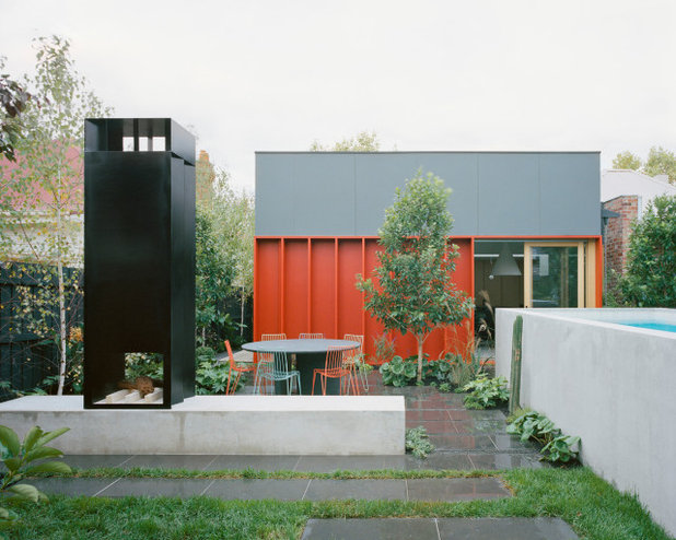
The new addition is set back from the northern boundary to maximise natural light and create two aspects for the living room. Internally, the coffered ceiling volumes over the extension reference the cellular plan of the existing weatherboard house by creating a series of loosely defined spaces above each ‘room’. This gives a sense of spaciousness and light by increasing ceiling heights where possible and adding a skylight.
The new spaces are anchored around a storage volume and day bed, which connect the study (the last room in the existing house) and the new living area. The landscape and pool continue this approach outside by overlapping different zones for planting, swimming and gathering.
The new spaces are anchored around a storage volume and day bed, which connect the study (the last room in the existing house) and the new living area. The landscape and pool continue this approach outside by overlapping different zones for planting, swimming and gathering.
The materials and finishes are applied in blocks of texture and colour to define different elements or sections of the house. The existing house is divided into two – a light volume for the kids’ bedrooms and study, and a darker, moody volume housing the main bedroom/ensuite and the corridor connecting to the new extension.
The new spaces are brighter and more stripped back, with a combination of terrazzo flooring, plywood joinery and walls, and two minimal black kitchen cabinets. Externally, the new addition is distinguished from the old house with a combination of dark cladding and a series of deep red door reveals and fins, which give the facade depth and texture, and protect openings.
Colours used:
- Dulux Terrace White.
- Dulux Black Caviar
- Dulux Mt Eden
- Dulux Carmen Miranda.
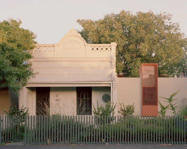
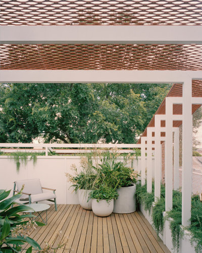
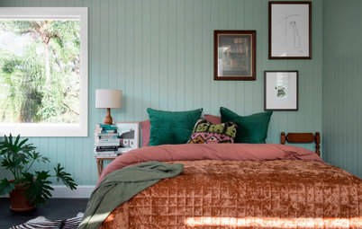
Commended
Designer: Studio Bright
Project: Autumn House
Location: Kew, Victoria
Photographer: Rory Gardiner
Project description: The existing house celebrates its layered heritage and detail is highlighted in colour. The original period facade was reinstated to a simple off-white (Dulux Pipe Clay), with contemporary elements in rich green (Porter’s Paints Jeep).
Wrapping the southern-most edge of the site and negotiating the tree, the new extension holds north-facing living spaces at the rear and functional rooms at the street. The resulting form is a continuous brick perimeter painted in Dulux Oyster Linen, appearing like a garden wall enclosing the tree above.
A painted, expanded metal wedge rises up over the brick base towards the rear laneway, its russet-tan colour (Dulux Russet Tan) a nod to the red brick buildings nearby.
The upper volume is surrounded by a slim garden, recessive in off-white (Dulux Pipe Clay), which allows the red mesh and lush green vegetation to take centrestage. The selected external paints reference the ever-changing colours of the elm tree, especially when in full autumnal flair.
The upper volume is surrounded by a slim garden, recessive in off-white (Dulux Pipe Clay), which allows the red mesh and lush green vegetation to take centrestage. The selected external paints reference the ever-changing colours of the elm tree, especially when in full autumnal flair.
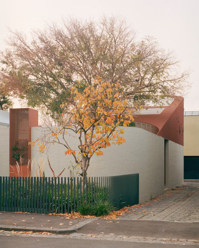
Colours used
New extension:
New extension:
- Bagged brick, steel angle and round columns in Dulux Oyster Linen.
- Mesh and mesh pop-up in Dulux Russet Tan.
- External first-floor walls and mesh ribs in Dulux Pipe Clay, full and half strength.
- Victorian street facade and roof in Dulux Pipe Clay.
- External walls and windows in Dulux Pipe Clay.
- External fence and detailing in Porter’s Paints Jeep.
Your turn
Which of these colourful homes is your favourite? Tell us in the Comments below, like this story, save the images for inspiration, and join the conversation.
More
Want to see another fab colourful home? Don’t miss this Melbourne Houzz: A Mid-Century Marvel in Mint
Which of these colourful homes is your favourite? Tell us in the Comments below, like this story, save the images for inspiration, and join the conversation.
More
Want to see another fab colourful home? Don’t miss this Melbourne Houzz: A Mid-Century Marvel in Mint

What are you working on?

Related Stories
Paint
How to Choose Your Perfect Paint Colours
By Erin Carlyle
Three USA designers share tips to pinpoint your style and mine memories to find the right paint palette for your home
Full Story
Renovating Advice
How to Choose Your Wall Colour to Complement Floors and Furniture
Which colour should I paint my room to suit the flooring and furniture? We've all asked it – and here are the answers
Full Story
Most Popular
How to Pick the Right Paint Colours for Your Federation House
By Joanna Tovia
Roof colour, wall materials and emerging trends all come into play for Federation paint schemes that work
Full Story
Colourful Homes
Suffering From White-Wall Syndrome? How to Add Colour Confidently
White walls are great... until they stop being inspiring. Five paint colour experts share how to transition to colour
Full Story
Expert Opinion
An Interior Designer Reveals How to Mix Colours and Make it Work
By tidgboutique
Don’t want to confine yourself to neutrals but lack the confidence to embrace colours? We have you covered
Full Story
Made Local
Made Local: How Dulux Colour Trends Are Born
Ever wondered how Dulux sees into the future to know the colours we'll be coveting in the year ahead? Here, we find out
Full Story
Interior Design
20 Honey-Hued Interiors That'll Make You Melt
Our coffee-break escape offers you five minutes' worth of images to inspire and delight. Jump right in...
Full Story
Awards
Paintbrushes Poised! 2023 Dulux Colour Awards Finalists Are In
Looking for interesting ways to add colour at home? Check out these shortlisted projects in the 2023 Dulux Colour Awards
Full Story
Picture Perfect
31 Great Ways With Colour for Every Room in Your Home
Our coffee-break escape offers you five minutes' worth of images to inspire and delight. Jump right in...
Full Story
Trade Shows
What Colours Will We Want in 2023? Maison & Objet Reveals All
By Claire Tardy
Nuanced jade, soft pinks and beiges, and blocks of purples and oranges offer colourful salves to troubled times
Full Story
I love the rusty browns and oranges. Just wondering if it would be too warm a colour to live with during a QLD summer though. Maybe the calming green of pic number 3 is a safer choice!
It is so exciting to see interesting design which respects a wonderful tree. Too often people remove something which, when looked at creatively, is actually an amazing asset which could not be repeated for 50 years if it were removed. Well done.