
Decorating
Mix Master: How to Clash Prints and Patterns Like a Pro
Clashing prints is a trend that can be tricky to pull off. Here’s a cheat sheet to help you master the art of mixing motifs in your home

Is your home a happy blend of mismatching prints, colours and styles, or do you cringe when you see spaces that aren’t perfectly coordinated? If you tend to play it safe when decorating, we suggest you step out of your comfort zone and try bold design techniques – like layering clashing prints and patterns – that can instantly transform a bland, one-dimensional room into one that’s brimming with personality and life.
Don’t know where to start? Follow these 15 easy decorating tips and you’ll be a print- and pattern-mixing pro in no time.
Don’t know where to start? Follow these 15 easy decorating tips and you’ll be a print- and pattern-mixing pro in no time.
2. Play with textures
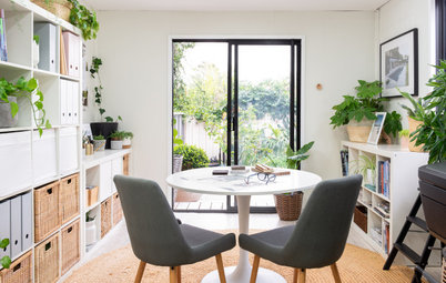
Add an extra layer of visual appeal to your space by introducing different patterns and textures. A fluffy shag rug, plush upholstered armchair and ottoman, woven throw and soft fabric cushions – all in a variety of prints and textures, of course – make an appearance in this colourful, eclectic home office.
Add an extra layer of visual appeal to your space by introducing different patterns and textures. A fluffy shag rug, plush upholstered armchair and ottoman, woven throw and soft fabric cushions – all in a variety of prints and textures, of course – make an appearance in this colourful, eclectic home office.
3. Stick with one theme
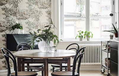
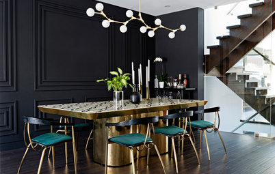
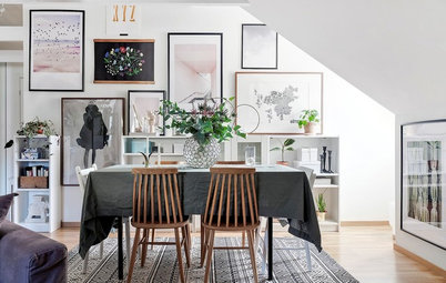
Create visual harmony with clashing prints by choosing a single theme to tie the look together. You can’t go wrong with dual geometric prints, as you can see in the elegant dining room pictured here.
Create visual harmony with clashing prints by choosing a single theme to tie the look together. You can’t go wrong with dual geometric prints, as you can see in the elegant dining room pictured here.
4. Cover your walls with patterned wallpaper
If you’ve graduated from decorating your sofa with clashing cushions, and are ready to try the trend on a larger scale, dress your walls with bold printed wallpaper, and team it with patterned flooring that also packs a punch.
If you’ve graduated from decorating your sofa with clashing cushions, and are ready to try the trend on a larger scale, dress your walls with bold printed wallpaper, and team it with patterned flooring that also packs a punch.
5. Treat animal prints like neutral tones
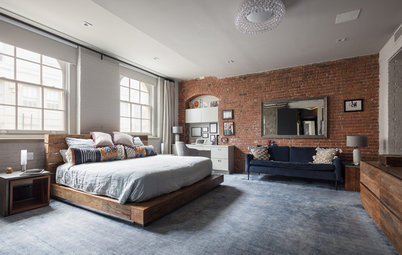
Many people shy away from decorating with animal prints as they think they look too loud, or in some cases, tacky. The trick is to use these patterns like you would any neutral (most are natural in colour, anyway) to ensure they don’t overwhelm but blend seamlessly into the space. This preppy bedroom shows how it’s done; while leopard-print carpet lines the floor, it takes a backseat to the bold Burberry-inspired check quilt covers, which instantly attract the eye.
Many people shy away from decorating with animal prints as they think they look too loud, or in some cases, tacky. The trick is to use these patterns like you would any neutral (most are natural in colour, anyway) to ensure they don’t overwhelm but blend seamlessly into the space. This preppy bedroom shows how it’s done; while leopard-print carpet lines the floor, it takes a backseat to the bold Burberry-inspired check quilt covers, which instantly attract the eye.
6. Select shades on opposite sides of the colour wheel
If you’re not fussed on using dual patterns in the same shade, find designs in tones that sit opposite each other on the colour wheel. Orange and blue, yellow and blue, purple and green, and pink and green, are just a few combos that work well together.
If you’re not fussed on using dual patterns in the same shade, find designs in tones that sit opposite each other on the colour wheel. Orange and blue, yellow and blue, purple and green, and pink and green, are just a few combos that work well together.
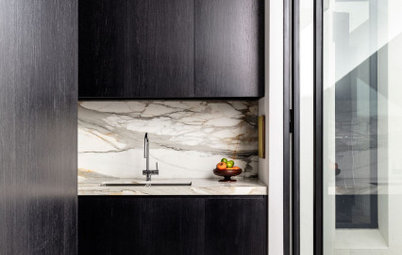
7. Go natural
If your home is decorated in a neutral palette, with very little colour in sight, pair natural materials with distinct details or markings – like timber and Calacatta marble – together to achieve a mixed-pattern look that suits your decorating scheme.
If your home is decorated in a neutral palette, with very little colour in sight, pair natural materials with distinct details or markings – like timber and Calacatta marble – together to achieve a mixed-pattern look that suits your decorating scheme.
8. Pair stripes with everything
Yes, everything. Not convinced? This sophisticated kids’ playroom proves our point, and shows just how well stripes work with both traditional (we love this plaid rug) and modern patterns (notice the quirky cityscape wallpaper?)
Discover more ways to how you can decorate your room with stripes
Yes, everything. Not convinced? This sophisticated kids’ playroom proves our point, and shows just how well stripes work with both traditional (we love this plaid rug) and modern patterns (notice the quirky cityscape wallpaper?)
Discover more ways to how you can decorate your room with stripes
9. Choose identical patterns in different scales
If you’re fond of a particular motif, try to find other items with the same (or a look-alike) design, but in a smaller or larger scale. Here, the upholstered bedhead features a pattern that’s very similar to the floral wallpaper behind it, but in a much smaller size.
If you’re fond of a particular motif, try to find other items with the same (or a look-alike) design, but in a smaller or larger scale. Here, the upholstered bedhead features a pattern that’s very similar to the floral wallpaper behind it, but in a much smaller size.
10. Master an all-monochrome palette
Stick with a classic black-and-white combo if you’re not confident at experimenting with colour. This will make your clashing-prints project a whole lot easier.
Stick with a classic black-and-white combo if you’re not confident at experimenting with colour. This will make your clashing-prints project a whole lot easier.
11. Be soft, not loud
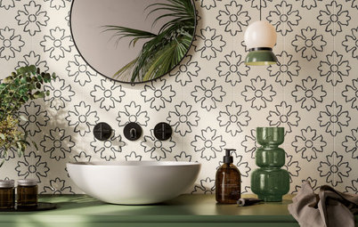
If your design style is subtle and sophisticated, rather than bold and bright, layer patterns in soft, soothing tones. This bathroom has the right idea; it features soft coral and white wallpaper in a feminine print, which contrasts beautifully with the round opalescent penny tiles, below.
If your design style is subtle and sophisticated, rather than bold and bright, layer patterns in soft, soothing tones. This bathroom has the right idea; it features soft coral and white wallpaper in a feminine print, which contrasts beautifully with the round opalescent penny tiles, below.
12. Consider chevron
This eye-catching pattern is a great alternative to the classic stripe; it’s strong and structured but oozes character, which basic striped motifs sometimes lack. Like stripes, chevron goes with pretty much everything, which is another tick in its favour.
This eye-catching pattern is a great alternative to the classic stripe; it’s strong and structured but oozes character, which basic striped motifs sometimes lack. Like stripes, chevron goes with pretty much everything, which is another tick in its favour.
13. Keep it in the (same colour) family
If you want to make a bold statement, pick two or more contrasting patterns in a colour combo that pops, like the orange and white geometric rug and floral drapes used in this mid-century modern office.
If you want to make a bold statement, pick two or more contrasting patterns in a colour combo that pops, like the orange and white geometric rug and floral drapes used in this mid-century modern office.
14. Pare back a playful pattern with something structured
If you don’t want your space to look OTT, team a fun, quirky print with a contrasting design that’s fairly simple. In this nursery, a yellow and beige geometric rug anchors the room, while sparrow wallpaper adds a touch of whimsy and playfulness.
If you don’t want your space to look OTT, team a fun, quirky print with a contrasting design that’s fairly simple. In this nursery, a yellow and beige geometric rug anchors the room, while sparrow wallpaper adds a touch of whimsy and playfulness.
15. Use a neutral base
An easy way to mix prints in your home is to start with a pattern in a neutral tone and layer with motifs in clashing colours and styles. With this simple design trick, you can’t go wrong!
MORE
Wild Walls: How to Be Bold Yet Beautiful With Wallpaper
How to Master the Art of Mix-and-Match Dining Chairs
8 Mesmerising Colour Palettes for Living Rooms
Mood-Boosting Colours for Your Home
TELL US
Are you a pro at mixing prints and patterns? Share your top tips in the comments section below! Don’t forget to share photos of your home, too.


Sponsored

Sponsored
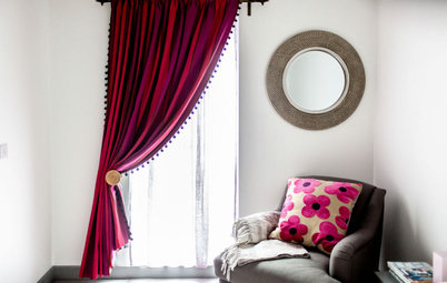
If you’re a clashing-prints novice, try the trend by layering small patterned items like cushions, or fittings that can be removed (curtains are a good option), as you can easily replace them if the scheme isn’t working or you just feel like a change.