
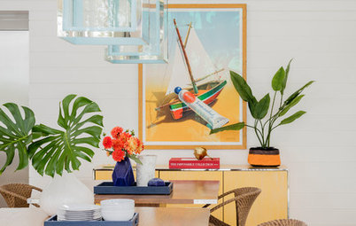
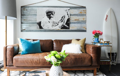
Decorating
How to Decorate With Typography
Master how to make an artistic impact using letters, words and phrases to give your messages a deeper meaning

Typography is a sure-fire way to make a huge impact in your home. The shapes and curves of letters and symbols can be used to dramatically enhance or juxtapose other features, or literally tell your guests something. However, looks may be deceiving, because pulling it off isn’t necessarily as easy as it looks. Ask any designer, art director or illustrator about typography and they’ll tell you that this technique is an art form in itself. It’s not merely an exercise in choosing a few random characters and shoving them together to create a miraculous effect.
Mastering typography takes time, careful consideration and intention. When choosing letters, symbols or numbers to work with, you also need to consider things like colour palette, material, size, typeface and scale. The best way to think of your display is literally as an artwork because, above all else, it needs to specifically match your space and personality.
Once you get it right though, you won’t be able to take your eyes off your masterpiece. Here are some tips and ideas to get you started …
Play mix ’n match
Adventurous? Good. This one is for you. A mixture of multi-coloured letters and symbols on a blank wall is one of the most eye-catching typography effects. But you’ll need to experiment a lot beforehand, firstly with sourcing different coloured letters and secondly with the arrangement.
Adventurous? Good. This one is for you. A mixture of multi-coloured letters and symbols on a blank wall is one of the most eye-catching typography effects. But you’ll need to experiment a lot beforehand, firstly with sourcing different coloured letters and secondly with the arrangement.
The next step is getting the configuration perfectly balanced. Think this typography (left) was simply mounted on the wall? Chances are the owner played around with the configuration first. A lot.
TIP: Lie the letters flat on the floor and play around with them like it’s a jigsaw puzzle until you find an arrangement you’re happy with. Then, before mounting them, outline each shape with a pencil on the wall. That way you get to triple check you’re happy with the positioning before you start hammering.
TIP: Lie the letters flat on the floor and play around with them like it’s a jigsaw puzzle until you find an arrangement you’re happy with. Then, before mounting them, outline each shape with a pencil on the wall. That way you get to triple check you’re happy with the positioning before you start hammering.
Go big and bold
Selecting one ‘hero’ letter to feature as an art-piece is a bold statement. You need to feel confident it balances out with the rest of the room. Notice how the large ‘F’ works well with the oversized photograph and attention-grabbing chandelier? If this ‘F’ had been featured in a space with much smaller accessories, the scale would have been way off.
Selecting one ‘hero’ letter to feature as an art-piece is a bold statement. You need to feel confident it balances out with the rest of the room. Notice how the large ‘F’ works well with the oversized photograph and attention-grabbing chandelier? If this ‘F’ had been featured in a space with much smaller accessories, the scale would have been way off.
This is another great example of big and bold lettering transforming a room from moderate to memorable. Although this time, the letter also serves as a functional piece. The powder blue shade is inspired. We give it an A+.
Use the fridge as your canvas
Adhesive or magnetic letters come in all shapes, colours and sizes. So go crazy on your fridge. But again, be strategic. You don’t want it looking like a child’s alphabet board with letters scrambled all over the place. Full words work well here.
Adhesive or magnetic letters come in all shapes, colours and sizes. So go crazy on your fridge. But again, be strategic. You don’t want it looking like a child’s alphabet board with letters scrambled all over the place. Full words work well here.
Roll out the wallpaper
Typography on wallpaper gives you two design statements in one. Close up you can distinguish the intricate letters, while from afar it can look like one stunning patterned print.
TIP: Always request samples of wallpaper first. Stick the pieces up next to one another and leave them for a week or so before making your final decision.
Look to accessories
These work especially well in a workspace or study where bookends, paperweights and large-lettered notebooks add interest and colour. Opt for letters that relate to your initials or simply go for shapes you find intriguing.
These work especially well in a workspace or study where bookends, paperweights and large-lettered notebooks add interest and colour. Opt for letters that relate to your initials or simply go for shapes you find intriguing.
Get graphic with furniture
Purchase a new statement piece or shop around for fabric that you can use to reupholster pre-loved pieces.
TIP: White typography on a black background always stands out (and vice versa). You can tie the look together by teaming it with tonal accessories. But resist the urge to go OTT by incorporating other soft furnishings featuring additional typography.
Stack it up
For a subtle nod to the trend, experiment with stacking coffee table books so that their spines create an interesting typography effect. This can be achieved pretty much anywhere in the house. Just make sure the background isn’t too busy. Adopt the adage: white looks right (as seen here in this filled-in fireplace).
For a subtle nod to the trend, experiment with stacking coffee table books so that their spines create an interesting typography effect. This can be achieved pretty much anywhere in the house. Just make sure the background isn’t too busy. Adopt the adage: white looks right (as seen here in this filled-in fireplace).
Hang graphic artwork
This one is a given, but again it can take a while tracking down the perfect piece. Or in this case, pieces.
TIP: To make your typography really pop, consider anchoring it with a feature wall, like in this living room. The tomato shade brings out the red in the artwork. The right-way-up versus upside-down configuration offers an interesting take too.
Take your type outside
Why hang a standard run-of-the-mill numeral outside your front door when the alternative is so much more stylish? I love how this gives your home a certain personality.
TIP: Research different fonts and typefaces online before speaking to a designer about getting wooden and metal letters made.
Why hang a standard run-of-the-mill numeral outside your front door when the alternative is so much more stylish? I love how this gives your home a certain personality.
TIP: Research different fonts and typefaces online before speaking to a designer about getting wooden and metal letters made.
Alternatively, consult a sign-writer about having your address painted directly onto your front door or porch. A combination of script and block lettering (as seen here) can look beautiful together.
Play with stencils
Get that red paint out because this is a fun one to do yourself. Particularly in unexpected places where people wouldn’t expect to find a cheeky phrase … or two.
Get that red paint out because this is a fun one to do yourself. Particularly in unexpected places where people wouldn’t expect to find a cheeky phrase … or two.
Or, if you want to take it further, try making your own artwork using stencils or adhesive letters. Follow your lead from this shot and use vintage wooden pieces as your canvas.
TIP: Have a family? Great. Get each person to come up with their own phrase or mission statement. That way, the words take on a much deeper meaning and the process becomes a family project.
TIP: Have a family? Great. Get each person to come up with their own phrase or mission statement. That way, the words take on a much deeper meaning and the process becomes a family project.
Do-it-yourself
If you trust your artistic skills, try customising your own piece of furniture. It will definitely be a one-of-a-kind.
TIP: Complete a couple of drafts of what you’re going to write. Follow the lead of this set of drawers which features one ‘hero’ word surrounded by a smaller text. Once you start, you don’t want to stop because you made a mistake.
Find out more reasons why you should DIY
Play with Scrabble pieces
If that last suggestion is waaay too hands on, get crafty instead. Adhesive or magnetic Scrabble letters are easy to get a hold of (check our your nearest craft store) and visually very striking.
TIP: Try sticking them to thick, good quality card and then framing them.
If that last suggestion is waaay too hands on, get crafty instead. Adhesive or magnetic Scrabble letters are easy to get a hold of (check our your nearest craft store) and visually very striking.
TIP: Try sticking them to thick, good quality card and then framing them.
Get reflective
Look closely and you’ll see a beautiful poem reflected in this full-length mirror. The owner provided a PDF of the words in the desired typeface to the glass company and they simply etched it onto the surface.
Look closely and you’ll see a beautiful poem reflected in this full-length mirror. The owner provided a PDF of the words in the desired typeface to the glass company and they simply etched it onto the surface.
Start a mood board
If you change your mind constantly, this is a great way to temporarily display typography. Collect cards, snippets and clippings before editing your favourites and displaying them on a notice board in your office or study.
TIP: Change up the configuration every other month so you stay inspired by the trend.
SHARE WITH US
Have you used typography creatively in your home? Or do you have a special message you’d love to display? We’d love to see them, so please post a high-resolution photo or message in the comments section below.
MORE
Word Up: The Writing’s on the Wall
Putting Pen to Paper: How to Revive This Lost Art
How to Nurture Your Creative Side at Home

The owner of this cottage (pictured) had the letters of ‘bakery’ made especially for her kitchen space. Getting something made-to-measure is one of the most fuss-free ways to incorporate typography. You can still take an active role in selecting materials, size and what you want to spell, however you also have the safety net of working with a professional. They will be able to advise you on the best size and weight of your letters to suit your space.
TIP: Explore metal, wooden, plastic and vinyl options and compare the different finishes and textures.