


USA Houzz: 1970s Pad Takes On New Role As Contemporary Urban Sanctuary
A San Francisco designer transforms her dated '70s-era apartment into a contemporary newlywed nest to share with husband
Mary Jo Bowling
29 September 2014
Houzz Contributor; writer, reader, serial remodeler.
Catherine Kwong’s personal and professional life were undergoing major changes: She had moved back to the San Francisco Bay Area from New York City, she was preparing to launch her own interior design business, she purchased her first home, and she and her boyfriend were on the cusp of getting engaged. With change in the air, she dove into the renovation of an apartment that started as a place of her own but, near the end of the project, morphed into a soon-to-be-newlywed nest.
Houzz at a Glance
Who lives here: Interior designer Catherine Kwong and Brian Kwong
Location: San Francisco
Size: 120 square metres (2 bedrooms, 2 bathrooms)
Houzz at a Glance
Who lives here: Interior designer Catherine Kwong and Brian Kwong
Location: San Francisco
Size: 120 square metres (2 bedrooms, 2 bathrooms)
Photos by Bess Friday
When Kwong and her then-boyfriend moved to San Francisco, she purchased her first home: a condo in the city’s Jackson Square neighbourhood, known for its historic brick buildings and old San Francisco character. The home is in a development constructed in the 1970s and had an interior to match. “It was kind of scary,” she says. “There was white carpet and mirrored panels everywhere.”
Excited about the changes afoot, Kwong decided to modify the look of the space without altering the architecture. With paint and furnishings, she updated the look from the feel-good era to the present.
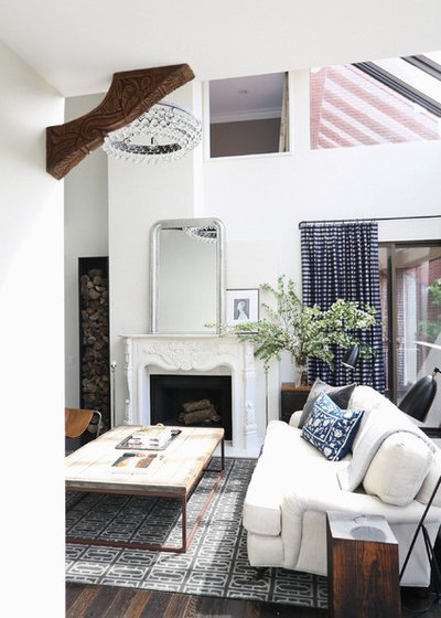
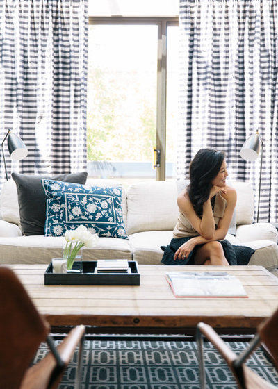
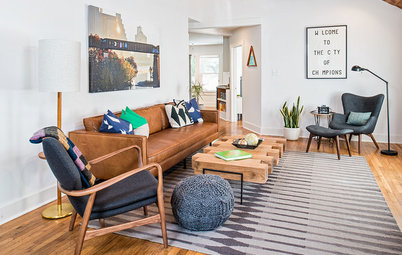
She started in the living room, where a crisp palette of white and indigo enlivens the space. The rounded lines of the mirror, sofa, chair and a carved wooden bracket (an Indonesian piece scored at a junk yard and seen in the upper left) soften the angular lines of the architecture.
When Kwong and her then-boyfriend moved to San Francisco, she purchased her first home: a condo in the city’s Jackson Square neighbourhood, known for its historic brick buildings and old San Francisco character. The home is in a development constructed in the 1970s and had an interior to match. “It was kind of scary,” she says. “There was white carpet and mirrored panels everywhere.”
Excited about the changes afoot, Kwong decided to modify the look of the space without altering the architecture. With paint and furnishings, she updated the look from the feel-good era to the present.
She started in the living room, where a crisp palette of white and indigo enlivens the space. The rounded lines of the mirror, sofa, chair and a carved wooden bracket (an Indonesian piece scored at a junk yard and seen in the upper left) soften the angular lines of the architecture.
Kwong used as inspiration the Brooklyn home of Jenna Lyons (she’s the creative director of J. Crew, and she plays the mean corporate boss on the television show Girls). “I was trying to do the San Francisco version of that home,” the designer says of Lyons’ glam but casual, elegant yet rustic space, often seen in published photos.
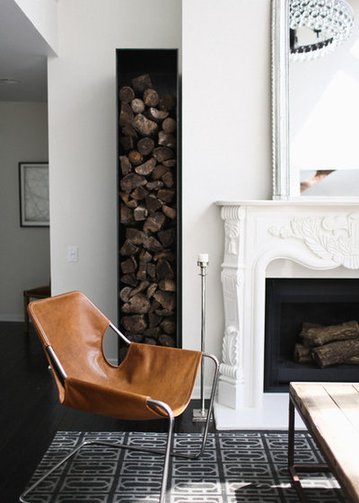
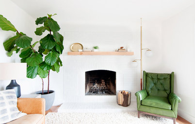
She started with the fireplace, which used to be a simple tile-surrounded affair. “I designed the new mantel myself,” Kwong says. “Because it was the focal point, I wanted it to be special. Although I wanted it to be white and clean, I also wanted it to have some sort of ornamentation.”
The carved mantel is juxtaposed with a sculptural wood box, also custom designed by Kwong. “I loved the idea of a tall element made of cold-rolled steel against the more classic mantel,” she says. Kwong notes that making it tall was essential. “The footprint of the home is small, but the ceilings are double height,” she says. “This tall piece draws the eye up.”
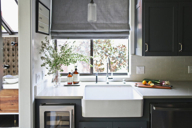
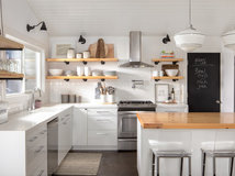
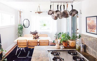
The narrow galley kitchen was equipped with the Euro-style cabinets beloved by 1970s homeowners. Kwong swapped them for grey Shaker-style cabinets. “I wanted the space to feel cosy,” she says.
In this room space is at a premium, but that doesn’t mean Kwong had to sacrifice amenities. She made room for elements such as a wine refrigerator and a farmhouse sink by choosing the slimmest models of appliances she could find. “I decided on what was most important to me, such as a big farmhouse sink, and included it,” Kwong says. “After that it was a game of inches.”
“Cabinet space is also important, and it seems like there is never enough,” she says. “To make the most of them, I outfitted as many cabinets as possible with pullouts.”
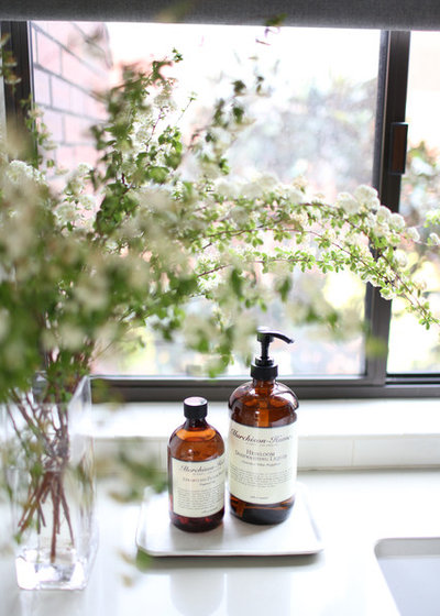
Because space is limited, Kwong makes utilitarian items serve a decorative purpose. “Packaging matters when something is on display,” she says of her Murchinson-Hume dishwashing liquid.
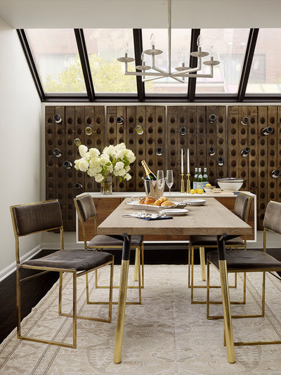
One distinctive feature of many condos in this development is an angled glass ceiling. In Kwong’s unit it’s in the dining room, located next to the kitchen. “When I first looked at this home, they had it styled as an office,” she says. “My first reaction was that it should be a dining room, but I thought it was too small.”
In truth the room only felt small. By installing deconstructed riddling racks (old wooden racks used to store bottles in wine caves), she made the room seem more expansive. “I think that large gestures make a room look bigger,” she says. The panels float on brackets away from the wall, allowing bottles that will be opened in the near future to rest there.
The table is an off-the-shelf item from Blu Dot, but Kwong made it her own by applying gold leaf to the legs. “For my own house, I spent more on the finishes and curtains – which I believe define the character of a room,” she says.
See more wonderful wine storage ideas
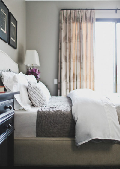
She applied the same rule to the master bedroom, where the furnishings are from retail sources, but the curtains are custom and crafted of high-end fabric.
Bed: Crate & Barrel
Bed: Crate & Barrel
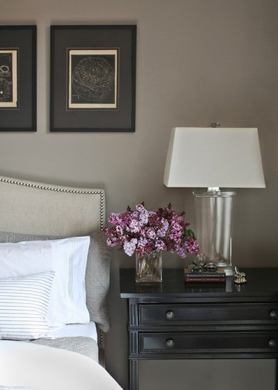
“In the public parts of the house, the walls are white,” says Kwong. “But in the other rooms, I used colour.” In the master bedroom, she opted for a soothing palette of greys and taupes.
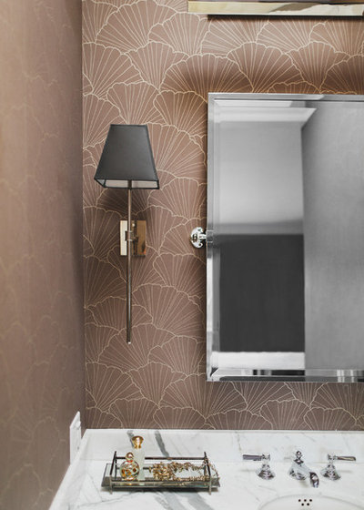
The colour palette continues into the master bath, with its taupe- and purple-toned wallpaper.
Faucets: Waterworks; sconces: The Urban Electric Company; wallpaper: Osborne & Little
Faucets: Waterworks; sconces: The Urban Electric Company; wallpaper: Osborne & Little
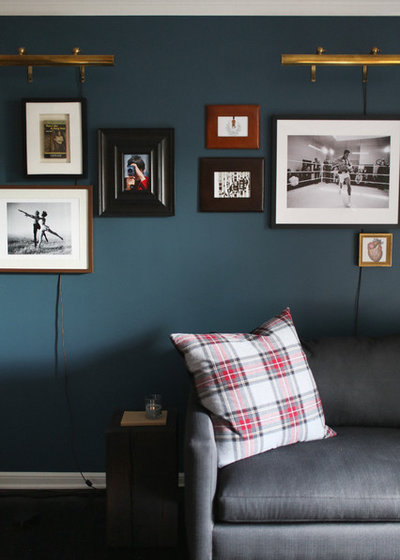
A darker colour cloaks Brian’s study. The couple got engaged near the end of the project, and this room was the last one to be completed. “My husband is an emergency room physician, and he keeps odd hours,” Kwong says. “He needed a dark room where he could sleep during the day if he needs to.” In addition to the dark walls, she installed blackout shades on the windows.
The art wall contains photos they both love and mementos of their lives.
The art wall contains photos they both love and mementos of their lives.
Decorating her first home has been a great personal exercise for Kwong, seen here. “I tried to create a place that was classic and not too trendy, and I think it is,” she says. “This is a real sanctuary for me.”
What are you working on?
Related Stories
Modern Homes
An Updated Mid-Century Look for a Modern Californian Home
An interior designer brings her skills home to create comfortable, family-friendly rooms on a budget
Full Story
Houzz Around The World
USA Houzz: Rusticity Rules in an Alpine Retreat
By Sam Smith
This wood-panelled holiday home provides access to views and outdoor activities for its adventurous homeowners
Full Story
Houzz Around The World
All Aboard a Floating Cabin Home in Seattle
This small home on the bay has the best of both worlds – rustic cabin living with killer water views
Full Story
Houzz Around The World
USA Houzz: A Cool Coastal Home Named 'Mystic Rock'
By Faith Towers
Built behind a rocky outcropping, this DIY- and art-infused home has plenty of privacy for its family of four
Full Story
Contemporary Homes
Houzz Tour: A Century-Old Townhouse Gets a Fresh, Modern Update
This two-level apartment is now bathed in natural light and warmth, thanks to clever design and lots of vintage charm
Full Story
Colourful Homes
Houzz Tour: A Boho Bungalow Embraces Colour and Fun
A first-time buyer’s eclectic, collected style comes together in this Portland, Oregon, home
Full Story
Houzz Around The World
USA Houzz: Cosy and Clutter-Free in a Charming Rental Home
By Janet Paik
A bright and inviting vibe rules in a couple’s 74-square-metre home decorated with vintage finds in a minimalist farmhouse-cottage style
Full Story
Houzz Around The World
USA Houzz: A Manly Home Gets the Designer Touch
This Texan transplant had no time to style his home himself, so he called in the experts to create a rustic pad fit for a king
Full Story
Houzz Around The World
USA Houzz: A Minimalist Revamp Brings a Dark Home Into the Light
This pair of avid DIY-ers used their love of mid-century design, bohemian decor and recycled secondhand finds to brighten up a dated home
Full Story
Small Homes
Customised Tiny for a Couple to Call Home
By Julie Sheer
This cedar-clad tiny house on wheels provides all a Californian couple need to live life on their own terms
Full Story
Very nicely done.
Not all women like things that are frilly or what we perceive as 'feminine'; my sister is like this, she grew up with 4 brothers and had a hard time coming up with an outfit for our youngest brother's wedding coming up in a month.
Even myself, I own a 1960's ranch style house, and I hate the various molding in homes, the roman ogee, classical, Victorian... carved spirals, turned and carved finials, and all those other frilly things, they are just not for me. I like simple lines, single panel doors, a more industrial or mid century modern or modern look.
Lovely!!!