
Decorating

Why You Shouldn't Go Overboard With Colour
Using colour with restraint both inside and outside can be far more effective than a not-so-subtle approach

If I could write this article in colour I probably would, and the reason is that colour almost always captures the mood, the personality and the energy of the space you are creating, and even more so of that of the creator. You can tell a lot about a person from the way they dress, the colour of their shoes or the print on their shirt. A house is no different – colour on both the inside and outside of the home will provide you with a glimpse of the type of person who lives there. After all, what we wear is a reflection of who we are and how we use colour in our home most certainly reflects what we want our house to be.
So what do you want to tell the world? And how much colour should be used? Well, the amount of colour depends on what mood you are trying to set or what personality you are trying to convey. Did you know that red raises the energy in a room while green and blue are restful, serene and relaxing colours? Or that purple is associated with sophistication, drama and luxury, while black is the colour of authority and power and, at the same time, stylish and timeless? Colour is an individual preference and will not always be universally liked, and too much of a colour can have the opposite effect of what you are trying to achieve. So to provide you some tips, this is how restraint with colour is used to create beautiful homes.
So what do you want to tell the world? And how much colour should be used? Well, the amount of colour depends on what mood you are trying to set or what personality you are trying to convey. Did you know that red raises the energy in a room while green and blue are restful, serene and relaxing colours? Or that purple is associated with sophistication, drama and luxury, while black is the colour of authority and power and, at the same time, stylish and timeless? Colour is an individual preference and will not always be universally liked, and too much of a colour can have the opposite effect of what you are trying to achieve. So to provide you some tips, this is how restraint with colour is used to create beautiful homes.
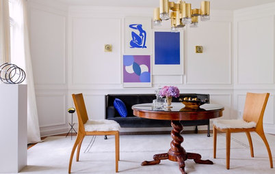
Colours that are opposites
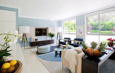
They say that blue and green should never be seen next to each other. Someone forgot to tell Greg Natale! This colour scheme shows the sophistication and skill of not only Natale but also the homeowner who has shown great faith in their designer to capture a particular mood. From the soft blues of the dining room walls to the soft greens of the kitchen cabinets that sit on a black and white checkerboard floor, I am transported back to my childhood in the ‘70s when this colour scheme adorned our own home, but not in such a dramatic manner. You just want to walk through those doors to see what else is happening.
They say that blue and green should never be seen next to each other. Someone forgot to tell Greg Natale! This colour scheme shows the sophistication and skill of not only Natale but also the homeowner who has shown great faith in their designer to capture a particular mood. From the soft blues of the dining room walls to the soft greens of the kitchen cabinets that sit on a black and white checkerboard floor, I am transported back to my childhood in the ‘70s when this colour scheme adorned our own home, but not in such a dramatic manner. You just want to walk through those doors to see what else is happening.
Colour to make a statement
Hand in the air if you would ever dare paint a room a single colour –not only on the walls and ceiling but also the architraves, skirtings, door, cornices and ceiling rose. Oh, and that colour is black. Even the hydronic heater and marble fireplace is black.
The interior designers at Mr. Mitchell have not only shown remarkable restraint in their use of colour, but they have told us a lot about the homeowners. The colour black provides a backdrop for all the worldly possessions of the homeowner and makes a statement about who they are. Remember in my opening paragraph when I mentioned that black is a colour of authority and power? The interior styling of this room helps reinforce the use of the colour black, to tell a story, from the bold timber period desk and leather chair, to the world globe and horseracing prints on the wall, to the prized winner’s cup on the fireplace mantle. Finally, far from using a period pendant, the designers have chosen what looks like a contemporary design: a light fitting made of antlers.
Zero colour
There are times when no colour is the appropriate solution. (Even though white is actually a colour). Horton & Co. Designers has not only created a mood in the room that is one of tranquility, but provided us a glimpse of the personality of the homeowners. There is no doubt that this is a reading room, where the books take centrestage and provide all the colour. The soft fabrics and the print on the wall also add additional highlight colours, taking their cue from the vast book collection. If a room is going to be filled with objects that contain a lot of colour, it is important you don’t add additional colours on the walls or all of the objects will recede into the background and any impact will be lost.
There are times when no colour is the appropriate solution. (Even though white is actually a colour). Horton & Co. Designers has not only created a mood in the room that is one of tranquility, but provided us a glimpse of the personality of the homeowners. There is no doubt that this is a reading room, where the books take centrestage and provide all the colour. The soft fabrics and the print on the wall also add additional highlight colours, taking their cue from the vast book collection. If a room is going to be filled with objects that contain a lot of colour, it is important you don’t add additional colours on the walls or all of the objects will recede into the background and any impact will be lost.
Colours from the same palette
I could almost tell you the colour of the outside of this house without seeing an exterior photo. Colours from the same colour palette allow you to create a mood. So how much colour did the designers at Darren Palmer Interiors use? Well at the outset you would say two –black and a dark taupe. However, there are other colours that also come into play including the white ceiling and the grey carpet. Shadows also add colour by changing the shade of one wall to another. Remember that when you choose the number of colours you want to use in a space some other colours will naturally come into play, so try not to highlight too many colours or your message will be lost.
I could almost tell you the colour of the outside of this house without seeing an exterior photo. Colours from the same colour palette allow you to create a mood. So how much colour did the designers at Darren Palmer Interiors use? Well at the outset you would say two –black and a dark taupe. However, there are other colours that also come into play including the white ceiling and the grey carpet. Shadows also add colour by changing the shade of one wall to another. Remember that when you choose the number of colours you want to use in a space some other colours will naturally come into play, so try not to highlight too many colours or your message will be lost.
Colour that reflects
Like the previous photo, there appears to be only a couple of colours in this bathroom design. However, the architects at Smart Design Studio realised that reflective glass and mirrored surfaces would create depth and colour by their inherent characteristics. Even the tiles have a few shades of taupe, and there are also a couple of whites – the white of the porcelain fixtures and the white of the ceiling. You think you have only chosen two colours but look how many actually appear.
Like the previous photo, there appears to be only a couple of colours in this bathroom design. However, the architects at Smart Design Studio realised that reflective glass and mirrored surfaces would create depth and colour by their inherent characteristics. Even the tiles have a few shades of taupe, and there are also a couple of whites – the white of the porcelain fixtures and the white of the ceiling. You think you have only chosen two colours but look how many actually appear.
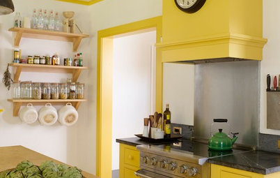
Colour to highlight
In this kitchen design, the cabinetry specialists at KTC Design wanted to highlight the unusual colour selection for the benchtop. In order to draw your attention to the benchtop and make it the focal point, the palette of the remaining joinery is neutral along with the colour selection of the walls. Had the designers chosen to also use other highlight colours in this room then the focal point of the kitchen benchtop would have been lost.
In this kitchen design, the cabinetry specialists at KTC Design wanted to highlight the unusual colour selection for the benchtop. In order to draw your attention to the benchtop and make it the focal point, the palette of the remaining joinery is neutral along with the colour selection of the walls. Had the designers chosen to also use other highlight colours in this room then the focal point of the kitchen benchtop would have been lost.
Colour for personality
I love this space because the architects at Scott Weston Architecture Design obviously had a strong brief from their clients on how the space should reflect who they are. There are so many colours in this room that are picked up in the selection of the furnishings, joinery, curtains and even the pot plant. There was no need for a colour selection for the walls except for a not-so-subtle black print that provides further evidence of the homeowners’ personality. You just want to know what all the other rooms in this house look like. Remember though, that this colour palette is not for everyone. Some would argue that no restraint was shown, but that is far from the truth. Considerable thought was given to coordinating the colour of the chairs to match the curtains, and the tabletop to match the overhead cupboards. Colour is an individual preference and a reflection of you.
See more of this home
Colour to create drama
There are times as an architect when you want to highlight the architectural forms of a space in a dramatic fashion. This contemporary kitchen which is sculptural in form was designed by the Smart Design Studio, and the drama of the space is created by careful restraint in the colour selection. In order to highlight the individual architectural elements, colour contrasts are created. For example, the white recessed cabinets clearly stand out against the dark panelled wall. The sweeping white curved mezzanine above is also highlighted against this same dark wall.
The designers also realised that to limit the colour selection they would also need to limit the material selection for the tiles and benchtop, as that would introduce yet more colours. Therefore, the same stone material was used for the floor and the kitchen benchtop. The only hint of a foreign colour is the green of the grass following the same line down the side of the building, but that, too, is contrasted against the white wall.
Colour to highlight form
If you want to hide an architectural form, you simply paint it the same colour as the rest of the house. However, if you want to show off the form, you paint it a different colour altogether. The team at Design Unity wanted to express the bold angled form on this house which sits proud of the facade, so what better way to do it than give it a strong colour that contrasts with the white adjacent walls? Had they introduced just one other colour, the message would have been lost. Even the landscape design supports the architectural form.
If you want to hide an architectural form, you simply paint it the same colour as the rest of the house. However, if you want to show off the form, you paint it a different colour altogether. The team at Design Unity wanted to express the bold angled form on this house which sits proud of the facade, so what better way to do it than give it a strong colour that contrasts with the white adjacent walls? Had they introduced just one other colour, the message would have been lost. Even the landscape design supports the architectural form.
Colour to highlight architectural elements
A house which displays external architectural elements you want to highlight, such as fretwork, are often painted a different contrasting colour to the rest of the facade. This is seen in many period homes. So how many colours do you highlight? Many homeowners are authentic in the restoration process. Some Victorian and Edwardian homes, for example, display many colours in order to highlight the roof, the gutters, the fretwork, corbels, fencing, and so on. These homes usually have a vast amount of literature to help you restore the home to the original colour scheme and allow you to identify the architectural style. Even in this contemporary timber home, interior designers at The Space Within have chosen to highlight the craftsmanship of the timberwork against the boldness of the facade by choosing one colour only to help express the difference. The introduction of a third colour on the outside of this home would have disrupted the purity of the design.
A house which displays external architectural elements you want to highlight, such as fretwork, are often painted a different contrasting colour to the rest of the facade. This is seen in many period homes. So how many colours do you highlight? Many homeowners are authentic in the restoration process. Some Victorian and Edwardian homes, for example, display many colours in order to highlight the roof, the gutters, the fretwork, corbels, fencing, and so on. These homes usually have a vast amount of literature to help you restore the home to the original colour scheme and allow you to identify the architectural style. Even in this contemporary timber home, interior designers at The Space Within have chosen to highlight the craftsmanship of the timberwork against the boldness of the facade by choosing one colour only to help express the difference. The introduction of a third colour on the outside of this home would have disrupted the purity of the design.
Colour for luxury
I have always believed as an architect that if you want to make a house look expensive, choose one colour or two as an absolute maximum, with the second colour used sparingly. So, for example, paint the facade, fence, windows, even the downpipes, all the one colour. Don’t differentiate.
You should also choose a colour that exemplifies sophistication, luxury and style. If you take a drive around the most affluent suburbs in Australia, you will notice that many of these homes take on this use of a single colour. Their fences, walls, fenestration, etc, are all one colour. As an analogy, its like wearing a timeless black suit or dress – it’s all one colour and looks sophisticated. As you can see, the builders at To The Mil have demonstrated luxury in this home with the use of one colour and a second colour used only to highlight.
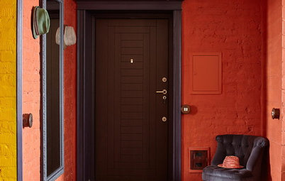
Colour as identity
There are times when you have to literally tell the world where to go, and I do mean literally. Michelle Walker uses colour successfully to identify not only the entrance door but also the garage in this nondescript facade that sits flush on the street boundary. Sometimes you just have to be bold and direct.
There are times when you have to literally tell the world where to go, and I do mean literally. Michelle Walker uses colour successfully to identify not only the entrance door but also the garage in this nondescript facade that sits flush on the street boundary. Sometimes you just have to be bold and direct.
Colour by day and night
Choosing the right colour and the amount of colour to use both inside and outside of the house is not easy and that’s why professionals are the go-to people because they have the experience to not only showcase your house but your personality as well, and create just the right mood.
Here, the experts at Interiors By Darren James have used not only colour but light to create the right mood for this amazing poolside setting. Did you know that individual colours look completely different under different light? The contrast can be amazing. The team at Taubmans has brought out a colour lighting tool on the company’s website – you can select a colour and instantly see the changes of that colour under the influence of different lighting.
HAVE YOUR SAY
If you have used colours with restraint or no restraint in your home design, attach a photo or share your thoughts in the comments section.
MORE
7 Ways the Great Australian Landscape Can Inspire Your Colour Scheme
Is Colour Setting the Right Tone in Your Home?
How to Be Truly Confident With Colour

Sponsored
Sponsored
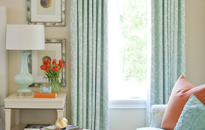
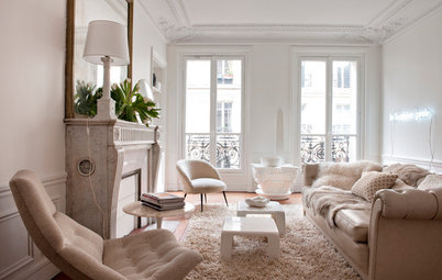
If you were walking down this hallway towards these double doors that are open, there is no doubt you would be drawn into the room. Interior designers from Destination Living have been very clever in showing restraint with their colour palate. The soft blue of the walls, in contrast with the white colour scheme, beckons you inside in anticipation of what lies beyond. Choosing only one colour can be so difficult, however I have no doubt that the mood the designers wanted to create by using blue only, was one of peace and tranquility.