


Amazing Additions: 8 Modest Homes Made Marvellous
Ultra-modern extensions can take an old home and make it liveable again, as these renovations reveal
Joanna Tovia
30 May 2017
Houzz editorial team. Photojournalist specialising in design, travel and living well. Follow her photodocumentary about pets and the people who love them on Instagram @unfoldingtails
Houzz editorial team. Photojournalist specialising in design, travel and living well.... More
It’s not always possible to build the house of your dreams from scratch, but if you’re open to a bit of contrast between old and new, homes designed for days of old can transition beautifully into the 21st century. As these remarkable Australian and New Zealand designs reveal, just because an extension or addition doesn’t blend in with the original home doesn’t make it any less special. In fact, many would argue that contemporary add-ons can make a plain house into a masterpiece… and infinitely more suitable for modern family living.
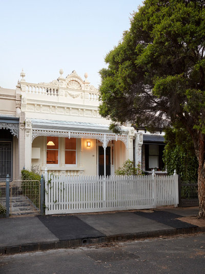
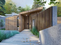
1. Creative solution
Terrace houses and worker’s cottages pose significant challenges for homeowners in need of a little more space, but this project shows what can be accomplished when imagination is allowed to run a little wild. Although the original facade was restored, there’s no sign of the dramatic changes that took place on the roof and at the rear of this home.
Terrace houses and worker’s cottages pose significant challenges for homeowners in need of a little more space, but this project shows what can be accomplished when imagination is allowed to run a little wild. Although the original facade was restored, there’s no sign of the dramatic changes that took place on the roof and at the rear of this home.
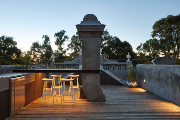
A new roof deck hides behind the original front facade – and there’s ample space for bar seating and an outdoor kitchen.
The rooftop terrace is accessed via the modern two-storey addition.
The timber-clad facade of the addition glows at night. And the backyard even has space for a second outdoor kitchen.
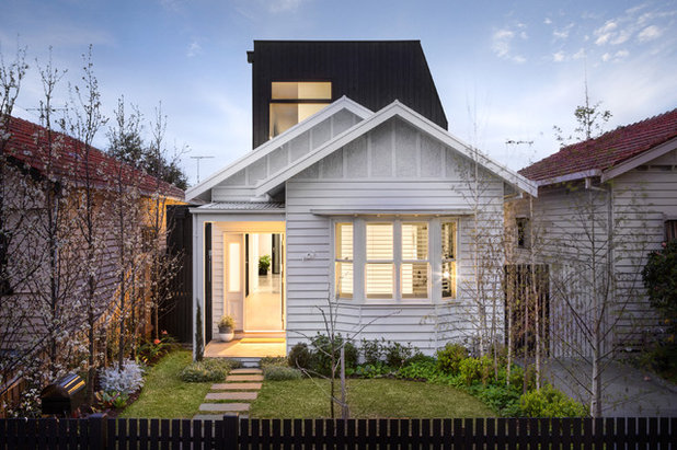
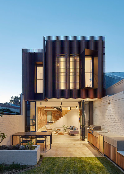
2. Cottage contrast
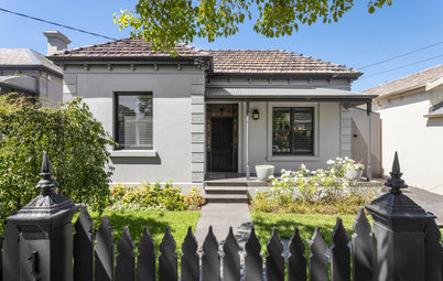
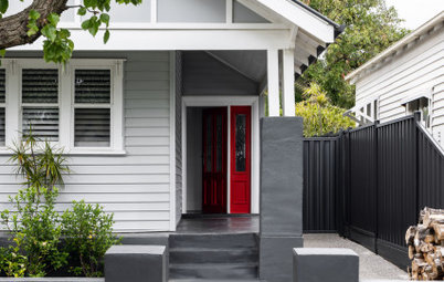
A modern rear addition transformed a dilapidated cottage into a much-loved family home. While council and heritage restrictions often mean extensions have to be hidden from the street, in this suburb it was allowed to stand out and proud.
10 of the coolest before-and-afters from Houzz
A modern rear addition transformed a dilapidated cottage into a much-loved family home. While council and heritage restrictions often mean extensions have to be hidden from the street, in this suburb it was allowed to stand out and proud.
10 of the coolest before-and-afters from Houzz
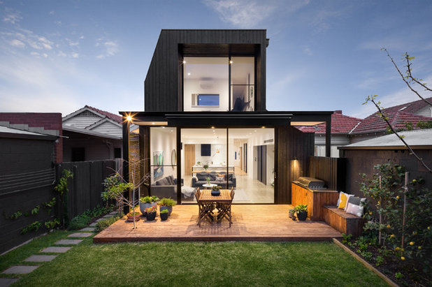
The cottage is located on a small inner-suburban Melbourne block, so going out and up made the most sense – with careful consideration of flow and use of space.
The addition allowed for contemporary and spacious living areas, despite the block’s size constraints.
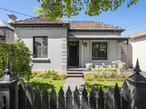
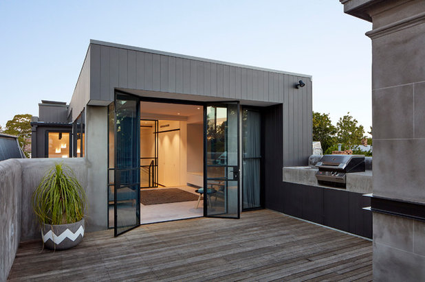
3. Little but large
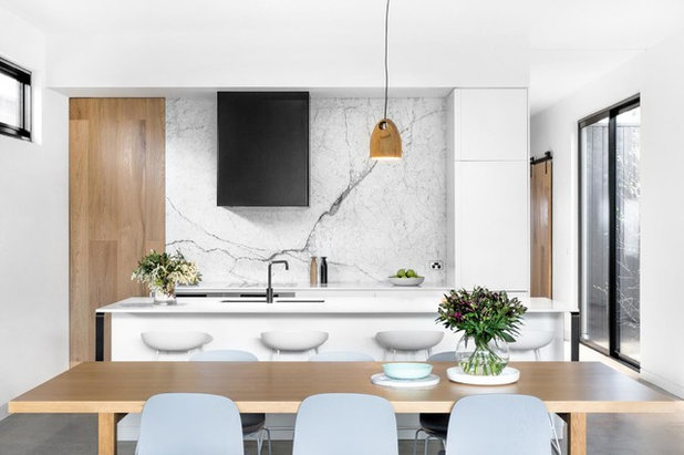
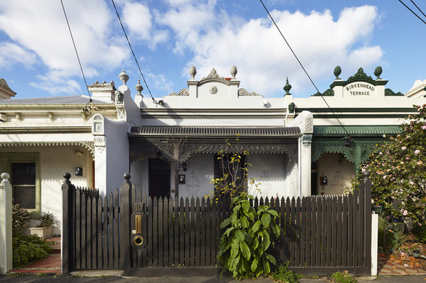
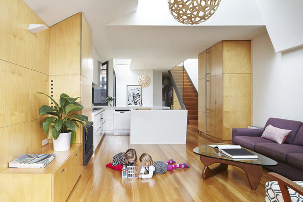
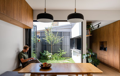
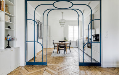
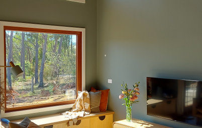
Here is another Victorian terrace transformation that is invisible from the street – essential when there are strict heritage guidelines. This inner-Melbourne home was bursting at the seams – a young family of four lives here – and suffered from a lack of natural light. The site is five metres wide and 140 square metres.
Here is another Victorian terrace transformation that is invisible from the street – essential when there are strict heritage guidelines. This inner-Melbourne home was bursting at the seams – a young family of four lives here – and suffered from a lack of natural light. The site is five metres wide and 140 square metres.
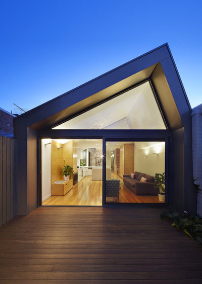
The extension and renovation turned this tiny house into a generous home comprising four bedrooms, a study and two bathrooms, all the while protecting the neighbours’ privacy and respecting historical concerns. The design also had to avoid casting shadows over the neighbours’ north-facing living room windows – careful sunlight and shadow studies were required.
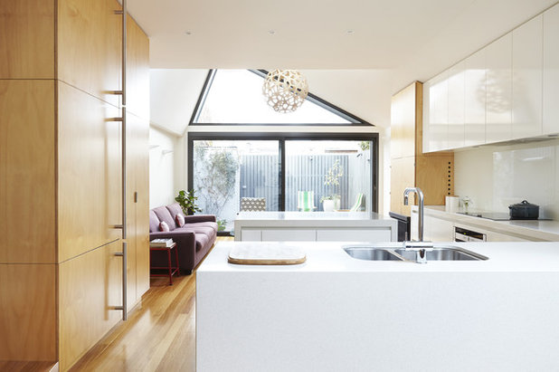
The home is now filled with light thanks to vaulted ceilings, skylights and plenty of glass. The vaulted ceilings throughout the ground and first floor enhance the feeling of space and capture extended views of neighbouring trees.
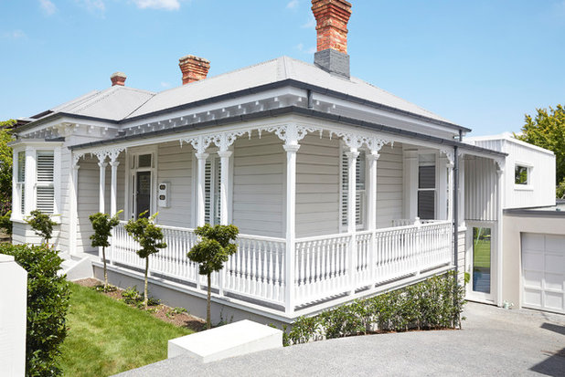
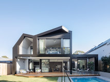
4. Auckland add-on
There’s something seductive about a period home, to be sure. But if the home doesn’t suit your lifestyle, it can soon start to feel cramped and confining. Add a child or two into the mix and selling up or adding an extension are often the only options.
There’s something seductive about a period home, to be sure. But if the home doesn’t suit your lifestyle, it can soon start to feel cramped and confining. Add a child or two into the mix and selling up or adding an extension are often the only options.
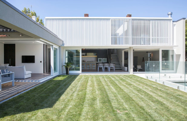
This ultra-modern addition is barely visible from the front, thanks to a sloping backyard. The old lean-tos on the existing home were demolished to make way for a long, tall, west-facing extension. The upper storey was wrapped in white timber screens to ward off the late-afternoon sun. A one-storey extension was also added along one side of the garden to create a much-needed family room, and to provide privacy from the neighbours.
Although the addition is in dramatic contrast to the original home, it is deliberately complementary in scale and flow. Original homes of this style (known as villas in New Zealand) had high ceilings and wide hallways, and square rooms with tall sash windows and deliberate openings, says architect Gerrard Hall, adding that even the smallest, most humble villas had a sense of generosity that more modern houses lack.
Take a tour of this impressive home
Take a tour of this impressive home
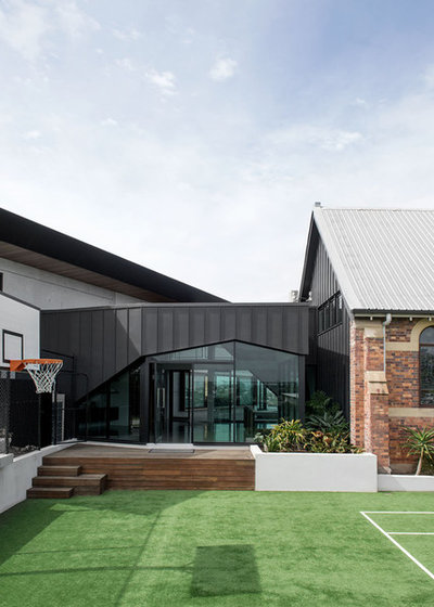
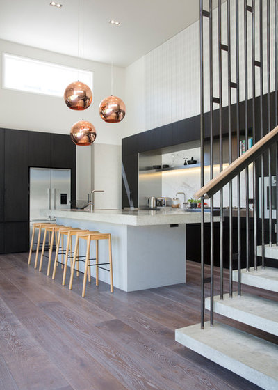
5. Brisbane beauty
This project involved a two-storey off-form concrete and glass extension to a 1924 heritage-listed church. A zinc box links the two structures, and there’s another accessway via an underground garage, whisky bar, cellar and workshop – through a tunnel!
This project involved a two-storey off-form concrete and glass extension to a 1924 heritage-listed church. A zinc box links the two structures, and there’s another accessway via an underground garage, whisky bar, cellar and workshop – through a tunnel!
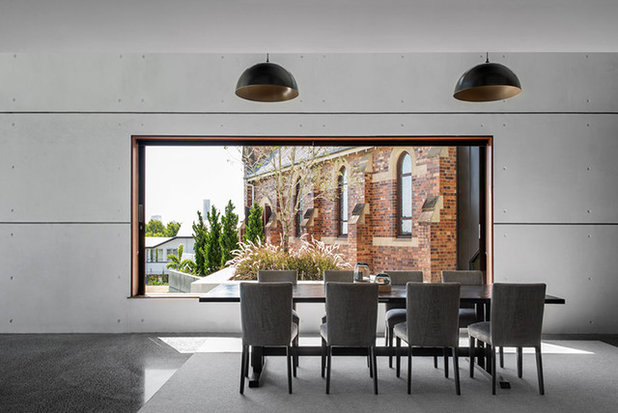
The ground-floor extension is home to a living area, media room and guest room, all opening out onto a tennis court, pool, city views and a landscaped garden. And, of course, the church.
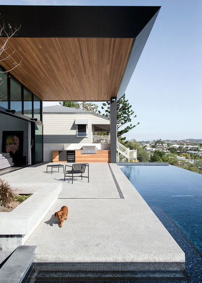
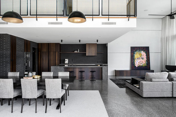
Upstairs is a master suite, and three bedrooms and bathrooms that cantilever into large voids. The upper floor also has a bridge connection to a mezzanine home office, which sits within the existing heritage church.
See more ultra-contemporary extensions
See more ultra-contemporary extensions
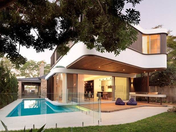
6. Sydney pool house
The inspiration for this Randwick home’s two-storey addition came from a houseboat – evident in its rounded corners and wraparound swimming pool. The cantilevered first-floor master bedroom provides shade and a rainproof cover for the outdoor terrace.
The inspiration for this Randwick home’s two-storey addition came from a houseboat – evident in its rounded corners and wraparound swimming pool. The cantilevered first-floor master bedroom provides shade and a rainproof cover for the outdoor terrace.
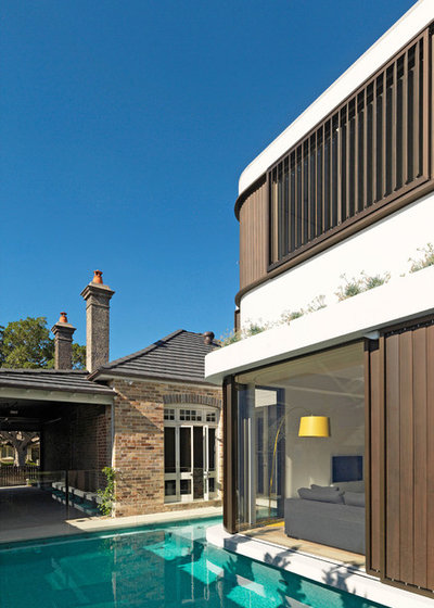
The verandah/carport is also new, but ties in seamlessly with the original home – a single-storey cottage built in 1910. Motorised sliding shutters on the addition provide privacy and sun protection.
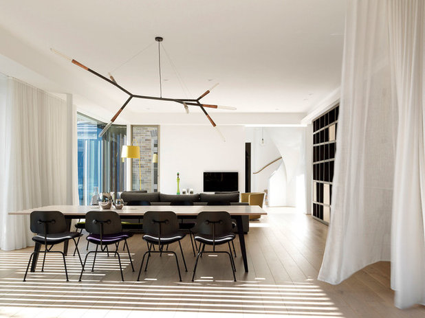
Inside, an elliptical stairway connects the old and the new, and leads to the upstairs bedrooms.
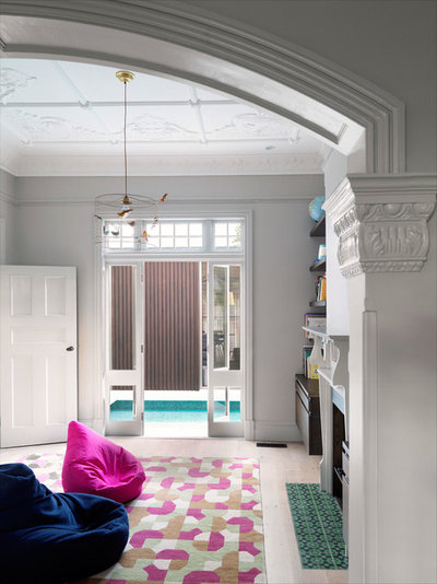
In the original home, French doors open directly onto the pool.
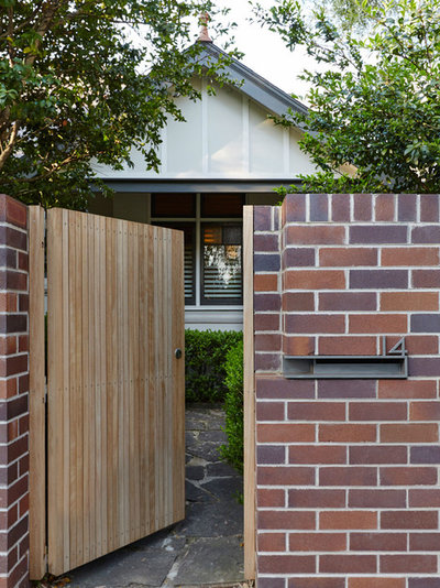
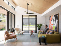
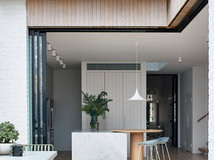
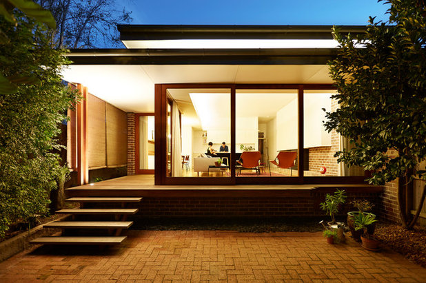
7. Sydney semi
A typical semi-detached house in Neutral Bay was reworked to accommodate the needs of a young family, the new front fence and gate hinting at the smart rear addition to come.
A typical semi-detached house in Neutral Bay was reworked to accommodate the needs of a young family, the new front fence and gate hinting at the smart rear addition to come.
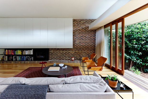
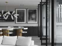
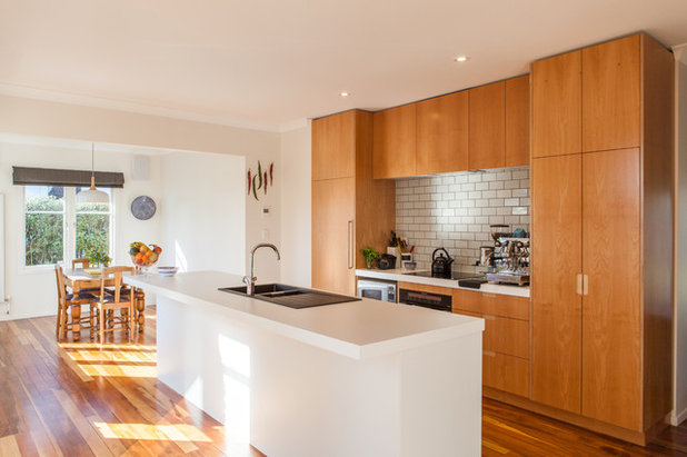
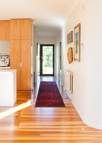
The addition has given the family living here plenty of room to move and some much-needed storage. It’s filled with sunlight and frames views of the garden.
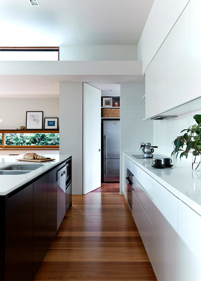
And what’s a modern extension without a sleek new kitchen? For people living in old homes in need of a renovation, this alteration alone can be life changing.
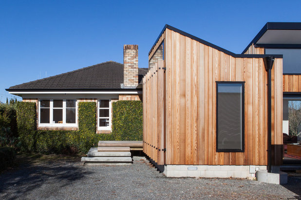
8. Kiwi wonder
This original 1940s home, located in Hamilton, New Zealand – in what’s known as a special character area – is clad in warm-toned Huntly bricks, typical of houses of the era. The owners renovated soon after buying the house, requiring a complete reconfiguration of internal spaces and extra living and study spaces. Although the addition is distinct from the original, it maintains a connection through scale, texture and colour.
This original 1940s home, located in Hamilton, New Zealand – in what’s known as a special character area – is clad in warm-toned Huntly bricks, typical of houses of the era. The owners renovated soon after buying the house, requiring a complete reconfiguration of internal spaces and extra living and study spaces. Although the addition is distinct from the original, it maintains a connection through scale, texture and colour.
The original home’s character has also been retained by mimicking the intimate scale of the existing interior spaces, with a welcome contemporary twist.
Your say
If you enjoyed this story, like it, bookmark it, save the photos and share your thoughts below. Join the conversation!
More
Read more stories about renovations
If you enjoyed this story, like it, bookmark it, save the photos and share your thoughts below. Join the conversation!
More
Read more stories about renovations


Related Stories
Renovation Guides
Room by Room: Experts on Ways to Avoid Common Renovation Blunders
From the kitchen to the garden, and all areas in between, experts identify common mistakes and share priceless insights
Full Story
Most Popular
How to Control the Cost of Your Renovation, Room by Room
Where to save, where to spend (and all the tricks in between) for keeping the cost of your renovation on track
Full Story
Before & After
Before & After: Once Hidden, a Victorian Home's Beauty Unmasked
Peeling back the layers of a series of modernisations and then adding a sympathetic new extension revitalised this home
Full Story
Project Of The Week
An Inspired Solution for a Dark & Disjointed Californian Bungalow
See how an architect opened up a light-starved, closed-in Melbourne home, and connected it with the neighbouring park
Full Story
Most Popular
Removing a Wall? What to Consider Before You Get Started
Thinking about getting rid of a wall at home to create more open space? Here's what you need to consider first
Full Story
Interior Design
What's Next in Homes? 4 Design Experts Reveal
Do you know which colours, shapes and styles we'll be coveting in the year ahead? Four design pros give the inside scoop
Full Story
Most Popular
Uh-Oh, You Bought a Cave: 7 Ways to Lighten Up a Dark Home
How one homeowner used windows, doors, mirrors and skylights to bring light into her dark, dark home
Full Story
Storage
Renovation Insight: How to Choose & Work With a Cabinet Maker
Custom joinery allows you to tailor a space to suit your needs – here's how to choose the right firm for the job
Full Story

Kitchens
Before & After: A Scandi-Style Kitchen in NZ That's Light & Airy
See this sweet, bright kitchen and dining space in Wellington, which had environmental concerns at the heart of its plan
Full Story
Projects Born on Houzz
Rural Houzz: A Reader's Forever Home, Inspired by Houzz
When designing a home on a challenging site for ageing-in-place, this reader turned to Houzz for inspiration and advice
Full Story
So many creative and innovative designs! Great source of inspiration when needed.
Some stunning examples here. We love the challenge of marrying old and new in a sympathetic way - constraints and parameters aren't all bad - almost the opposite in that they can inspire real creativity.
You know I think I'm going to have to differ on this... I know its all the rage, but i just think it looks really wrong. I like the front and the back of each, but I really don't like them mashed together! sometimes the extensions swamp the architecture of the front. I think good architecture has a conversation with its setting and surroundings, but these modern sculptural masterpieces completely overwhelm or ignore the house they're attached to and the street and neighbourhood.
I think the designs should at least make reference or nod towards the original house, for example when the modern extension uses the same materials like similar brick or for a timber cottage extension... timber. Or when the roofline is echoed even if in a more streamline form. Or a feature of the street architecture is re-interpreted like in an art deco extension that used curved windows. Some of these extensions don't sit well in situ either. Maybe it would be better not to live in a historic terrace house neighbourhood?