


10 Kitchen Colour Schemes That Will Stand the Test of Time
A new kitchen is a long-term fixture in your home. Ensure yours won't date by choosing a timeless colour scheme
Anne Ellard
19 September 2017
Houzz Australia Contributor. Kitchen designer at Kitchens by Kathie in Brisbane, Australia. I strongly believe that above all else, the most important thing when designing a kitchen is creating something that the client loves!
Houzz Australia Contributor. Kitchen designer at Kitchens by Kathie in Brisbane,... More
Planning your new kitchen is exciting but it can be overwhelming at times too, with so many different aspects to consider. That’s why I always suggest my clients break the process down into stages and take each one a step at a time. Planning the colour scheme is the part they enjoy the most, but they are often scared of choosing one that will date quickly. These 10 classic and timeless colour schemes are worth considering for your next kitchen renovation. All can have different colour accessories added to them to change the look and feel of the space over time, but I guarantee you won’t tire of any of these schemes quickly.
To aid you in your selections, I have provided one benchtop suggestion and one cabinet door colour suggestion to help you achieve a similar look to each of the schemes in your own home (the colours and materials I have suggested are not necessarily exactly what was used in the photos). Your cabinet maker or kitchen designer will be able to easily source all these materials for you.
Take a look at some ‘real life’ colour swatches when you are shopping. You will notice that some colours will look different on your computer or tablet screen than they do in real life. This is because it depends on what type of screen you are viewing it on, the resolution of the uploaded images and the calibration of your screen. This is why it is always best that you choose colours for your kitchen, or any room in your home, from real swatches or sample paint pots and never from shade cards (unless real paint chips have been used) or websites.
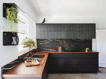
1. Black, White and Grey
The contrast of black and white has been a much loved colour combination both in fashion and interiors for many, many years. Although the contrast of black and white is strong, it’s still a very easy scheme to live with. Because there is no real colour as such, a black and white scheme can be brightened with various coloured accessories that can easily be changed as you tire of them.
When we think black and white, we think black tie – smart and sophisticated, and most definitely not out of date. To create maximum impact with this colour scheme, look for the brightest, most crisp white and the purest black. Then soften the harsh contrast of black and white by introducing some grey tones.
Black is a strong tone that creates big impact, so if you have a small space, use it sparingly. Consider a glossy finish for your black surfaces; this will help to bounce light around the room and make the black feel less heavy.
Browse more contemporary kitchens

Get the look
Cabinet colour: Resene ‘Black’
Material: Paint
The purest black in the Resene colour range.
Benchtop colour: Carrara marble
Material: Natural marble
Probably one of the most well-known and most popular marble choices for benchtops and sometimes floor tiles.
Cabinet colour: Resene ‘Black’
Material: Paint
The purest black in the Resene colour range.
Benchtop colour: Carrara marble
Material: Natural marble
Probably one of the most well-known and most popular marble choices for benchtops and sometimes floor tiles.
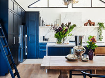
2. Navy and Cream
Getting its name from the British Royal Navy, the colour navy is sophisticated and timeless. When we think of navy, we think of uniformed soldiers or figures of importance such as police. The colour instills a sense of trust and order in us – so it’s no wonder we love it so much.
Look at various tones of the colour and select one that suits your home and the lighting in the space the best. It doesn’t have to be the typical uniform navy that you might have in mind. A dark navy can look almost black while a more muted navy with grey tones might be more suitable as it’s not as dark and overpowering.
Team your chosen shade of navy with contrasting rich cream tones. Think coastal chic. Use warm creams that don’t appear too yellow.
If you love the idea of navy but are afraid that it may make your space appear too dark, you could just use navy as a feature colour on your island bench or some overhead cabinets, leaving the rest of the kitchen a brighter cream colour.

Get the look
Cabinet colour: Taubmans ‘Old Mill Blue’
Material: Paint
A muted greyish navy colour that isn’t overpowering.
Benchtop colour: Caesarstone ‘Buttermilk’
Material: Quartz (engineered stone)
A natural-looking colour variation with warm creamy tones.
Cabinet colour: Taubmans ‘Old Mill Blue’
Material: Paint
A muted greyish navy colour that isn’t overpowering.
Benchtop colour: Caesarstone ‘Buttermilk’
Material: Quartz (engineered stone)
A natural-looking colour variation with warm creamy tones.
3. Natural Tones
Natural, like white, doesn’t have to mean boring. A natural colour scheme is warm, homey and is completely timeless due to the fact than none of the colours are strong and overpowering, so you won’t tire of looking at them. They are soft and inviting.
Think sandy and stone colours. This colour scheme looks great on either modern or traditional-style cabinets, but it really adds a grown-up touch to a traditional or country-style kitchen too.
Look for benchtop colours that mimic the look of natural stone, or better still – if it’s within your budget – consider using real granite or marble for a completely authentic, natural style. Select a stone or stone-look material that isn’t too busy – after all, we’re aiming for a timeless look, so you don’t want to choose something that you will tire of easily.
For your cabinet fronts, pick up a colour from within the benchtop to tie both surfaces together and continue the natural feeling.
Get the look
Cabinet colour: Laminex ‘Moleskin’
Material: Laminate
A natural, earthy, creamy colour that isn’t too yellow.
Benchtop colour: ‘Colonial Gold’
Material: Natural granite
Non-uniform spots of brown and gold scattered across a creamy base.
Cabinet colour: Laminex ‘Moleskin’
Material: Laminate
A natural, earthy, creamy colour that isn’t too yellow.
Benchtop colour: ‘Colonial Gold’
Material: Natural granite
Non-uniform spots of brown and gold scattered across a creamy base.
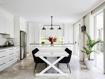
4. White on White
I know what you’re thinking … boring! But white on white kitchens, although admittedly not to everyone’s taste, are perhaps the most timeless of all kitchen colour schemes and the most popular, with very good reason. White is a very easy colour to live with, it’s easy on the eye, doesn’t demand attention, you won’t get tired of looking at it and, best of all, there is an endless choice of coloured accessories that you can team with white without them clashing.
An all-white kitchen exudes an air of sophistication, simplicity and grace. It looks fresh and bright and never dated. You can easily add colour to an all-white kitchen, and change it often with the use of coloured accessories such as pendant lights, small appliances and even plants.
Choose your shade of white carefully. Opt for shades that are on the cooler side (with a slight blue undertone) as opposed to whites that are too warm, as these can sometimes appear yellow depending on the light in your home.
Browse more kitchens with dark hardwood floors

Get the look
Cabinet colour: Dulux ‘Lexicon Quarter White’
Material: Paint
One of the whitest white paints out there. It’s bright, fresh and is guaranteed to never date.
Benchtop colour: Caesarstone ‘Calacatta Nuvo’
Material: Quartz (engineered stone)
This is Caesarstone’s interpretation of natural Calacatta marble. It has a crisp, white base with an elegant grey vein.
5. French Grey
Everything about the French is sophisticated and timeless, especially their provincial kitchen style and colouring.
French provincial-style kitchens tend to use subtle soft colours such as light blues, soft greys, antique whites and muted coffee colours. These soft colours highlight the detailed design of French provincial-style kitchens.
These soft subtle colours can be used to create a timeless colour scheme in both modern and traditional-style kitchens. Soft greys can have a tinge of blue, yellow and even pink to them if you would like to add a hint more colour.
Combine soft grey cabinets with a natural colour benchtop that also contains some grey tones, but don’t forget to create some contrast – make sure that the cabinets and benchtop colours are not too similar or you could end up with a flat, uninteresting scheme.

Get the look
Cabinet colour: Resene ‘French Grey’
Material: Paint
A soft grey that isn’t too dull or dark and will never date.
Benchtop colour: ‘Thunder White’
Material: Natural granite
A beautiful natural granite (one of my favourites, I have to say) with varying tones of grey, and sometimes almost black veins, spotted with burgundy flecks on a white base.
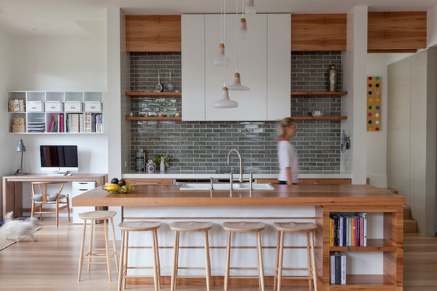
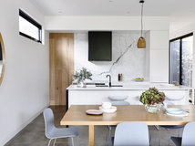
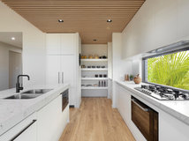
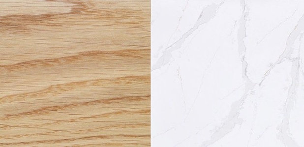
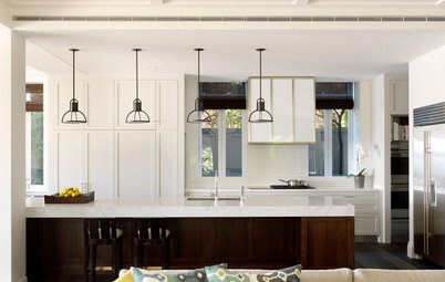
6. White and Timber
It doesn’t get more natural than timber, and it’s that natural beauty that makes timber such a timeless choice. Regardless of whether the material you use is real timber or a timber effect laminate, the look of timber creates a welcoming and homely feel that you will be happy to live with for a very long time.
Combine timber colouring with white for a beautifully contrasting, once again, timeless scheme that simply won’t date because the white doesn’t compete with the timber for attention and therefore has a soothing effect.
Confine the use of timber to feature areas such as benchtops, feature paneling or open shelves, so it’s not too overwhelming in the space and avoid timbers that are too reddish or too dark in colour, as you may tire of these more easily than a light, natural colour timber.
Depending on whether you are creating a traditional or contemporary style space, combine your timber colour with either a modern crisp white or a more traditional creamy white.
Browse Scandi-style kitchens
Get the look
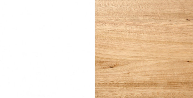
Cabinet colour: Laminex ‘Polar White’
Material: Laminate
This colour is the whitest, brightest white available in the Laminex range.
Benchtop colour: ‘Tasmanian oak’
Material: Solid wood
A light-coloured solid wood with subtly varying tones – neither too dark nor too light – a perfectly timeless choice.
As important as colour is, it’s not the only thing that can create a timeless look for your kitchen. While planning your new build or renovation, think about adding elements such as Shaker-style cabinet doors, a butler’s sink, marble benchtops and natural timber to help your kitchen scheme stay stylish through the years. These elements, individually or combined, will bring a sense of elegance to your space that will never go out of style.
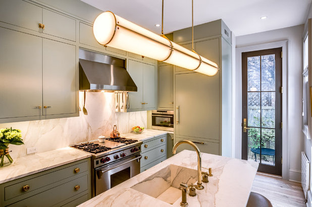
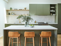
7. Olive Green and Champagne
When you think olive green, army uniforms and camouflage clothing may be the first things that come to mind. However, olive green is a tasteful and sophisticated colour choice for interiors. Olive is a dark yellowish green with a soothing, earthy aesthetic.
Just as the earthy taste of green olives is complemented by the refreshing acidity of champagne, the same can be said for colours that carry the same name in interior decorating. Dress olive green cabinets with warm metal handles in champagne, brass or gold colours. When selecting a benchtop colour, choose a light-coloured material with a creamy undertone instead of crisp white. Consider a natural stone or stone-look material that has subtle veins in darker cream or champagne to provide a refreshing contrast with the more muted aesthetic of olive green.
Other greens worth considering in the kitchen are sage green and any earthy or dusty green. Think muted and murky with grey and yellow undertones.
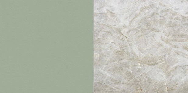
Get the look
Cabinet colour: Laminex ‘Bayleaf’
Material: Laminate
A muted and understated sophisticated green tone.
Benchtop colour: ‘Taj Mahal’
Material: Quartzite
A creamy beige natural stone with hints of champagne and green.
Cabinet colour: Laminex ‘Bayleaf’
Material: Laminate
A muted and understated sophisticated green tone.
Benchtop colour: ‘Taj Mahal’
Material: Quartzite
A creamy beige natural stone with hints of champagne and green.
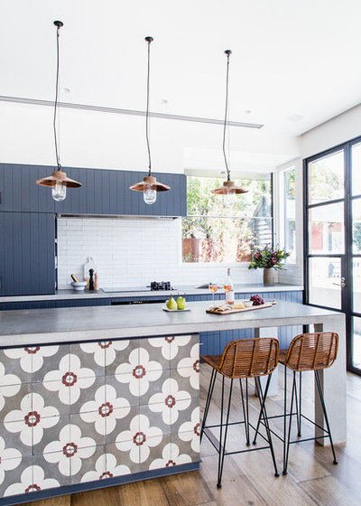
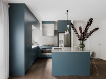
8. Blues and Greys
The combination of blue and grey tones creates a soothing and tranquil colour scheme that can be applied to both contemporary and traditional-style kitchens.
Here, the darker tone of the blue cabinetry is instantly brightened with the introduction of lighter grey benchtops and grey and white feature tiles.
Any shade of blue and grey will work well together as long as there is some contrast. Ensure that one of the colours is a darker tone than the other to avoid a bland effect. Add some white accents to further lighten the colour scheme.
Concrete benchtops, or engineered-stone benchtops designed to look like concrete, are a popular choice for kitchen renovations at the moment. Concrete has actually been used in kitchens of different styles for many years and is certain to look just as good in 15 years as it does now.
Real concrete will slowly patinate over time, changing slightly in colour and appearance, whereas engineered-stone benchtops are consistent in colouring and won’t change over time.

Get the look
Cabinet colour: Dulux ‘Stream’
Material: Paint
An elegant blue with dark grey undertones.
Benchtop colour: Concrete
Material: Real concrete
Real concrete benchtops will each have unique colourings and markings.
Cabinet colour: Dulux ‘Stream’
Material: Paint
An elegant blue with dark grey undertones.
Benchtop colour: Concrete
Material: Real concrete
Real concrete benchtops will each have unique colourings and markings.
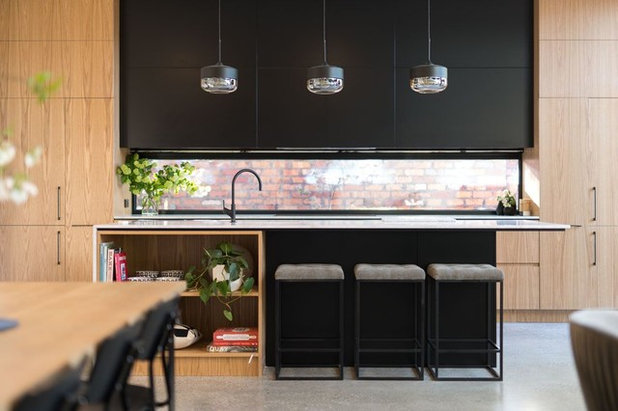
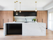
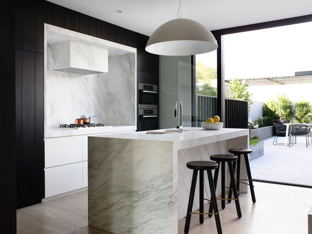
9. Black, Timber and Marble
This is the perfect colour scheme for those who love black and white but want to add a little something extra. It’s a warmer alternative to the stark ‘tuxedo’ look of mixing black with white.
Timber has always been a popular material choice in kitchens, whether it be on cabinetry, benchtops or flooring. Its warm colouring and natural aesthetic is appealing and inviting in any space.
Almost any timber colour will work with black, just avoid anything too dark or too red as it will jar with the black.
Look at timber veneer and laminate options when choosing timber colour materials for cabinetry fronts for a more cost-effective and durable alternative to solid wood. Veneer and laminate will also offer more consistency in colouring and grain pattern for a more uniform look.
A matt finish black will look more natural and work much better with timber tones than a high-gloss finish.
Choose a marble or marble-look benchtop that has a white or light grey base with darker grey veining to tie the look together.
Get the look
Cabinet colour: ‘American White Oak’
Material: Veneer
A warm timber colour with a mostly straight grain.
Benchtop colour: Silestone ‘Calacatta Gold’
Material: Engineered stone
A manufactured material with marble-look veining with hints of gold, a perfect tie-in with the warm tones of American oak.
Cabinet colour: ‘American White Oak’
Material: Veneer
A warm timber colour with a mostly straight grain.
Benchtop colour: Silestone ‘Calacatta Gold’
Material: Engineered stone
A manufactured material with marble-look veining with hints of gold, a perfect tie-in with the warm tones of American oak.
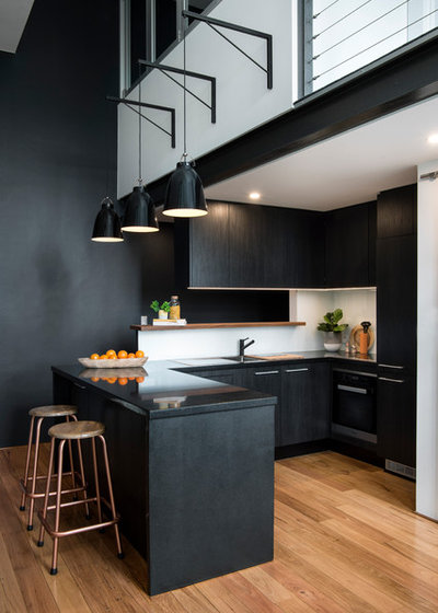
10. All Black
Black-on-black oozes sophistication and elegance and, given its longstanding popularity in both interiors and fashion, is much less likely to date than ‘on trend’ colours.
However, an all-black kitchen won’t be to everyone’s taste and won’t suit every home, and it’s certainly not one for the faint-hearted.
Black by its very nature is a dark and sultry colour that should be considered carefully before being used in any space, especially small and dark areas.
Some tricks that can be used to make an all-black kitchen feel less dark and overpowering include combining different textures and finishes to create visual interest, and using high-gloss surfaces to bounce more light around the space.
Add subtle highlights to break up the continuous block of black by selecting handles in a brushed stainless steel, polished chrome or polished brass.

Get the look
Cabinet colour: Polytec ‘Black Woodmatt’
Material: Laminate
A solid black colour laminate with a natural wood grain appearance and texture in a matt finish.
Benchtop colour: Caesarstone ‘Jet Black’
Material: Engineered stone
A solid black colour highlighted with random fine white chips.
Tell us
What colour scheme did you use in your kitchen that has stood the test of time? Share your success in the Comments below. And if you found this story helpful, like it, bookmark it, save the photos and share your thoughts below. Join the conversation.
What are you working on?


Related Stories
Renovating Advice
How Do I Find, Assess & Hire the Right People for My Renovation?
Do you need a kitchen designer or a joiner? An architect or an interior designer? Find out with our essential reno guide
Full Story
Renovation Guides
What Key Measurements & Room Dimensions Should I Know for a Reno?
Read practical information about key room measurements and minimum clearances for fittings and fixtures in every room
Full Story
Bedrooms
12 Decorating Tips to Make Any Bedroom Look Better
By Anne Ellard
Want to know how to make your bedroom look better? Here are 12 great tricks
Full Story
Renovation Guides
Room by Room: Experts on Ways to Avoid Common Renovation Blunders
From the kitchen to the garden, and all areas in between, experts identify common mistakes and share priceless insights
Full Story
Bathroom Expert Advice
5 Reasons Your Bathroom Smells Funky (and How to Fix the Problem)
A plumber reveals five reasons your bathroom might smell like sewage or emanate a musty odour
Full Story
Kitchen Renovations
From Planning to Pendants: Kitchen Lighting Essentials
By Joanna Tovia
This valuable guide will give you all you need to know about choosing kitchen lighting for fabulous form and function
Full Story
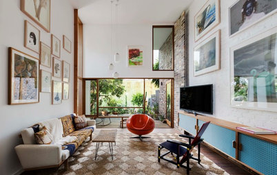
Living Rooms
The Full Picture: How High Should Your TV Be?
By Matt Clawson
We look at an important question to consider when locating your television: how high should you set it?
Full Story
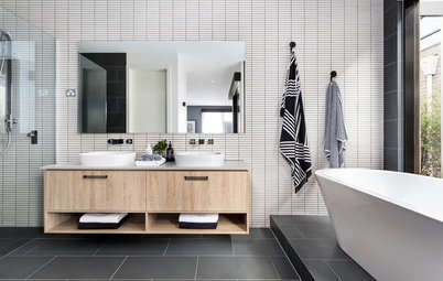
Bathrooms
All the Dimensions You Need to Know for Your Bathroom Makeover
Fit everything comfortably in a small or medium-size bathroom by knowing standard dimensions for fixtures and clearances
Full Story
Renovation Guides
How to Control the Cost of Your Renovation, Room by Room
Where to save, where to spend (and all the tricks in between) for keeping the cost of your renovation on track
Full Story
Architecture
Renovation Insight: How to Choose an Architect
A great architect can turn your dream home into reality – three industry experts reveal where to look for the right one
Full Story
Mine is white on white seamless,with clean lines, no handles, I love the brightness of it. I perk it up with coloured accessories, bright art work etc. just had a beautiful black sink installed and I love it, it’s certainly not boring.
I love my black venetto cabinetry, gray 1230 x 600 stone like tiles and my amazing 3.2 metre Long Island bench. The black sink and tap and mirror splash back just make it all pop. Colour is added with artwork and blue and white a Temple Jars.
Seta is right - times change, everything dates, opinions are different (just read these comments where everyone believes their way is right), do what you love.