


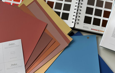
Which Colour Schemes Work Best in Which Rooms?
Take the guesswork out of colour decisions with this guide to which of your favourite hues work best where
Amanda Nicholls
26 July 2015
I am a magazine editor, a published author and a freelance writer. Based in the picturesque lower Blue Mountains, I am in the throes of turning my first house into a home. With two gorgeous girls to pick up after, life is busy for this mum, but I wouldn't have it any other way! My two favourite rooms in the house are the kitchen with it's glamorous wood top benches and French provincial cabinetry, and the play room, because even though it's the messiest room in the house, it's where the family spend a tonne of quality time playing and using our imagination.
I am a magazine editor, a published author and a freelance writer. Based in the picturesque... More
The basic psychology of colour focuses on three main areas: the mind, the body, and emotion. The effects colour has on us often goes unnoticed, but subconsciously colour can make a big impact. Large companies have tapped into this very concept to choose the colour that best represents their brand values. Take the colour red, for example. Red is a physical colour that represents passion, excitement, leadership and power. Big-name brands such as Coca-Cola, Lego and Kellogg’s are synonymous with the colour red. Red demands our attention, hence the reason the global signal for ‘stop’ is red.
Each colour has its own meaning, so if you are looking to introduce some serious colour to your home but aren’t quite sure which is the right colour for you or your space, here’s some insight into the impact colours can have on you and your home.
Each colour has its own meaning, so if you are looking to introduce some serious colour to your home but aren’t quite sure which is the right colour for you or your space, here’s some insight into the impact colours can have on you and your home.
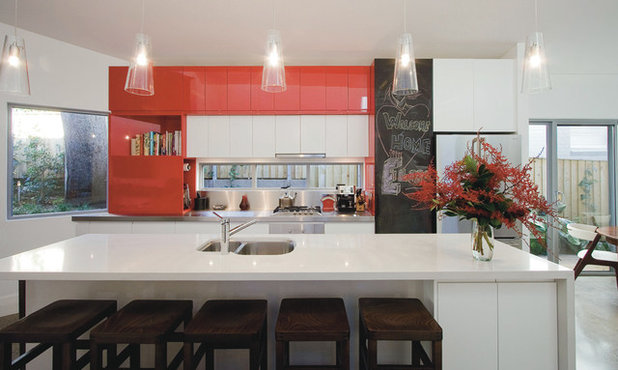
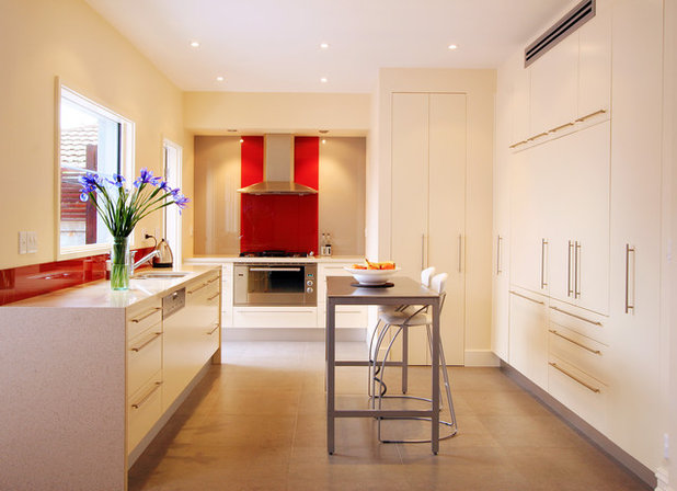
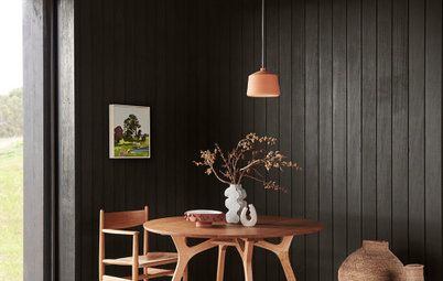
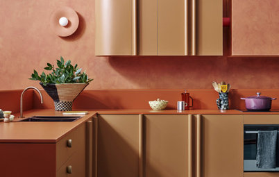
Red in the kitchen
They say the kitchen is the heart and soul of the home, and whether you’re a gourmet chef or simply an avid appreciator of a good home-cooked meal, red is an ideal colour choice in this bustling space.
Red is a powerful colour, and sends off signals of passion and excitement. It can be as subtle or as dramatic as you like, but one thing is for sure – red is guaranteed to make an impact with its strong and bold agenda.
For this reason, the kitchen is a perfect place for red to dominate design, especially if cooking is your passion, as the very definition of this colour is just that – passion. Red is also believed to stimulate appetite and for this reason, it is often used in restaurant settings. Do I need to mention that Pantone’s colour for this year is the earthy wine red hue, Marsala?
Adding red to your kitchen can be as simple as a sophisticated splashback, or if you want to send a message without committing fully to the colour, introduce it subtly with lighting, an eye-catching piece of art or a vibrant red plant.
ROOMS TO AVOID: The bedroom may be an area to steer clear with this look, as the bedroom is a space that needs to be peaceful and conducive to rest. Red is exciting and packs a punch, so if you really love red and want to introduce it to your boudoir, a less-is-more approach is the way to go.
OTHER ROOMS THAT LOVE RED: Red applied to the main living space can be quite effective, especially if you love to entertain guests. Red is a stimulating colour and can promote conversation and confidence as it exudes energy – this makes it a great choice for an area where you plan to invite friends to enjoy the space.
OTHER ROOMS THAT LOVE RED: Red applied to the main living space can be quite effective, especially if you love to entertain guests. Red is a stimulating colour and can promote conversation and confidence as it exudes energy – this makes it a great choice for an area where you plan to invite friends to enjoy the space.
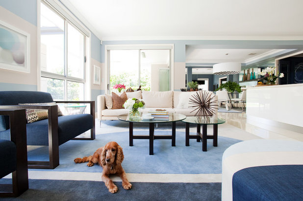
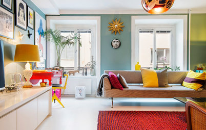
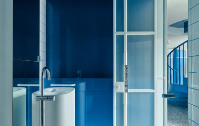
Blue in the living room
The living room is one of the most important spaces in any home as it is the place the family retreats to for relaxation and much-needed downtime. For that reason, blue is an ideal colour in the living room.
Peaceful is the word that springs to mind when you think of the colour blue. This heavenly hue gives off a calming effect and has a serene quality, inducing a feeling of contentment.
Inject a certain calmness to your lounge room using tranquil blue hues to create an atmosphere that will feel inviting to its visitors. The best way to execute this colour is to pick one aspect to focus all of your blue energy on, to make the colour really pop. It could be the furniture, the walls, the rug, or it could be the trimmings such as the curtains, cushions, artwork and side tables. The key is to keep it consistent and focused so as not to distract the eye.
ROOMS TO AVOID: From baby blue to classy navy, it’s difficult to get blue wrong, but if you plan on using it in an area such as the kitchen, use it wisely. Getting the right look for your culinary area will rely upon selecting the right tone more than how much or how little you decide to use. A bright blue kitchen could look glacial and sleek, while a soft blue kitchen would suit a home with a vintage layout. My advice would be to keep blue to a minimum in this area to really strike a chord. One or two standout features will achieve wonders.
OTHER ROOMS THAT LOVE BLUE: Blue is a cool and soothing colour and can look particularly beautiful in a tiled space. Because its essence is calming, it is ideal to apply blue to a bathroom or ensuite to maximise the full effect of this serene colour. Feature tiles can look stunning in blue and can be complemented with matching towels or hanging planters, to give a subtle nod back to blue and its natural qualities.
OTHER ROOMS THAT LOVE BLUE: Blue is a cool and soothing colour and can look particularly beautiful in a tiled space. Because its essence is calming, it is ideal to apply blue to a bathroom or ensuite to maximise the full effect of this serene colour. Feature tiles can look stunning in blue and can be complemented with matching towels or hanging planters, to give a subtle nod back to blue and its natural qualities.
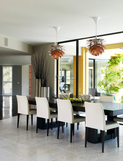
Achromatic in the dining room
Formal dining areas speak volumes about your style. A tastefully designed dining room can complement an eye-catching kitchen without detracting from the style choices you have made there.
That’s why an achromatic colour scheme (neutral colours such as black, white, grey or brown) will stand out for all the right reasons, without competing with other rooms.
Black works well with every colour because black is all colours combined. Black also signifies sophistication and glamour. An effective way of using black in your dining area is to look for a central focal piece such as the dining table. The table can be complemented with chairs in any colour of your choice. You can keep it in line with the achromatic scheme by using white chairs, or go for something colourful and bright that goes off with a bang when set against the classic black table. You may want to continue the chosen colour scheme of your kitchen by selecting chairs in a matching hue to tie the dining area intrinsically to the style of your kitchen.
Similar to black, white dining tables are an understated gem. White signifies cleanliness, purity and hygiene – all important for an area associated with food and mealtime.
Other elements that can look wonderful in a dining space include materials such as timber, metal, bronze and stone – and because these naturally inspired materials don’t possess a dominant hue, they can also be accentuated with pops of bright colour.
Other elements that can look wonderful in a dining space include materials such as timber, metal, bronze and stone – and because these naturally inspired materials don’t possess a dominant hue, they can also be accentuated with pops of bright colour.
ROOMS TO AVOID: This look is sleek and sophisticated but it’s best to avoid using it in the main living area. An achromatic colour scheme omits a sense of sterility, and if you have used this wonderfully modern look in your dining space, you will want to retire to an area of the house that promotes relaxation and good conversation.
OTHER ROOMS THAT LOVE AN ACHROMATIC COLOUR SCHEME: Using an achromatic colour scheme in the home is a must because it is a modern look with a classic twist, meaning it will really last the distance. Materials used in achromatic design such as timber, glass and marble are durable, high-quality and will stand the test of time. They are also materials that generally aren’t sourced cheaply, so when designing an area such as the kitchen or bathroom, use a neutral palette to allow your space to remain timeless.
OTHER ROOMS THAT LOVE AN ACHROMATIC COLOUR SCHEME: Using an achromatic colour scheme in the home is a must because it is a modern look with a classic twist, meaning it will really last the distance. Materials used in achromatic design such as timber, glass and marble are durable, high-quality and will stand the test of time. They are also materials that generally aren’t sourced cheaply, so when designing an area such as the kitchen or bathroom, use a neutral palette to allow your space to remain timeless.
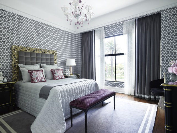
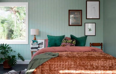
Purple in the master bedroom
The master bedroom is an intensively private space. Aside from the obligatory tour of your home for guests, your master bedroom is not a room that is readily on display. For some, it is a private space that is shared between two people. So choosing a colour that represents both persons’ interests can be quite the task. This is where opulent purple can work wonders.
Because of its regal nature, you can easily incorporate purple into a unisex space without making the room look overly feminine.
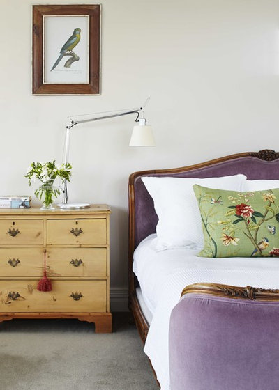
Purple can be distinguished and elegant by choosing deeper shades, or calming in soft lilacs. It is a colour that speaks to our spiritual side and emits feelings of truth, authenticity and respect. It also has the feeling of luxury, so I can’t think of a better colour to surround yourself in with that special someone.
ROOMS TO AVOID: Purple had its heyday in the past decade, but that’s not to say it can’t still be very dramatic if incorporated into your home today. The key is to use it with a minimalist touch. When incorporated with a modern palette of light grey, purple can be rather chic. Don’t be afraid to play with purple, but do your homework and be calculated in your use of the colour. For instance, a purple kitchen today might look dated.
OTHER ROOMS THAT LOVE PURPLE: Purple is an introspective colour that promotes thought and creativity. This is why purple is an excellent choice to feature in a home study or library. A few lovely trimmings could bring your study area to life. Try sheer curtains with a lilac hue, a gorgeous violet rug or a purple statement lamp to create a room that is brimming with inspiration.
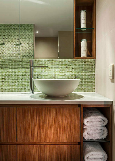
Green in the bathroom
From lush forest greens to bright emeralds and juicy apple greens, this colour choice helps brings us back to nature, and is just the reason it’s so easy to apply in the home. Full of restorative qualities, the colour green is a must if you are looking to create a space that has a sense of equilibrium or a room that will leave you with a feeling of clarity.
The bathroom is a wonderful place to introduce a touch of green. Whether you want to incorporate it with clean whites, or go for an intense floor-to-ceiling tile, it will help transform your room into a true home.
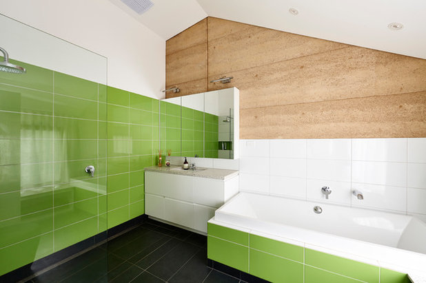
Other natural materials such as timber or stone work a treat when coupled with green. The aim is to create a room filled with ambience, so select your materials carefully to ensure the rest of your bathroom design complements your green haven.
ROOMS TO AVOID: Green is oozing with positive qualities, which makes it easy to work with in almost any room in your house. Green is meant to be seen, so use it in a space where you can enjoy it to its fullest potential. For this reason, I would suggest bringing it out of the bedroom and into the home. Not because it doesn’t work in the boudoir, but rather because it works so well in other areas.
OTHER ROOMS THAT LOVE GREEN: Green offers balance and using green in your design can create a space that encapsulates the perfect sense of equilibrium between the mind and the soul. This is why it can work seamlessly in an area where you hope to provoke thought, such as a study or a room where you want to promote relaxation, such as the living room. Green reminds us of growth, restoration and emits a sense of wellbeing. It is the perfect colour to use when looking for a fresh start.
More: Bathroom Colour Guide: Go Green and Calm the Senses
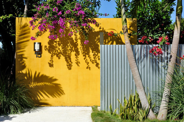
Yellow in the backyard
Backyards, balconies, decks, pool areas … you name it, my vote is emphatically for a yellow outdoor area.
You can’t get much warmer than a sunny, cheerful yellow. Using yellow in your home evokes happiness and promotes positivity, so add a little lemon to your life for an instant mood-booster.
Outdoor entertaining areas look quite effective with an added yellow zest, and because yellow goes with almost any colour, you can mix and match with another colour scheme, or pare it back to basics with neutral trimmings and splashes of yellow throughout the space.
More: Colour Wisdom From Nature: Yummy Yellow
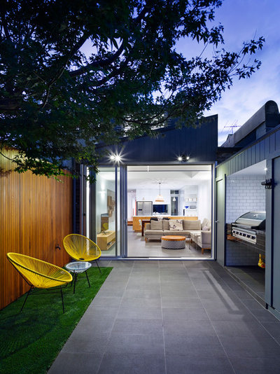
Depending on the area you’re working with, you can go any number of ways when introducing yellow. A golden coloured pergola or shade cloth, or some vibrant yellow chairs will bring your backyard to life.
If you want to give the colour a test first before investing in more permanent fixtures, outdoor rugs, umbrellas and throw pillows are a great place to start without breaking the bank.
ROOMS TO AVOID: While it’s hard to go wrong with yellow because of its positive energy, it’s best to feature yellow where it’s most likely to be seen; so in this case, wasting yellow’s good karma in the bathroom might be a faux pas.
OTHER ROOMS THAT LOVE YELLOW: Yellow is the lightest colour on the spectrum and its ‘lightness’ resonates with its psychological properties of hope, fun and happiness. Using yellow in your design can induce an instant mood boost. This is why one of the most inviting places to incorporate yellow into your home can be the entrance. A blazing yellow door will be an eye-catching inclusion to your home, and you can continue your sunny-inspired theme inside with a golden runner in the entryway, yellow furniture choices for consoles or side tables, or even some strategically placed yellow vases.
The bedroom is another wonderful place in which to introduce a warmer touch with yellow. This can be achieved with a throw rug over the foot of the bed, some divine yellow cushions and yellow side tables to wrap up the look.
TELL US
Which colours do you think look best where? Share your thoughts in the Comments.
MORE
5 Fool-Proof Steps to a Spot On Colour Scheme
The Case for a Colour-Coded Home
How to Be Truly Confident With Colour
Related Stories
Paint
How to Choose Your Perfect Paint Colours
By Erin Carlyle
Three USA designers share tips to pinpoint your style and mine memories to find the right paint palette for your home
Full Story
Renovating Advice
How to Choose Your Wall Colour to Complement Floors and Furniture
Which colour should I paint my room to suit the flooring and furniture? We've all asked it – and here are the answers
Full Story
Most Popular
How to Pick the Right Paint Colours for Your Federation House
By Joanna Tovia
Roof colour, wall materials and emerging trends all come into play for Federation paint schemes that work
Full Story
Colourful Homes
Suffering From White-Wall Syndrome? How to Add Colour Confidently
White walls are great... until they stop being inspiring. Five paint colour experts share how to transition to colour
Full Story
Expert Opinion
An Interior Designer Reveals How to Mix Colours and Make it Work
By tidgboutique
Don’t want to confine yourself to neutrals but lack the confidence to embrace colours? We have you covered
Full Story
Made Local
Made Local: How Dulux Colour Trends Are Born
Ever wondered how Dulux sees into the future to know the colours we'll be coveting in the year ahead? Here, we find out
Full Story
Houzz Tours
Queensland Houzz: A Cute Cottage Awash With Colour and Pattern
Bold colour, quirky prints and an abundance of art transformed this 1920s cottage into an inviting and relaxing gem
Full Story
Houzz Tours
My Houzz: A Moody, Modernised Home in Melbourne Regains its Charm
The original beauty of this Californian bungalow was lost to unsympathetic updates – see how a designer brought it back
Full Story
Interior Design
20 Honey-Hued Interiors That'll Make You Melt
Our coffee-break escape offers you five minutes' worth of images to inspire and delight. Jump right in...
Full Story
Awards
Paintbrushes Poised! 2023 Dulux Colour Awards Finalists Are In
Looking for interesting ways to add colour at home? Check out these shortlisted projects in the 2023 Dulux Colour Awards
Full Story
l have always had red accessories in my kitchen and l must say they definitely bring in a good pop of color!