
Decorating

Show Your Dark Side: Decorate With Shades
Explore a whole new world of interiors with moody and luxurious shades of rich, dark colour

If you want to go dark and dramatic with your interior decor, then shades of your favourite colour should be part of your decorating tool kit. These colours can deliver drama while creating a moody yet – sometimes surprisingly – calm feeling. They lend great presence to a space and can be used in just about any area of your home. They can even be used together with neutrals or pastels for balance. That said, there are some things to understand when working with shades, which I’m about to share with you. The first is not to be afraid of the dark!
SHADES OF COMMON COLOURS
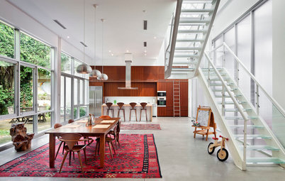
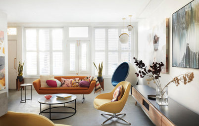
Yellow
When black is added to a primary colour, such as yellow, it effectively removes the brightness of the colour but still leaves the hue. Shades of yellow include mustard, amber and dirty gold. Adding a small amount of black to yellow achieves the shade of mustard, as pictured here on the walls and accent armchair.
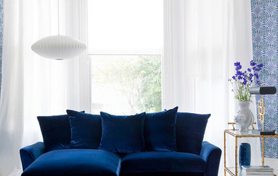
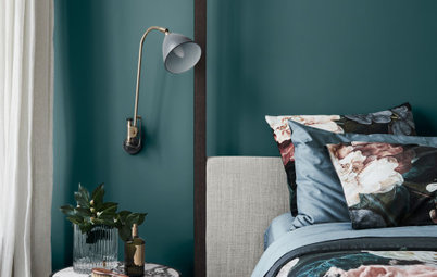
Blue
Adding black to blue creates some beautiful shades of this primary, including denim, navy and midnight blue. In the room pictured here, those three different shades of blue have been layered and used together on walls, furnishings and built-ins.
Adding black to blue creates some beautiful shades of this primary, including denim, navy and midnight blue. In the room pictured here, those three different shades of blue have been layered and used together on walls, furnishings and built-ins.
Green
Black can be added to any colour to create darker shades of the same hue. Here, a deep and moody olive green is a result of adding black to the secondary colour green.
Black can be added to any colour to create darker shades of the same hue. Here, a deep and moody olive green is a result of adding black to the secondary colour green.
Orange
Rust is an example of a shade of orange.
Rust is an example of a shade of orange.
HOW TO USE SHADES
Create a striking backdrop
Using a dark shade of colour on your walls can really make artwork, furniture and monochromes, such as black and white, pop. Framing the white cabinets in this kitchen with a muted mustard instantly makes the white cabinetry appear more crisp as it pops against the darker background.
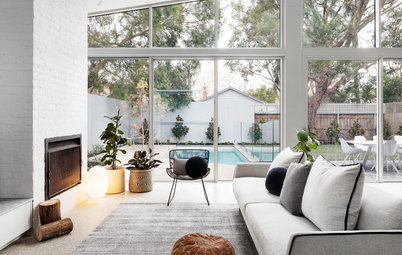
Revel in the darkness
Embrace the darkness of small rooms that don’t have much natural light by selecting a dark shade as the main colour in the space. This works particularly well in bedrooms, and makes the room feel both cosy and moody. You can lift the look by adding accessories in lighter shades or even tints of the same colour.
Embrace the darkness of small rooms that don’t have much natural light by selecting a dark shade as the main colour in the space. This works particularly well in bedrooms, and makes the room feel both cosy and moody. You can lift the look by adding accessories in lighter shades or even tints of the same colour.
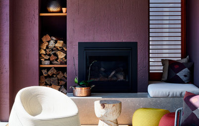
Layer it up
This dark red living area is the perfect example of how using shades of one colour can create a striking and dramatic space. One fearlessly ruddy shade is layered with another, as seen in the two-toned striped wallpaper. The darker red of the sofa helps to ground the space.
Red revs up a practical kitchen
Play with light
This spacious kitchen boasts beautiful panelled cabinet fronts painted a luxurious dark shade of forest green. Such a colour can have the effect of making a space feel small, however, when texture and visual interest are added, such as the highlights and shadows created by the panelling on the doors, the room instantly feels grand.
This spacious kitchen boasts beautiful panelled cabinet fronts painted a luxurious dark shade of forest green. Such a colour can have the effect of making a space feel small, however, when texture and visual interest are added, such as the highlights and shadows created by the panelling on the doors, the room instantly feels grand.
Saturate the space
Prevent dark shades from being overpowering by using the same dark shades of colour on both walls and trims in a room. In this bathroom, the walls, ceiling, cornice and skirting boards have all been painted the same dark shade of blue. This helps to soften the look as the trims blend into the walls instead of standing out.
Prevent dark shades from being overpowering by using the same dark shades of colour on both walls and trims in a room. In this bathroom, the walls, ceiling, cornice and skirting boards have all been painted the same dark shade of blue. This helps to soften the look as the trims blend into the walls instead of standing out.
Work from the ground up
The layering of shades of the same colour adds depth to a room. A dark shade of brown is used here on the floor, grounding the space while the light taupe-striped wallpaper on the walls is complemented with darker shades of brown in the soft furnishings and upholstery.
The layering of shades of the same colour adds depth to a room. A dark shade of brown is used here on the floor, grounding the space while the light taupe-striped wallpaper on the walls is complemented with darker shades of brown in the soft furnishings and upholstery.
Pare it back with monochromes
If you want to play it safe and so choose to decorate your room entirely in monochromatic shades, then you’ll be working with greys. In this small bedroom, a medium shade of grey has been selected as the main colour for the space, while layers of contrast have been added with darker shades of grey on the bedhead and bedlinen.
How to make monochrome magic
TELL US
What dark and moody shades have you used to create a dramatic effect in your home? Share your tips in the Comments.
MORE
Trend Forecast: Key Colours for 2016
Dare to be Different: Colour Combos That Break the Rules
Dark and Moody Rooms That Are Anything but Gloomy
A shade of colour is achieved by mixing the colour with black, which reduces its vibrancy and makes it a more muted colour if just a tiny bit of black is added or a darker colour if a lot is added. Shades can range from a dirtier version of a full hue to almost black, and are richer and sometimes even more intense than the original colour.
Moody alternatives to black