
Decorating
Why the '80s are Back and it's OK by Us
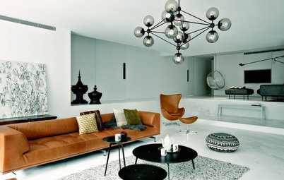
You knew it would happen one day: after years of tearing out bad 1980s renovations, the decade everyone loves to hate is back

If you lived through the 1980s, the following story may be too much: I understand entirely that it may be too soon for you to contemplate the return of the decade that everyone loves to hate. For the past few decades, after all, every renovation story you’ve read has referred to tastefully painting over bright colours and geometric windows in soothing tones of white, beige and taupe. Scando design and rationalised floor plans are all the rage.
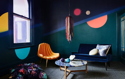
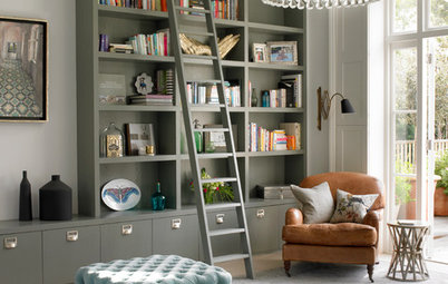
Sometimes, though, you need some colour – hell, a bit of fun – in your life. You need a bit of playfulness: some expressed staircases in bright hues of yellow and purple, say. And so it is that the 1980s are back. Bold colours! Ethnic patterns! House plants! Brass! They’re creeping back into the design vernacular. I hope you’re as happy about this as I am.
Sometimes, though, you need some colour – hell, a bit of fun – in your life. You need a bit of playfulness: some expressed staircases in bright hues of yellow and purple, say. And so it is that the 1980s are back. Bold colours! Ethnic patterns! House plants! Brass! They’re creeping back into the design vernacular. I hope you’re as happy about this as I am.
Beetlejuice
Remember the house in Beetlejuice? The nice white clapboard mansion that the Maitlands cheerfully tore limb from limb, opening up spaces and voids, while adding bright yellow protruding beams and a postmodern jetty to nowhere?
This project – a renovation of a 1980s painting studio on the grounds of the Charles Moore Foundation in Austin, Texas by director Kevin Keim – reminds me of that (in a good way). The cube is 2.7 metres by 2.7 metres and 4.8 metres high: Keim removed the suspended ceiling and went right up to the roof to create a sleeping platform upstairs.
Shelves and nooks surround the stairs and sleeping loft: Mexican folk art and Bauhaus geometric prints contrast here with crisp white walls and protruding volumes. Note the use of Broadway bulbs, which are inexpensive and add a metallic accent – not to mention a soft yellow glow. You’ll be singing Day-O at the table in no time.
Geometry and colour
At the Dos Iguanas Residence – a 300 square metre house at the end of a very long driveway in the hills of Glen Ellen, California – House + House Architects designed a series of stucco boxes that tumble down the site.
Here, red and ochre stucco contrast with charcoal window frames in an exuberant display of playful geometry.
The cheerful colour palette continues inside with masterful precision: a staircase is articulated in shades of aubergine and yellow, with a touch of lime to contrast with the dark pink wall to the left. Throughout the house, the design team used colour to define spaces as you walk through the house, creating a journey through the house.
And texture
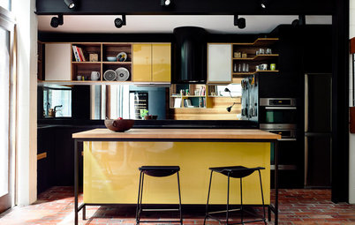
By my count, the facade of this house in Denver, Colorado house designed by Heidi Mendoza of RE.DZINE has no fewer than five different cladding materials. Kudos. I particularly love the red window frames set into the bright yellow wall.
One thing the 1980s didn’t do all that well was environmental performance, but this place has it in spades – it has a platinum LEED rating.
Accentuate the positive…
This renovation by Palo Alto’s Ashford Associates works beautifully. The important things are the style and the green. The architects opened out a formerly dark kitchen-living area by taking the ceiling up into the rafters.
New skylights flood the area with much-needed light. The best bit, though, is the treatment of the beams, which the architects painted a lovely grey-green.
Then add houseplants
Here’s another view of the kitchen and those beams. The architects slipped a second floor office up into the roof, which looks down through the new space. Note how the green is repeated in the clients’ furnishings.
10 best indoor plants
Here’s another view of the kitchen and those beams. The architects slipped a second floor office up into the roof, which looks down through the new space. Note how the green is repeated in the clients’ furnishings.
10 best indoor plants
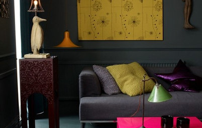
Neon. Go on
Neon is possibly the most-referenced reason for hating the 80s: the neon pops of colour are as cringe-worthy as Kylie Minogue’s scrunchy hair ties.
Like anything, it’s all in how you do it – here a simple study nook is perked up by a pink Eiffel chair and bird print to match.
Give your home a neon wake-up call
Glass bricks aren’t as bad as you remember
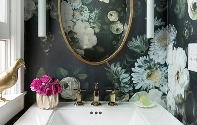
Glass bricks have a bad reputation – and rightly so, given how indiscriminately and badly used they’ve been in the past 30 years.
Done right – as in this bathroom by the masters of gentle Postmodernism, House + House – they curve gently and allow light to filter through a space.
Note the repetition of curves in this bathroom – along the top of the mirror the edge of the vanity and the step into the shower. A playful square window in the shower only adds to the effect.
Tie it together with black
The key to this fantastic assemblage of colours in the kitchen of the Colour House in Melbourne by Ande Bunbury is actually … black. Built from re-purposed cabinetry painted in colours ranging from red to yellow to pink, there’s nothing quiet about it. The thing that ties it together is the black.
TELL US
How is the 1980s making a return in your home? Tell us about it and share a photo in the Comments section.
MORE
10 Retro Ideas for Your Kids’ Space
How to Work With Pantone’s Colours of 2016

Sponsored
Sponsored
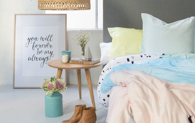
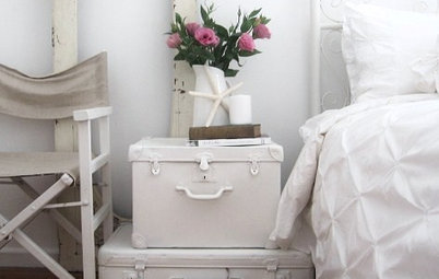
Here’s an easy one to start with, from Taubmans Spring 2015 range – it might not look it, but the 1980s influence is strong in this one: soft pink walls, a greeny pastelly painting, brass lamp and pastel abstract cushions.
Note the tasteful placement of Julia Child’s excellent Mastering the Art of French Cooking on the bookshelf, which is a masterful exercise in pastels if ever there was one.