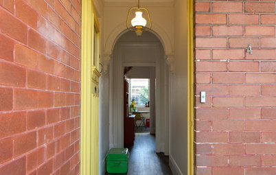
Best of the Week: Colourful Homes From Around the World
Colour is uplifting, energising, and expressive. Here are 26 homes that embrace magnificent colour in all its glory

Colour; it’s an easy, effective and fun way to add energy and personality to a home. Whether you like the controlled precision of a Mondrian-style approach or the flamboyance of Frida Kahlo-esque style, here are some enticing examples of colour, done well.
Be it an entire house decked out in enriching tones, or the selective use of complementary hues to ramp up the appeal of a particular area, these photos will help you transform your home from a grey area into a place where your true colours are gloriously, vibrantly on show.
Be it an entire house decked out in enriching tones, or the selective use of complementary hues to ramp up the appeal of a particular area, these photos will help you transform your home from a grey area into a place where your true colours are gloriously, vibrantly on show.
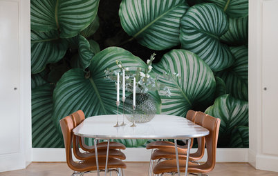
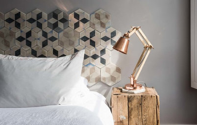
2. Location: Sydney, NSW
Why we love it: While anything would look good on this console, which sits in an apartment designed by Arent&Pyke, the clever contrast between the restraint of the Mondrian-style colour-blocked console and the loose form of the tropical bouquet is gold.
Why we love it: While anything would look good on this console, which sits in an apartment designed by Arent&Pyke, the clever contrast between the restraint of the Mondrian-style colour-blocked console and the loose form of the tropical bouquet is gold.
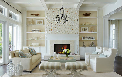
3. Location: Florida, USA
Why we love it: This waterfront retreat’s interior is derived from the home’s strong architectural elements and sports a vibrant blend of colours – fuchsia, turquoise, and kiwi green to reflect the bright, natural beauty of that part of the state.
Why we love it: This waterfront retreat’s interior is derived from the home’s strong architectural elements and sports a vibrant blend of colours – fuchsia, turquoise, and kiwi green to reflect the bright, natural beauty of that part of the state.
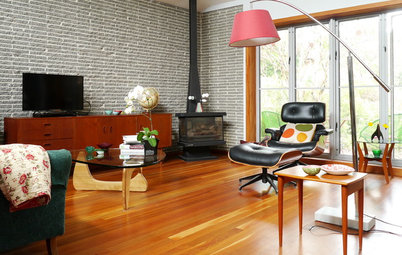
4. Location: Melbourne, Victoria
Why we love it: The formality of black-and-white stripes, which grounds the scheme, is balanced by the vibrant shots of yellow in the stool and cushions. It’s simple, satisfying and easy to reproduce.
Why we love it: The formality of black-and-white stripes, which grounds the scheme, is balanced by the vibrant shots of yellow in the stool and cushions. It’s simple, satisfying and easy to reproduce.
5. Location: Brisbane, Queensland
Why we love it: Because it’s a prime example of how colour, even plenty of it, needn’t be overwhelming. The neutral backdrop allows the rich artwork by Betty Club Mbitjana to energise the room. And the artwork also informs the colour selection of various other accessories, from the chair to the coffee table and cushions; a study in colour cohesion.
Why we love it: Because it’s a prime example of how colour, even plenty of it, needn’t be overwhelming. The neutral backdrop allows the rich artwork by Betty Club Mbitjana to energise the room. And the artwork also informs the colour selection of various other accessories, from the chair to the coffee table and cushions; a study in colour cohesion.
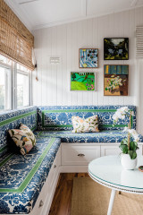
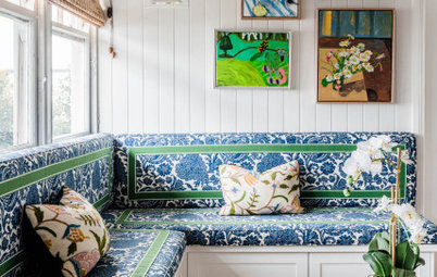
6. Location: Sydney, NSW
Why we love it: By way of contrast, you can ramp up the colour of the backdrop and keep a restricted colour palette for furnishings and accessories. Here, a chalky, blue-based purple adds a light, cosseting feel to a rental apartment, undisturbed by accessories in contrasting tones.
Why we love it: By way of contrast, you can ramp up the colour of the backdrop and keep a restricted colour palette for furnishings and accessories. Here, a chalky, blue-based purple adds a light, cosseting feel to a rental apartment, undisturbed by accessories in contrasting tones.
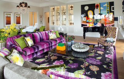
7. Location: New York, USA
Why we love it: Because a colourful mix is the perfect partner for eclecticism.
Why we love it: Because a colourful mix is the perfect partner for eclecticism.
8. Location: Sydney, NSW
Why we love it: The colour palette – turquoise for the sea, yellow for the sun – perfectly reflects this home’s beachside location. And the informal arrangement of colours reflects the casual, breezy seaside environment.
Why we love it: The colour palette – turquoise for the sea, yellow for the sun – perfectly reflects this home’s beachside location. And the informal arrangement of colours reflects the casual, breezy seaside environment.
9. Location: San Francisco, USA
Why we love it: Going bold with black-and-white stripes – applied horizontally – and then throwing in the unexpected green velvet banquette is such a lively celebration, and a lovely reflection of its dwellers’ way of life.
Why we love it: Going bold with black-and-white stripes – applied horizontally – and then throwing in the unexpected green velvet banquette is such a lively celebration, and a lovely reflection of its dwellers’ way of life.
10. Location: Sydney, NSW
Why we love it: Because the combination of a bright yellow and blue with a ‘safe’ colour such as caramel allows for expression and interest without overwhelming or, importantly, detracting from the mid-century-style decor.
Why we love it: Because the combination of a bright yellow and blue with a ‘safe’ colour such as caramel allows for expression and interest without overwhelming or, importantly, detracting from the mid-century-style decor.
11. Location: Townsville, Queensland
Why we love it: It’s such a well put together vignette, where colour is present but doesn’t seek attention. The blush-pink daybed contrasts perfectly with the modern painting by Anna Dance; connected by the black standard lamp.
Why we love it: It’s such a well put together vignette, where colour is present but doesn’t seek attention. The blush-pink daybed contrasts perfectly with the modern painting by Anna Dance; connected by the black standard lamp.
12. Location: Los Angeles, USA
Why we love it: It’s a unique celebration of graffiti-inspired art in a home. Painterly and proud.
Why we love it: It’s a unique celebration of graffiti-inspired art in a home. Painterly and proud.
13. Location: Melbourne, Victoria
Why we love it: The homeowners took a risk with colour by adding it to a fixture in the house, and it paid off. Solid balustrades are most often plain so as not to attract attention, but this patterned approach provides an element of excitement to the scheme, meaning the rest of the interior doesn’t have to push the boundaries.
Why we love it: The homeowners took a risk with colour by adding it to a fixture in the house, and it paid off. Solid balustrades are most often plain so as not to attract attention, but this patterned approach provides an element of excitement to the scheme, meaning the rest of the interior doesn’t have to push the boundaries.
14. Location: Massachusetts, USA
Why we love it: This house fairly explodes with colour, pattern and shapes. In this living room library, the homeowner created her own wallpaper by cutting shapes out of FedEx boxes, layering the shapes on top of each other and hand painting each shape.
Why we love it: This house fairly explodes with colour, pattern and shapes. In this living room library, the homeowner created her own wallpaper by cutting shapes out of FedEx boxes, layering the shapes on top of each other and hand painting each shape.
This gorgeously saturated Frida Kahlo-esque colour scheme is from the same home.
15. Location: Melbourne, Victoria
Why we love it: Orange features strongly in this home, particularly in the hardworking areas of the kitchen and bathroom. We love the way they’ve picked out features to highlight, adding a jolt of energy to an otherwise safe scheme. A great and economical way to make a statement.
Why we love it: Orange features strongly in this home, particularly in the hardworking areas of the kitchen and bathroom. We love the way they’ve picked out features to highlight, adding a jolt of energy to an otherwise safe scheme. A great and economical way to make a statement.
16. Location: Sydney, NSW
Why we love it: There’s a lot of colour in this room but because it’s tonally similar, it’s calming rather than attention-grabbing. Lesson to learn: colour can be done in so many ways, not always bright, not always primary.
Why we love it: There’s a lot of colour in this room but because it’s tonally similar, it’s calming rather than attention-grabbing. Lesson to learn: colour can be done in so many ways, not always bright, not always primary.
18. Location: Jacksonville, USA
Why we love it: Teal and rose again! A colour pairing we wouldn’t have considered until we saw these beautiful renditions.
Why we love it: Teal and rose again! A colour pairing we wouldn’t have considered until we saw these beautiful renditions.
This is from the same home. The lively green wallpaper, the teal carpet, and matching joinery, the repetition of white frames so there’s breathing space between the pattern and intense colour. Clever.
19. Location: Sydney, NSW
Why we love it: Blue and green should never be seen. Pffft! Clearly this Brett Mickan-designed room disproves that theory.
Why we love it: Blue and green should never be seen. Pffft! Clearly this Brett Mickan-designed room disproves that theory.
20. Location: Melbourne, Victoria
Why we love it: Colour goes such a long way to expressing the aesthetic intent of a space, as this scheme by Camilla Molders Design shows. Here, the brief to create an environmentally friendly home is reflected in the bamboo cabinetry and reclaimed ironbark, but it’s also reinforced in the dense, earthy, almost crafty, colours chosen.
Why we love it: Colour goes such a long way to expressing the aesthetic intent of a space, as this scheme by Camilla Molders Design shows. Here, the brief to create an environmentally friendly home is reflected in the bamboo cabinetry and reclaimed ironbark, but it’s also reinforced in the dense, earthy, almost crafty, colours chosen.
21. Location: Melbourne, Victoria
Why we love it: Because even when you are going with bright, attention-grabbing furniture, this apartment shows you can still have class. As long as you let those select items shine, the remainder can be pared back to one or two supporting colours.
Why we love it: Because even when you are going with bright, attention-grabbing furniture, this apartment shows you can still have class. As long as you let those select items shine, the remainder can be pared back to one or two supporting colours.
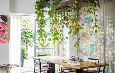
22. Location: London, UK
Why we love it: This Victorian terrace in South Hampstead has the best of both worlds. We love the use of grey to make the lower cabinetry recede, and bright yellow to lift your eyes to the upper cabinets. It’s funky and modern without being frivolous.
Why we love it: This Victorian terrace in South Hampstead has the best of both worlds. We love the use of grey to make the lower cabinetry recede, and bright yellow to lift your eyes to the upper cabinets. It’s funky and modern without being frivolous.
23. Location: Melbourne, Victoria
Why we love it: Another fine example of how colour can be present without overwhelming.
Why we love it: Another fine example of how colour can be present without overwhelming.
24. Location: Dallas, USA
Why we love it: The bright orange modular shelving system dominates the back wall of the living room in this bright home, which is full of design classics from the ’60s and ’70s. Chrome accents and geometric art pop against the grey wall.
Why we love it: The bright orange modular shelving system dominates the back wall of the living room in this bright home, which is full of design classics from the ’60s and ’70s. Chrome accents and geometric art pop against the grey wall.
25. Location: Adelaide, SA
Why we love it: The owners of this Adelaide home, designed by architecture practice Grieve Gillett Andersen, wanted a composed series of elemental shapes and saturated primary and secondary colours. In the kitchen, the bright-green benchtops and splashback are softened by timber joinery and accented with dark green laminates. Elsewhere, red doors add another pop of interest. Modern fun.
Why we love it: The owners of this Adelaide home, designed by architecture practice Grieve Gillett Andersen, wanted a composed series of elemental shapes and saturated primary and secondary colours. In the kitchen, the bright-green benchtops and splashback are softened by timber joinery and accented with dark green laminates. Elsewhere, red doors add another pop of interest. Modern fun.
26. Location: London, UK
Why we love it: Sometimes it’s OK to have a whimsical approach to colour. Just because.
Tell us
What do you love about colour? Tell us in the Comments below. And while you’re at it, let us know which other spaces you’d like to see in our ‘best of’ series.
More
Best of the week: Wondrous wallpapers
Why we love it: Sometimes it’s OK to have a whimsical approach to colour. Just because.
Tell us
What do you love about colour? Tell us in the Comments below. And while you’re at it, let us know which other spaces you’d like to see in our ‘best of’ series.
More
Best of the week: Wondrous wallpapers

Why we love it: Watermelon pink, strawberry red, apple green, juicy orange; a lovely fruity palette beautifully expressed. We love how confidence with colour and not holding back makes this living room irrepressibly happy.