


From Zesty Citrus to Lapis Lazuli: Spring's Hottest Hues
Be it blushing pinks or vibrant blues, this spring's colours are guaranteed to re-energise your interiors
Gabrielle Chariton
28 August 2017
Houzz Australia Contributor. Freelance writer and editor. I write about anything and everything but I specialise in housing design, kitchens, bathrooms and sustainable living. I pass the time by painting old furniture white, photographing animals, haunting op-shops and dreaming up renovation projects. See more of my work at www.gabriellechariton.com
Houzz Australia Contributor. Freelance writer and editor. I write about anything... More
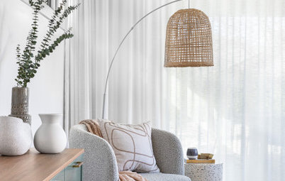
Spring is nearly here, which means it’s time to cast off the dark hues of winter and freshen up interiors with cheerful brights and softer colours. We’ve asked three colour experts to reveal which shades are trending for spring, and how you can use them to best effect in your home.
Spring is a time to throw back the curtains, freshen up and declutter. It’s an opportunity to bring new life and energy into your home and one of the best ways to do this is with colour.
“At the change of seasons, we often clean out our wardrobe, putting the dull winter things away and bringing in fresh new pieces for the warmer weather,” says Judith Briggs, principal colour designer at Colour Consultants Australia. “You can apply that analogy to your interiors: go through each room, putting away heaters and heavy blankets. Bring the outdoors in with flowers, plants and bright, zesty colours.”
“At the change of seasons, we often clean out our wardrobe, putting the dull winter things away and bringing in fresh new pieces for the warmer weather,” says Judith Briggs, principal colour designer at Colour Consultants Australia. “You can apply that analogy to your interiors: go through each room, putting away heaters and heavy blankets. Bring the outdoors in with flowers, plants and bright, zesty colours.”
Creating a spring-inspired colour palette in your home isn’t necessarily about repainting. “When you paint a room, the colour should be beautiful no matter what time of the year it is,” says Melanie Stevenson, marketing manager at Porter’s Paints. A better way to acknowledge the changing seasons, she says, is to dress your interiors with accessories: choose a statement lamp or pendant light in a vibrant, on-trend shade, hang an oversized, colourful artwork on the wall, or simply introduce colour with flowering plants and greenery.
See colourful homes from around the world
See colourful homes from around the world
According to Jessica Viscarde, interior designer and director of The Eclectic Creative Studio, this season designers are drawing inspiration from the colours of nature: “You can choose to refresh your interior for spring in small ways, such as changing up your scatter cushions to deep emerald-green velvets and fibrous, textural woven lumbar cushions.”
Other great additions, says Viscarde, are smaller accessories such as terracotta planters and crisp linen throw rugs in deep blue, which can be draped over the bed or sofa. For more impact, she suggests reupholstering a tired vintage armchair or changing your bedhead upholstery to a luscious, pattered fabric. The key to spring vibrance is layering: enlivening a room not just with colour, but with pattern and texture too.
Here are the some of the key spring-spirational colours to look out for:
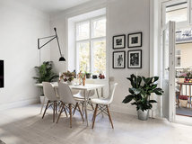
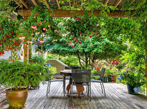
Gorgeous greens
The 2017 Pantone Colour of the Year is ‘Greenery’ – a fresh, yellow-based green, the colour of budding leaves – and interiors across the country have never been so verdant. “We’re seeing every kind of green, from chameleon, olive, forest… I think you could pick any green and you’d be on-trend at the moment,” says Briggs.
The 2017 Pantone Colour of the Year is ‘Greenery’ – a fresh, yellow-based green, the colour of budding leaves – and interiors across the country have never been so verdant. “We’re seeing every kind of green, from chameleon, olive, forest… I think you could pick any green and you’d be on-trend at the moment,” says Briggs.
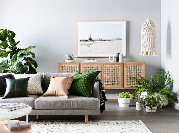
How to style it: A garden-fresh serving of greens is the perfect antidote to the winter doldrums: introduce it with opulently textured fabrics, botanical prints, and by filling your home with plants. A strategically placed mirror can also help up the green factor by reflecting the colours of your garden into your interior.
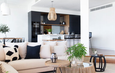
“Introduce deeper tones such as emerald greens and deeper blues through smaller statement pieces such as an ottoman, cushion or smaller art piece, then blend with natural styling elements such as indoor greenery, natural stone, raw timbers and native flowers such as wattle or eucalyptus,” says Viscarde.
Tip: Buying a new floor rug is a great way to give your living room a seasonal update. Viscarde advises investing in the largest rug you can afford for the space, and making sure that it runs beneath the sofa, thus avoiding what she calls “the dreaded floating postage-stamp effect”.
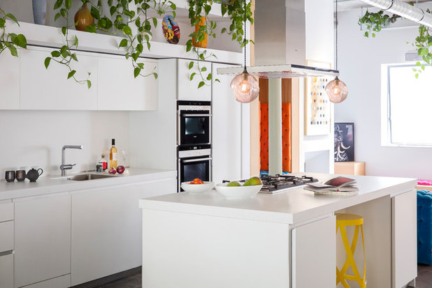
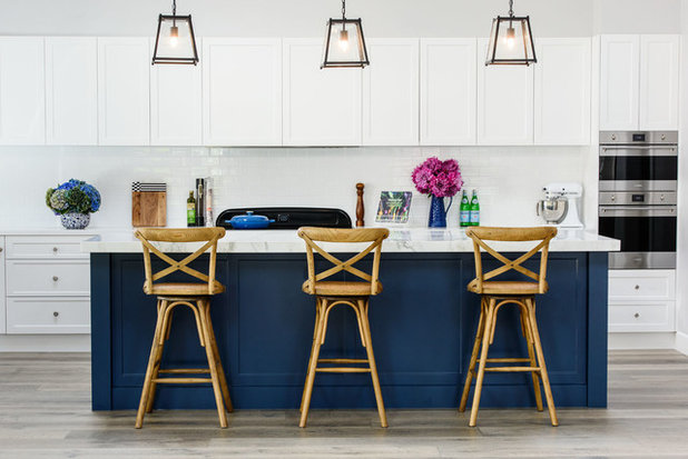
This London kitchen has all the right ingredients for spring: delicate fronds of greenery accented with pops of earthy terracotta, orange and yellow. Briggs suggests replicating the look by putting some brightly coloured appliances or cookware on display. “There are some great ranges of coloured benchtop appliances on offer, such as kettles and toasters, that will really add a pop in your kitchen,” she says. Accessorising with terrariums or pot plants adds that essential dash of green to soften the space and give an instant mood lift.
Read about colourful benchtop appliances
Read about colourful benchtop appliances
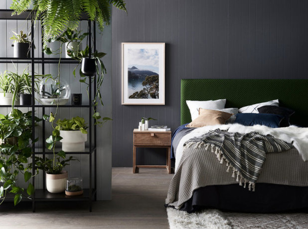
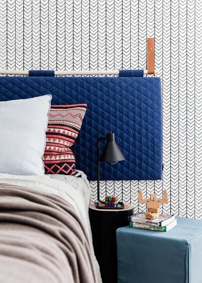
Tip: “Style your bed to suit the warmer months by switching heavy bedlinen for lightweight, breezy fabrics – think sheets in natural bamboo, linen and Turkish cottons,” says Viscarde.
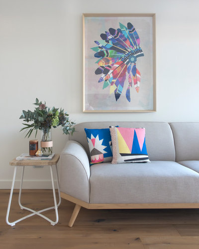
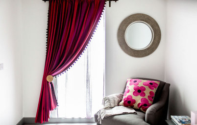
Pretty in pink
Pink has been one of the most directional colours of the past couple of years, with everything from barely there blushing whites to deep crimsons brightening up our walls and homewares. Whether you go for pale and pretty, vibrant and playful, or a dusky, romantic shade, pink’s rosy charm makes it a winning choice for spring decor.
Pink has been one of the most directional colours of the past couple of years, with everything from barely there blushing whites to deep crimsons brightening up our walls and homewares. Whether you go for pale and pretty, vibrant and playful, or a dusky, romantic shade, pink’s rosy charm makes it a winning choice for spring decor.

Pink pairs well with a surprising number of colours: teaming it with burnt orange will deliver a warm, earthier feel, or put a blue-based (cool-toned) pink with clear greens and sky-blue to evoke the crystalline beauty of a sunny spring day.
How to style it: Pink is a high-energy colour, and just a touch will bring a space to life. Introduce pink on cushions and other textiles, combining pastels with bolder shades for added depth and dimension.
Sweet florals and luscious decorative bird prints are irresistible. Or simply fill your vases with masses of delicious pink flowers.
Sweet florals and luscious decorative bird prints are irresistible. Or simply fill your vases with masses of delicious pink flowers.
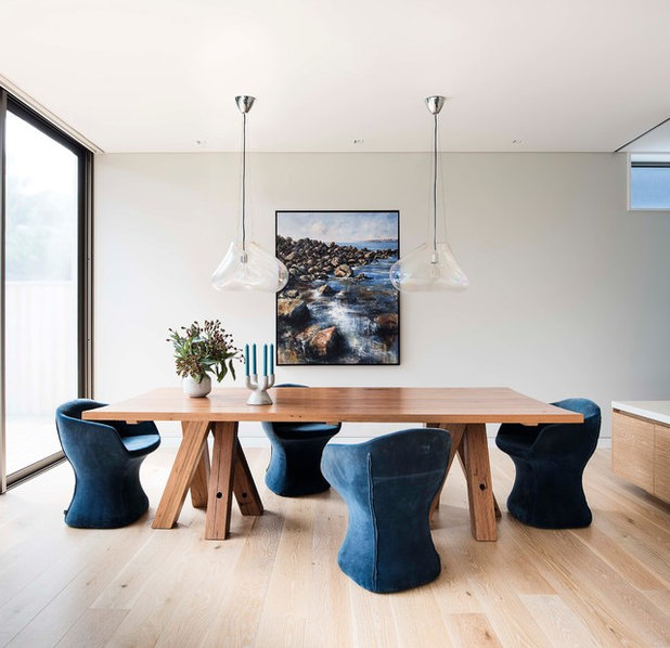
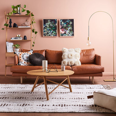
Dive into blue
Stevenson says blues – particularly deeper shades – are making a huge comeback. Navy blue, while beautiful for winter, has a depth and coolness that’s also perfect for spring. Clear, gem-inspired blues such as lapis lazuli and turquoise are both elegant and invigorating.
Stevenson says blues – particularly deeper shades – are making a huge comeback. Navy blue, while beautiful for winter, has a depth and coolness that’s also perfect for spring. Clear, gem-inspired blues such as lapis lazuli and turquoise are both elegant and invigorating.
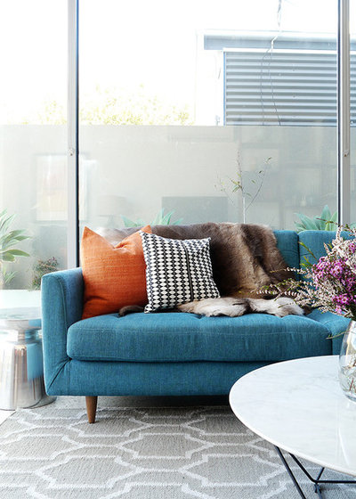
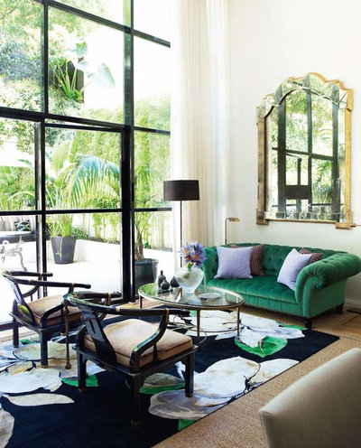
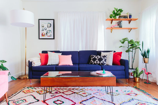
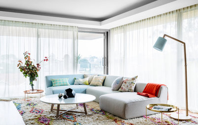
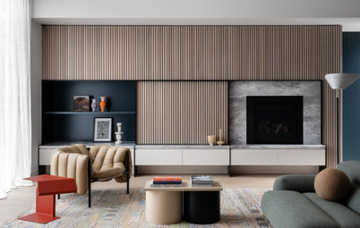
How to style it: Blue teams well with corals and mustards. For a fresh, contemporary take, Viscarde suggests pairing blues with burnt orange and terracotta tones, and adding in natural fibres and textures for contrast. The look is played to perfection in this Melbourne living room, where Viscarde has dressed up a blue sofa with a splash of burnt orange. A hint of yellow ties the black-and-white cushion into the palette, while the fur rug adds texture and cosiness.
Tip: Updating your tableware – crockery, glasses and napery – is a quick, easy and affordable way to inject on-trend spring shades into your decor, says Briggs. “It’s nice to have some fresh and bright new things on the table that go with the lighter food we eat in the warmer months.”
Golden daze
From zesty citrus to mellow mustards, yellow is the colour of optimism and sunshine, according to Briggs. It’s the colour of daffodils, daisies, and pillowy-soft blooms of wattle. A splash of this cheery shade will light up your life as no other colour can.
From zesty citrus to mellow mustards, yellow is the colour of optimism and sunshine, according to Briggs. It’s the colour of daffodils, daisies, and pillowy-soft blooms of wattle. A splash of this cheery shade will light up your life as no other colour can.
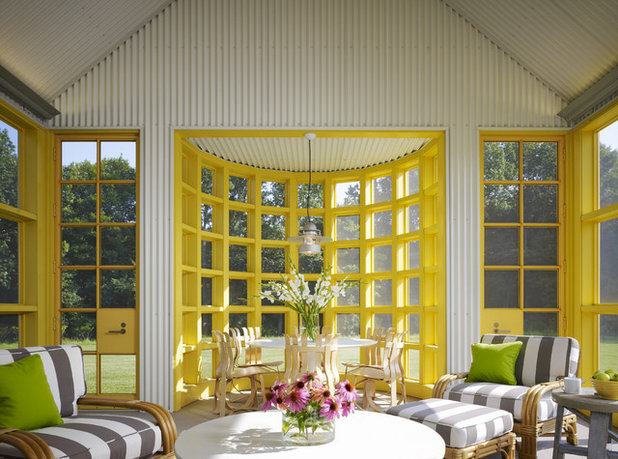
How to style it: Yellow delivers an instant spring zing – and like pink, a little goes a long way. It teams beautifully with muted greys: pull in some yellow to add a splash of irreverence to a monochrome scheme, while retaining a sophisticated edge.
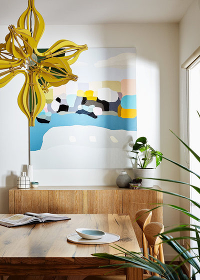
“Bright yellow accessories add a surprise pop of colour and a light-hearted feel to any room,” Briggs writes in her book, Bye Bye Bland: How to Create Sensational Spaces Using Colour. “Blue with yellow is a traditional combination, reminding us of sun and sky above and also of the ocean and sandy shores.” Team golden hues with turquoise for a peppy look, or with deep sapphires for elegance.
“Bright yellow accessories add a surprise pop of colour and a light-hearted feel to any room,” Briggs writes in her book, Bye Bye Bland: How to Create Sensational Spaces Using Colour. “Blue with yellow is a traditional combination, reminding us of sun and sky above and also of the ocean and sandy shores.” Team golden hues with turquoise for a peppy look, or with deep sapphires for elegance.
Tip: Some strategy is required when using bold colour accents in a room. “The mistake a lot of people make is to just bring in one colourful item,” says Briggs. “This can create a jarring effect because it just jumps out at you. It’s better to repeat that colour in two or three other places – this will integrate it more, allowing the eye to move around the room and take in all the decor.”
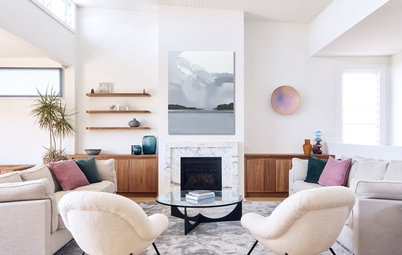
Neutrals and naturals
For a more subtle, pared-back aesthetic, try building a palette of layered neutrals. Viscarde suggests working with warmer whites and earthy, biscuity tones for an inviting feel. “These earthier tones create a sense of cosiness and grounding, with a calming feel of being closer to nature,” she says.
For a more subtle, pared-back aesthetic, try building a palette of layered neutrals. Viscarde suggests working with warmer whites and earthy, biscuity tones for an inviting feel. “These earthier tones create a sense of cosiness and grounding, with a calming feel of being closer to nature,” she says.
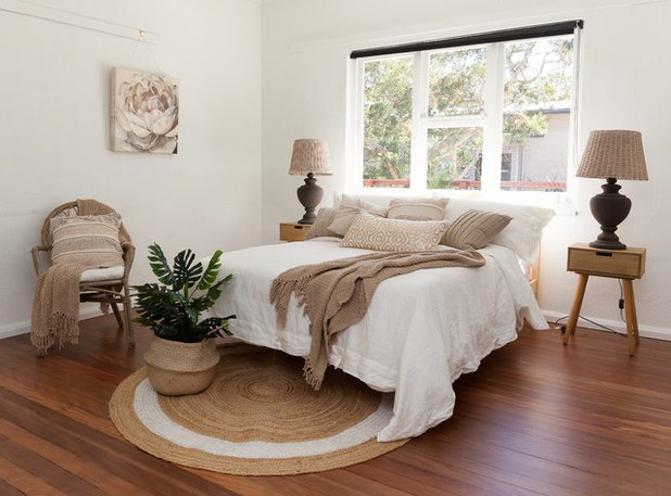
Tip: When decorating with neutrals, don’t underestimate the importance of undertones – the ‘hidden’ base notes of colour. “Ascertain the undertones of all the elements in your room, including fixed elements such as flooring. Then try to use neutrals that have the same undertone or a compatible one,” Briggs advises. Placing colour swatches next to each other will help reveal this elusive undertone – look for tinges of warm (yellow, rose, ochre, cream) or cool (blue, grey, green) shades.
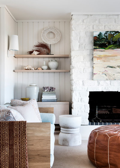
How to style it: When you strip the bright colours out of a room, be sure to add texture. And this spring, it’s all about natural fibres: “Textural flat-weave floor rugs in materials such as jute, wool, silk and cotton are great transitional pieces for spring,” says Viscarde. “Layer rugs for a casual, bohemian feel.”
She also suggests blending different timbers with similar tonal values to add interest, for example teaming blonde and lighter oaks with ash-based walnut and blackbutt. Rattan, leather and stone will also deliver an earthy, organic appeal.
She also suggests blending different timbers with similar tonal values to add interest, for example teaming blonde and lighter oaks with ash-based walnut and blackbutt. Rattan, leather and stone will also deliver an earthy, organic appeal.
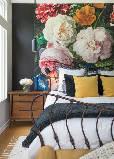
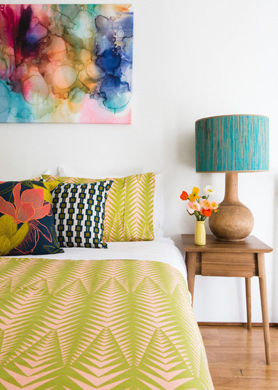
Watercolours
According to Stevenson, another directional look for spring is watercolour-style prints of blowsy florals in fresh, vivid colours: “The spring wallpapers feature beautiful big designs – it’s all very painterly and washy,” she says.
Briggs concurs, adding, “I think we’re probably attracted more to watercolour images in spring. They’re light, fresh and evocative of water and being outdoors.”
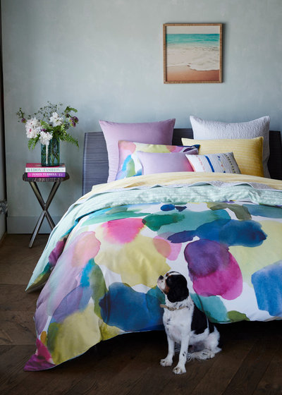
How to style it: These gorgeous splashy prints are adorning everything from wallpapers to floor rugs, and translate particularly well into the bedroom. “Your bedroom is one room you can easily transform for spring,” says Briggs. “Introducing fresh doona covers and cushions and a few new accessories to your bedsides can bring a whole new feeling to the space.”
Amp up the pretty factor in your sleeping quarters with breezy, overblown prints in crisp shades of pink, blue and green, such as the ones in this bedroom. Tie the look together by picking out one shade from the print for your accessories, such as lamp shades, cushions and candles.
Tip: Love the impact of florals but don’t want to commit to wallpaper? Make a spring statement by creating an oversize artwork using a beautiful watercolour wallpaper print.
Tell us
How do you get your home ready for spring? Tell us in the Comments below. And while you’re at it, don’t forget to like, share or bookmark this story.
More
Read more seasonal decorating stories
What are you working on?

Related Stories
Interior Design
The Golden Rules of Proportion: Decor Laws You Need to Know
An interior designer reveals the essential rules for achieving a perfectly balanced interior
Full Story
Interior Design
Design Masterclass: A Budget-Friendly Refresh of a Small Home
See how a designer's smart use of colour and considered storage solutions transformed a drab home for AUD$50,000
Full Story
Renovating Advice
Renovation Insight: How to Choose an Interior Designer
A skilled interior designer can help bring your decor dreams to life – three experts reveal how to choose the right one
Full Story
Interior Design
10 Decorating Rules Interior Designers Swear By
By Laura Downie
Want to give your home professional polish? An expert reveals the top 10 decorating rules you need to know
Full Story
Interior Design
8 Ways to Create Flow and Cohesion With Your Interior Design
These eight tips can help you select products, finishes and styles that work together from room to room
Full Story
For Pros
Trade Shows: Why They're Important Events You Don't Want to Miss
From networking to insights into new and emerging trends, here's why trade shows should be a firm 'yes' in your calendar
Full Story
Picture Perfect
22 Curtains That Dare to Be Different
Our coffee-break escape offers you five minutes' worth of images to inspire and delight. Jump right in...
Full Story
Project Of The Week
Before & After: A Cheap & Cheerful Makeover of a 1980s Caravan
Armed with an AU$1500 budget, a Melbourne couple rolled up their sleeves and transformed a caravan in just three months
Full Story
Houzz Tours
Melbourne Houzz: A Terrace Near Ruin Gets a Second Chance
See how a derelict Victorian terrace in Melbourne was transformed into a luxurious and serene family home
Full Story
Houzz Tours
Melbourne Houzz: A Family's Dream Home, 20 Years in the Making
Timeless, sophisticated and a little bit industrial – this heritage-home renovation is nothing short of spectacular
Full Story
Lets put some colours on the walls too, keep them soft and the rooms embrace you when you enter and soft blues and greens will keep the house feeling cool and fresh through our long hot summers.
Pity about the wattle though - means sneezing for a lot of people.
Some very inspiring tips to Spruce up your Home for Spring!
eleven11DESIGN, bedroom, that's me!