


Room of the Week: A Hamptons Kitchen That's a Vision in White
A space for everything and everything in its place. This Hamptons-style kitchen has looks and practicality in spades
Vanessa Walker
7 January 2019
Houzz Australia & New Zealand Editor-in-Chief
In a Q&A format, we talk to the designers – and examine the creative thinking – behind some of Houzz’s most loveable rooms.
Images by Gathering Light.
Answers and styling by Kristie Hill, interior designer and creative director at Colourcube Interiors
Who lives here: A family with two teenage boys
Location: Bunbury, WA
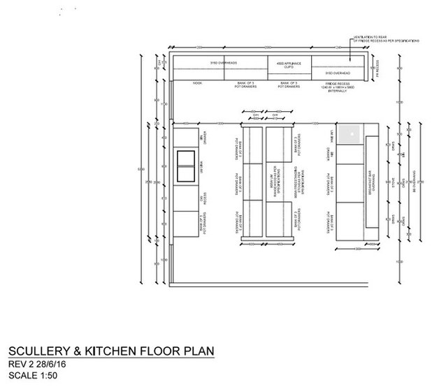
Room: A kitchen with a hidden IT nook and scullery
Answers and styling by Kristie Hill, interior designer and creative director at Colourcube Interiors
Who lives here: A family with two teenage boys
Location: Bunbury, WA
Room: A kitchen with a hidden IT nook and scullery
Brief
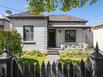
The brief was to create a large, functional home that was Hamptons-inspired and also had a modern touch while complementing the original Art Deco architecture and fittings.
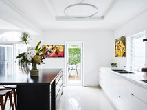
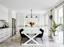
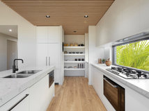
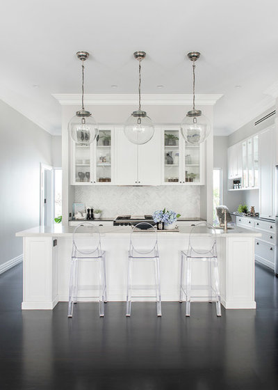
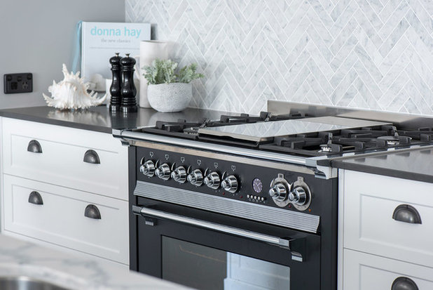
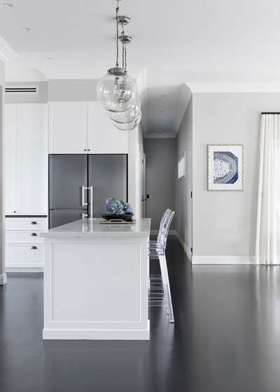
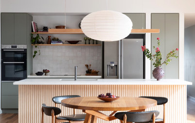
In terms of kitchen design, the client wanted a place for everything. The main component was to ensure the owner had a scullery to prepare all her food; an appliance cupboard to store all her appliances; a freestanding cooker; filtered water in the island bench; and somewhere she can sit and tend to her home-office needs. We integrated an IT nook in the kitchen, hidden away so the island bench could be kept clutter free.
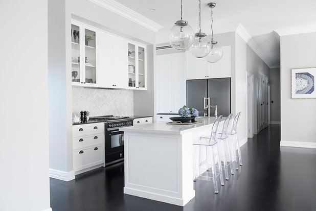
The client also wanted a kitchen so when friends and family visit, they can sit around the island table eating or drinking, while the cooking mess can be hidden away. We designed a larger-than-usual island to house all the client’s crockery and ceramics, and allow plenty of room for everyone to congregate.
The brief was to create a large, functional home that was Hamptons-inspired and also had a modern touch while complementing the original Art Deco architecture and fittings.
In terms of kitchen design, the client wanted a place for everything. The main component was to ensure the owner had a scullery to prepare all her food; an appliance cupboard to store all her appliances; a freestanding cooker; filtered water in the island bench; and somewhere she can sit and tend to her home-office needs. We integrated an IT nook in the kitchen, hidden away so the island bench could be kept clutter free.
The client also wanted a kitchen so when friends and family visit, they can sit around the island table eating or drinking, while the cooking mess can be hidden away. We designed a larger-than-usual island to house all the client’s crockery and ceramics, and allow plenty of room for everyone to congregate.
Starting point
We had to work with the existing jarrah floors, so this set the tone for the rest of the colour palette. We decided to stain the jarrah to give the room a modern edge. The Art Deco cornices and ceiling roses were the two main existing features that we had to work with. Everything else we could start from scratch.
We had to work with the existing jarrah floors, so this set the tone for the rest of the colour palette. We decided to stain the jarrah to give the room a modern edge. The Art Deco cornices and ceiling roses were the two main existing features that we had to work with. Everything else we could start from scratch.
Key design aspects
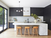
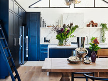
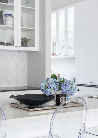
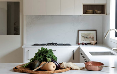
Colour palette: Black, white and indigo blue.
Materials palette: Jarrah flooring was stained in Black Japan with a 15-percent gloss finish. The walls are painted Brume by Dulux. Polytec Oberon profile doors are painted in Lexicon Quarter by Dulux.
The splashback tiles are
Crosby Tiles Soho Mosaic from Armanti Tiles and Bathware, laid in a 45-degree herringbone patten. Benchtops are in Caesarstone Raven and the island bench is in Smartstone Statuario Venato.
Key pieces of furniture/fittings: The pendant lights are Celeste in large from Cranmore Home. The bar stools are replica Philippe Starck Victoria Ghost stools from Matt Blatt.
Thinking behind the arrangement of furniture/fixtures
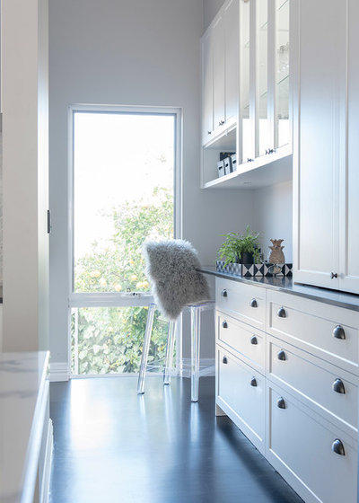
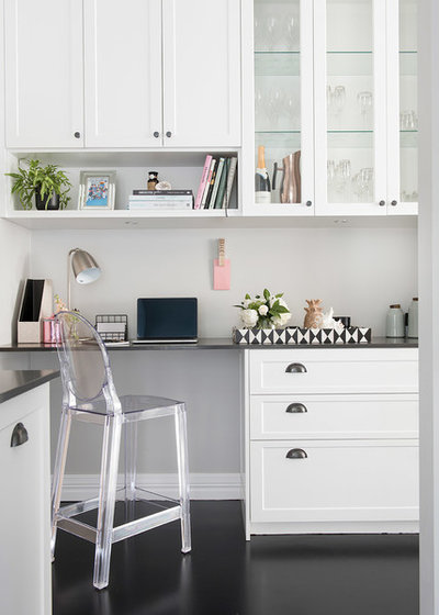
The client wanted a space in the kitchen area that is her own personal space to pay bills, do online shopping and keep records, but it needed to be private enough that it can’t be seen from the kitchen.
She wanted the area to be kid-free, somewhere they couldn’t overtake with their schoolwork and mobile phones. We designed the space to flow from the kitchen area, making sure the specification was consistent right through to the e-nook and scullery.
We feel this e-nook study space is the perfect placement for our client – her private corner – but also still included in the main kitchen area.
Challenges you worked around
The main challenge was that the house design had been completed and construction had commenced when we became involved, and the original cabinet design didn’t work at all. Therefore, we had to redesign the whole area to what the client had hoped for.
The other challenge was the floorboards and getting them stained correctly. It took two different trades and four attempts but they finally got there – a very expensive exercise.
We had also originally selected some other light fittings for the kitchen. The client had sent me photos once the kitchen was installed, and I thought, ‘Nope. We have to change those lights to clear glass spheres’. And it just worked so well.
Why do you think this room works?
All aspects of the design and the selections are well considered. Putting the colour palette together with all the samples was key.
The kitchen design flows so well. The fridge is easy to access for all family members. Each cupboard is placed where the client wanted all her kitchen items – plates and appliances are in the right spot, and it’s easy to access bins, glassware and plasticware. Plus, the massive scullery for all her pantry and prep work really means the front kitchen can remain clean and uncluttered.
Tell us
What do you love about this kitchen? Tell us in the Comments below. And don’t forget to save your favourite images, save the story, and join the conversation.
More
Want more great design? Take a look at last week’s Room of the Week: A Kitchen That Doesn’t Hide Everyday Clutter
What do you love about this kitchen? Tell us in the Comments below. And don’t forget to save your favourite images, save the story, and join the conversation.
More
Want more great design? Take a look at last week’s Room of the Week: A Kitchen That Doesn’t Hide Everyday Clutter

What are you working on?
Related Stories
Kitchens
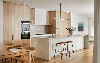
A Kitchen That Uses Special Elements to Punch Above Its Weight
This couple wanted a well-designed kitchen that incorporated their pre-bought furniture; this designer delivered
Full Story
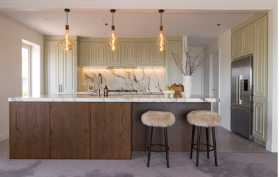
Kitchens
An Interplay of Light, Dark & Colour Creates a Striking Kitchen
All-white joinery, floors and walls is foiled by a handsome island bench and contemporary artworks in this handy kitchen
Full Story
Kitchens
Before & After: A Beachy Sydney Kitchen Sans the Coastal Cliché
A fresh materials palette gives a sense of place, while avoiding style stereotypes, to uplift this timeless new kitchen
Full Story
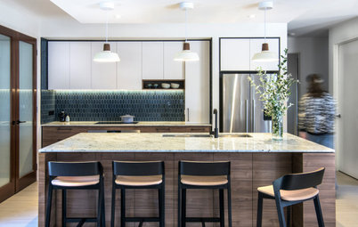
Kitchens
Before & After: A Penthouse Kitchen High on Glamour & Substance
This NZ penthouse kitchen needed to open up to the views and adjacent dining area. The designer served up that and more
Full Story
Projects Born on Houzz
Before & After: An Open-Plan Kitchen Goes from Boring to Boss
After scouting Houzz for designers, this couple found the right match in a local designer who transformed their space
Full Story
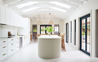
Kitchens
Before & After: A Cathedral-Like Kitchen With Soft Texture & Tone
High ceilings, curves, fluted features and beautiful tactile details elevate this white kitchen into the stratosphere
Full Story

Kitchens
Before & After: A Scandi-Style Kitchen in NZ That's Light & Airy
See this sweet, bright kitchen and dining space in Wellington, which had environmental concerns at the heart of its plan
Full Story
Kitchens
Before & After: A Quietly Quality Kitchen That Kept Its Layout
The layout couldn't be changed, but a clever approach to storage and colour transformed this Melbourne kitchen
Full Story
Projects Born on Houzz
Room of the Week: A Reader's Bathroom Inspired by Houzz
When you're planning a new bathroom, where do you look for ideas? Houzz, of course! See how this reader did it
Full Story
Kitchens
Room of the Week: A Scandi Kitchen That Doubles as a Workspace
Pared-back lines, a clay-coloured ceiling and a cooking/storage 'pod' star in this designer's family kitchen/work zone
Full Story
Appreciate the reply thanks. Will have them for our renovation as well.
The wall colour is beautiful, is it Brume 1/2 strength?