This Colour, There: Where to Use Colour to Enhance Mood
We dive into the psychology behind colour, so you're better informed about how to use it within your home
Jacquelene Symond
24 October 2017
Houzz Australia Contributor. Architectural Colour Consultant, Trainer, Writer and PostGrad Psychology student
Houzz Australia Contributor. Architectural Colour Consultant, Trainer, Writer and... More
Did you know our sense of sight communicates 10 times more information than any of our other senses? Not only does it influence the appearance of a space, design and materials, it affects everyday life, from our appetite to our productivity.
Our response to colour is a complex one, which combines personal taste, trends, cultural influences, physical responses and even what Carl Jung termed the collective unconscious. Within your home, your personal experience with a colour should always be your number one consideration… however, if you want to use colour to support a specific mood, feeling or behaviour, take advantage of these commonly experienced reactions.
Our response to colour is a complex one, which combines personal taste, trends, cultural influences, physical responses and even what Carl Jung termed the collective unconscious. Within your home, your personal experience with a colour should always be your number one consideration… however, if you want to use colour to support a specific mood, feeling or behaviour, take advantage of these commonly experienced reactions.
Red
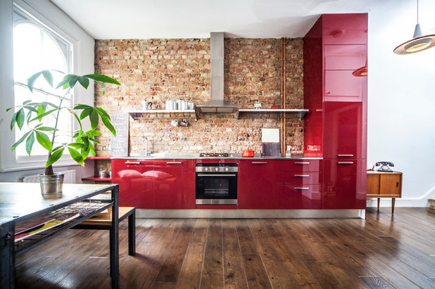
No colour has been researched more than red. As our eyesight evolved millions of years ago, red was the colour that helped us survive, thrive and multiply; it allowed us to identify the ripe from the unripe fruit, it gave us the ability to sense danger in the form of fire, and it allowed a male to identify when a female was fertile due to the flushed colour of her skin. It is no wonder shades of red have been described as energetic, stimulating, appetising and even sexy.
A 2012 study that looked at emotional responses to colour suggested that the red/orange spectrum was considered the most appetising of colours by a whopping 79 per cent over black/white (5 per cent) and blue/purple (9 per cent).
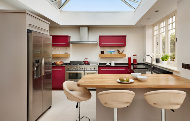
If you dare, take advantage of the effects of red by using it in the kitchen. Add red to splashbacks, lighting, furniture and crockery.
In a thesis that looked at the effect of the colour red on marketing, Julia Bölke reported that red has been seen to enhance human metabolism by 13.4 per cent, therefore boosting vitality and physical endurance. There’s a reason Virgin Active uses red; it’s also the perfect colour for use in your home gym.
Tip: Like any shade, balance red with neutrals and other colours within the spectrum as too much red can cause irritability, make people feel uncomfortable and even raise blood pressure.
10 Kitchen Colour Schemes That Will Stand the Test of Time
Tip: Like any shade, balance red with neutrals and other colours within the spectrum as too much red can cause irritability, make people feel uncomfortable and even raise blood pressure.
10 Kitchen Colour Schemes That Will Stand the Test of Time
Pink
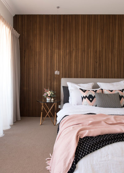
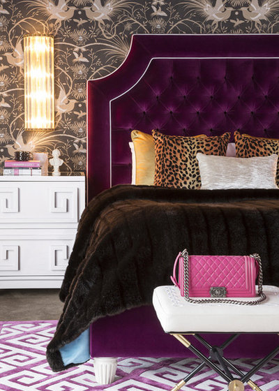
Pink brings with it all the characteristics of red but in a gentler, more nurturing way. As opposed to the raw passion that fire-engine red may have, pink may bring a sense of romance and caring to a space. The lighter the tone, the softer and more feminine the mood. If you have an aversion to pastels, think about using rose-pink – it’s a perfect balance between red and pastel pink.
Pink brings with it all the characteristics of red but in a gentler, more nurturing way. As opposed to the raw passion that fire-engine red may have, pink may bring a sense of romance and caring to a space. The lighter the tone, the softer and more feminine the mood. If you have an aversion to pastels, think about using rose-pink – it’s a perfect balance between red and pastel pink.
Alternatively, add black or grey to create a sense of sophistication and elegance to a room.
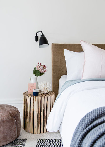
Tip: To bring a little softness and create a sense of balance in an already masculine bedroom, use shades of pink in soft furnishings such as cushions, sheeting and throws.
Yellow
It’s known as the colour of joy, happiness and sunshine. However, poor old yellow was given a bad wrap in the late 1980s by Carlton Wagner, an interior designer based in the US who claimed the shade made babies cry and people argue. It hit the media and his opinion was promoted throughout the industry… and sometimes still is. Research was never forthcoming, and in fact he was quoted by those who attended his seminars as saying that the colour should be obliterated forever.
It’s known as the colour of joy, happiness and sunshine. However, poor old yellow was given a bad wrap in the late 1980s by Carlton Wagner, an interior designer based in the US who claimed the shade made babies cry and people argue. It hit the media and his opinion was promoted throughout the industry… and sometimes still is. Research was never forthcoming, and in fact he was quoted by those who attended his seminars as saying that the colour should be obliterated forever.
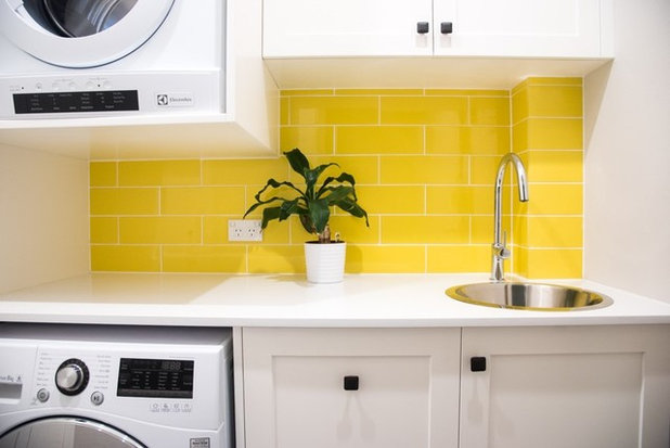
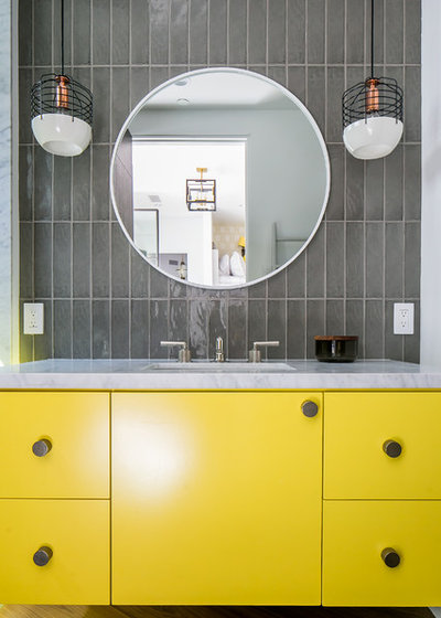
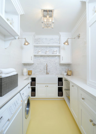
Use it in small areas where you’d like to brighten up a space such as a laundry or powder room.
Tip: Yellow can be similar to white in its light reflection value, which means it can easily take on the properties of what is next to it. Be sure to check samples in the light you will be using it in.
Orange
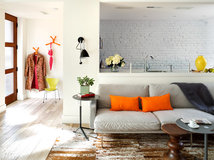
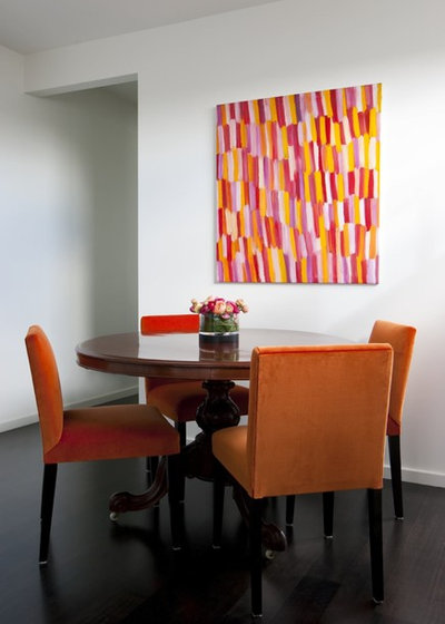
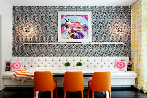
Considered the hottest shade in the spectrum, the colour orange has been known to stimulate digestion, metabolism and detoxification. It’s also considered the most social of colours. Use it in the shade that appeals to you, from true orange through to peach and apricot. This colour provides the perfect backdrop for your dining area, where you can sit back, converse and share stories over a home-cooked meal with friends and family.
Browse orange dining rooms on Houzz
Tip: Bring shades of orange into your eating area through artwork, furniture or even bowls of orange fruit such as mangoes, oranges and mandarins.
Yellow-green
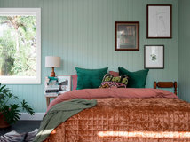
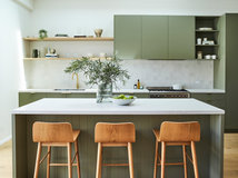
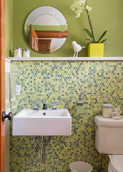
Green sits dead centre on the colour spectrum and is therefore known for its balancing effect. In 2017 Pantone chose ‘Greenery’ as the colour of the year. It was described as a fresh and zesty yellow-green shade that evokes the first days of spring when nature’s greens revive, restore and renew. Pantone suggested that Greenery signals consumers to take a deep breath, oxygenate and re-invigorate.
Green sits dead centre on the colour spectrum and is therefore known for its balancing effect. In 2017 Pantone chose ‘Greenery’ as the colour of the year. It was described as a fresh and zesty yellow-green shade that evokes the first days of spring when nature’s greens revive, restore and renew. Pantone suggested that Greenery signals consumers to take a deep breath, oxygenate and re-invigorate.
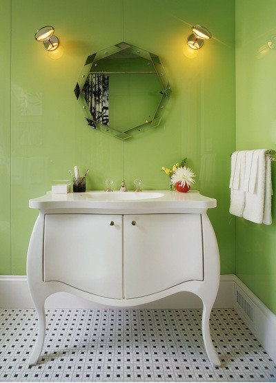
Tip: In a similar way to yellow, this colour can be too bright to sit with for any length of time so use it in areas such as small bathrooms, laundries or even outdoors.
Blue-green
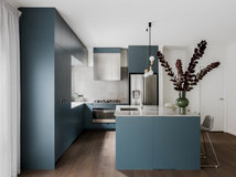
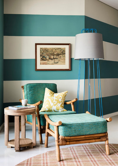
On the other end of the green scale, a blue-green colour named ‘Marrs Green’ was recently named the world’s favourite colour. Chosen after surveying 30,000 people across 100 countries, experts believe the colour was chosen due to its sense of calm and balance in an unpredictable world. Described as a dark teal, it has simultaneous warmth and coolness, which is said to somehow feel inviting and absorbing.
On the other end of the green scale, a blue-green colour named ‘Marrs Green’ was recently named the world’s favourite colour. Chosen after surveying 30,000 people across 100 countries, experts believe the colour was chosen due to its sense of calm and balance in an unpredictable world. Described as a dark teal, it has simultaneous warmth and coolness, which is said to somehow feel inviting and absorbing.
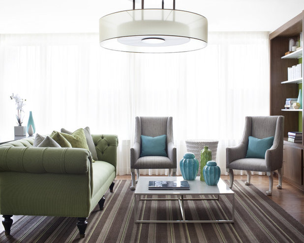
Tip: Use splashes of this colour in areas where you like to relax and unwind after a hectic day, such as the living area.
Blue
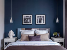
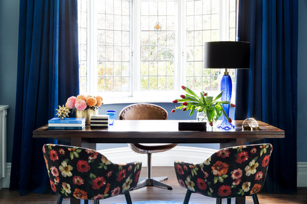
Research has suggested that people working in an all-blue office made substantially fewer errors than those that worked in an all-white office. Use mid to dark blues in your home office to clarify thought and concentration. Alternatively, use it in lighter shades in a child’s bedroom to create a sense of calm and focus, particularly during high school years.
5 Fool-Proof Steps to a Spot On Colour Scheme
Tip: Deep blues can also be depressing, so be mindful of balancing this colour scheme with neutrals and other pops of colour such as yellow and orange.
Purple
Purple is the colour of royalty, mystery and opulence, known as the colour that Cleopatra used to seduce Mark Antony. In deeper shades it can be passionate and sensual, particularly when teamed with shades of gold or silver. Softer shades, such as lavender and lilac, can have a calming effect when combined with white or cream.
Tip: Purple is ‘that’ colour people have the strongest response to. Personal relationships to colour should always be taken into account first and foremost when choosing colours for your home.
Finally, with so many colours, tints and shades to choose from, if you’d like to apply colour to your home and are still stuck on choosing the right shade to support your moods, feelings and behaviours, ask the advice of a professional colour consultant. Most have touched on applying colour psychology within their training and can guide you to ensure you choose the perfect shade for your space.
Tell us
Have you used any of these colours in your home? Tell us why, and what effect you think they’ve had in the Comments below. Join the conversation.
More
Find interior decorators and designers on Houzz
Related Stories
Interior Design
The Golden Rules of Proportion: Decor Laws You Need to Know
An interior designer reveals the essential rules for achieving a perfectly balanced interior
Full Story
Interior Design
Design Masterclass: A Budget-Friendly Refresh of a Small Home
See how a designer's smart use of colour and considered storage solutions transformed a drab home for AUD$50,000
Full Story
Renovating Advice
Renovation Insight: How to Choose an Interior Designer
A skilled interior designer can help bring your decor dreams to life – three experts reveal how to choose the right one
Full Story
Interior Design
10 Decorating Rules Interior Designers Swear By
By Laura Downie
Want to give your home professional polish? An expert reveals the top 10 decorating rules you need to know
Full Story
Interior Design
8 Ways to Create Flow and Cohesion With Your Interior Design
These eight tips can help you select products, finishes and styles that work together from room to room
Full Story
For Pros
Trade Shows: Why They're Important Events You Don't Want to Miss
From networking to insights into new and emerging trends, here's why trade shows should be a firm 'yes' in your calendar
Full Story
Picture Perfect
22 Curtains That Dare to Be Different
Our coffee-break escape offers you five minutes' worth of images to inspire and delight. Jump right in...
Full Story
Project Of The Week
Before & After: A Cheap & Cheerful Makeover of a 1980s Caravan
Armed with an AU$1500 budget, a Melbourne couple rolled up their sleeves and transformed a caravan in just three months
Full Story
Houzz Tours
Melbourne Houzz: A Terrace Near Ruin Gets a Second Chance
See how a derelict Victorian terrace in Melbourne was transformed into a luxurious and serene family home
Full Story
Houzz Tours
Melbourne Houzz: A Family's Dream Home, 20 Years in the Making
Timeless, sophisticated and a little bit industrial – this heritage-home renovation is nothing short of spectacular
Full Story









Tere Batham I LOVE your bathroom. Can you pls share the name of the colour you used on the walls. Thank you. I have used creamy yellow in the lounge and green-yellow in the spare room. I had to work with terracotta floors but did love them both and find both of them are very restful.