
Decorating
10 Tips for Adding Attitude to Neutrals
Give a little edge to a neutral palette with pattern, texture, contrast – and a dash of colour

If your favoured paint hues are grey, greige, biscuit or polished pebble, chances are you’ve incorporated neutral tones into your home. We’re told that creating a scheme using these ‘non-colour’ shades is terrifically easy – there’s less to go wrong than when bingeing on brights. But play it too safe and your decor could end up going from beige to blah.
Or perhaps you’re not totally sold on the neutrals trend and long for a touch more contrast and a dash of colour? Either way, read on for 10 tips to help rev up your neutrals while keeping things chic and serene.
Or perhaps you’re not totally sold on the neutrals trend and long for a touch more contrast and a dash of colour? Either way, read on for 10 tips to help rev up your neutrals while keeping things chic and serene.
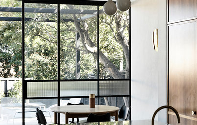
3. Swerve sterility
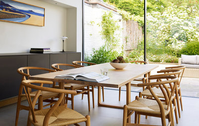
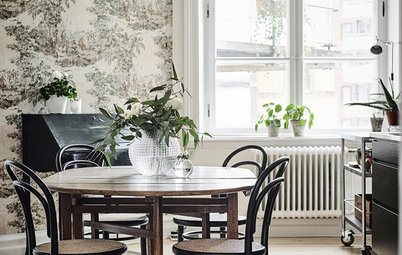
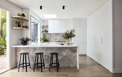
All-white spaces can often appear rather clinical. One way to avoid this is to incorporate rough finishes such as wood, concrete and brick, which all create the opposite effect. This kitchen has very little in the way of colour, but certainly packs a powerful design punch thanks to these textured, industrial-inspired elements.
All-white spaces can often appear rather clinical. One way to avoid this is to incorporate rough finishes such as wood, concrete and brick, which all create the opposite effect. This kitchen has very little in the way of colour, but certainly packs a powerful design punch thanks to these textured, industrial-inspired elements.
4. Look for light and shade
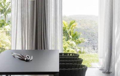
Neutral needn’t mean pale. Choose a highly saturated version of your favourite shade and use it to add dimension and depth, as with this stormy grey alongside lighter neutrals.
Neutral needn’t mean pale. Choose a highly saturated version of your favourite shade and use it to add dimension and depth, as with this stormy grey alongside lighter neutrals.
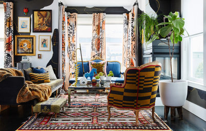
5. Colour-block the lot
Imbue your neutrals with extra impact by using one shade across both skirting boards and walls. You can then use furniture and accessories to dial up the contrast as much or as little as you like.
Are you ready to go over to the dark side?
Imbue your neutrals with extra impact by using one shade across both skirting boards and walls. You can then use furniture and accessories to dial up the contrast as much or as little as you like.
Are you ready to go over to the dark side?
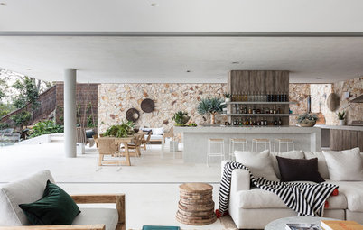
6. Learn about layering
For neutrals to work cohesively in a large, open-plan space, it’s a case of intertwining lots of similar colours, a few darker shades (in the same tone) and a sparing use of brights. This low-key layering can be used across paint, furniture and accessories to create a soothing scheme that’s neither shouty nor boring.
For neutrals to work cohesively in a large, open-plan space, it’s a case of intertwining lots of similar colours, a few darker shades (in the same tone) and a sparing use of brights. This low-key layering can be used across paint, furniture and accessories to create a soothing scheme that’s neither shouty nor boring.
7. Step up the shine
Boost flat neutrals with a little metallic magic. Take your colour cue from the existing decor, but choose metallic accessories in a complementary shade to introduce subtle sparkle. Alternatively, look to metallic wallpaper with a slight sheen and incorporate on a feature wall, or in alcoves as seen here.
Boost flat neutrals with a little metallic magic. Take your colour cue from the existing decor, but choose metallic accessories in a complementary shade to introduce subtle sparkle. Alternatively, look to metallic wallpaper with a slight sheen and incorporate on a feature wall, or in alcoves as seen here.
8. Get creative
It’s an obvious tip but one worth remembering: well-chosen artwork has transformative powers. Set against a neutral grey backdrop, these abstract prints spring to life. The fact that the backgrounds of the images are a similar grey to the walls only enhances the effect.
Discover how art can jazz up your baby’s nursery
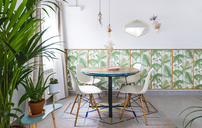
9. Pick out a pattern
There’s a lot to love in this super-stylish boudoir – from the textured silk wallpaper to the inky-blue bedside tables – but it’s the geometric-print cushions that really steal the show.
Bold patterns can add instant attitude to a neutral room – but to keep the theme muted, choose a print that features one of the shades used in the rest of your scheme and gently builds on it.
Learn how to clash patterns and colours with confidence
10. Make mine a mocha
Indulge that coffee craving with a creamy palette of cappuccino shades. Brown may have fallen off the interior design radar in recent years, but it’s rapidly making a comeback thanks to our love of everything nude and neutral. Pair with white or cream for a tasty mocha swirl.
TELL US
How have you used neutrals in your home – and which look is your favourite here? Share your thoughts in the Comments.
MORE
How to Design a Neutral Room That Kicks Boring to the Kerb
12 Delightful Themes for Gender-Neutral Nurseries
Bedroom Colour Combos That Soothe Your Soul

Sponsored

Sponsored
The key to giving neutrals an edge is texture, texture and more texture. Soft, tonal colours blossom when combined in a way that creates visual interest: rough with smooth, matt with shiny. The contrast of wooden planks and a metal table and lamp, along with the soft bed, make this sleep space a winner.