10 Tips for Discovering the Right Palette for You
Take cues from the environment, start with your favorite fabric, and other secrets for unlocking your personal palette
Charmean Neithart
17 September 2013
A palette is one of the first things I notice when I walk into a home. It's an interesting subject because the wrong palette, or combination of colors, can really disrupt a living space, yet the right palette is different for everyone.
On almost every job, I'm asked, "How do I figure out which palette works for me and my house?" I remind people that the colors they like might not be colors they want to live with or that are right for their home's architectural style.
Here are some tips for starting the house palette that may have you stumped.
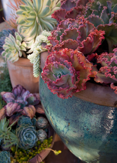
Use nature for inspiration. Mother Nature does it best. If you see colors in nature that appeal to you, translate those colors with paint, fabrics and art.
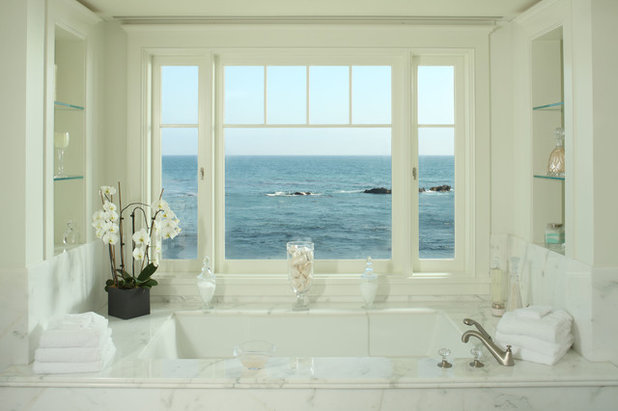
Yield to a view. If you have incredible views, just let them dictate the palette. Neutrals tend to enhance a view. The landscape and weather conditions will provide an ever-changing scene for you to enjoy.
Paint Sampling 101. If you want to start with paint, then prepare your space. Sample paint against a white backdrop, not against an existing color.
Sample boards work great because you can move them around. Observe at different times of day, and always use two coats. Make sure to sample in the finish you will ultimately be using.
Sample boards work great because you can move them around. Observe at different times of day, and always use two coats. Make sure to sample in the finish you will ultimately be using.
Start with one great fabric. Have you ever stumbled upon that one great fabric that made you declare love right then and there? I have, and that fabric is now a great starting point for a whole room palette. Use it to select paint, rugs and art. The colors don't have to match, just complement one another.
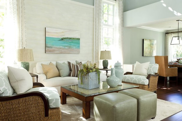
Consider your location. If you are near the ocean, mountains or other location-specific environments, use the terrain as a guide. Cool blues from water or warm browns from the mountains might make you feel at home, inside and out.
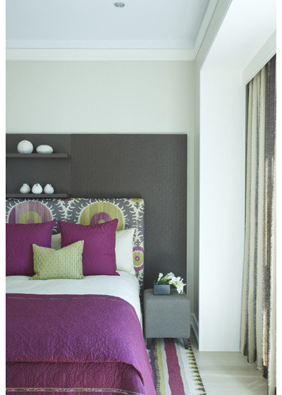
Think about contrast. Many times colors are dismissed as "too light." Are you thinking about the opportunity that a pale paint color offers? Think about the furniture or prints you might own. A pale color can serve as a beautiful backdrop for eye-pleasing contrast.
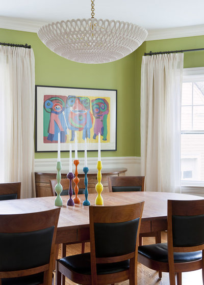
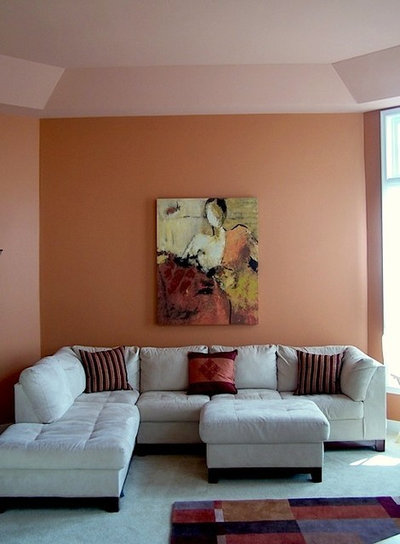
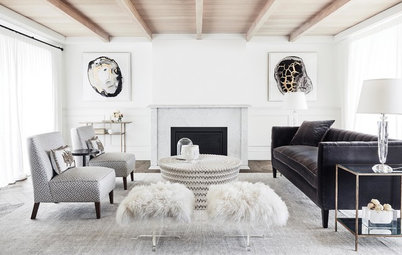
Use restraint with bright colors. I love color; however, a room can suffer if there is too much of a good thing. Bright colors are best shown against crisp white details like casings or curtains. Note the neutral furniture that allows the paint color and vivid art to set the cheerful palette.
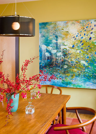
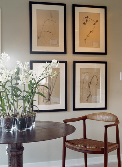
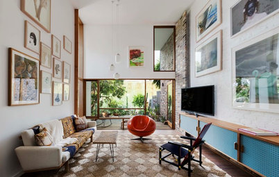
Use art as a guide. I'm not a big fan of matching. I know matching is intuitive, but it's not always the best choice for your palette. Start with a piece of art, then select complementary paint and furniture. This is where a color wheel can come in handy. Remember: Opposites are good.
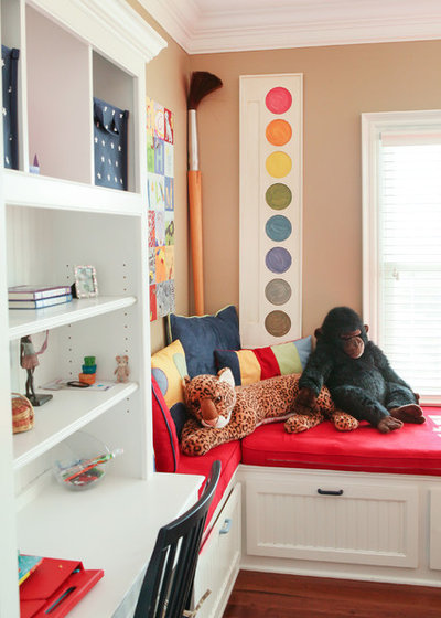
Consider function. What will you be doing in the room you are working on? A palette can often be determined by function. Are you working on a child's room, nursery, playroom or breakfast room? Here is your chance to have some fun. Try color combinations that are cheery and whimsical, yet cohesive. You may not want this look all over your house, but it's OK to let loose in a room, especially if it suits the function.
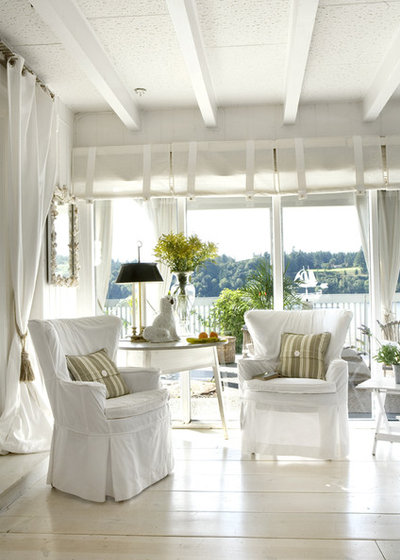
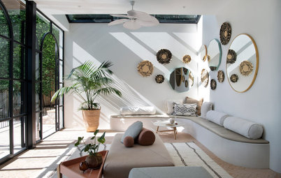
White palettes count. I want to debunk the thought that whites don't count as a palette. Different shades of white make a soothing living space and can enhance architectural details. If you enjoy a constantly changing environment, then white might be your color. Color can be brought in with flowers and seasonal changes on pillow fabrics.

Related Stories
Renovating Advice
How Do I Find, Assess & Hire the Right People for My Renovation?
Do you need a kitchen designer or a joiner? An architect or an interior designer? Find out with our essential reno guide
Full Story
Renovation Guides
What Key Measurements & Room Dimensions Should I Know for a Reno?
Read practical information about key room measurements and minimum clearances for fittings and fixtures in every room
Full Story
Kitchens
How Practical Is... Handleless Joinery?
Handleless joinery is popular in modern homes. But how suitable are cupboards that can only be opened with a touch?
Full Story
Most Popular
12 Decorating Tips to Make Any Bedroom Look Better
By Anne Ellard
Want to know how to make your bedroom look better? Here are 12 great tricks
Full Story
Renovation Guides
Room by Room: Experts on Ways to Avoid Common Renovation Blunders
From the kitchen to the garden, and all areas in between, experts identify common mistakes and share priceless insights
Full Story
Interior Design
The Golden Rules of Proportion: Decor Laws You Need to Know
An interior designer reveals the essential rules for achieving a perfectly balanced interior
Full Story
Most Popular
5 Reasons Your Bathroom Smells Funky (and How to Fix the Problem)
A plumber reveals five reasons your bathroom might smell like sewage or emanate a musty odour
Full Story
Most Popular
From Planning to Pendants: Kitchen Lighting Essentials
By Joanna Tovia
This valuable guide will give you all you need to know about choosing kitchen lighting for fabulous form and function
Full Story
Most Popular
The Full Picture: How High Should Your TV Be?
By Matt Clawson
We look at an important question to consider when locating your television: how high should you set it?
Full Story
Bathrooms
All the Dimensions You Need to Know for Your Bathroom Makeover
Fit everything comfortably in a small or medium-size bathroom by knowing standard dimensions for fixtures and clearances
Full Story
Food 4 thought
Many years ago I bought a dress without trying it on; it looked terrible on me when I got it home. This wasn't my first time around the block with this experience, and I wondered why I'd succumbed to something I KNEW wasn't right. I just stood there looking at it, and suddenly I realized it was the color scheme that did it for me -- yellow, red, blue, green. More rustling around in the old brain cells, and I realized the colors evoked a joyful visual memory of a childhood Christmas tree lit with -- you guessed it -- yellow, red, blue, and green lights. Since then I've used this palette throughout my house. Even though the tone in each room differs -- casual, formal, whimsical -- the palette (and antiques in all rooms) provide continuity. Two of the bedrooms use pastel versions. I haven't tired of these colors in more than 30 years. And now I don't have to buy that inappropriate dress/vase/chair just because it's done in "my" colors. :) I'm not suggesting anyone use this palette, but I am suggesting noticing how you respond to various colors and trolling your memories for inspiration. Happy coloring!