


12 No-Fail Ways to Make Any Room Look Better
Follow these basic decorating guidelines and your home will look like an interior designer has been visiting...
Judith Taylor
14 May 2014
I hate to break it to you, but stylists or designers don’t follow a secret decorating rule book. There are no hard and fast laws governing what we do. We are creative types by nature and love to imagine, dream, explore and follow our intuition. That being said, there are some general principles that guide us to ensure a great result every time. They are tried and true approaches that work, not secret tricks or skills that take years to master. Anyone can do them from day one. Consider this a foundation for developing your own quirky, creative, rule-breaking and intuitive approach.
Find an interior designer or decorator in your area
Find an interior designer or decorator in your area
1. Pick the paint colour last
I get calls all the time from new homeowners who want to pick a paint colour before they move in. I appreciate their logic: why not arrive to walls gleaming with a fresh coat of paint? Of course you can do it this way, but in my opinion it’s not ideal.
There are thousands of paint colours with various tints, tones and shades. And each one looks different from home to home, because light sources vary, meaning what looks good in your current home might not in your new one. You want the colour that best complements your upholstery, artwork, rug and whatever else. You can pick that colour only if your stuff is actually inside your home.
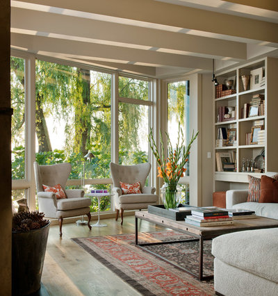
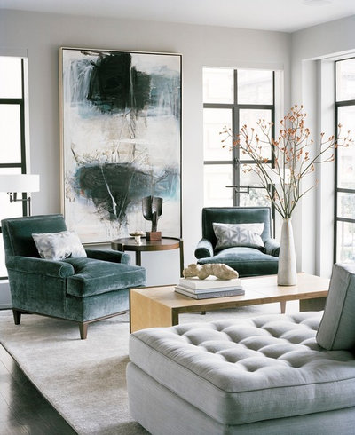
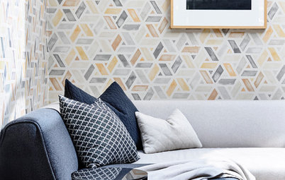
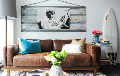
2. Give your furniture some breathing room
Resist overcrowding a room. Gracious living means space to manoeuvre with ease. This is really great news if you are working with a tight budget. You don’t need to fill up a space with lots of furniture. Spend more of your budget on fewer but better-quality pieces and your room will look better than if it’s stuffed to the gills with flea market finds. The high-backed chairs shown here, for example, stand out because they don’t have to fight for attention.
Resist overcrowding a room. Gracious living means space to manoeuvre with ease. This is really great news if you are working with a tight budget. You don’t need to fill up a space with lots of furniture. Spend more of your budget on fewer but better-quality pieces and your room will look better than if it’s stuffed to the gills with flea market finds. The high-backed chairs shown here, for example, stand out because they don’t have to fight for attention.
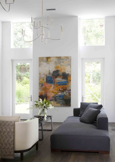
3. Hang artwork at the right height
Galleries and museums hang artwork so that the midline (centre) of each piece is 145cm to 152cm from the floor. (The average human eye level is 145 cm.) You should do the same.
In a room like this, where the ceilings soar, there might be a tendency to hang the art higher. But remember, it needs to relate to human scale, not the structure’s scale.
If you’re not sure, take a picture. It’s remarkable how much a photo can reveal. Print it out or use Photoshop or an app to draw on the photo. This can give you a sense of whether a larger or smaller piece of art is needed or a tall plant might be best to fill an empty spot.
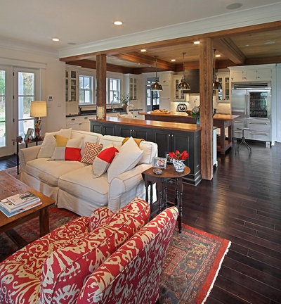
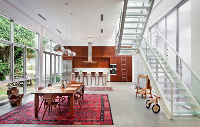
4. Know how to arrange furniture on a rug
There are basically three ways you can arrange furniture on your rug.
ALL ON: The rug is large enough to place all of the furniture legs on top of it. This creates a more luxurious feel. For this, bigger is better. Just be sure to leave at least 30cm to 45cm of surface free on all four sides of the rug.
ALL OFF: If you have a small room, keeping all legs off the rug is a great cost-effective choice. You don’t want to pick too small a rug, though, or it may look insignificant, like an afterthought. The rug should appear as though it could touch the front legs of each of the seating pieces. This approach is best suited when you’re layering a pattern over a larger solid or textured rug.
Shop a wide selection of rugs on Houzz
FRONT ON: Put just the front feet of all your seating pieces on the rug to tie the arrangement together visually and create a well-defined space while lending a feeling of openness.
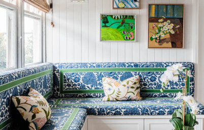
5. Resist the urge to go too ‘themed’
For example, the Cape Cod look is a very popular request. You know the hallmarks: pine lining, a blue and white colour palette and some ship paintings. But this has been done so many times, it lacks individuality. In this room a coastal vibe was achieved through a palette, artwork and materials that give the effect without drawing on the obvious clichés.
For example, the Cape Cod look is a very popular request. You know the hallmarks: pine lining, a blue and white colour palette and some ship paintings. But this has been done so many times, it lacks individuality. In this room a coastal vibe was achieved through a palette, artwork and materials that give the effect without drawing on the obvious clichés.
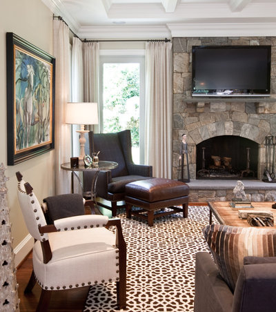
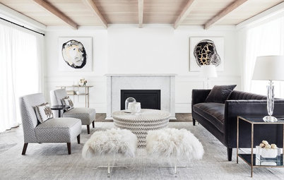
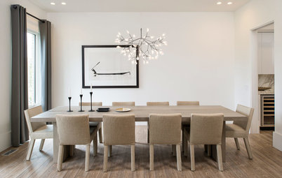
6. Create a focal point
There are leading roles and supporting cast members in any production. The same is true in design. Choose your star and make it the focal point to anchor a room. Allow other items to take a secondary role. Don’t ask everything to have a leading role, it will just result in visual noise.
Your focal point might be a dramatic range hood in the kitchen, a mantle and artwork in the living room or a bedhead in the bedroom. Whatever it is, choose something that will draw attention. In this room the fireplace and the lighting work together as a collective focal point, bringing your eye right to the centre of the composition and anchoring it there.
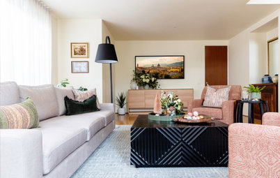
7. Consider sight lines
Your focal point should be free and clear from one room to the next so that it feels like you’re being drawn between them. That’s why the best spot for a focal point is usually directly across from the entrance to the room.
Here a seating arrangement around artwork draws the viewer into the room because the sight line is clear.
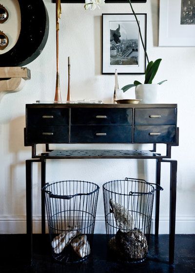
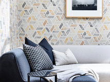
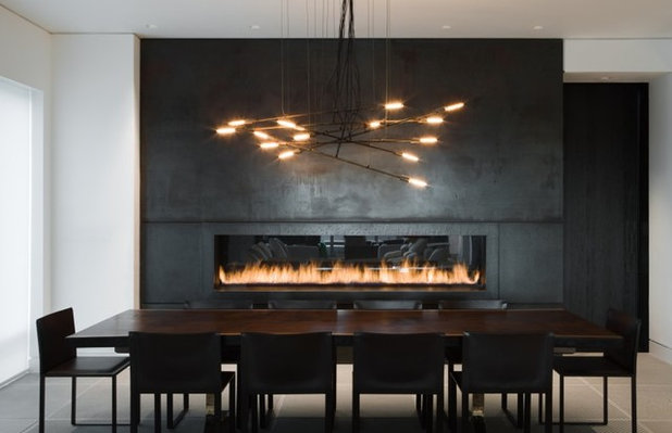
8. Edit your knick-knacks
Don’t hang on to a piece that just doesn’t fit. I don’t care if your great-aunt Sally gave it to you. If it’s not working for you, then find a new home for it (maybe in a different room).
The unifying theme here is the use of black in the utilitarian pieces. The balance is almost perfect. It reminds me of something fashion designer Coco Chanel said about accessorising: “Before you leave the house, look in the mirror and take one thing off.” In design, know when to stop.
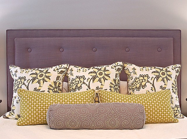
9. Vary the scale
What looks good in a store may look like an elephant in the room when you bring it home, or could be too tiny to be of any significance. So always vary scale and proportion.
The oversize sunburst mirror frame fills up the wall space nicely here, while the sand dollars make an interesting grouping below. The sand dollars would be much too insignificant individually. Threes and fives (odd numbers) make for more pleasing arrangements than even numbers.
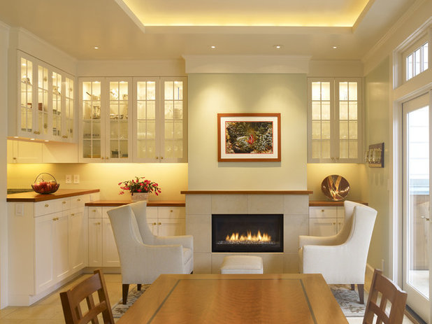
10. Add layers of lighting
In this kitchen seating area, the splashback is lit, the artwork is highlighted and the cabinet interiors are filled with light. One central lighting fixture would not have had nearly the same dramatic result.
Professionals build layers of lighting to create interest, intrigue and variety. In a room where everything is lit evenly, nothing stands out. Pick a focal point and perhaps a secondary focal point and highlight those. Add general ambient lighting and some lower lighting, such as table lamps, for interest.
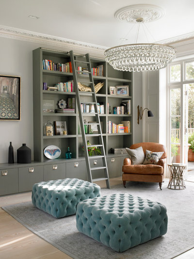
11. Be bold
Personality is what makes a space great. Make your own statement and have fun. The more you try, the more you will begin to see what works and what doesn’t.
Incorporate unexpected elements for drama. Here, the unconventional ottoman seats, library-style bookshelves and oversized chandelier are all unexpected in a conventional living room, but the result has charisma. Eschew expected pieces and interpretations if you want a room that will create a ‘wow’ effect.
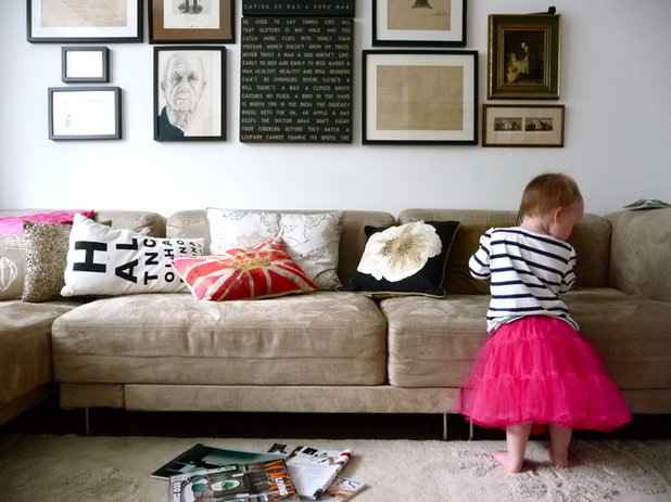
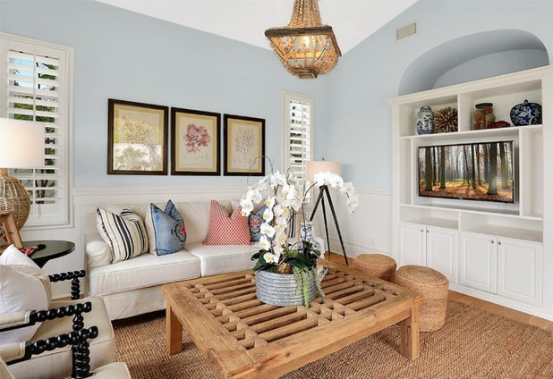
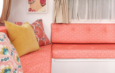
12. Ignore all principles in favour of creativity
Having some guidelines gives people a good starting point for furnishing their home, even if some of them aren’t practical for a particular space.
Go with something personal that makes you smile and, above all, is comfortable. Overly designed rooms don’t really translate to modern life. A cushion collection and an art arrangement that are seemingly haphazard, as shown here, create a dressed-down look with plenty of style.


Related Stories
Interior Design
The Golden Rules of Proportion: Decor Laws You Need to Know
An interior designer reveals the essential rules for achieving a perfectly balanced interior
Full Story
Most Popular
An Interior Designer's Guide to Arranging Cushions
By Anne Ellard
Get to grips with your ever-growing pile of cushions with these professional tips for choosing and arranging cushions in your home
Full Story
Decorating
The Power of Negative Space in Interior Design
By Janet Dunn
A design element that's not even there can forever change how you view your home
Full Story
Houzz Tours
Queensland Houzz: A Cute Cottage Awash With Colour and Pattern
Bold colour, quirky prints and an abundance of art transformed this 1920s cottage into an inviting and relaxing gem
Full Story
Project Of The Week
Before & After: A Cheap & Cheerful Makeover of a 1980s Caravan
Armed with an AU$1500 budget, a Melbourne couple rolled up their sleeves and transformed a caravan in just three months
Full Story
Most Popular
Ask the Experts: What Goes With Tan Leather?
Embrace this versatile material, colour and texture with inspirational ideas from designers in the know
Full Story
Most Popular
Masonry Magic: 15 Ways to Trick Out Your Exposed Brick Wall
Do you find exposed brick walls cold? Add contemporary warmth and interest with these 15 transformative ideas
Full Story
Projects Born on Houzz
Before & After: From Dump Zone to New 'Welcome Home' Living Area
Home office, yoga zone, dumping ground... this front room was having a serious identity crisis – but look at it now!
Full Story
Picture Perfect
30 Christmas Schemes to Inspire and Delight
Our coffee-break escape offers you five minutes' worth of images to inspire and delight. Jump right in...
Full Story
Most Popular
16 Clever Ways to Create Zones in Open-Plan Spaces
Create distinct areas in large, open rooms with these creative design ideas – no walls or other fixed vertical structures required!
Full Story
My motto is...stick to a style that you like such as traditional in my case. use pieces you like not pieces that coordinate necessarily. Make the room speek you. Ahh, so relaxing is key.
This article was very helpful for me :) sure, it’s a bit sad I couldn’t buy a law book about how to design your room but at least now I know how to make my room seem less overwhelming. I tend (okay, I do it all the time) to cast way to many stuff as the leading roles. Thanks to this post I now know it’s best with simply 3 or less focal points.
HU-9694120 I am glad you found it helpful, and you are right about too many focal points. It would be like putting on all your favourite jewelry at once. Nothing would be special.