
3 Apartments With Soul... and How They Did It
Adding character and interest to an apartment isn't always easy – we asked three designers for their insiders' tricks

There are many reasons to love apartment living – proximity to cafes and shops, new (or newish) fixtures and no lawn to mow on the weekends being chief among them. On the downside, the interiors can often be small and veer towards cookie-cutter style. If you’re seeking ways to make your small apartment feel more like home, look no further – here are three apartments packed with character, along with insights from the designers behind them on how they created each space.
The floor plan after works
Brief
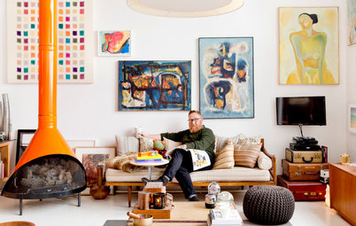
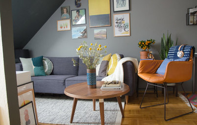
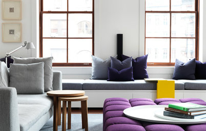
My client travels frequently for work and he wanted to create a sanctuary where he could spend the little time he had at home in style and enjoy his beautiful Sydney views. Colour was an important part of the brief.
What were the client’s must-haves?
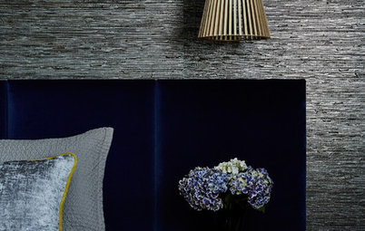
The client was very trusting and there was only one must-have – a comfortable chair in which to watch sport on the weekends. I found a high-backed chair with a unique shape from King Living, which we covered in a gorgeous red fabric to fit with the colourful brief.
Brief
My client travels frequently for work and he wanted to create a sanctuary where he could spend the little time he had at home in style and enjoy his beautiful Sydney views. Colour was an important part of the brief.
What were the client’s must-haves?
The client was very trusting and there was only one must-have – a comfortable chair in which to watch sport on the weekends. I found a high-backed chair with a unique shape from King Living, which we covered in a gorgeous red fabric to fit with the colourful brief.
What wasn’t working about the apartment originally?
My client has a flair for colour and fun, but the original design felt dull and lacking in character. Plus, the colours and finishes were outdated and worked against each other.
The kitchen was the main focus of the renovation as it was small, dark and gloomy. The client wanted it ripped out and redone.
Inspired to revamp your own apartment? Find a local interior designer near you who can make it happen
The living/dining room before works
What condition was the apartment in when you came onboard?
It was in good condition with just a few wear and tear issues.
What condition was the apartment in when you came onboard?
It was in good condition with just a few wear and tear issues.
What exactly did you do?
How did you add character and soul to the space?
- I kept the original floor plan as the client needed to move in straight away.
- I put in a completely new kitchen and painted and furnished the entire apartment.
How did you add character and soul to the space?
- I updated the palette wth bright white paint, marble and tiles.
- I added timber finishes for warmth.
- Colourful furniture injects interest and drama.
Budget: Approximately $60,000.
Where did most of it go?
It was balanced quite well between the kitchen and furniture such as the locally made sofa, dining table, coffee table and artwork in the living room. The client loves unique, well-made pieces so we selected items from some gorgeous suppliers, including sustainable products and work by local artisans.
How Do I… Commission a Piece of Timber Furniture?
The kitchen before works
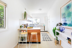
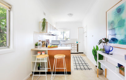
How did you add character to the tiny kitchen?
Being such a small space, I decided to keep the palette simple but warm with white and timber. The Smartstone benchtops kept the scheme sophisticated but I did have a bit of fun by adding the brass and round penny tiles.
How did you add character to the tiny kitchen?
Being such a small space, I decided to keep the palette simple but warm with white and timber. The Smartstone benchtops kept the scheme sophisticated but I did have a bit of fun by adding the brass and round penny tiles.
The kitchen after works
As the kitchen area has no natural light entering it, the palette needed to be light and bright, which is why I chose white and the pale timber veneer.
When creating any interior, I love adding a touch of drama or contrast. I did this here by using charcoal floor tiles that tie in with the colour of the vein in the Smartstone benchtop.
Any smart savings?
To save on costs, I specified print artworks for the bedrooms and some lower-priced decorative objects throughout the apartment.
On Display: 6 Ways to Add Impact to Your Art Arrangements
To save on costs, I specified print artworks for the bedrooms and some lower-priced decorative objects throughout the apartment.
On Display: 6 Ways to Add Impact to Your Art Arrangements
Images by Tom Blachford
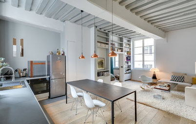
2. Old Meets New
Architect, interior designer and commentator: Melanie Beynon, principal at Melanie Beynon Architecture & Design (who worked on this project with interior designer Megan Hounslow)
Location: Melbourne, Victoria
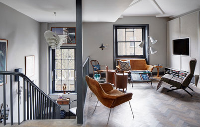
Description: A loft apartment in a heritage building that originally functioned as a dressmaker’s workshop
Who lives here: A couple
Apartment size: 105 square metres
Bedrooms and bathrooms: Two bedrooms and one bathroom
2. Old Meets New
Architect, interior designer and commentator: Melanie Beynon, principal at Melanie Beynon Architecture & Design (who worked on this project with interior designer Megan Hounslow)
Location: Melbourne, Victoria
Description: A loft apartment in a heritage building that originally functioned as a dressmaker’s workshop
Who lives here: A couple
Apartment size: 105 square metres
Bedrooms and bathrooms: Two bedrooms and one bathroom
The apartment before works
Brief
To open up the apartment and draw in natural light, while honouring the history of the space.
What were the client’s must-haves?
Brief
To open up the apartment and draw in natural light, while honouring the history of the space.
What were the client’s must-haves?
- A bigger kitchen as they are keen cooks.
- Entertaining spaces.
- Quiet spaces.
The apartment before works
What wasn’t working about the apartment originally?
This heritage space had been converted into a residence in the 1990s. The bedrooms were partitioned off in a way that blocked the light. The clients didn’t need as much privacy as this layout provided and they wanted to open the space up and draw in natural light.
The floor plan
What condition was the apartment in when you came onboard?
It was dark and dated. But it had charming architectural features, including high ceilings, original timber storehouse doors and arched and industrial wired windows.
What condition was the apartment in when you came onboard?
It was dark and dated. But it had charming architectural features, including high ceilings, original timber storehouse doors and arched and industrial wired windows.
What exactly did you do?
- Redesigned the space to boost natural light and respond to the heritage architecture.
- Added a new bigger kitchen.
- Installed new joinery.
- Added a spacious dressing area.
- Replaced walls with full-height glass and ribbed-glass screens and sliders to create zones while allowing natural light to flow through.
- Activated the windows and doors to open up the apartment to the characterful laneway outside so the clients can welcome the inner-city atmosphere inside when they choose to.
- Whitewashed the brickwork or lined it with expansive custom joinery in a soft matt finish.
Budget: Around $200,000.
Where did most of it go?
On the joinery.
Best of the Week: 29 Sensational Joinery Ideas
Where did most of it go?
On the joinery.
Best of the Week: 29 Sensational Joinery Ideas
How did you add character and soul to the space?
- Added custom kitchen joinery in plywood with a metallic automotive coating that provided lustre while complementing the matt walnut floors.
- Specified ribbed-glass walls and sliders to provide dynamic levels of light and movement between the rooms.
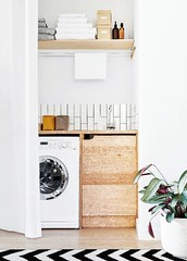
- Specified hand-applied micro-cement to the bathroom walls to reinforce the warehouse feel in a way that is both sophisticated and authentic.
The bathroom before works
The bathroom after works
Images by Chris Warnes
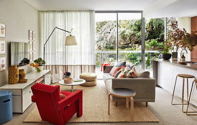
3. Parisian Chic for an Oversize Family Apartment
Interior designer and commentator: Mishell Wise, co-director at Conway + Wise
Interior Design
Interior architecture and styling: Conway + Wise Interior Design
Builder: Burmah Constructions
Location: Bellevue Hill, NSW
Description: A Georgian-style, two-level apartment in a small block of three, with sweeping harbour views over lush greenery. The apartment feels like a house with a private entrance, garden and terrace
Who lives here: A family of six with four teenagers
Apartment size: 270 square metres
Bedrooms and bathrooms before works: Three bedrooms, two bathrooms and a sunroom
Bedrooms and bathrooms after works: Five bedrooms and three bathrooms
Brief
To design a family home in sympathy with the original Georgian architecture that embraced natural materials. My client sought beauty and comfort without compromising relaxed living and a colour palette that connected with the view.
What were the client’s must-haves?
To design a family home in sympathy with the original Georgian architecture that embraced natural materials. My client sought beauty and comfort without compromising relaxed living and a colour palette that connected with the view.
What were the client’s must-haves?
- A stylish but relaxed feel.
- A soothing colour palette that connected with nature.
- An entertainer’s kitchen.
- Plenty of storage to house a multitude of sports gear for this sports-loving family, such as surf boards, skis and golf clubs.
The apartment before works
What wasn’t working about the apartment originally?
The kitchen was too small for a family this size. A shared bathroom was impossible.
The home was liveable, but not beautiful. A variety of past additions had resulted in a fragmented appearance with different skirtings and cornices in every room and even different ceiling heights.
What condition was the apartment in when you came onboard?
When we first met our clients they had already started demolishing the kitchen without a plan or council or strata approval. The site was on shut-down until approval had been obtained.
The old kitchen was small and dark, and located at the rear of the apartment. Two of the bedrooms were uninhabitable.
It was a chaotic tangle of partially removed walls and electrical wires and with no clear direction on what to do moving forward.
The apartment before works
Budget: Around $700,000, excluding furnishings.
Where did most of it go?
On the 26 items of custom-designed joinery.
Budget: Around $700,000, excluding furnishings.
Where did most of it go?
On the 26 items of custom-designed joinery.
The floor plan before works
What exactly did you do?
What exactly did you do?
- Designed, reconfigured and developed materials, finishes and fixtures palettes for the entire apartment.
- Replaced the closed-in U-shaped kitchen with a galley-style kitchen with lots of storage.
- Converted the tiny dark laundry into a butler’s pantry and laundry, which are hidden behind the galley kitchen.
- Divided one of the larger bathrooms into a separate ensuite for the master bedroom and a bathroom to be shared by two bedrooms.
- Borrowed space from the second bedroom to turn the sunroom into a proper bedroom.
- Converted the attic into two bedrooms.
- Gutted and redesigned the upstairs bathroom.
- Installed a fireplace and an adjacent library wing off the main living area.
- Restored the ornate Georgian ceilings.
- Added an abundance of custom joinery to boost storage.
The floor plan after works
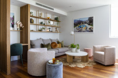
How did you add character and soul to the space?
How did you add character and soul to the space?
- The apartment had fabulous bones – large north-facing windows and high ornate ceilings. The concept was designed around playing to these strengths, orientating major elements towards the view, and ensuring the overall style was in keeping with the apartment’s natural grace.
- Restoring the ornate ceiling and adding wall panelling throughout were the main things that added character.
- New chevron timber flooring added further charm.
- We used beautiful natural materials, such as marble, to infuse the interior with luxury.
- Attention was paid to the little details, such as installing high decorative skirting boards and replacing the cornices.
Tell us about the custom joinery
The apartment had virtually no storage so we designed over 20 pieces of custom joinery. With four sporty kids an enormous amount of storage for sports equipment was required. It was important that a cohesive look was achieved, however with so many pieces we needed subtle differentiation.
We did this by using a Shaker profile for joinery visible to the living and dining areas and a fine beading profile to complement the wall panelling.
The master bedroom had a double-beading profile to exude elegance. For the teenagers’ bedrooms, we used a V-joint profile – it’s in keeping with the rest of the joinery but has a younger look and feel.
How did you boost natural light?
The oversize north-facing windows were hidden behind heavy curtains. Low cupboards made the space feel cluttered and detracted from both the view and the light.
We removed all the original cabinetry and chose not to install any window furnishings in the living areas to fill the home with an abundance of light, installing only shutters where privacy was required. Ideally, we would have installed French doors and a balcony, however budget and time did not permit.
Tell us about the chevron flooring
Our concept for this house-size apartment was ‘Parisian chic’, artfully blending old and new. We wanted to maintain the original features of the Georgian architecture while creating classic, sophisticated interiors with a modern edge.
When designing, one of the first and major decisions is flooring. To work with our concept, real timber with a depth and richness was a must and chevron immediately shouts ‘Paris’.
Tell us about the palette
We added interest to the predominantly neutral palette though texture, watery blues that reflected the harbour and earthy accents. This end result was a scheme that’s natural and soothing yet sophisticated.
Your turn
How have you added character to your own apartment? Tell us in the Comments below, like this story, save the images for inspiration, and join the conversation.
More
Looking for more apartment inspiration? Don’t miss 3 Ways to Make Your Apartment or Small Garden Lovely and Lush


Sponsored

Sponsored
1. Colour Crush
Interior designer and commentator: Kate Leabeater of Studio Oscar Lea
Location: Paddington, NSW
Description: An apartment in a 1990s/early 2000s building
Who lives here: A gentleman who travels the world frequently for work
Apartment size: 117 square metres
Bedrooms and bathrooms: Two bedrooms (one that doubles as a study), one bathroom and one ensuite