3 Great Small Kitchens... and How They Did It
Skinny, awkward, seriously short on space – find out how these designers overcame the challenges of these teeny spaces

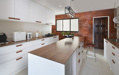
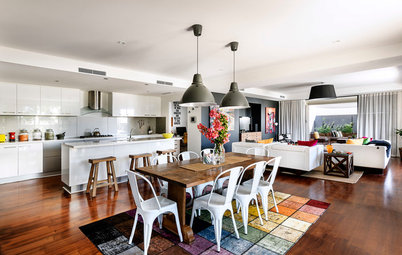
A too-small kitchen can present all sorts of design challenges – storage, preparation space and an uncluttered feel chief among them. If you need ideas for your own tiny cooking space, look no further. We’ve gathered together three kitchens that are small on space but big on style and efficiency – and we asked the designers to reveal exactly how they did it.
Brief
Client’s must-haves
- A generously proportioned, functional and light-filled kitchen.
- A direct connection to the courtyard (and outdoor kitchen used to stir-fry food).
Client’s must-haves
- More bench space and storage.
- A double sink.
- A direct connection to the courtyard.
- An outdoor stir-fry kitchen.
The kitchen before works, which led to the main bathroom
What wasn’t working about the kitchen originally?
What wasn’t working about the kitchen originally?
- The existing galley kitchen was dark and narrow.
- There was a laundry cupboard within the kitchen, which took up valuable space.
- The kitchen was a thoroughfare as it was the only access point to the main bathroom.
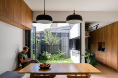
The kitchen floor plan, with the courtyard to the right
What challenges did you face?
What challenges did you face?
- Original terrace houses like this one typically have smaller rooms with poor connection to outdoor spaces. On small narrow lots, there is so much potential to take advantage of the outdoor areas and maximise the use of the whole site.
- Access to natural light and ventilation, and creating a generous open-plan feel, are challenging when you are constrained by the dimensions of the site and proximity of the neighbours.
- Built-in storage is an important consideration to minimise daily clutter from being in view.
What exactly did you do?
- Relocated the kitchen to the rear of the house (swapped out its location with the main bathroom).
- Moved the laundry into a separate room.
- Extended the house to the side boundary to increase its width.
- Increased the ceiling height.
- Added triple-stacking sliding doors that connect the kitchen to the courtyard.
- Introduced new finishes, fittings, fixtures, joinery and lighting.
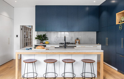
How did you deal with the lack of space?
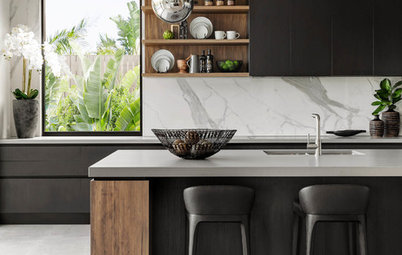
- The width of the kitchen was increased by building the terrace to both side boundaries.
- We chose to design a narrow island bench and located it in the centre of the room.
- Located the sink at the narrower end of the room to apportion space for bench seating at the other side of the island.
- Offset the cooktop and sink so two people can comfortably use the kitchen at the same time.
- Maximised storage by taking the cupboards right to the ceiling.
- Installed full-height, north-facing glazing to draw light into the room and take advantage of the generous ceiling height.
- Introduced stacking-slider doors. These can be opened from both sides, stacked to either side or stacked in the middle for flexibility; so when someone is using the kitchen, the courtyard is still accessible from the other side of the kitchen island.
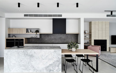
2. Small Wonder
Architect and interior designer: Caroline McNally, principal at McNally Architects and director at their interiors division I+D Studio
Location: Manly, NSW
Description: An awkwardly shaped kitchen with two columns in an apartment
Who lives here: A couple with two teenage children use it as a holiday home
Kitchen size: Around four square metres
Budget: Undisclosed
The kitchen floor plan
Brief
Client’s must-haves
Brief
- Better functionality.
- Include seating.
- Change the orientation so diners in the kitchen can enjoy beach views.
- A better connection to the living area.
Client’s must-haves
- An open-plan kitchen that connects to the living area.
- Better lighting in the kitchen’s work spaces and feature lighting over the bench.
The original kitchen
What wasn’t working about the kitchen originally?
There was a lot of inefficient space as a column separated the kitchen and living area. Also, there was no seating in the kitchen.
What wasn’t working about the kitchen originally?
There was a lot of inefficient space as a column separated the kitchen and living area. Also, there was no seating in the kitchen.
What challenges did you face?
- The kitchen had two awkward columns it it, and the one in the middle of the room couldn’t be removed. This column essentially determined the shape of the kitchen.
- The second column sat in the middle of the kitchen benchtop, obstructing flow to the living area.
- The plumbing could not be moved so we had to keep the locations of the refrigerator, dishwasher and sink in the same spots, which influenced the kitchen design.
- We couldn’t move the plumbing outlets and electrics either, as they were in the floor and ceiling slabs.
- There were no ceiling downlights.
View into the original kitchen
What exactly did you do?
What exactly did you do?
- Softened the appearance of the middle column by rounding the ends and covering it with a feature tile, which we carried through to the island.
- Removed the half-wall in the middle of the benchtop to open the space to the living area.
- Ran the plumbing through the cabinetry to get the sink to the middle of the kitchen without drilling into the concrete slab. This changed the orientation of the kitchen and meant the clients can now enjoy beach views while prepping meals and washing up.
- Added downlights by putting in a shallow false ceiling.
- Put in Karndean Designflooring vinyl timber-look floorboards that met strata’s acoustic regulations.
- Covered the bottom part of the kitchen window (while giving it the appearance of looking like a normal window) so joinery could go in front of it.
- Added eat-in seating.
- Put in new appliances, sinks and taps.
View into the original kitchen
How did you deal with the lack of space?
How did you deal with the lack of space?
- We installed a pull-out pantry to provide space-savvy storage.
- Specified drawers over cupboards, which pull out towards you for maximum storage potential.
- To visually integrate the column and kitchen design, we used the same tile throughout.
- We maximised the size of the benchtop for the space to allow for preparation work and casual dining.
- Specified clean lines and a light colour palette to visually open the kitchen.
Tell us about the study nook
This was a dead corner and we wanted to make it part of the kitchen and living area. The client also wanted a study nook or casual desk where they could catch up on emails.
We used the same curved detail in the joinery as we did with the kitchen bench and timber veneer for the wall and joinery. It’s a lovely, contained area that also includes display space and hides the internet modem.
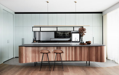
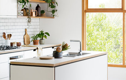
3. Minimalist Chic
Interior designer: Sabine Thiel-Siling at STS Interiors
Location: Brisbane, Queensland
Description: A small kitchen on the 22nd floor of a 1980s apartment
Who lives here: A gentleman
Kitchen size: Approximately 7.4 square metres
Budget: Around $60,000 including appliances
Interior designer: Sabine Thiel-Siling at STS Interiors
Location: Brisbane, Queensland
Description: A small kitchen on the 22nd floor of a 1980s apartment
Who lives here: A gentleman
Kitchen size: Approximately 7.4 square metres
Budget: Around $60,000 including appliances
The kitchen floor plan
Brief
Client’s must-haves
Brief
- A kitchen that was open, minimalist and masculine.
- Contemporary finishes and materials.
- No breakfast bar or stools.
Client’s must-haves
- A separate wine fridge.
- A cooktop with concealed ventilation.
- A water filter.
What wasn’t working about the kitchen?
It was dated, cramped and although it was semi-open to the living room, it had a high bar wall and a low bulkhead that made it feel closed in. It also had poor lighting and not enough storage.
What exactly did you do?
It was dated, cramped and although it was semi-open to the living room, it had a high bar wall and a low bulkhead that made it feel closed in. It also had poor lighting and not enough storage.
What exactly did you do?
- Demolished the original kitchen and replaced it with new joinery and a new kitchen island.
- Took down the bar wall between the kitchen and living room to boost the connection between the two.
- Stripped the bulkheads back as far as possible.
- Specified new appliances, fixtures and lighting.
The kitchen before works
What challenges did you face?
The existing kitchen was U-shaped with an overly large free-standing fridge, a deep pantry, stepped-back benches and narrow overhead cupboards.
The U-shaped design of the kitchen was so narrow it made the corner cupboards practically unusable. Big bulkheads meant there wasn’t enough room for storage and the space felt cramped and overly busy.
I wanted to open up the kitchen, add more storage, install a wider benchtop, and create clean straight lines. However, I did not know what was behind the existing kitchen cupboards and appliances, and what was hidden in the walls in terms of pipework, wastes and connections.
It was only when the kitchen was demolished that we could see what was structural and couldn’t be moved or removed, and how much storage we could add.
How did you deal with the lack of space here?
Your turn
Did you find this story useful? In the Comments below, tell us which ideas could work in your own small kitchen, like this story and save the images for inspiration. Go on, join the renovation conversation.
More
Want more small-space inspiration? Don’t miss Tight Squeeze: A Genius Solution for a Narrow, Hemmed-In Site
- Installed a galley-style kitchen with straight lines.
- Added floor-to-ceiling cupboards on one wall to boost storage (which was made possible by adding a concealed refrigerator).
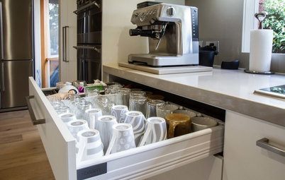
- Installed a concealed appliance cupboard in the centre of the joinery wall to house items such as the juicer and coffee machine (freeing up around one square metre of bench space).
- Specified fully accessible cupboards – no more awkward corner cupboards.
- Introduced easily accessible drawers at the lower points.
- Created a sleek and smooth horizontal surface on the island benchtop with a flush-mounted cooktop and an under-mounted sink.
- Chose push-to-open doors and drawers rather than ones with handles to keep the lines clean.
Your turn
Did you find this story useful? In the Comments below, tell us which ideas could work in your own small kitchen, like this story and save the images for inspiration. Go on, join the renovation conversation.
More
Want more small-space inspiration? Don’t miss Tight Squeeze: A Genius Solution for a Narrow, Hemmed-In Site
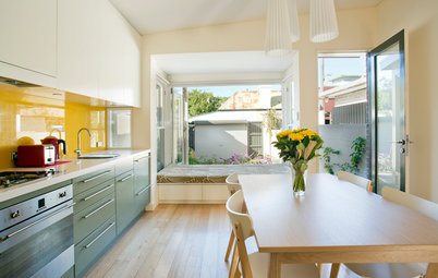

Architect: Kitty Lee, principal at Kitty Lee Architecture
Builder: Renotech Building
Location: Chippendale, NSW
Description: A narrow kitchen in a two-storey Victorian terrace
Who lives here: A young couple
Kitchen size: Approximately 12 square metres
Budget: Around $50,000 including appliances