


5 Fool-Proof Steps to a Spot On Colour Scheme
When used effectively, colour can be the strongest design element in your home. Make your colour choice the right one with these easy steps
Karyn McRae
20 November 2014
Houzz Australia Contributor. Interior Designer at McRae & Lynch Design.
As a designer, I’m often asked, “Can you throw some colours together?” However, paint colours should never be ‘thrown together’ and actually need careful consideration. Get the colours wrong and your whole space won’t gel. As designers, we study the theory of colour in Year One and even after years of experience we instinctively refer to the theory to get it right.
The following steps are what we consider before making any colour selection.
The following steps are what we consider before making any colour selection.
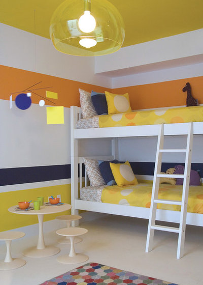
STEP 1: Give the space you are painting careful consideration
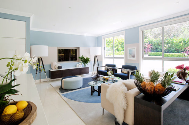
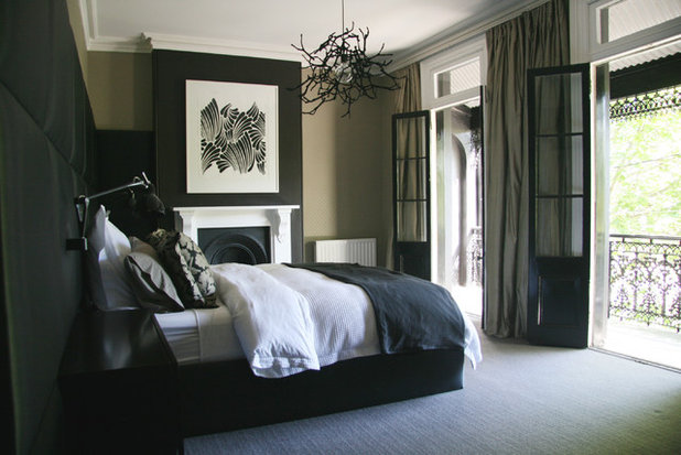
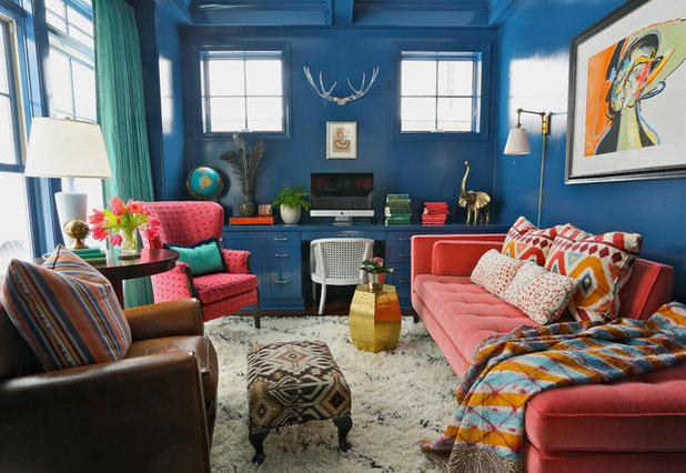
When you embark on a painting project, first consider the space you are painting and decide what mood you wish to create – will it bea dramatic scheme, serene, harmonious or neutral? Then,decide if the surfaces you intend on painting will play a staring role in the overall scheme, or if the walls will play a more subdued part.
When you embark on a painting project, first consider the space you are painting and decide what mood you wish to create – will it bea dramatic scheme, serene, harmonious or neutral? Then,decide if the surfaces you intend on painting will play a staring role in the overall scheme, or if the walls will play a more subdued part.
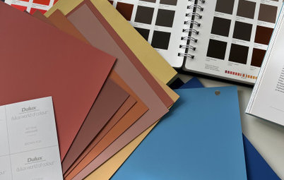
STEP 2: Grab some paint samples
As designers, we use fan decks of paint colours when putting together a new colour scheme and we order A4 brushout samples of the colours we think will suit.
If you don’t have access to a fan deck, go to your local paint shop or hardware store and grab the paint card samples that appeal to you –and don’t just grab one, grab a few. Paint samples tend to look quite different once you get them home.
DESIGN TIP: When looking at colour samples, we always take a piece of white paper and place it under the sample. Doing this lets us see what base colour the sample is throwing. A sample on its own may look ‘off white’, but when placed on top of the white paper it may look more grey, beige or even pink, and this base colour may not work with the scheme you are creating.
Read more: Colour Forecast: Key Trends for 2015
STEP 3: Always consider the lighting
We always consider both the natural light and the artificial light in a space when selecting paint. Lighting has an effect on the mood within a space and it is often overlooked when considering a new paint colour scheme. The amount of light within a space may determine the intensity of the colours you use.
Remember colour can appear quite different throughout the day and into the night as the lighting type changes from natural to artificial.
Want to know which paints and colours work best under the Australian sun? Find out here.
STEP 4: Look at the existing colours within the space
When choosing a colour scheme, you have to consider the existing elements within the space. For example, a timber floor will have its own colour to consider within the scheme you are creating. The same can be said for tiles and carpet, whether existing or new.
Consider any items of furniture that are to remain or that may be purchased. Colour is in every fixture and fitting within a space and all should be considered and compliment a new paint scheme.
STEP 5: Final colour check
Once you have edited the samples you brought home from the paint shop and you have chosen your colour scheme, you have two options:
Finally, don’t fear colour. If the wall you have painted doesn’t look right, you can always start over again … it’s only paint!
Once you have edited the samples you brought home from the paint shop and you have chosen your colour scheme, you have two options:
- If you are still a little unsure of your choices, go and buy sample pots of the colours you like and paint large pieces of white cardboard with them, then hang them on your wall. Live with them for a few days to help you confirm or eliminate your choices.
- Be confident that you have followed our tips and have taken into consideration the space, the light, the existing elements and go ahead and paint those tired walls!
Finally, don’t fear colour. If the wall you have painted doesn’t look right, you can always start over again … it’s only paint!
TELL US
Which winning colour combinations have you used? Tell us in the comments section.
MORE
Brush Up on Paint: Know Your Matts From Your Glosses
From the Pros: 7 Top Tips for Painting Interior Walls
20 Ways to Inject Personality With Paint … Inside and Out
How to Stop Procrastinating on Paint Colours
Which winning colour combinations have you used? Tell us in the comments section.
MORE
Brush Up on Paint: Know Your Matts From Your Glosses
From the Pros: 7 Top Tips for Painting Interior Walls
20 Ways to Inject Personality With Paint … Inside and Out
How to Stop Procrastinating on Paint Colours

What are you working on?


Related Stories
Paint
How to Choose Your Perfect Paint Colours
By Erin Carlyle
Three USA designers share tips to pinpoint your style and mine memories to find the right paint palette for your home
Full Story
Renovating Advice
How to Choose Your Wall Colour to Complement Floors and Furniture
Which colour should I paint my room to suit the flooring and furniture? We've all asked it – and here are the answers
Full Story
Most Popular
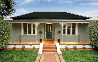
How to Pick the Right Paint Colours for Your Federation House
By Joanna Tovia
Roof colour, wall materials and emerging trends all come into play for Federation paint schemes that work
Full Story
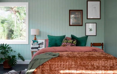
Colourful Homes
Suffering From White-Wall Syndrome? How to Add Colour Confidently
White walls are great... until they stop being inspiring. Five paint colour experts share how to transition to colour
Full Story
Expert Opinion
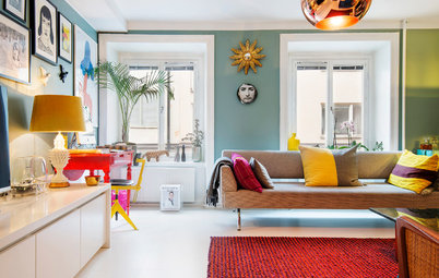
An Interior Designer Reveals How to Mix Colours and Make it Work
By tidgboutique
Don’t want to confine yourself to neutrals but lack the confidence to embrace colours? We have you covered
Full Story
Made Local
Made Local: How Dulux Colour Trends Are Born
Ever wondered how Dulux sees into the future to know the colours we'll be coveting in the year ahead? Here, we find out
Full Story
Houzz Tours
Queensland Houzz: A Cute Cottage Awash With Colour and Pattern
Bold colour, quirky prints and an abundance of art transformed this 1920s cottage into an inviting and relaxing gem
Full Story
Houzz Tours
My Houzz: A Moody, Modernised Home in Melbourne Regains its Charm
The original beauty of this Californian bungalow was lost to unsympathetic updates – see how a designer brought it back
Full Story
Interior Design
20 Honey-Hued Interiors That'll Make You Melt
Our coffee-break escape offers you five minutes' worth of images to inspire and delight. Jump right in...
Full Story
Awards
Paintbrushes Poised! 2023 Dulux Colour Awards Finalists Are In
Looking for interesting ways to add colour at home? Check out these shortlisted projects in the 2023 Dulux Colour Awards
Full Story
You sound very similar to me in your likes of Browns, beige,& white, I have painted the exterior of my home all white including roof. My front door, window trims, garage door are beige, it looks classic. Interior is all white with a couple of feature walls in metallic beige with beige tiles on floor I have chocolate brown leather lounge chairs in family room & white leather in media room it all looks stunning & classic at the same time, don't be afraid & go for what you love.
@singwell,
Thankyou for your comments and a big apology to Karen @ mcrae + lynch interior designs, who I promised I would send tile pictures etc...and then this thread sort of ran it's course and I totally forgot as Nov is probably the busiest time of the year for us as farmers.
Anyway, @ singwell,
I'm intrigued about your roof being white, can you send pics??
As you will have read, I was very undecided about colours back in 2014 but with the help of my daughter's keen eye and 15 paint pots later, we finally found a paint colour that matched or complimented the tile I finally chose for the living area, called Berger Polished Stone half strength and for the trim, including skirting boards, architraves, doors and ceilings is Dulux White Exchange quarter and I positively love it.
The two colours compliment one another beautifully. I have attached a pic of one of the completed rooms but of course it's hard to really see it all properly just via a photo.
The pictured tile is going in our bathroom but was discontinued after we had decided to go for tiles in the living area, so we had to try to find a tile that would still be a match in tone if not in type and found one at Beaumont called City Lights. The two different tiles only meet at the bathroom door and the new tile covers the floors in the rest of the house, so it shouldn't be an issue that they're a bit different as often bathrooms are different.
It's interesting, I was thinking of using the metalic paint too as my daughter used it and it's real nice but havn't actually done it, in fact I only just finished painting today!!
I too have a brown leather lounge and I bought a white bed for one of the bredrooms, an internal room without windows, so just a skylight, so I wanted this room to remain bright and white but not to stark white, given my colours were all on the warm side, so I chose a double strength of the ceiling colour and it looks great in there.
So at the end of the day, I did go for what I love!!