


6 Decorating Duos to Pair Up This Year
Mustard, brushed gold, geometrics, and more – learn how to mix and match 2016's key design trends like a pro
Rafael F. Bermejo
20 January 2016
With the year underway, it’s time to embrace the trends we’ve all been hearing about and put them to work in our homes. According to our army of experts around the world, colours to watch out for include baby pink and blue, mustard, white, and dark emerald green. Materials and patterns are on the move, too, and you can double their impact when you know how best to put them together. Houzz can help. These designer-ready decorative pairings will fast-track your decision making and refresh your home in all the right ways. Let’s get going!
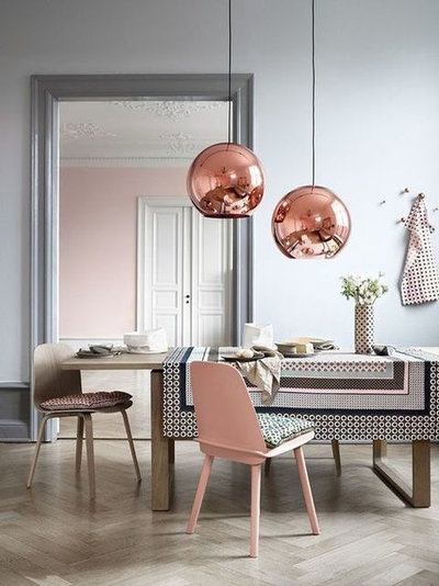
1. Baby pink and blue
Pantone’s somewhat controversial decision to showcase not one, but two colours for this year’s Colour of the Year, seems a natural place to kick-start our pair ups. The thought leaders in colour have predicted that sweet pink ‘Rose Quartz’ and soft purplish-blue ‘Serenity’ are going to be big colours for this year, bringing light and peace into our lives over more oppressive hues such as Marsala red (Pantone’s pick last year).
Pantone’s somewhat controversial decision to showcase not one, but two colours for this year’s Colour of the Year, seems a natural place to kick-start our pair ups. The thought leaders in colour have predicted that sweet pink ‘Rose Quartz’ and soft purplish-blue ‘Serenity’ are going to be big colours for this year, bringing light and peace into our lives over more oppressive hues such as Marsala red (Pantone’s pick last year).
“Colours this season are transporting us to a happier, sunnier place, where we feel free to express a wittier version of our real selves,” says Leatrice Eiseman, executive director of the Pantone Color Institute. For this reason, many colour experts are predicting similarly cheery and positive hues for this year.
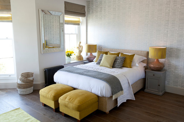
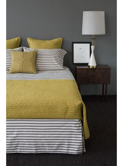
2. Mustard and grey
Another powerful colour combo to watch out for is mustard and our old friend from last year, grey. In fact, when given a choice between our editor’s choice of trending colours – olive green, mustard, grey, pink and beige – our global Houzz community voted mustard and grey as the shades they are most likely to adopt in their homes this year.
Another powerful colour combo to watch out for is mustard and our old friend from last year, grey. In fact, when given a choice between our editor’s choice of trending colours – olive green, mustard, grey, pink and beige – our global Houzz community voted mustard and grey as the shades they are most likely to adopt in their homes this year.
Although not all Houzzers specified that they would be trying these two colours together, we’re seeing lots of examples of them working together well. Many experts agree. Interior prop stylist Katsuya Kubokawa loves the combination of dark yellow and grey and French home-staging professional Isabelle Egron says there are unexpected pairings for mustard, too: “Mustard can be combined with the pastel colours characteristic of Scandinavian style, but it’s also amazing with ‘industrial’ anthracite grey,” she says.
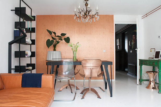
3. Burnished copper and leather
Metallics became part of the furniture last year, and there’s no sign of that letting up in 2016. Interior designer Nelly Reffet of Twinkle & Whistle of says hard silvery metals are being outclassed by burnished coppers, bronzes and aged brass and iron in furniture accents, lamps and accessories (more on bronze below).
The shining star metallics are set to be brought down to earth this year, with experts predicting they’ll be paired up with rustic, earthy, natural materials such as leather and light oak. “[Shiny surfaces] combine very well with vintage or rustic elements. Furthermore, if you add brightness in small amounts on a neutral base it reinforces the eclecticism of any space,” says Spanish interior designer Rocío Olmo.
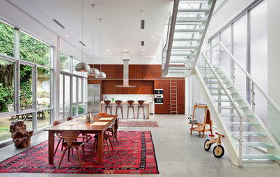
4. Timber and brass
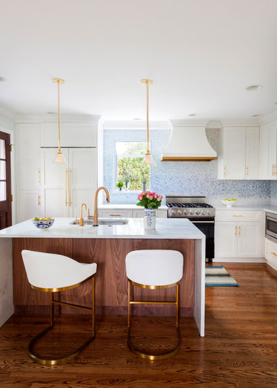
On the subject of pairing metallics and wood, give timber and brass a try. When asked to choose between five different materials – timber, stone, copper, polished concrete and porcelain tiles, our global Houzz community voted for timber as their go-to material for next year. And it just so happens that it goes perfectly with our experts’ favourite pick, brass. Reffet says tapware and doorware are getting in on the new-look metallics act now too – and the kitchen is the perfect place to show them off. “Brass in brushed or satin finishes is one to look out for,” says Reffet.
Warm, polished brass is the dominant finish in this kitchen, extending from floor to ceiling via the stools, hardware, tapware and pendant lights and pairing perfectly with the walnut on the island.
When mixing timber with brass or other metallics, go for a matt finish. In fact, choose matt pieces for timber next year in general: “Glossy cabinetry will be replaced by a more natural look – a reaction to our spending too many hours reading shiny tablets,” says interior designer Tennille Burnup.
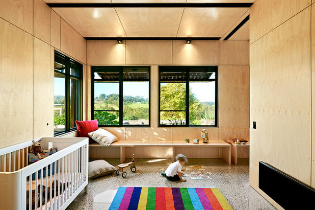
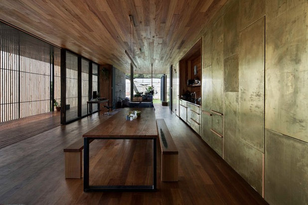
5. Plywood and … more plywood
As we said, there’s a huge trend towards timber going on. “The popular, warm feel of wood, as found in Japanese and Nordic styles, will keep growing,” says Japanese Pro Junko Maehata. Plywood, too, is continuing its upward swing. “Plywood is being used for walls, floors, stairs and even ceilings,” says Steve Burke, Managing Director of Amerex Renovations & Additions in Australia.
As we said, there’s a huge trend towards timber going on. “The popular, warm feel of wood, as found in Japanese and Nordic styles, will keep growing,” says Japanese Pro Junko Maehata. Plywood, too, is continuing its upward swing. “Plywood is being used for walls, floors, stairs and even ceilings,” says Steve Burke, Managing Director of Amerex Renovations & Additions in Australia.
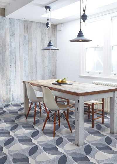
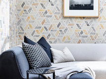
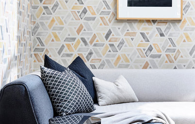
6. Geometrics and tiles
Concrete tiles featuring geometric and decorative patterns are coming back into favour all over the world. For example, some 45 per cent of Spanish and over 50 per cent of French Houzzers expressed their fondness for cement tiles featuring geometric patterns, when asked in our recent poll. These patterns translate easily in any space, whether for living room flooring, bathroom wall tiles, stair coverings or kitchen walls.
“Thirty years ago, white was very trendy, so we removed all the cement tiles,” says French homeowner eleonore66. “But now we’ve come back to them, as they are more beautiful and much more sophisticated than the ones made at the beginning of the 20th century.”
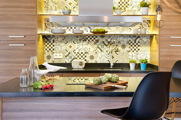
Designers are expecting to see consumers gravitating towards more geometric patterns that create a sense of fluid movement. “Having overcome a period of extreme minimalism in interior decoration, and with the revival of the vintage, people are asking for more decorative spaces once again. In this sense, the concrete tiles with different geometric and decorative patterns are something very authentic,” says Felipe Araujo, cofounder of Egue y Seta, a studio based in Barcelona.
TELL US
Which colours, materials and patterns do you think will trend this year? We look forward to reading your views in the Comments.
MORE
12 Hot Kitchen Trends Set to Sizzle in 2016
15 Bathroom Trends Splashing Down in 2016
Trend Forecast: Key Colours for 2016
TELL US
Which colours, materials and patterns do you think will trend this year? We look forward to reading your views in the Comments.
MORE
12 Hot Kitchen Trends Set to Sizzle in 2016
15 Bathroom Trends Splashing Down in 2016
Trend Forecast: Key Colours for 2016
What are you working on?
Related Stories
Interior Design
The Golden Rules of Proportion: Decor Laws You Need to Know
An interior designer reveals the essential rules for achieving a perfectly balanced interior
Full Story
Most Popular
An Interior Designer's Guide to Arranging Cushions
By Anne Ellard
Get to grips with your ever-growing pile of cushions with these professional tips for choosing and arranging cushions in your home
Full Story
Decorating
The Power of Negative Space in Interior Design
By Janet Dunn
A design element that's not even there can forever change how you view your home
Full Story
Houzz Tours
Queensland Houzz: A Cute Cottage Awash With Colour and Pattern
Bold colour, quirky prints and an abundance of art transformed this 1920s cottage into an inviting and relaxing gem
Full Story
Project Of The Week
Before & After: A Cheap & Cheerful Makeover of a 1980s Caravan
Armed with an AU$1500 budget, a Melbourne couple rolled up their sleeves and transformed a caravan in just three months
Full Story
Most Popular
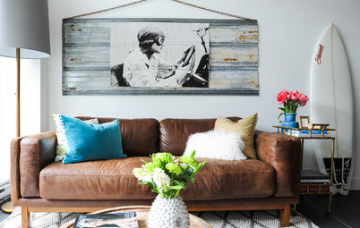
Ask the Experts: What Goes With Tan Leather?
Embrace this versatile material, colour and texture with inspirational ideas from designers in the know
Full Story
Most Popular
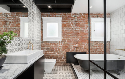
Masonry Magic: 15 Ways to Trick Out Your Exposed Brick Wall
Do you find exposed brick walls cold? Add contemporary warmth and interest with these 15 transformative ideas
Full Story
Projects Born on Houzz
Before & After: From Dump Zone to New 'Welcome Home' Living Area
Home office, yoga zone, dumping ground... this front room was having a serious identity crisis – but look at it now!
Full Story
Picture Perfect
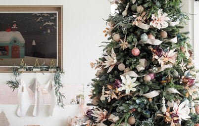
30 Christmas Schemes to Inspire and Delight
Our coffee-break escape offers you five minutes' worth of images to inspire and delight. Jump right in...
Full Story
Most Popular
16 Clever Ways to Create Zones in Open-Plan Spaces
Create distinct areas in large, open rooms with these creative design ideas – no walls or other fixed vertical structures required!
Full Story
LOVE the mixed metals we are seeing! Especially in fabrics.
I'm going with pale blue with light pumpkin orange decor, against plywood and white walls with shiny black and chrome bursts. That's where I'm going this year! I will post on my page when it all comes together. I did like the copper thing above but I'm seeing that in home decor all over the place now and it's already looking a bit tacky to me because it's overused. So I've gone chrome instead cos I'm a rebel like that. hehe.
love the geometric tiles I used a colourful geometric tile in my powder room to add a splash of colour and then the same tile in greys in my ensuite they add so much character.