


7 Ways the Great Australian Landscape Can Inspire Your Colour Scheme
Here's how to use the colours in the sand, sun, sea and bush to create an interior that sits in harmony with its surroundings
Avalon Pover-Leong
23 October 2017
Houzz Contributor, located along the coastline of NSW. I am constantly inspired by our beautiful Australian landscape.
Houzz Contributor, located along the coastline of NSW. I am constantly inspired by... More
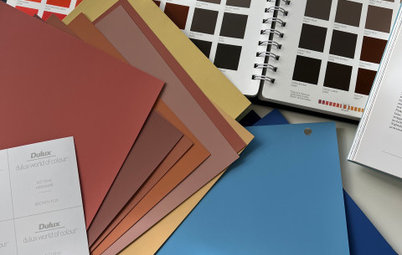
If you are looking for a way to bring colour into your space, a great way to start is by reflecting on your landscape and introducing a local or distant colour scheme, inspired by nature and your immediate surroundings, for a beautiful flowing effect. Immersing yourself in a space with a colour palette that resonates with you will create a positive atmosphere. With the warmer season approaching, there’s no better time than now to get outdoors and start gathering inspiration from what is around you. This vivid guide will take you through some examples of native Australian colours, and how to introduce them into your interior with downright stunning results.
The Australian landscape boasts a sensational array of colours. From the brilliant blues along the coast and across the skies, to the rich oranges of the desert, and the greens in our eucalyptus trees, our local landscape can be a wonderful place to inspire the colour palette of your home.
If you want to bring colour into your interior, looking at nature is a refreshing and reliable way to be inspired. As design commentator John Eussen taught me, “Nature doesn’t lie”.
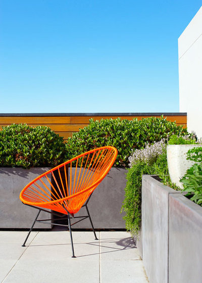
Chair: Acapulco
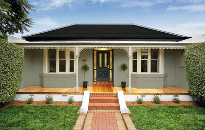
How to Choose Exterior Colours for a Show-Stopping Australian Home
Chair: Acapulco
How to Choose Exterior Colours for a Show-Stopping Australian Home
1. Choose an inspiring local or distant landscape
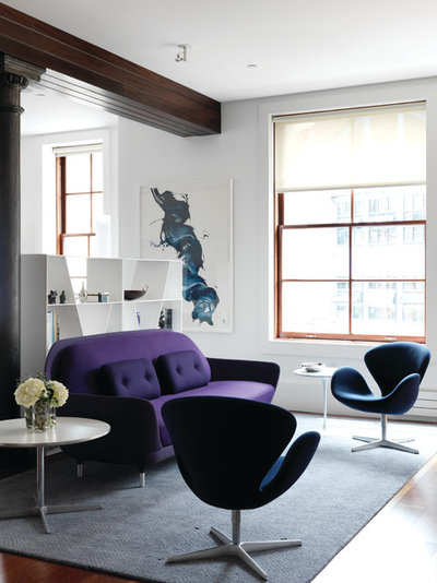
Whether you want to reflect your local surroundings or be inspired by a place you love in a different location, nature has a way of getting proportion and colour very right. This New York apartment by Nexus Designs was inspired by the Blue Mountains. They have applied the beautiful and rich indigo and purple tones of the area to the interior through furnishings and artwork.
Sofa: Favn; Swan chairs: Arne Jacobsen
2. Apply highlight colours
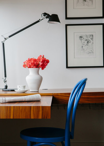
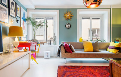
Introducing colour through furniture and accessories means you can mix up your schemes regularly. You can have fun and be playful, changing things around whenever you please. The pops of azure and coral conjure some of our more tropical regions, and bring an exciting and personal edge to this space.
Bentwood chair: Bon Bentwood
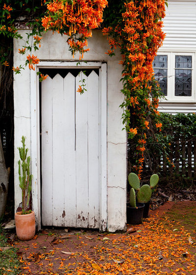
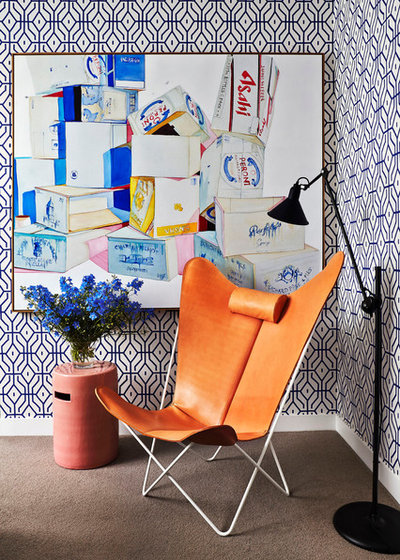
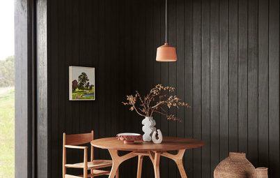
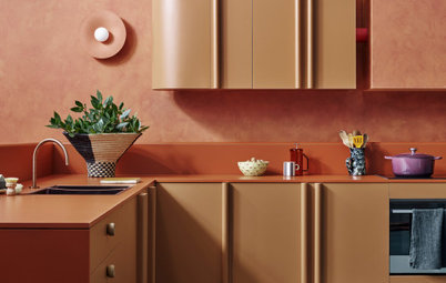
A great highlight colour is a vibrant orange, which is seen across the Australian landscape, both in the desert and through our flora. This trumpet vine (also known as a flame vine) is a South American native, yet it grows extremely well in Australia due to the warm climate – you may have seen it creeping over garages and fences in your own neighbourhood.
Give Your Walls a Lift Using Houzz’s Most Popular Hues
Give Your Walls a Lift Using Houzz’s Most Popular Hues
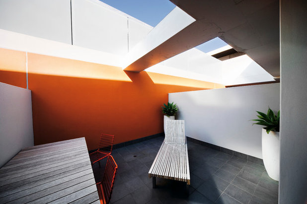
Orange is also seen in our soil and rocks, and emits a glowing presence of strength and stability when used well. A brilliant blaze of orange has been applied to this feature wall. Its bold presence adds volume and works as a striking contrast against the blue skies above.
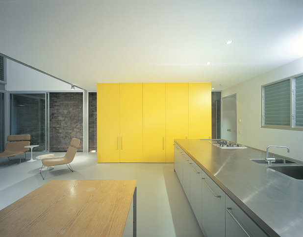
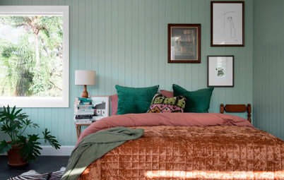
From delicate wattle trees, to our bright, hot summers on our golden beaches, yellow lends a bright, optimistic feeling to your space. This glossy yellow statement piece gives the room a lightweight and fun feel.
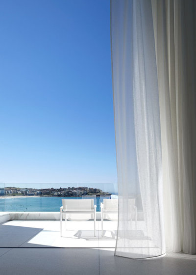
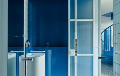
Of course, a major colour we can’t forget about in Australia is blue, thanks to our brilliant skies and glittering oceans.
The Best Paints and Colours Under the Australian Sun
The Best Paints and Colours Under the Australian Sun
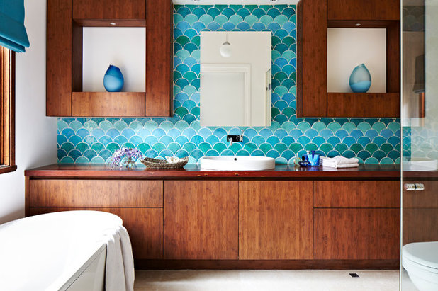
Mix and match different shades for a refreshing look. Beware of painting an entire wall in certain bright blues as this has the potential to date. Although, if you get the tone right, the risk can be well worth it. These tiles are a nice alternative as they add texture and have a three-way shade.
Tiles: Urban Edge
Tiles: Urban Edge

arentpyke.com
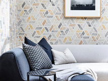
3. Pick a pattern
Once you have selected some bright or contrasting colours, try applying some texture and interest through pattern. The three colours used here work well together as they have been broken up with plenty of white in their patterns.
Once you have selected some bright or contrasting colours, try applying some texture and interest through pattern. The three colours used here work well together as they have been broken up with plenty of white in their patterns.
Have some fun mixing colours and pattern. Welcome in the liveliness of Australian summers with electric blues, vivacious oranges and rays of yellow for a visual feast.
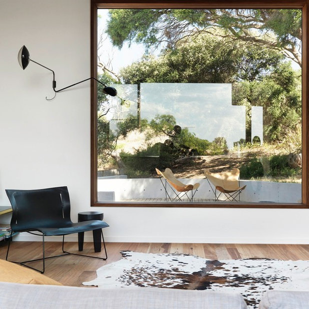
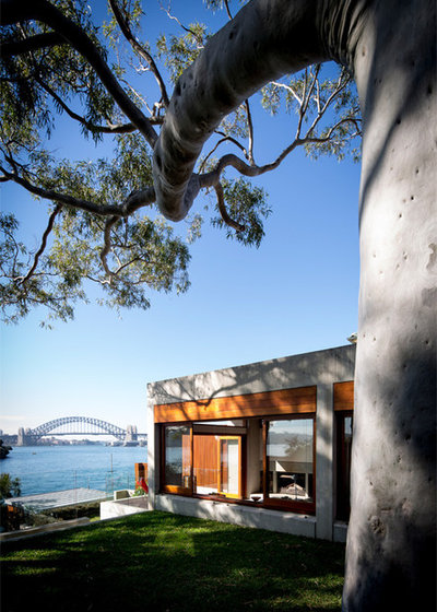
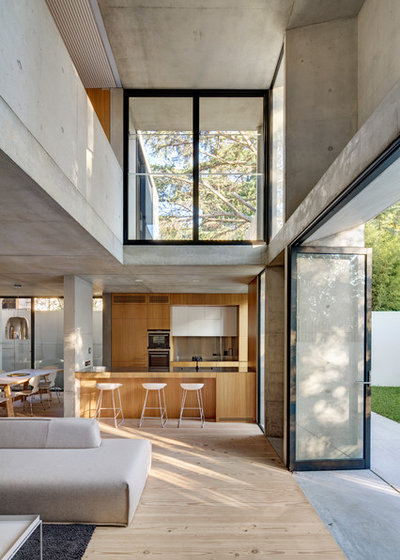
4. Bring in the bush
Our bushland is a canvas of greens and browns that have a homey and authentic feel to them. This interior has framed the bushy view and then used a complementary colour scheme of neutrals, blacks and whites to create a more seamless feel between inside and out.
See more of this project
BKF Butterfly Chairs: Muumuu Design; Cuoio Lounge: Eoos
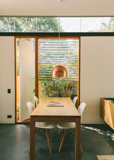
When working with the greens found in the bushland, try adding some copper, as it has a warm base colour that works well with these greens, and will also add a more luxurious feel to your interior.
Chairs: Eames
Peek Inside 5 Homes That Showcase True Australian Style
Chairs: Eames
Peek Inside 5 Homes That Showcase True Australian Style
5. Try a subtle colour scheme
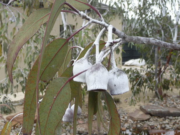
If you’re less inclined towards a bold colour scheme, there’s still plenty of inspiration to be found. Take a milky cool grey and combine it with an olive or khaki green as seen in the Eucalyptus caesia ‘Silver Princess’. Soft on the eye, the result is a subdued and restful atmosphere. To complement these paint colours inspired by nature, choose stainless steel, silver or mirrored finishes, as this will also add a lustrous accent.
If you’re less inclined towards a bold colour scheme, there’s still plenty of inspiration to be found. Take a milky cool grey and combine it with an olive or khaki green as seen in the Eucalyptus caesia ‘Silver Princess’. Soft on the eye, the result is a subdued and restful atmosphere. To complement these paint colours inspired by nature, choose stainless steel, silver or mirrored finishes, as this will also add a lustrous accent.
6. Go wild and woolly
Mimic the natural formations of our bushland in the textures of your soft furnishings. Cast woollen throws across your lounge or introduce sisal flooring for an evocative quality.
Mimic the natural formations of our bushland in the textures of your soft furnishings. Cast woollen throws across your lounge or introduce sisal flooring for an evocative quality.
7. Explore materiality
To incorporate the authentic feeling of the Australian landscape, look into locally sourced timbers. Timber looks beautiful against the coolness of unpolished concrete.
Find out more ways timber can warm up your kitchen
To incorporate the authentic feeling of the Australian landscape, look into locally sourced timbers. Timber looks beautiful against the coolness of unpolished concrete.
Find out more ways timber can warm up your kitchen
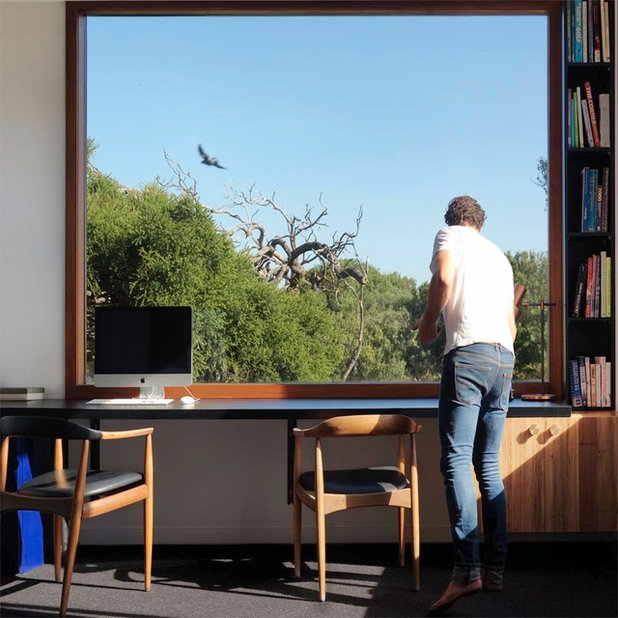
The timber used around this large window and in the interior blends the space well, inviting the landscape inside.
Chairs: CH20 Elbow
Tell us
Are you inspired by the Australian landscape when it comes to designing and decorating your home? How have you incorporated the colours and textures into your own home? Tell us in the Comments section below.
More
Get in touch with an interior designer or decorator to find out more

Related Stories
Paint
How to Choose Your Perfect Paint Colours
By Erin Carlyle
Three USA designers share tips to pinpoint your style and mine memories to find the right paint palette for your home
Full Story
Renovating Advice
How to Choose Your Wall Colour to Complement Floors and Furniture
Which colour should I paint my room to suit the flooring and furniture? We've all asked it – and here are the answers
Full Story
Most Popular
How to Pick the Right Paint Colours for Your Federation House
By Joanna Tovia
Roof colour, wall materials and emerging trends all come into play for Federation paint schemes that work
Full Story
Colourful Homes
Suffering From White-Wall Syndrome? How to Add Colour Confidently
White walls are great... until they stop being inspiring. Five paint colour experts share how to transition to colour
Full Story
Expert Opinion
An Interior Designer Reveals How to Mix Colours and Make it Work
By tidgboutique
Don’t want to confine yourself to neutrals but lack the confidence to embrace colours? We have you covered
Full Story
Made Local
Made Local: How Dulux Colour Trends Are Born
Ever wondered how Dulux sees into the future to know the colours we'll be coveting in the year ahead? Here, we find out
Full Story
Houzz Tours
Queensland Houzz: A Cute Cottage Awash With Colour and Pattern
Bold colour, quirky prints and an abundance of art transformed this 1920s cottage into an inviting and relaxing gem
Full Story
Houzz Tours
My Houzz: A Moody, Modernised Home in Melbourne Regains its Charm
The original beauty of this Californian bungalow was lost to unsympathetic updates – see how a designer brought it back
Full Story
Interior Design
20 Honey-Hued Interiors That'll Make You Melt
Our coffee-break escape offers you five minutes' worth of images to inspire and delight. Jump right in...
Full Story
Awards
Paintbrushes Poised! 2023 Dulux Colour Awards Finalists Are In
Looking for interesting ways to add colour at home? Check out these shortlisted projects in the 2023 Dulux Colour Awards
Full Story
I've been thinking for some time now of painting my kitchen cupboards a particular shade of eucalyptus green so the whole kitchen will blend in with the scenery outside. ( I am an outdoor girl at heart!) I have loved the deep blue of the near end of the day when the sun just sets in the summertime, and was thinking of that for a wall. Now reading this article, I think I might just have got the kick up the bum to do it!
When I visit the USA on my regular holiday, the several things I miss are always the many different green tones of the gum trees here (bluey-silver right through to deep greens), and the birds with their bright greens, reds, oranges, yellows and whites. Gee, we are really a lucky country.
We used the colours of the large angophora costata outside the window to develop a palette of colours for the interior and exterior of the house 30 years ago and have maintained it ever since ... for us it has been timeless and always in season.
Number 4 is effective.
The use of strong purple in a NY apartment (seen here and in another article) does not suggest the NSW Blue Mountains colours I know.