
8 Designer Tricks to Create a Harmonious Look in Your Home
Follow this advice for home decor where the rooms are all singing from the same song sheet

Designers have lots of strategies for creating a sense of harmony in a home, from repeating patterns to restricting materials. One thing they would agree on, though, is that a harmonious look is not the same as one that’s dull or predictable. Anything from super-bright colours to exposed brickwork, vibrant geometrics and textural tiles can be employed to subtly link the rooms in your home. The important thing is to use them consistently throughout a space to create a pleasant sense of cohesion.
Upstairs in the family bathroom, that same combination of oak and marble is seen again, this time on a bespoke vanity with black accents on the door and window frame.
Oak also adorns the stairs up to the converted loft and a sinuous handrail picks up the black accents used throughout the house.
2. Brighten up
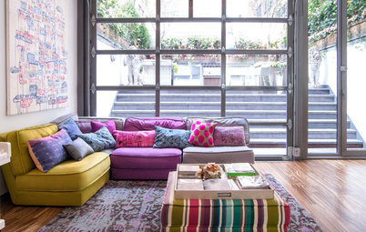
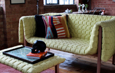
Harmonious doesn’t have to mean muted. Bright colours, rolled out boldly from room to room, create a joined-up style. Colour appears in dazzling splashes throughout this house, owned by interior designers Susie and Evros Agathou of Avocado Sweets Design Studio.
In the living space, built-in shelving is painted in a rainbow of zingy shades and teamed with cushions, artwork and a rug in similarly eye-grabbing tones.
Upstairs, bright accents are found even in the bedrooms. In this child’s room, a yellow pegboard and matching Tolix chair, alongside patterned curtains, continue the energising scheme.
3. Reveal the bones
Taking the decision to leave some of a house’s structural elements on show – its brickwork or ironwork, for instance – can create a sense of harmony if it runs through several rooms.
Stephen Nash of All & Nxthing left the brickwork along one wall of his kitchen exposed, painting it simply in fresh white. Dark, minimal cabinetry helps to balance its textural look.
Upstairs, there’s more white painted brickwork in the bathroom, where part of an original chimney has been preserved, supported by a steel.
4. Embrace a white-out
Perhaps the simplest way to create a sense of harmony in your home is to opt for a classic white backdrop throughout. White walls and ceilings are easy and inexpensive to pull off, and create a blank canvas against which colourful soft furnishings can stand out, as in this living room by Oasys Property Solutions.
Perhaps the simplest way to create a sense of harmony in your home is to opt for a classic white backdrop throughout. White walls and ceilings are easy and inexpensive to pull off, and create a blank canvas against which colourful soft furnishings can stand out, as in this living room by Oasys Property Solutions.
Upstairs, in this child’s bedroom, the fresh white walls and ceiling are boosted by a pale carpet, and the red armchair and yellow pendant light stand out against all that snowy freshness.
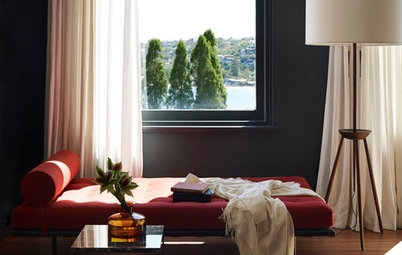
5. Add a thread of black
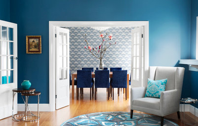
Black is an incredibly versatile colour that helps to ground a scheme. Use it a little or a lot, from room to room, to achieve a sense of harmony.
Here, in a scheme by Urbanology Designs, black is teamed with white, that classic Scandi pairing, and used boldly on kitchen cabinetry and taps.
Black is an incredibly versatile colour that helps to ground a scheme. Use it a little or a lot, from room to room, to achieve a sense of harmony.
Here, in a scheme by Urbanology Designs, black is teamed with white, that classic Scandi pairing, and used boldly on kitchen cabinetry and taps.
Move over to the living room, though, and it’s deployed more as an accent shade. It crops up on the chimney breast, lighting and cushions, tying the spaces together, but producing a much lighter effect than in the kitchen.
6. Go for geometrics
Pick a specific pattern – paisley, floral, herringbone, whatever you like – and drop it in throughout your home. In this house, designed by Caroline Milns of Zulufish, geometric patterns feature in most rooms. A hallway laid with black and white tiles leads into a music room with a geometric artwork.
Pick a specific pattern – paisley, floral, herringbone, whatever you like – and drop it in throughout your home. In this house, designed by Caroline Milns of Zulufish, geometric patterns feature in most rooms. A hallway laid with black and white tiles leads into a music room with a geometric artwork.
At the other end of the music room, the snug picks up the theme with a diamond-patterned rug.
In the guest ensuite, meanwhile, geometric pattern goes big with blue and white tiles in the shower.
7. Try textural tiles
Choosing tiles that, while different shapes and colours, deliver the same feeling of texture, helps to link rooms and conjure a feeling of harmony.
Designer Yoko Kloeden used zellige tiles as a splashback in both the kitchen and the loft ensuite (see next photo) in this house. These thick, glazed clay tiles have an uneven finish that bounces the light around beautifully.
In the loft’s tiny bathroom, the zellige tiles give a luxe feel to the shower, while their colours reflect the natural palette used throughout the project.
8. Show your metal
Pick a metal you love and work it in around your home. In this house, brass light fittings, taps and showerheads feature throughout.
Interior designer Celine Erlam of Indie & Co ensured there was even greater harmony by using the same square brass wall lights in several spots throughout the house…
Pick a metal you love and work it in around your home. In this house, brass light fittings, taps and showerheads feature throughout.
Interior designer Celine Erlam of Indie & Co ensured there was even greater harmony by using the same square brass wall lights in several spots throughout the house…
…including the kitchen…
…and the hallway.
Your turn
Do you love a scheme a cohesive home? Tell us in the Comments below. And don’t forget to save these images, like this story and join the conversation.
More
Keen for more advice on how to mix pattern and colour? Read A Designer’s Step-by-Step Masterclass on Mixing Colour & Pattern
Your turn
Do you love a scheme a cohesive home? Tell us in the Comments below. And don’t forget to save these images, like this story and join the conversation.
More
Keen for more advice on how to mix pattern and colour? Read A Designer’s Step-by-Step Masterclass on Mixing Colour & Pattern
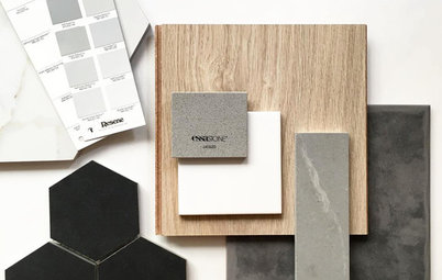
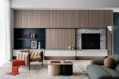
Using a restricted palette of materials gives this London house, designed by architect Brian O’Tuama, a relaxed, cohesive feel. Oak is used throughout and, in the kitchen, it appears in both its natural finish and painted a soft black. It’s teamed with Carrara marble on the island bench and splashback.